Opening Up the Ground Floors of Buildings Can Move Us Towards an Architecture of Place
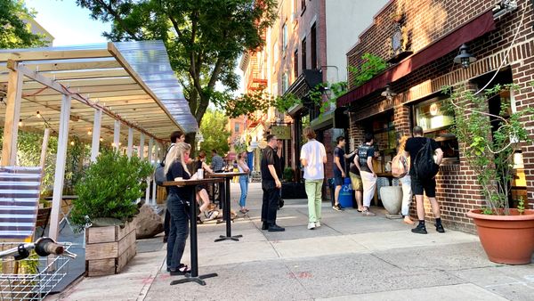
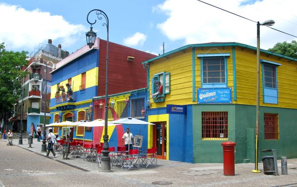
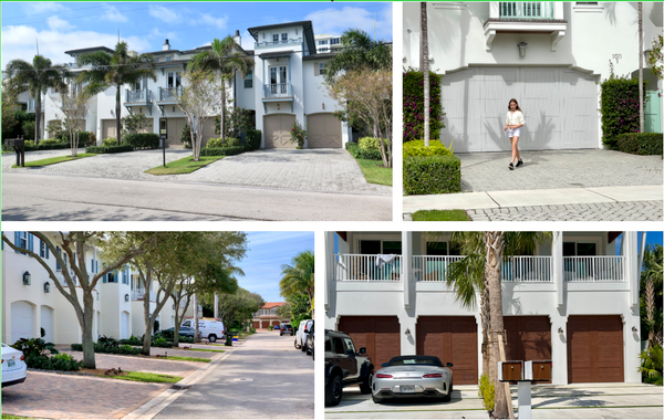
Inside-out spaces satisfy our social longings. Buildings reach out and get people to slow down and gather, better able to enjoy each other's presence. They provide "food" for our curiosities by giving us something interesting to look at and explore, and they fulfill our material needs by connecting us with a variety of goods that may otherwise have gone unseen. Bringing "inside" spaces out onto the sidewalk blurs the lines between public and private space, creating one dynamic, thriving ecosystem. This is what Jane Jacobs called "the sidewalk ballet," where the movements and activities of many different individuals – customers, visitors and vendors – create a powerful shared experience.
Below is a photo essay of great examples from around the world of "inside-out" street life – where indoor life meets the outdoor public realm.
A "front porch" attracts more life to public buildings
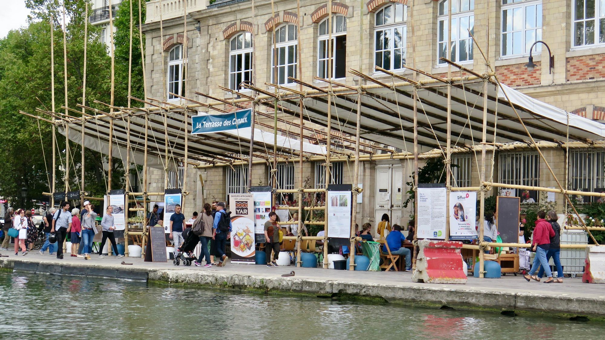
Bassin de la Villette in Paris
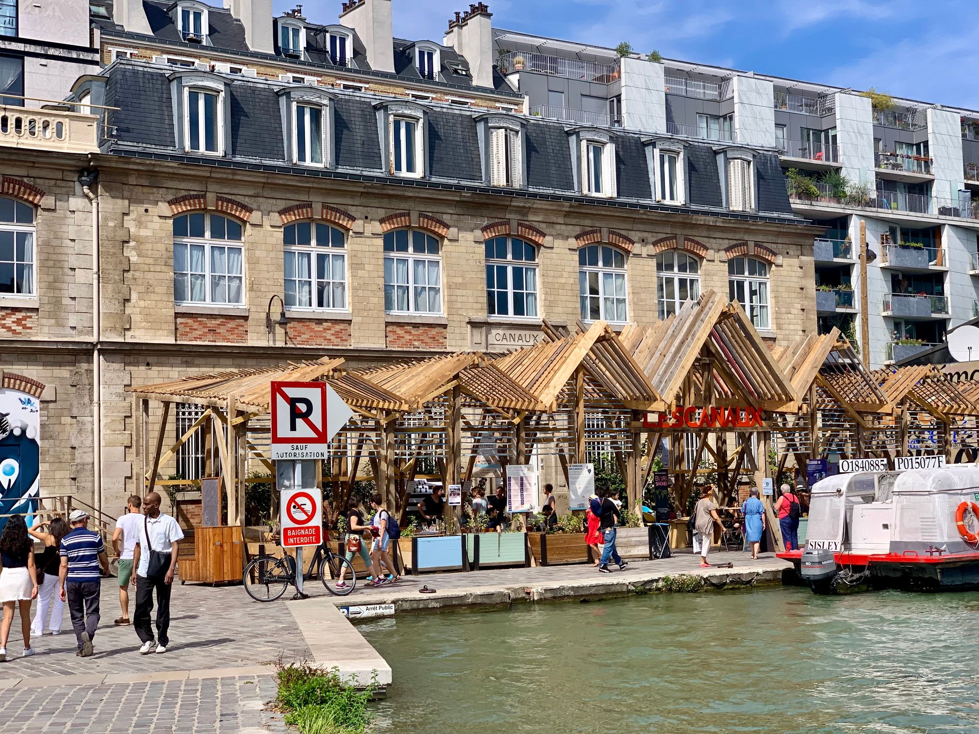
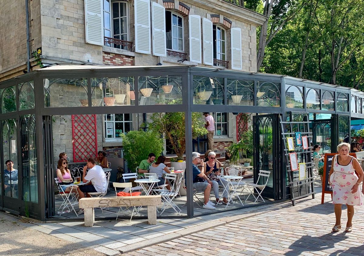
These buildings in Bassin de la Villette in Paris are a wonderful example of the great impact that bringing the inside out has on the visual character and atmosphere of a place. Whereas before, the activity in these buildings was private and hidden behind closed doors, now they are vibrant landmarks on the Bassin's shore, attracting new social life to the area.
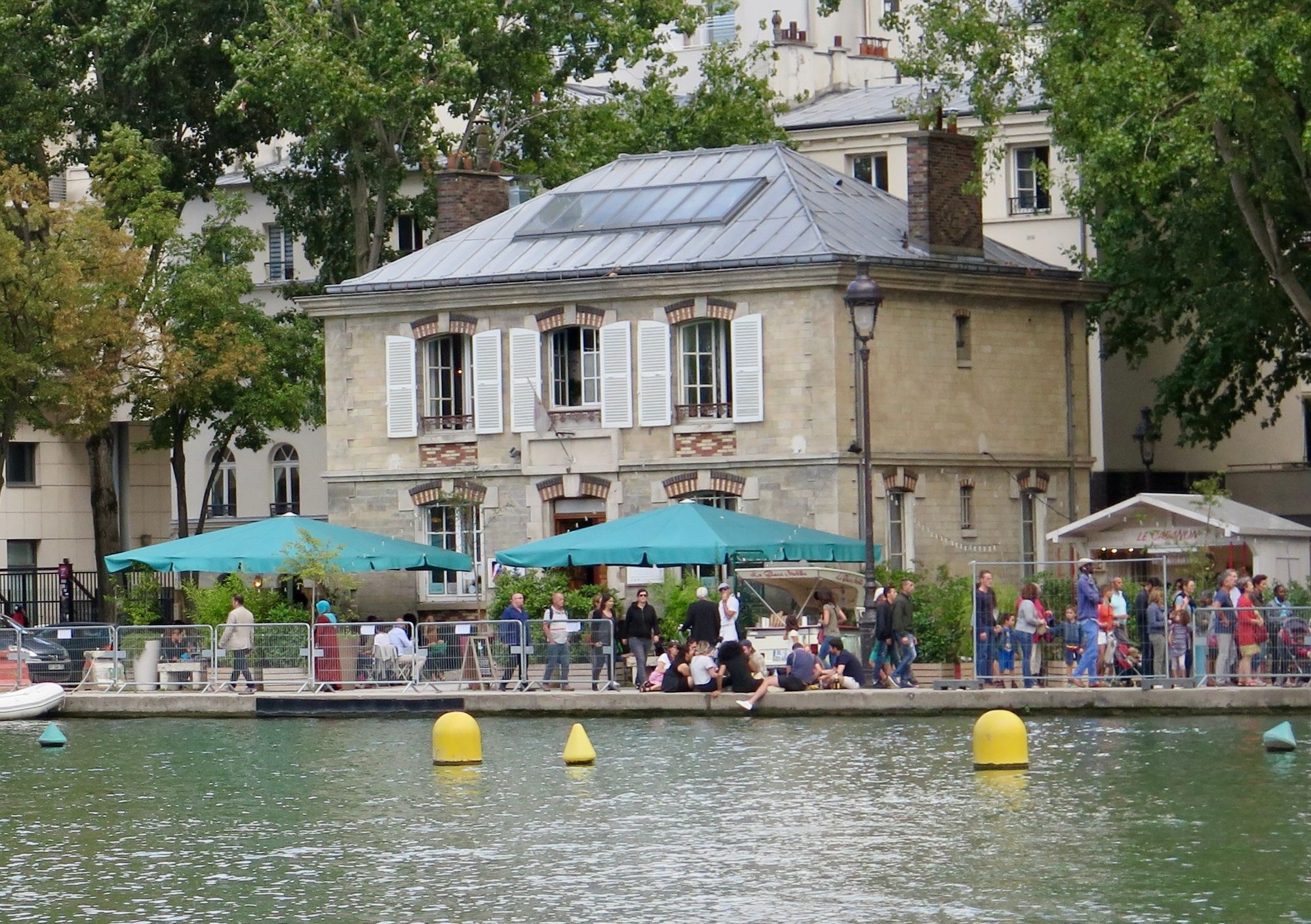
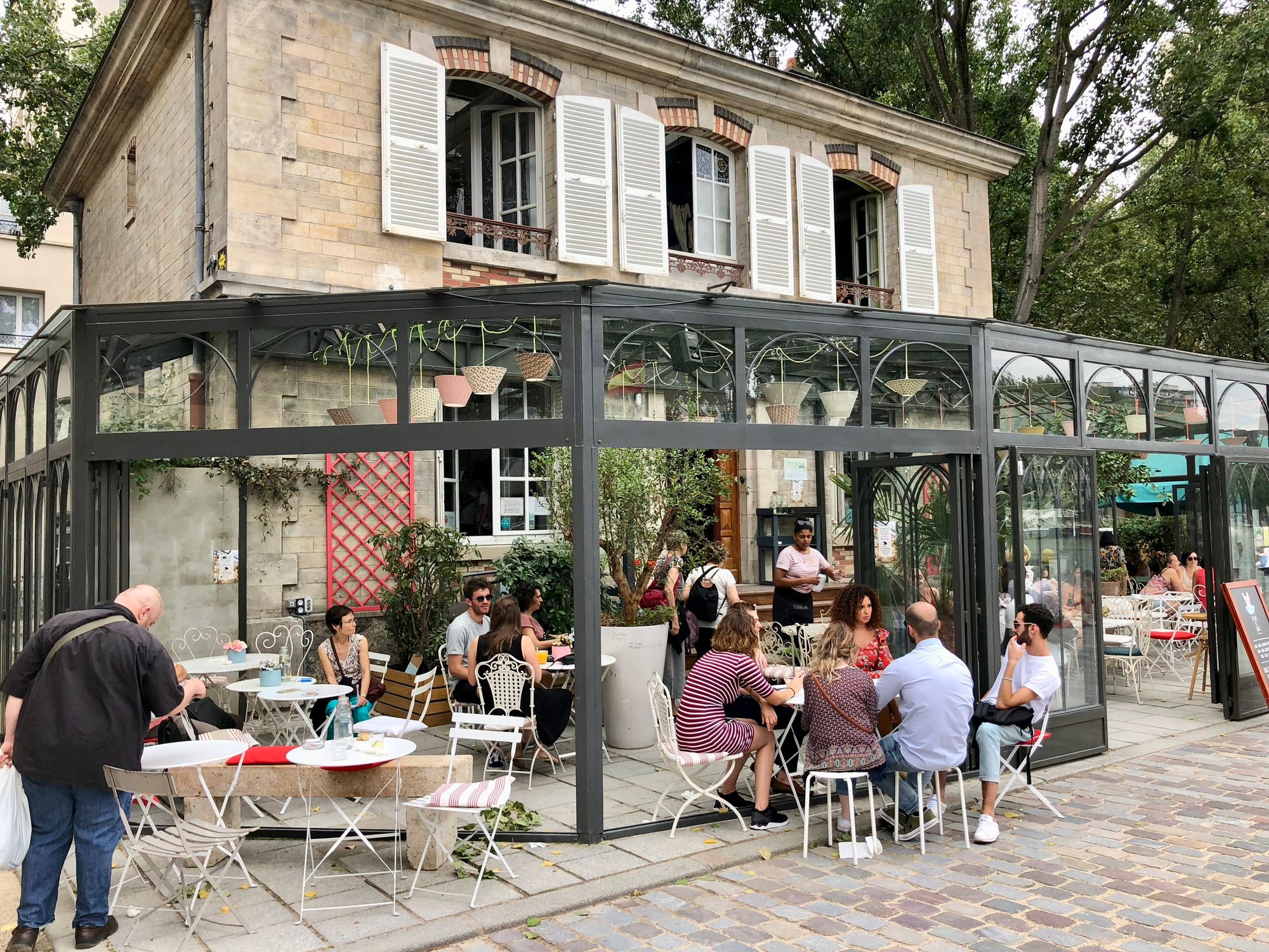
A building in Bassin de la Villette in Paris, before porch and after, with porch
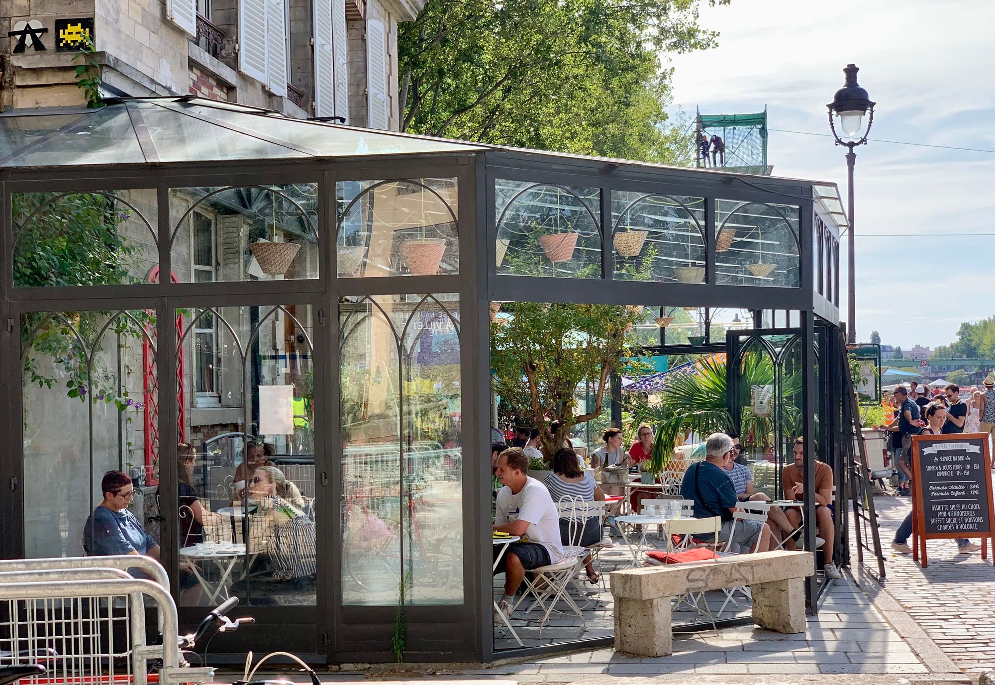
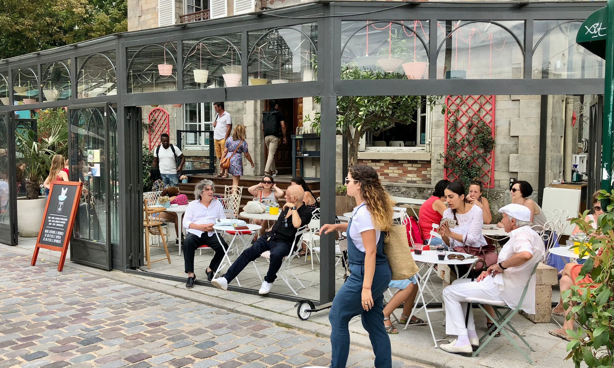
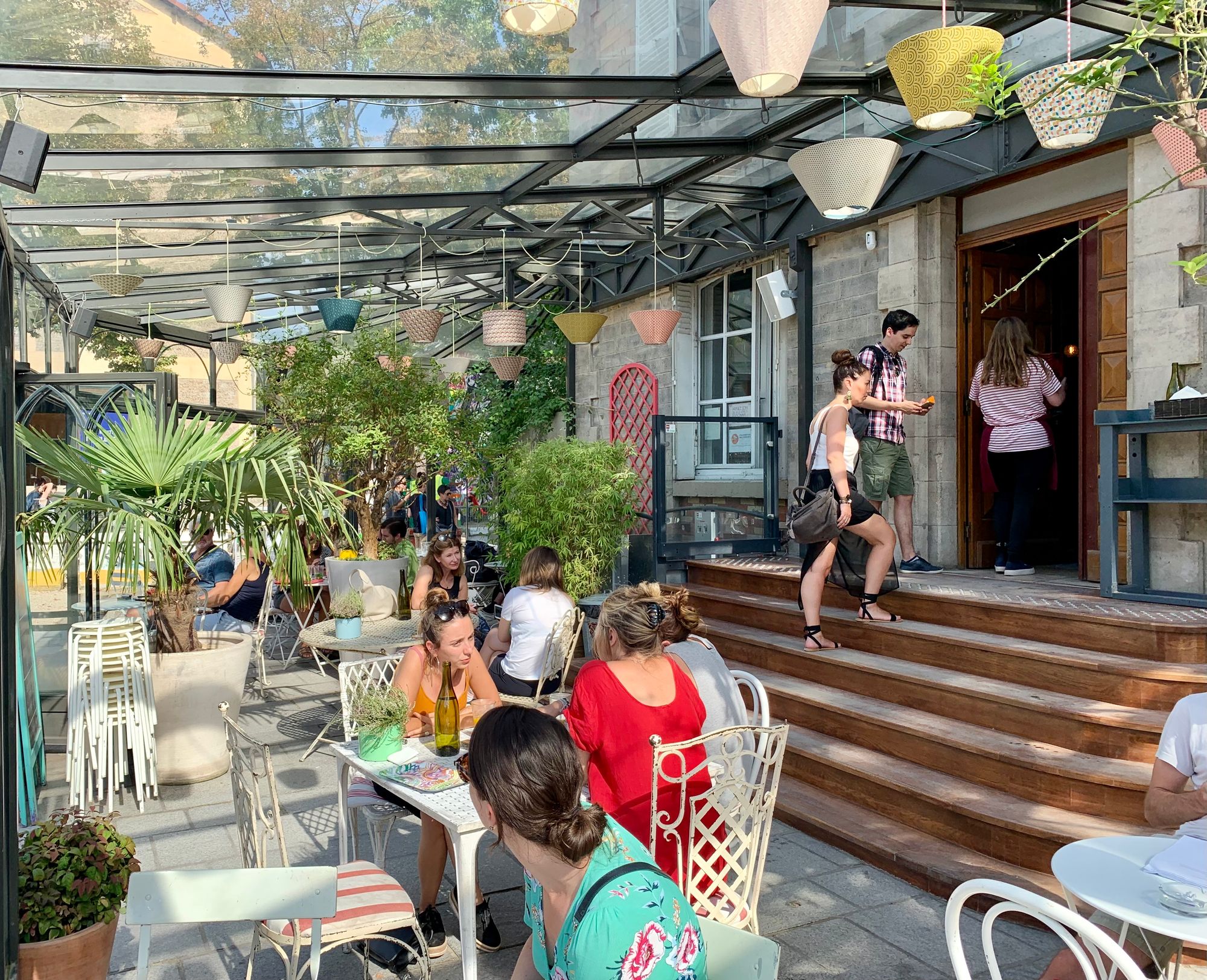
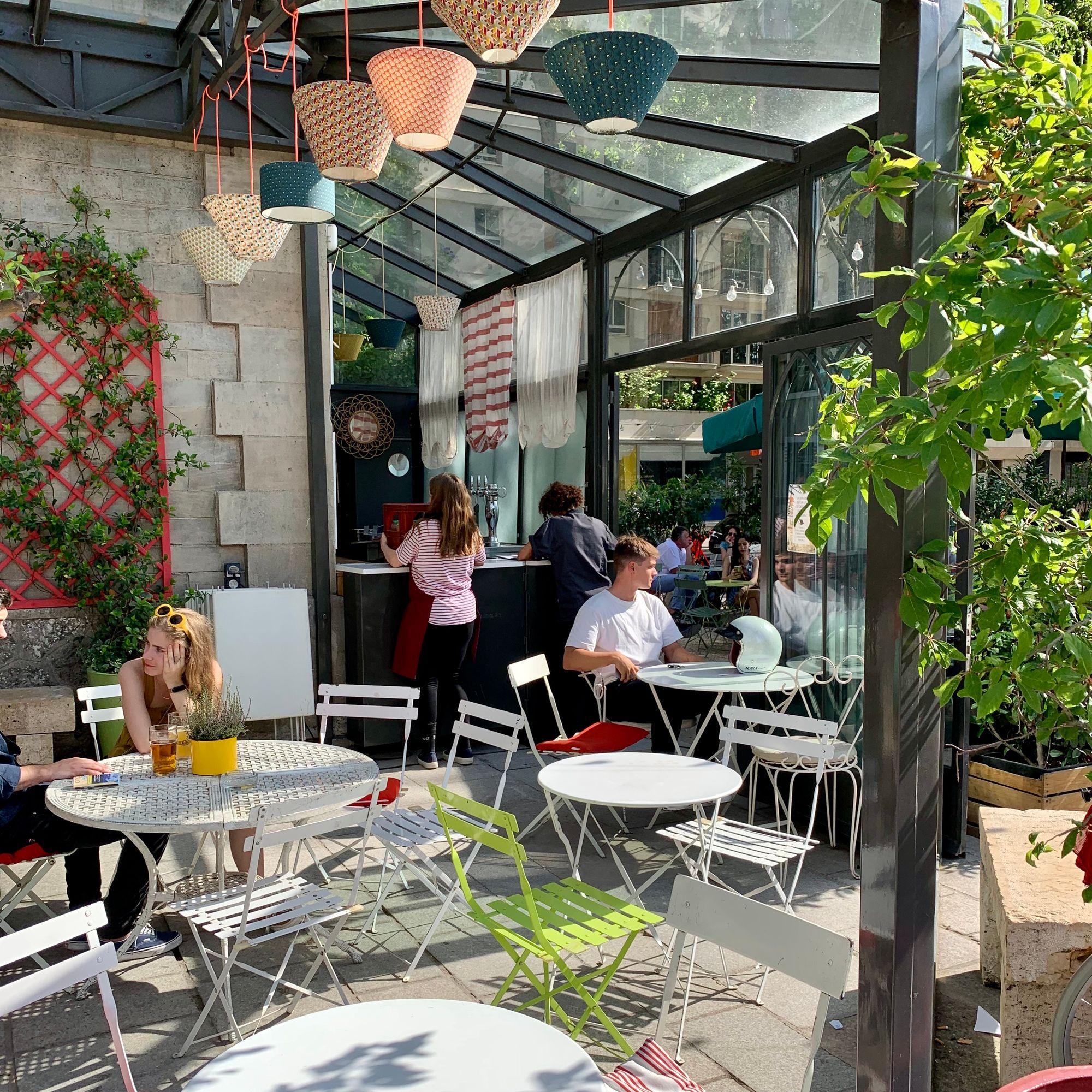
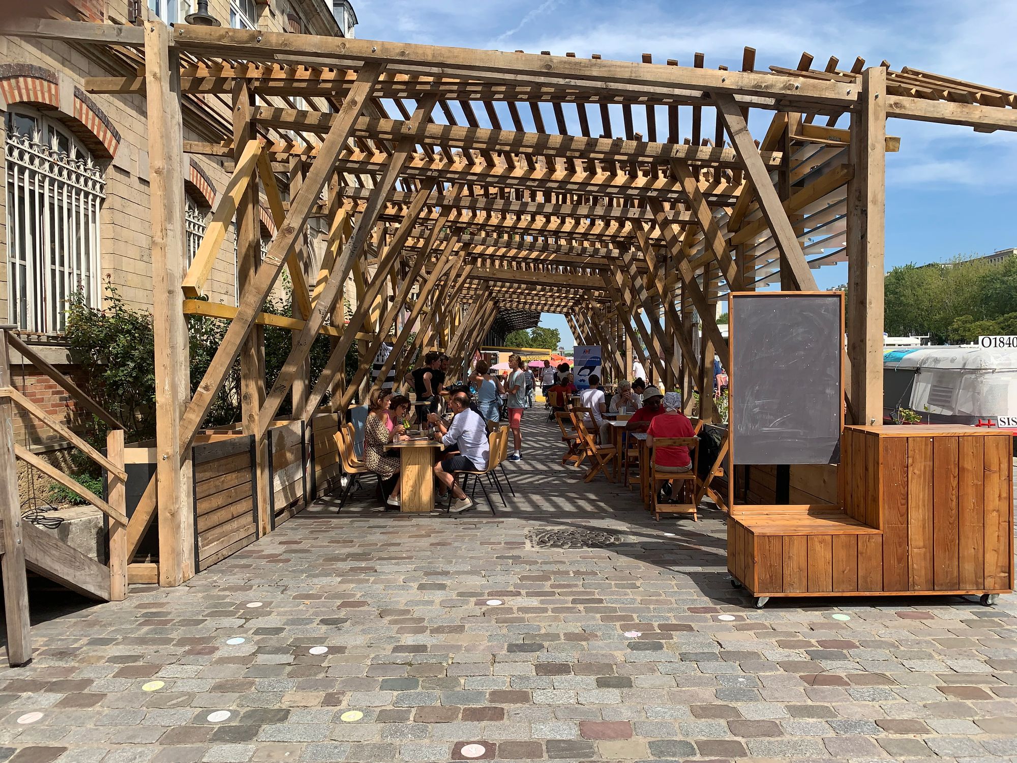
A second building in the Bassin de la Villette offers a unique set of seasonal temporary uses on top of its role as a cultural institution.
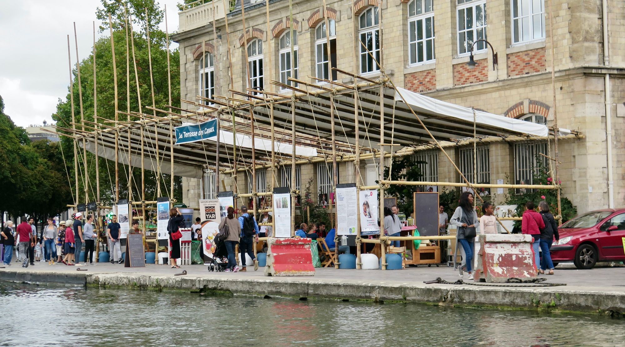
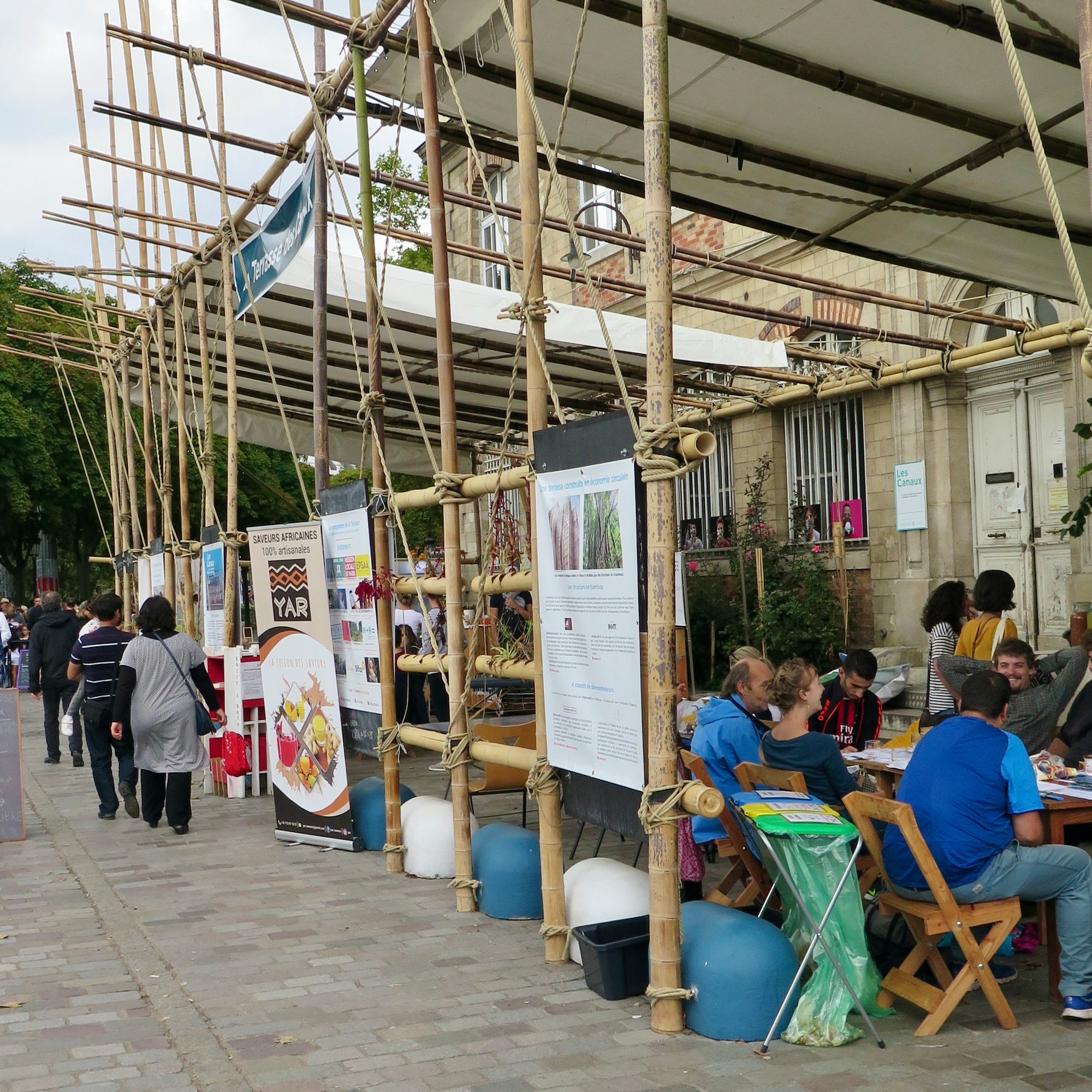
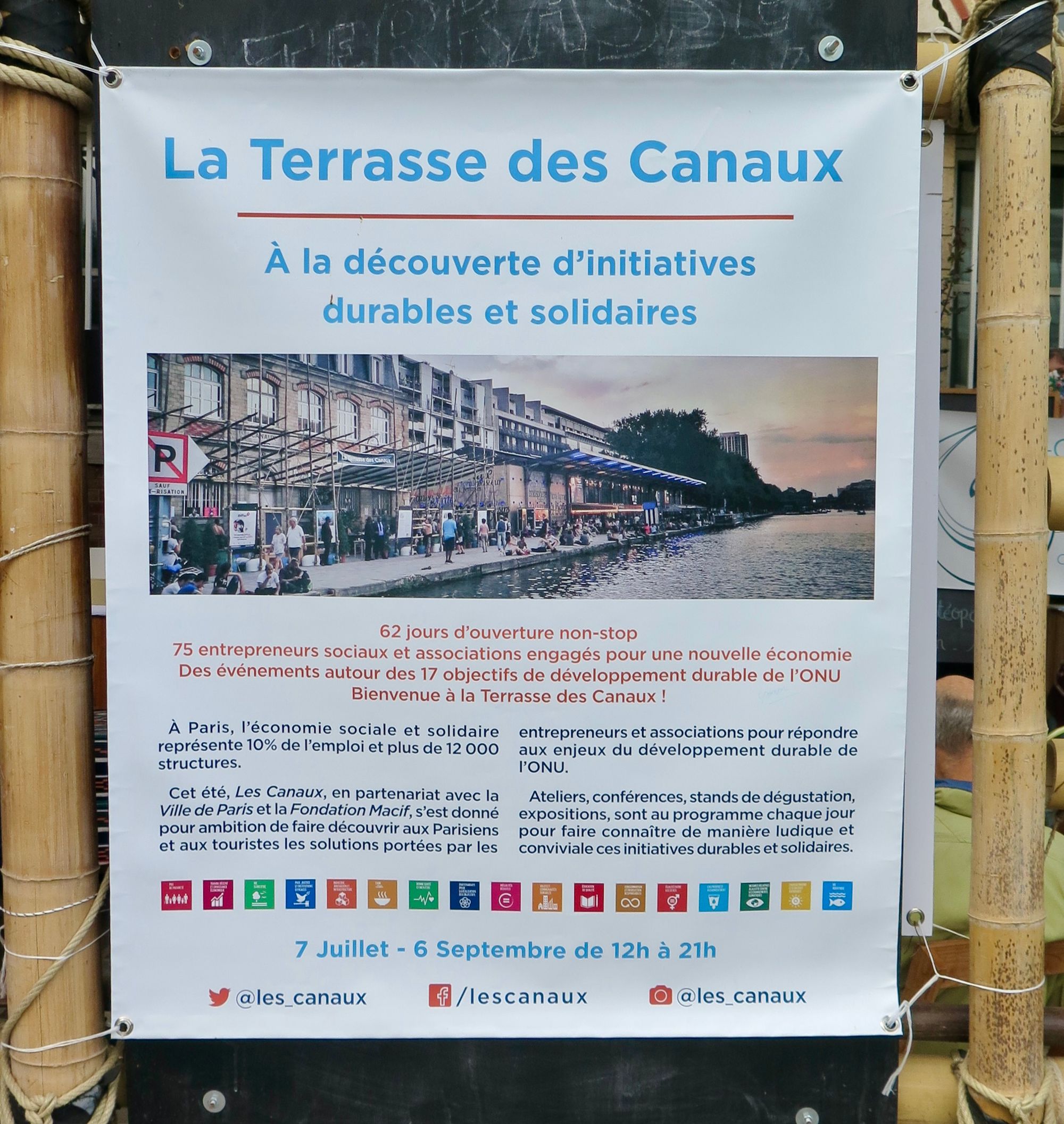
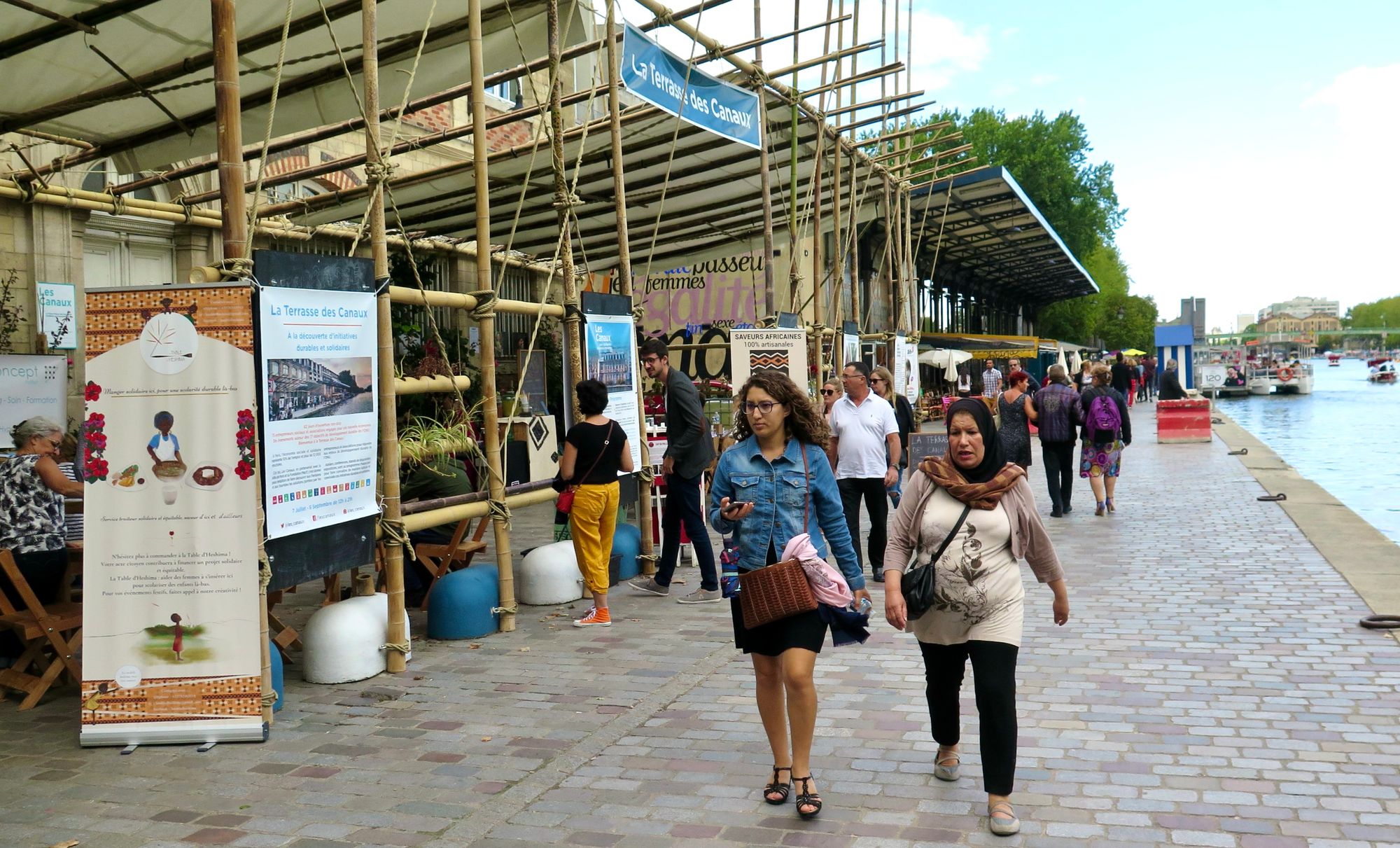
A bamboo structure was a temporary addition in 2017 and hosted a variety of activities that were previously done inside the building.
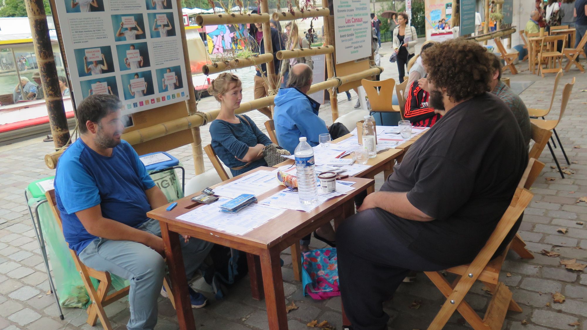
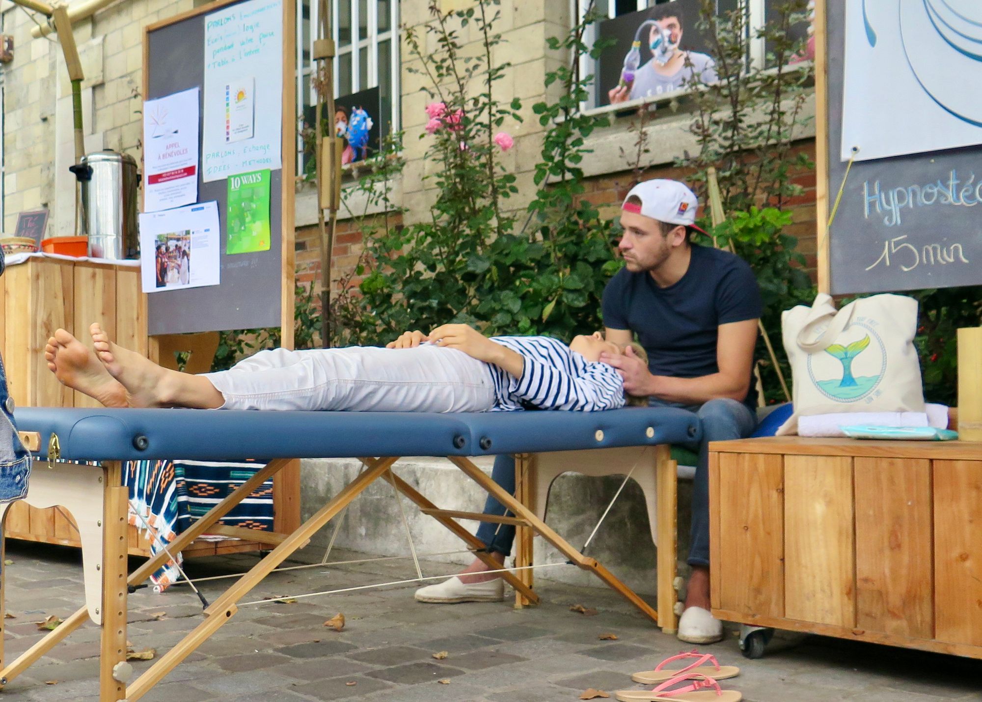
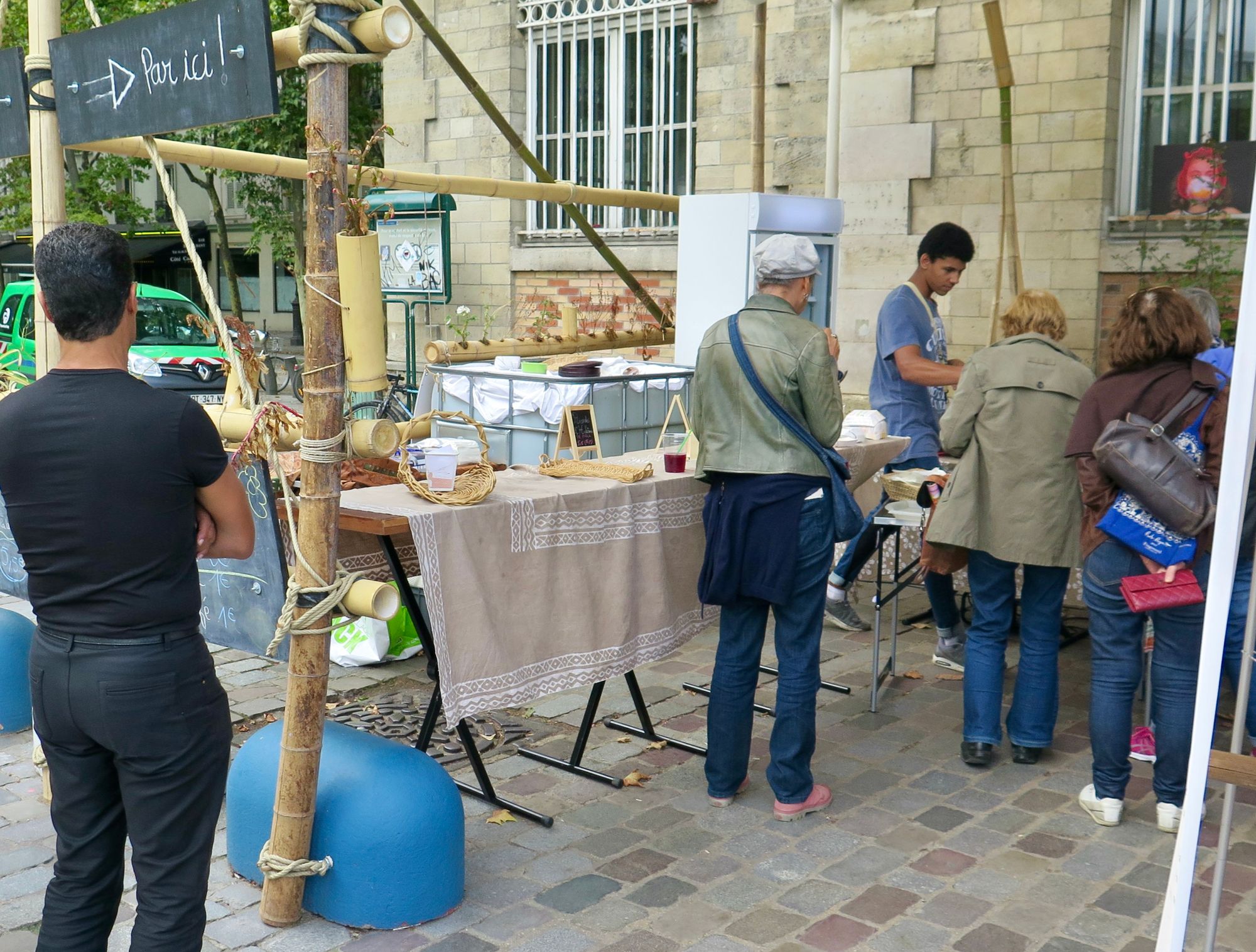
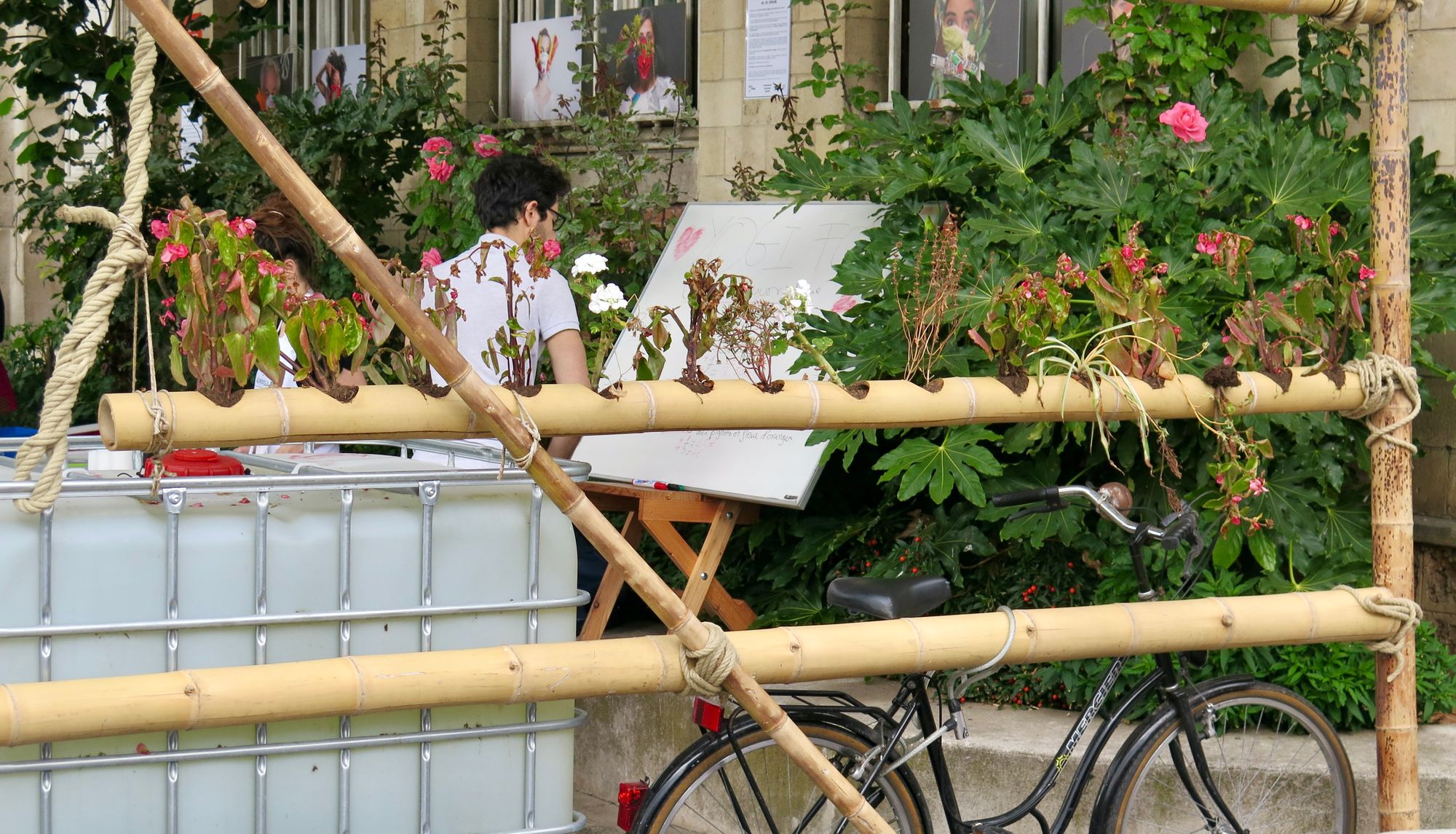
It grew from there: In 2018 and 2019, experiments were carried out with different activities in this area – with arts-centered programming, wellness installations, and more.
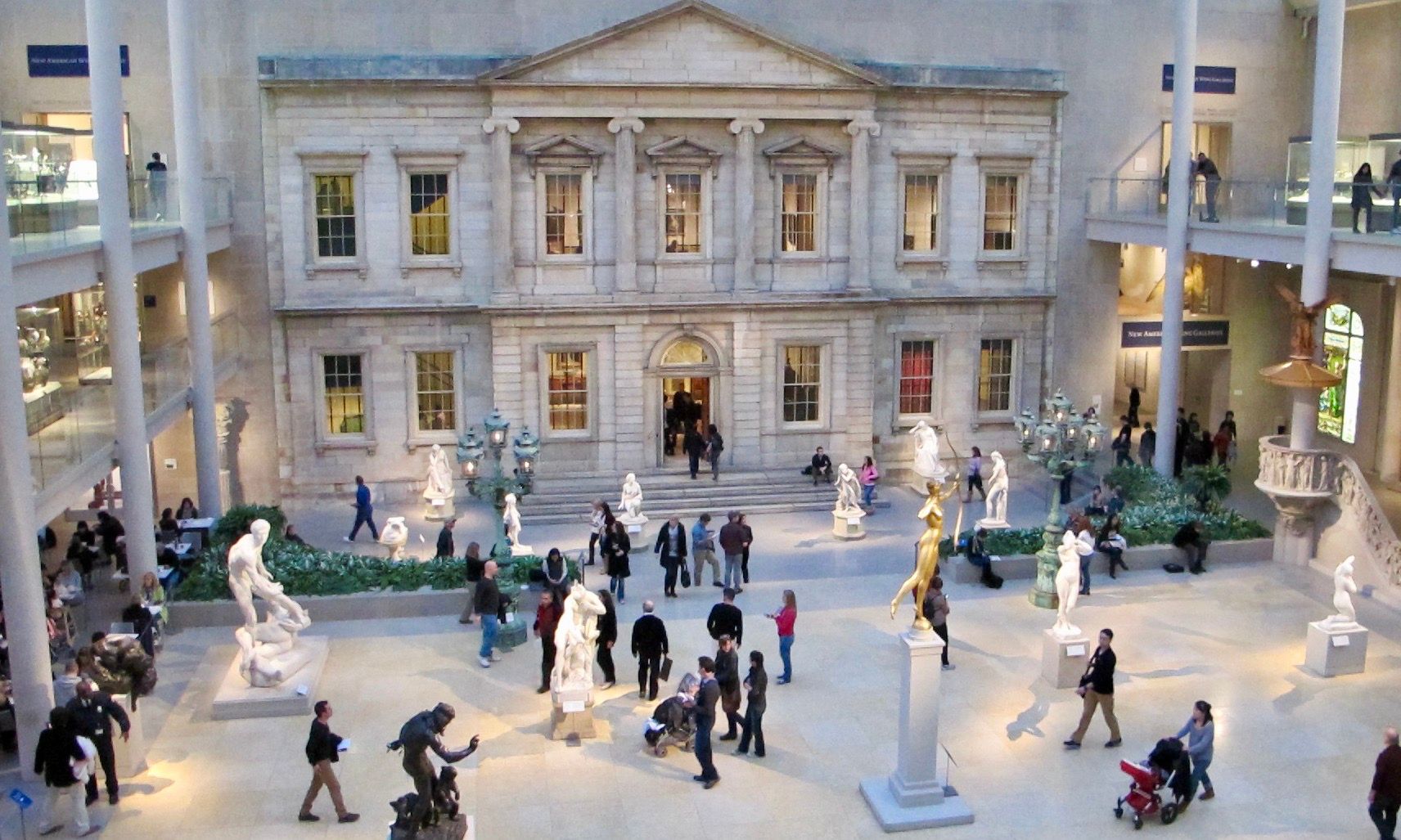
New York's Metropolitan Museum of Art
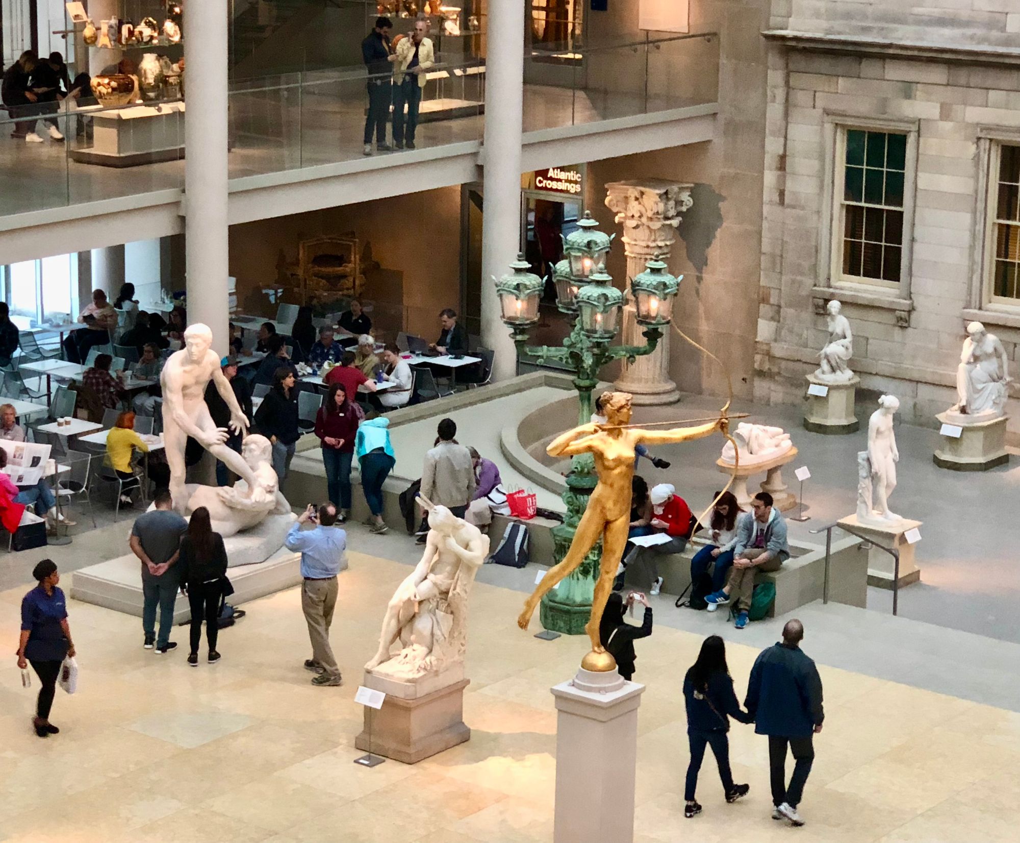
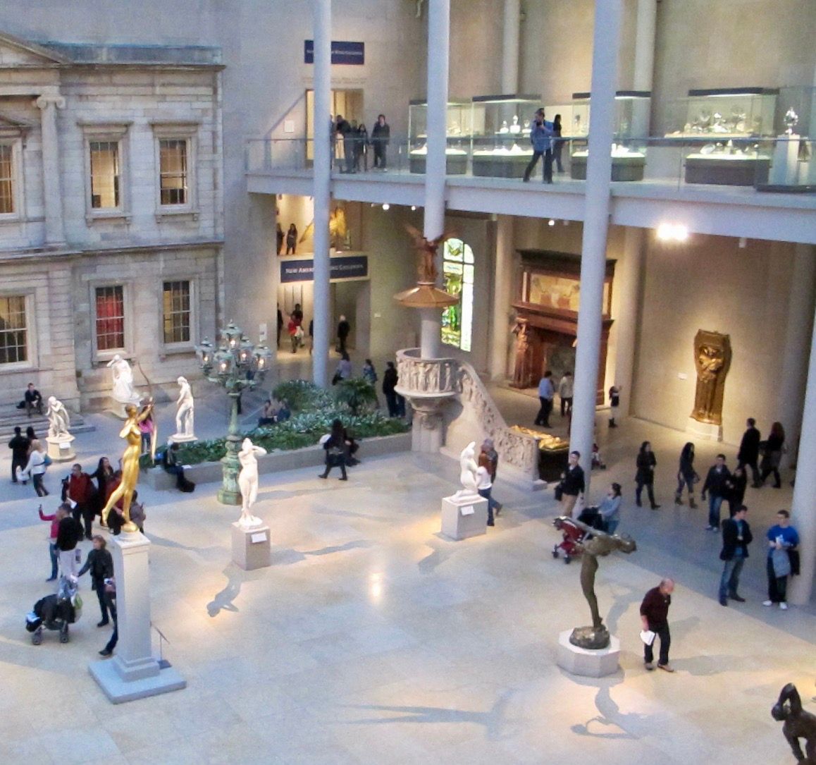
In a twist, the "courtyard" in the Metropolitan Museum of Art actually brings the "outside in" with an indoor space that looks like a classic Greek square, used for special events and socializing. Playing with the boundary between outdoors and indoors in this way makes a place more interesting and memorable.
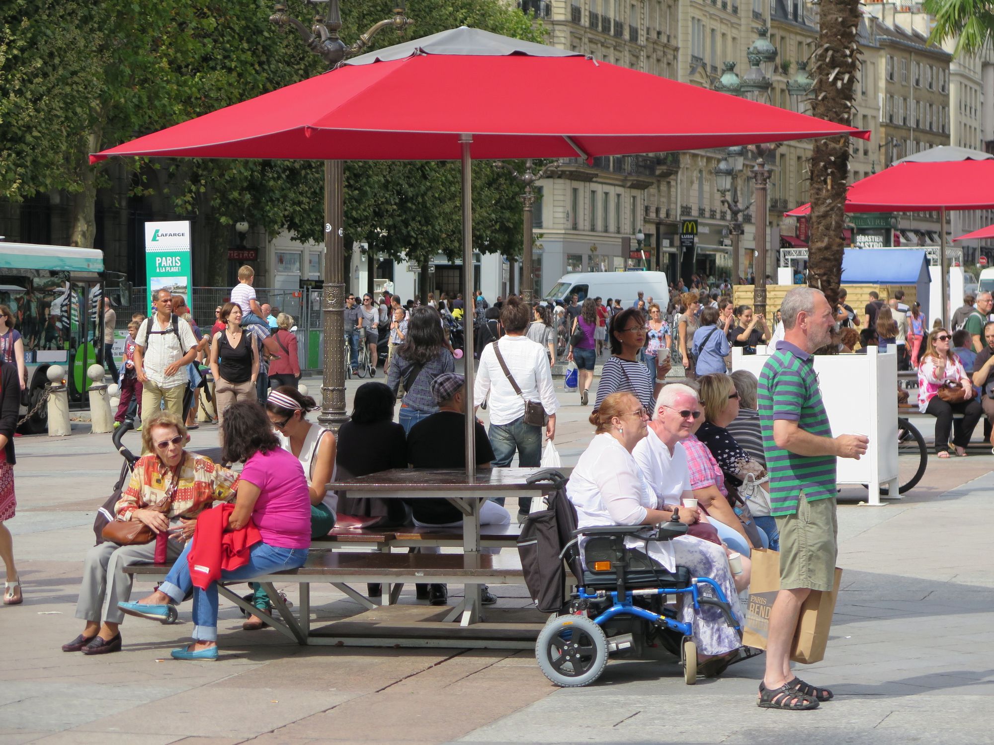
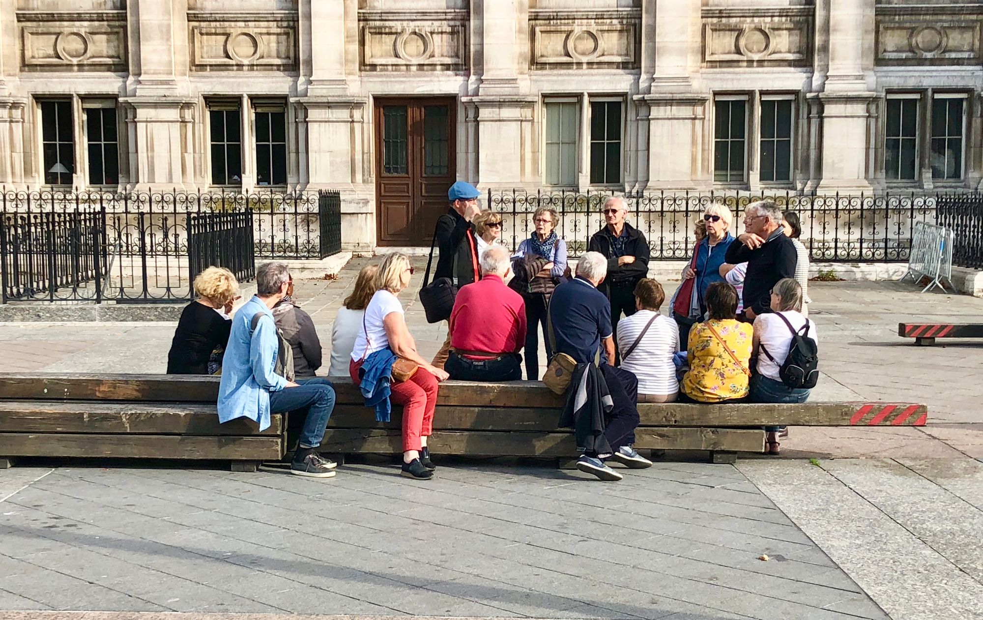
Paris - Hotel de Ville
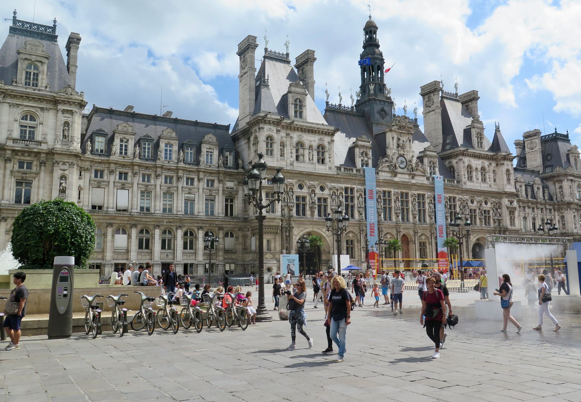
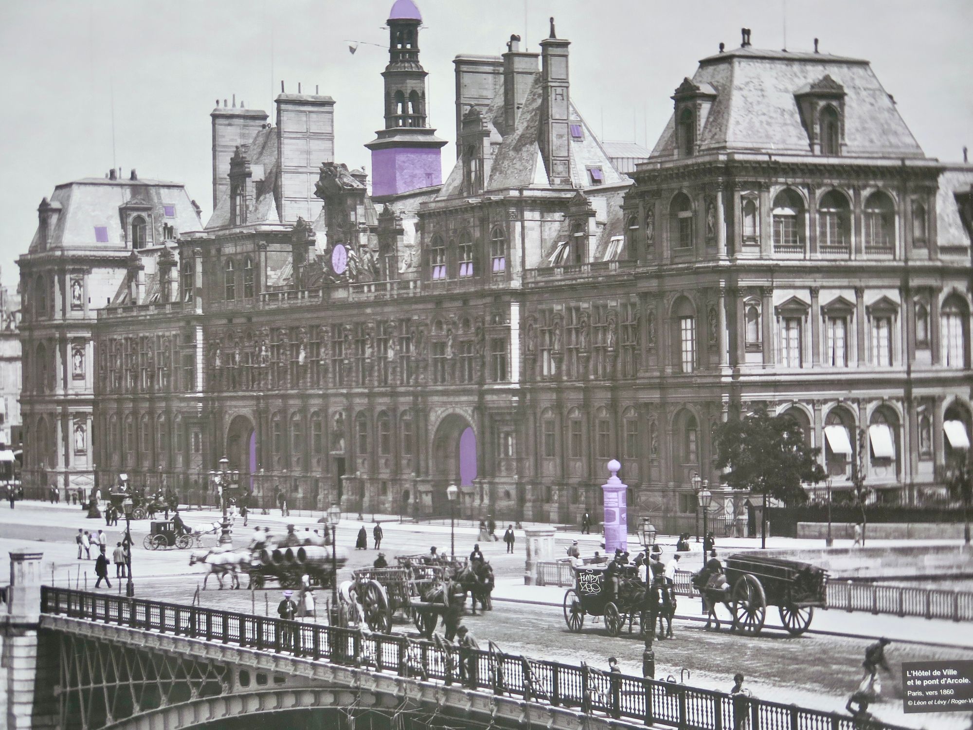
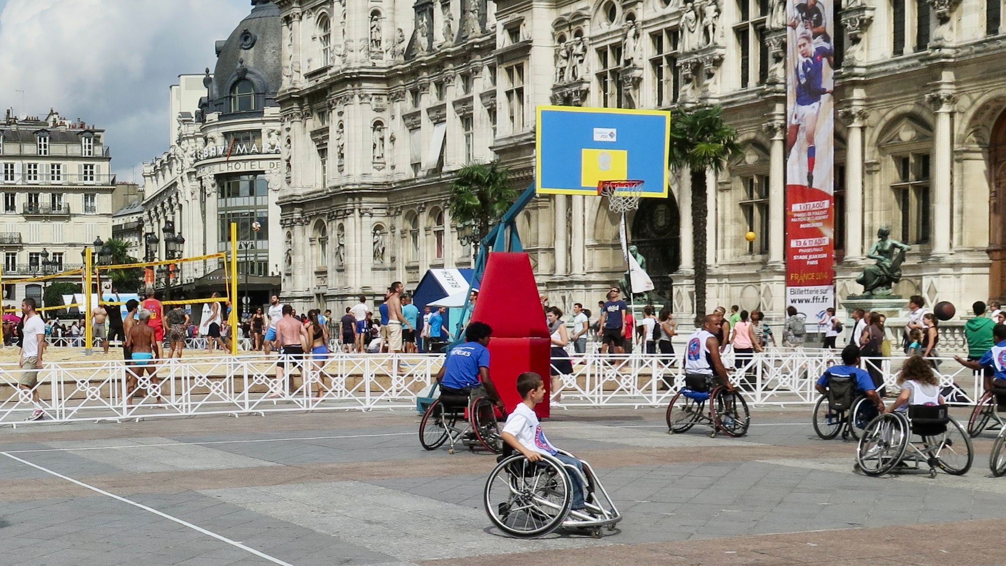
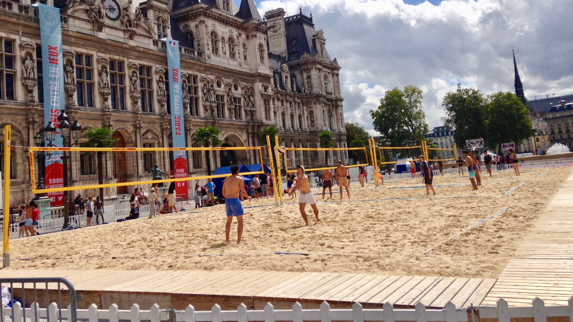
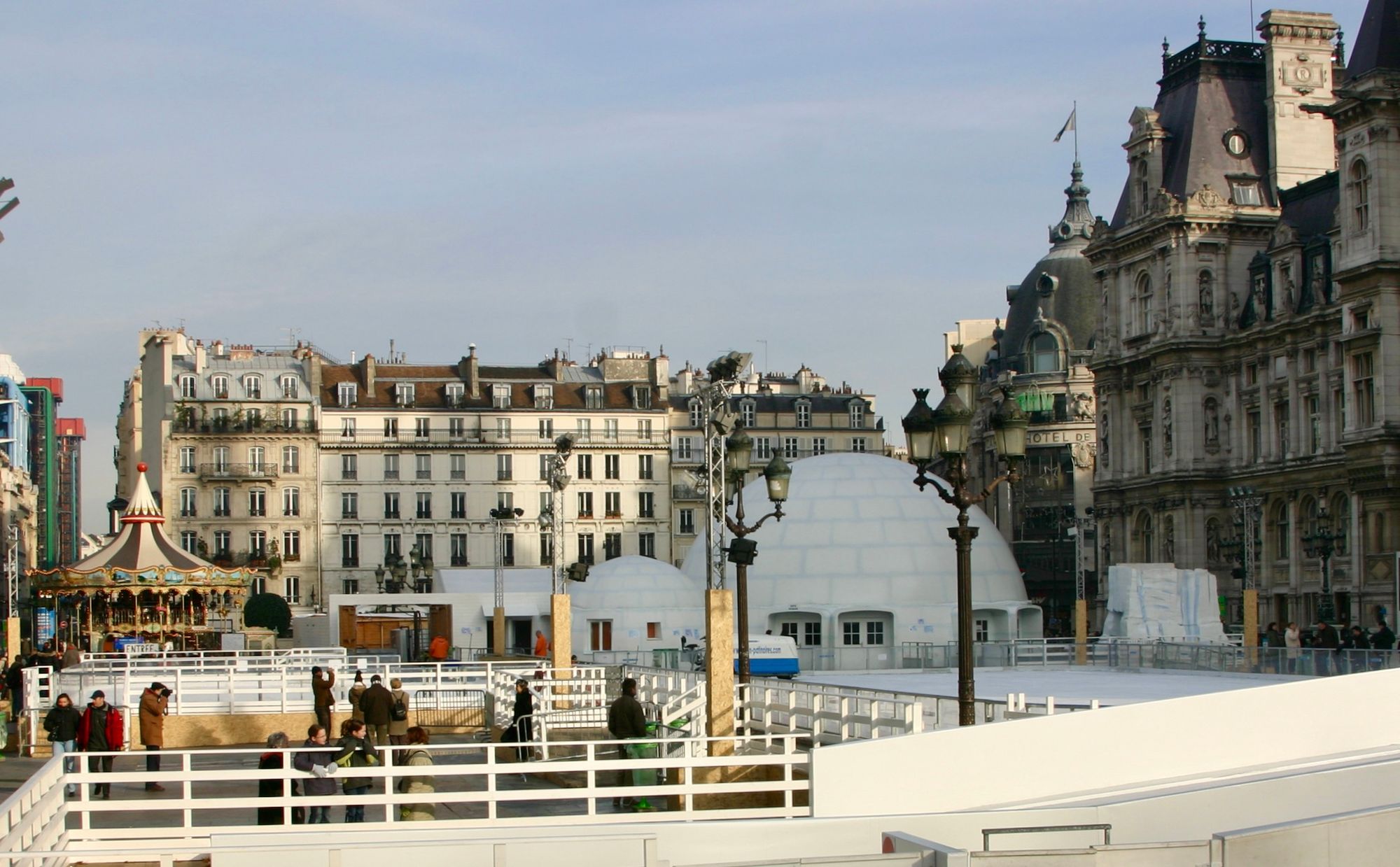
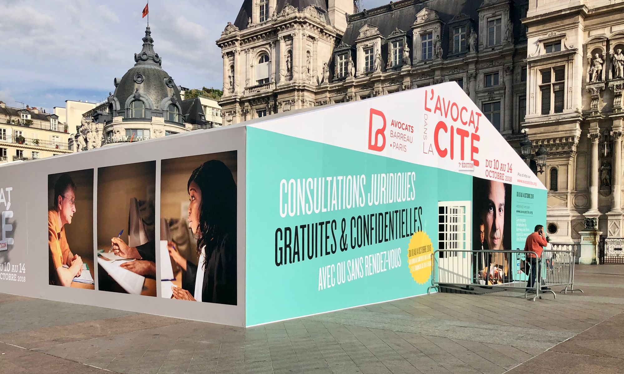
Public buildings like the Hotel de Ville (City Hall) in Paris use their plaza as a way of attracting public life. In one instance, sand was trucked here to create volleyball courts, publicizing the city's annual summer pop-up beach "Paris Plage" on the riverfront.
At other times they have added an ice skating rink, a court for wheelchair basketball, and a variety of other interactive installations that add value to the public space.
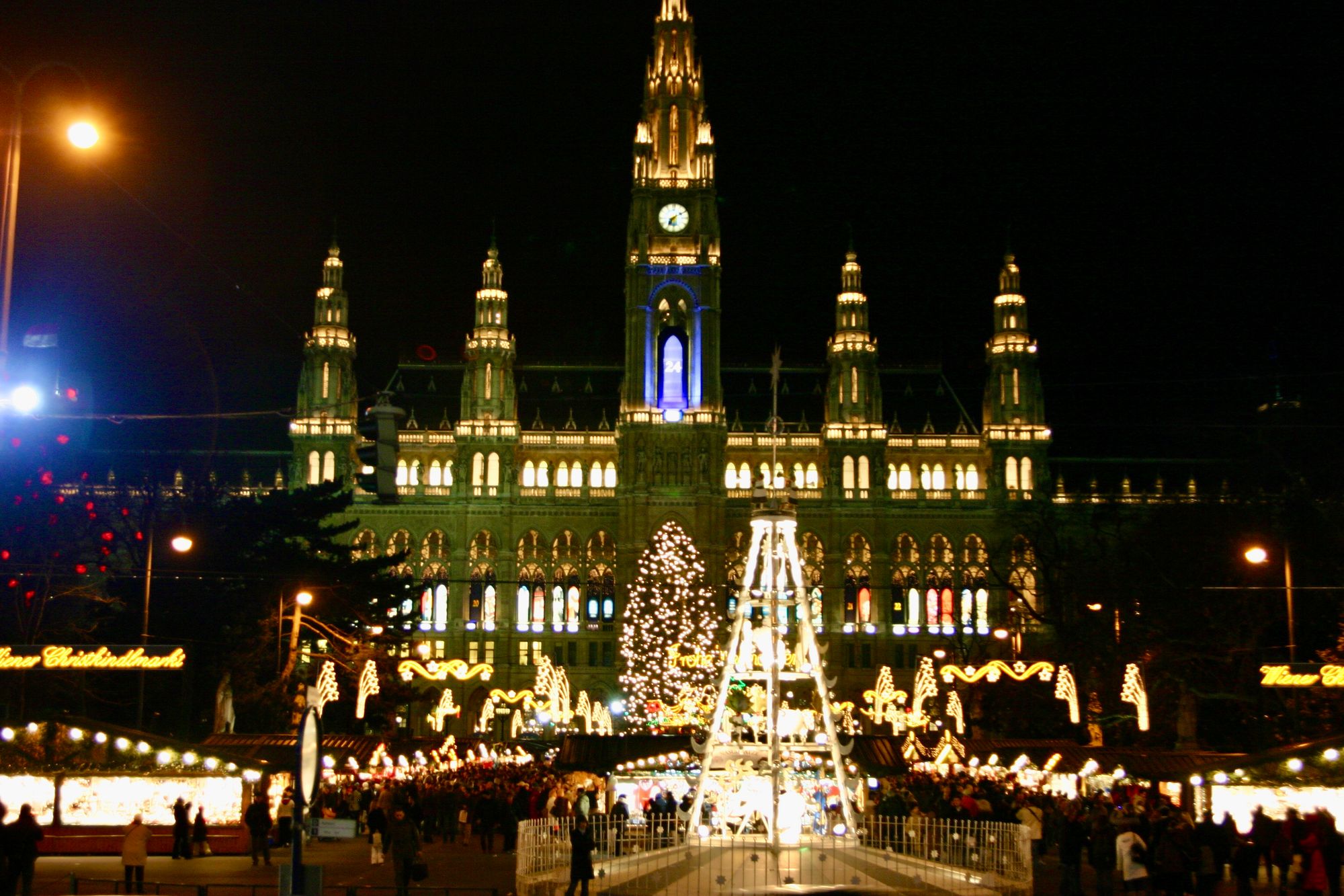
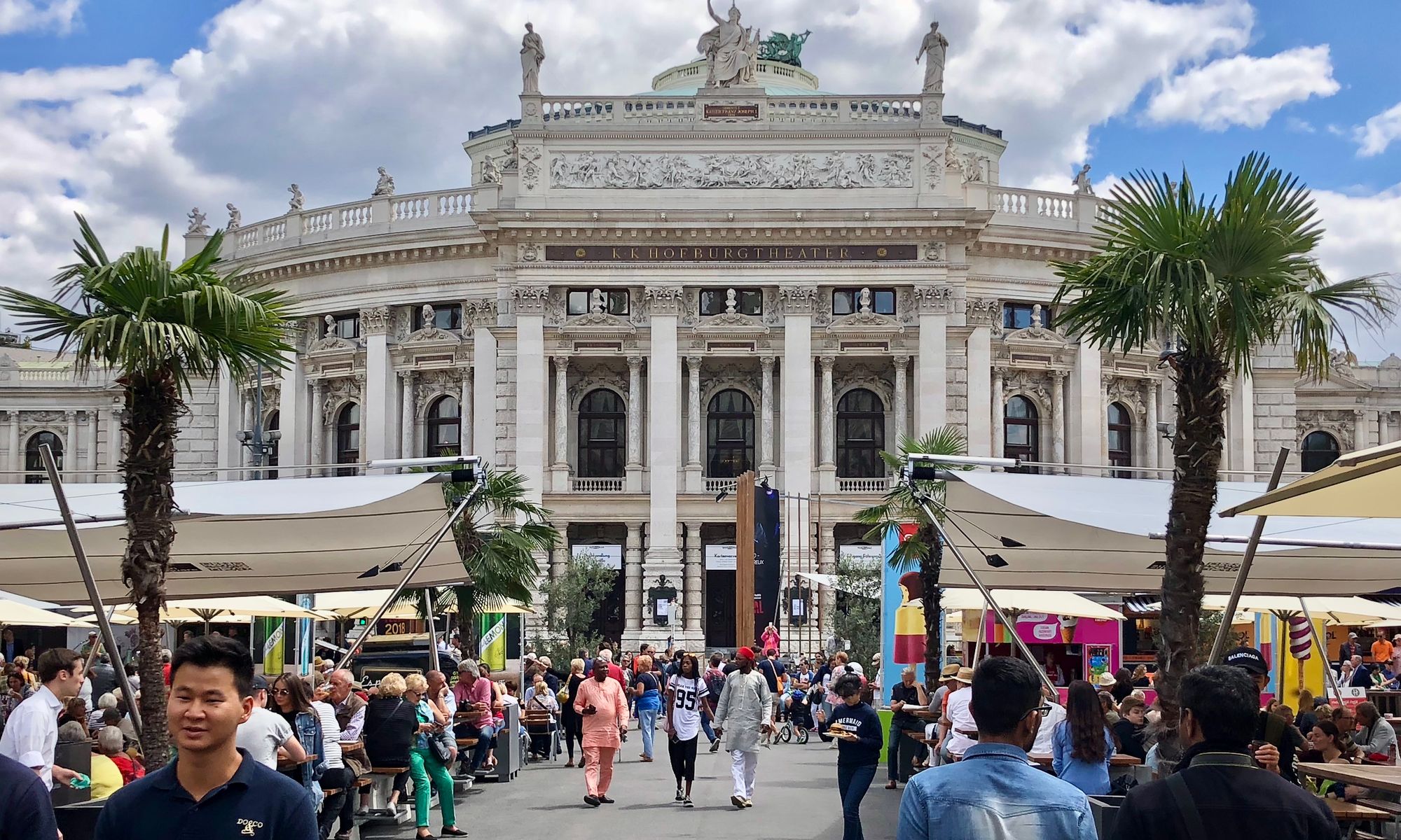
Vienna City Hall
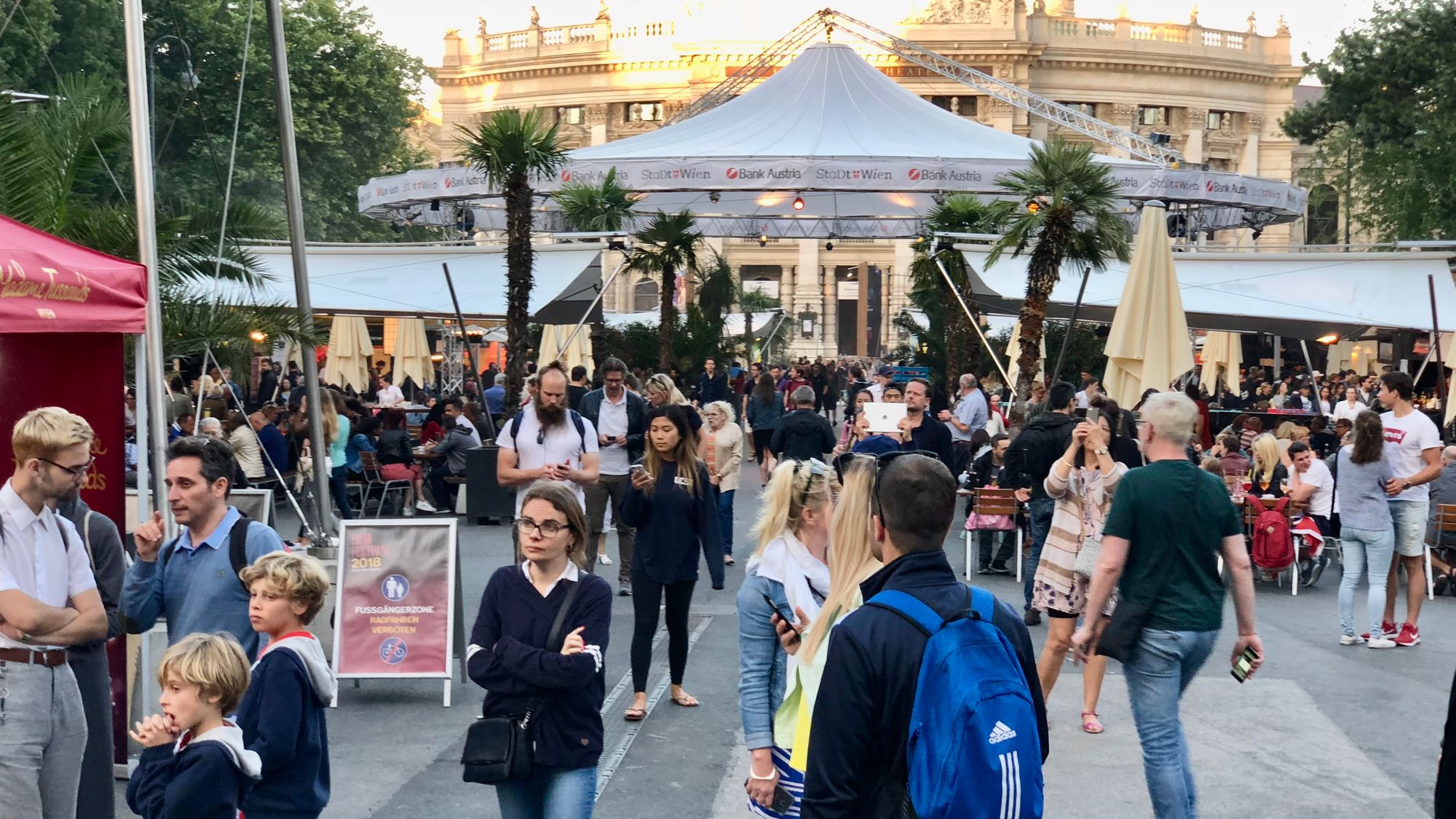
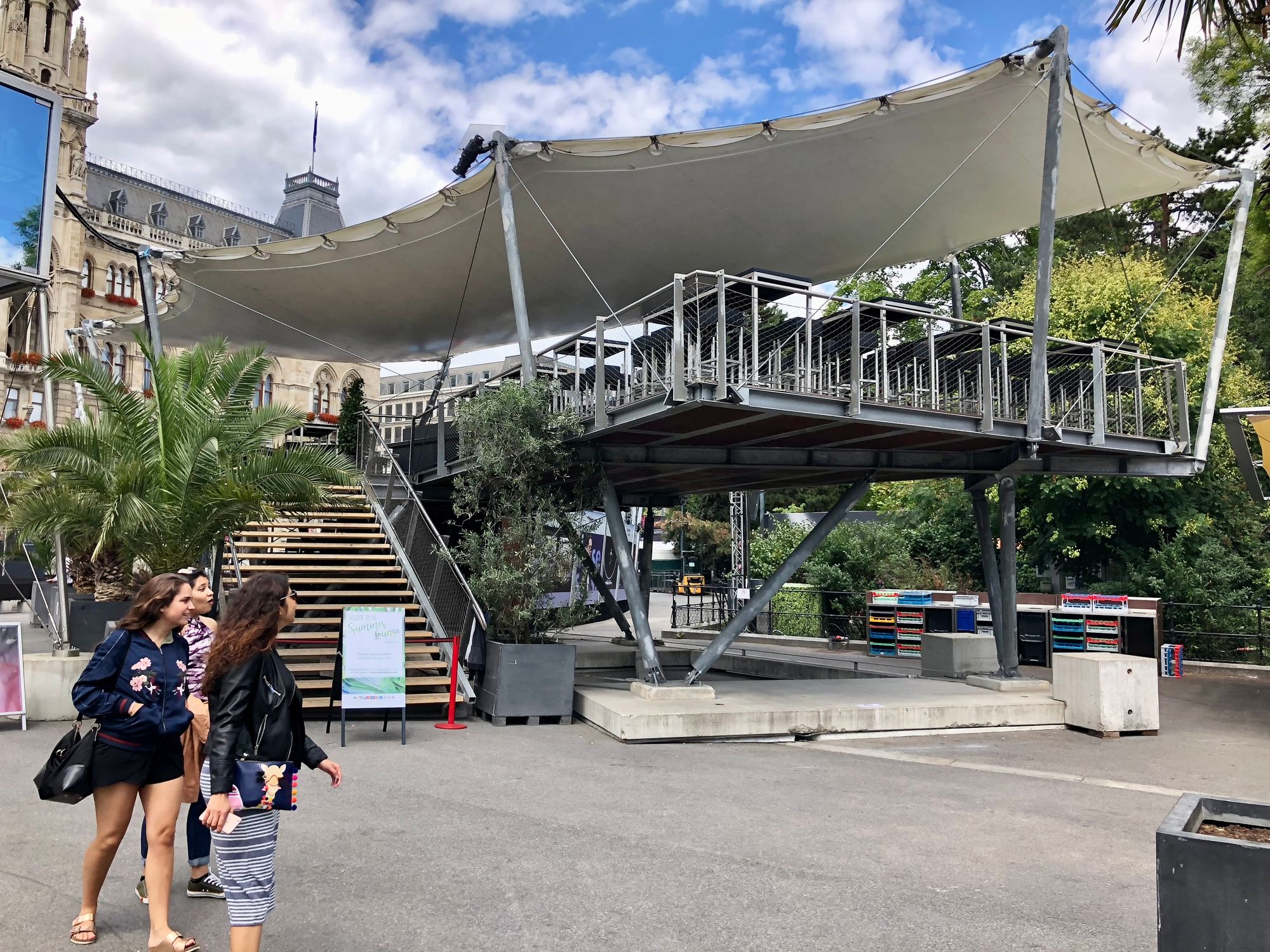
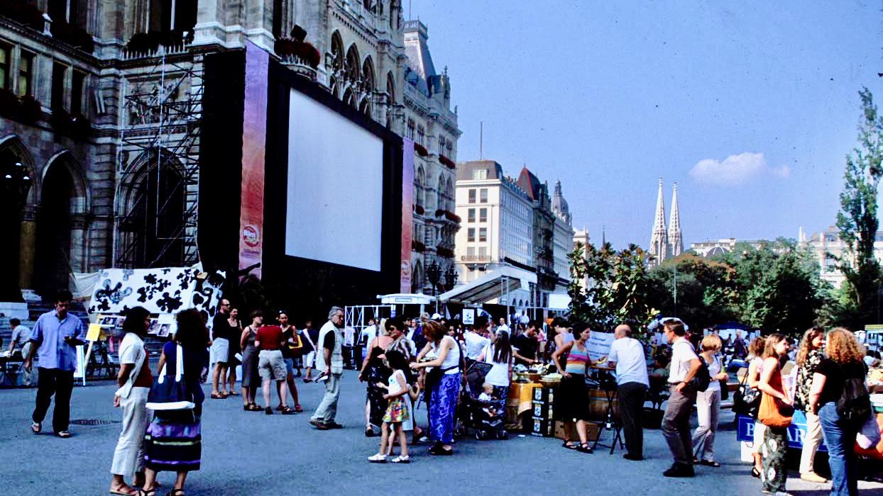
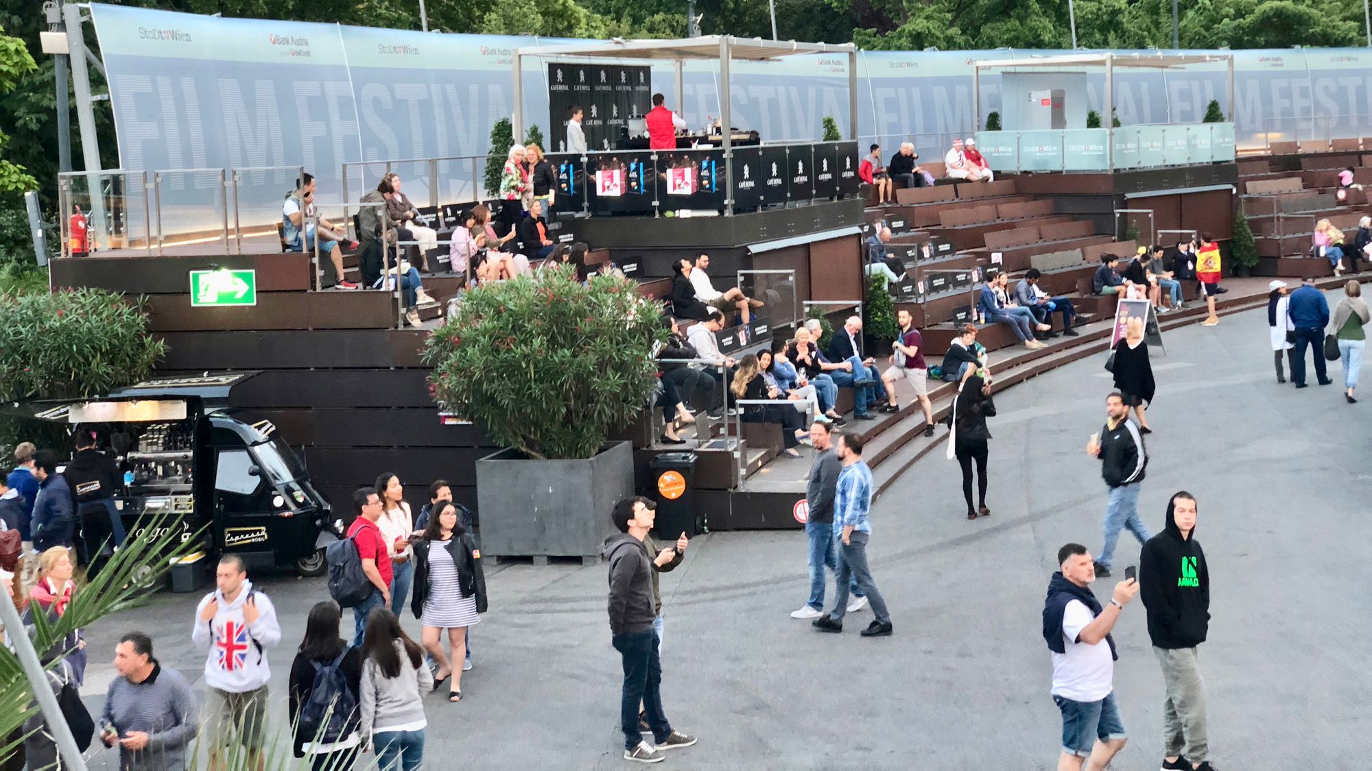
Vienna City Hall also does a lot with its "front porch" by hosting events such as markets and movie nights. When important civic buildings like city halls create public events and programs like this, it becomes a powerful statement about the importance of community.
Other public destinations
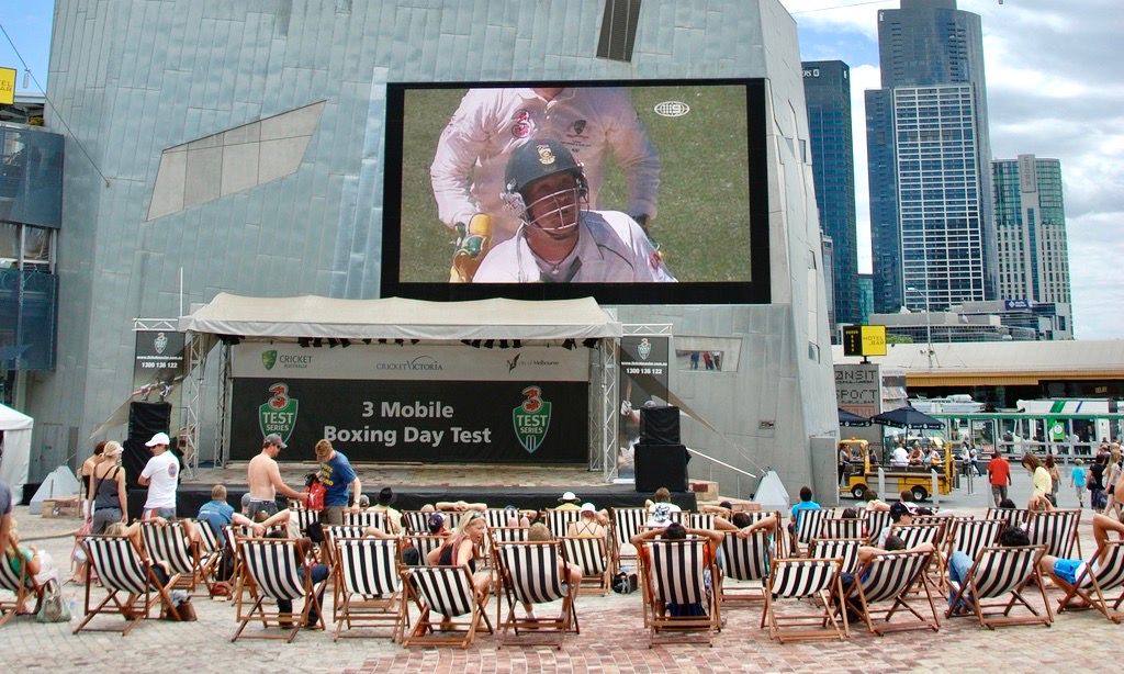
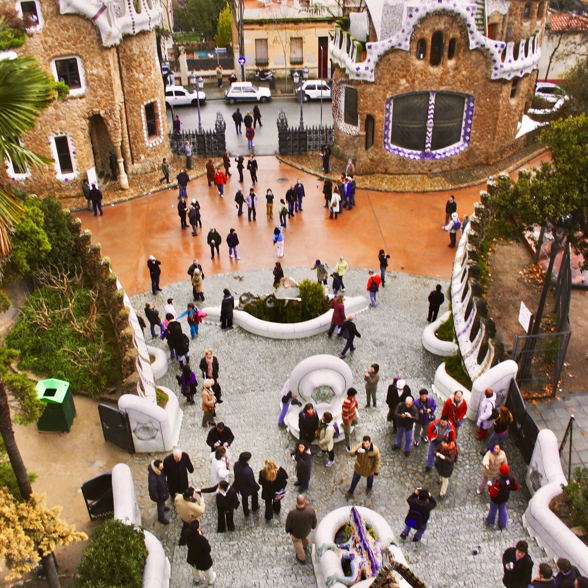
Social spaces that bring the indoors out in Melbourne and Barcelona
Main Street, Porches, and Plazas
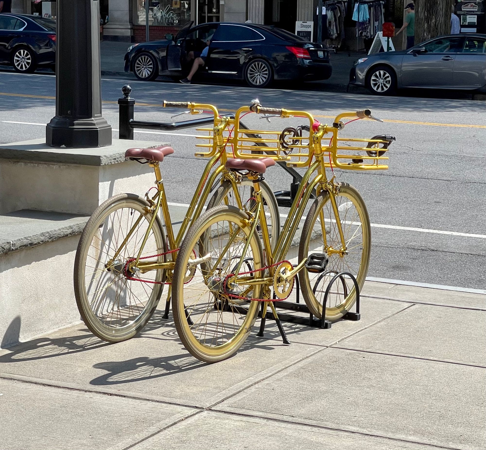
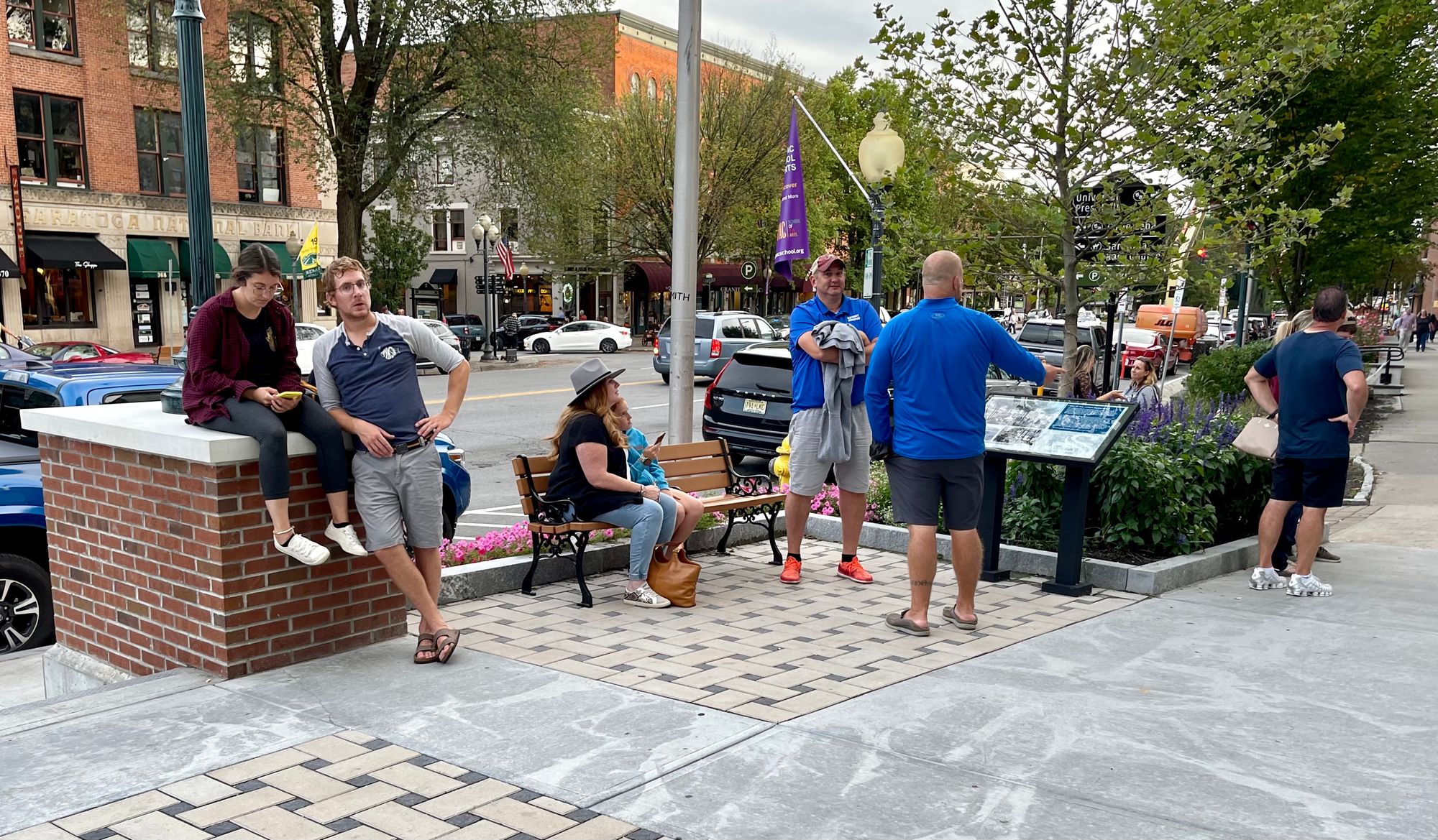
Saratoga Springs:
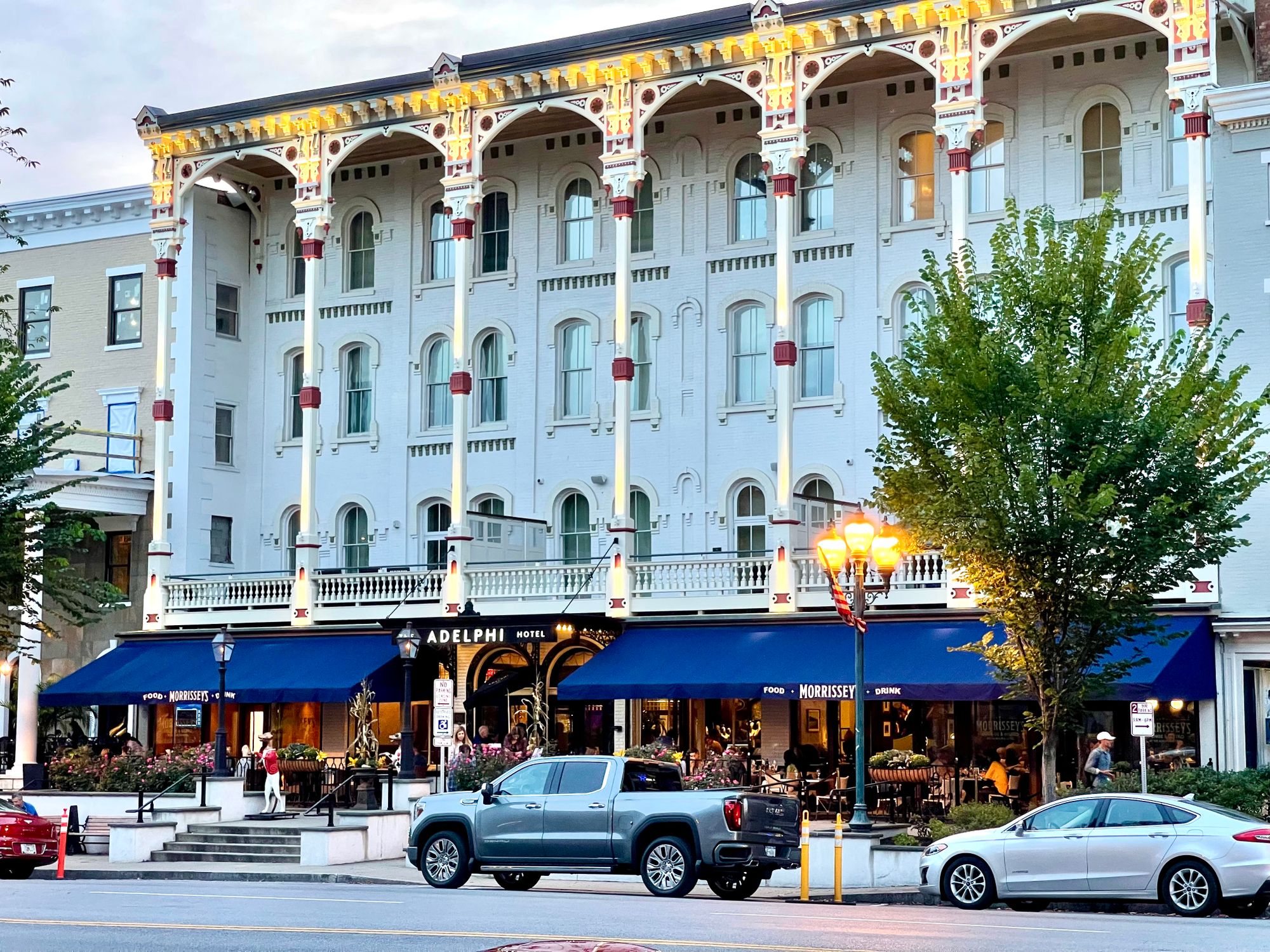
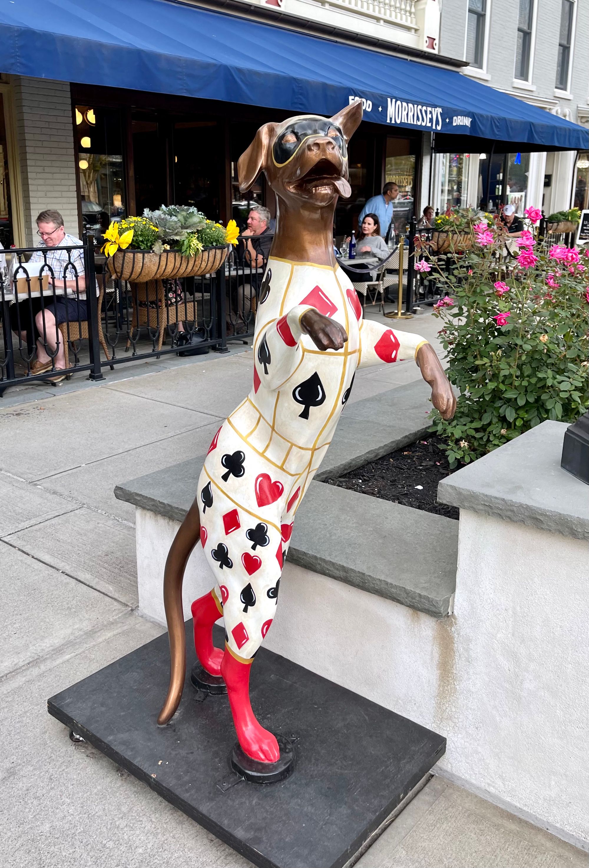
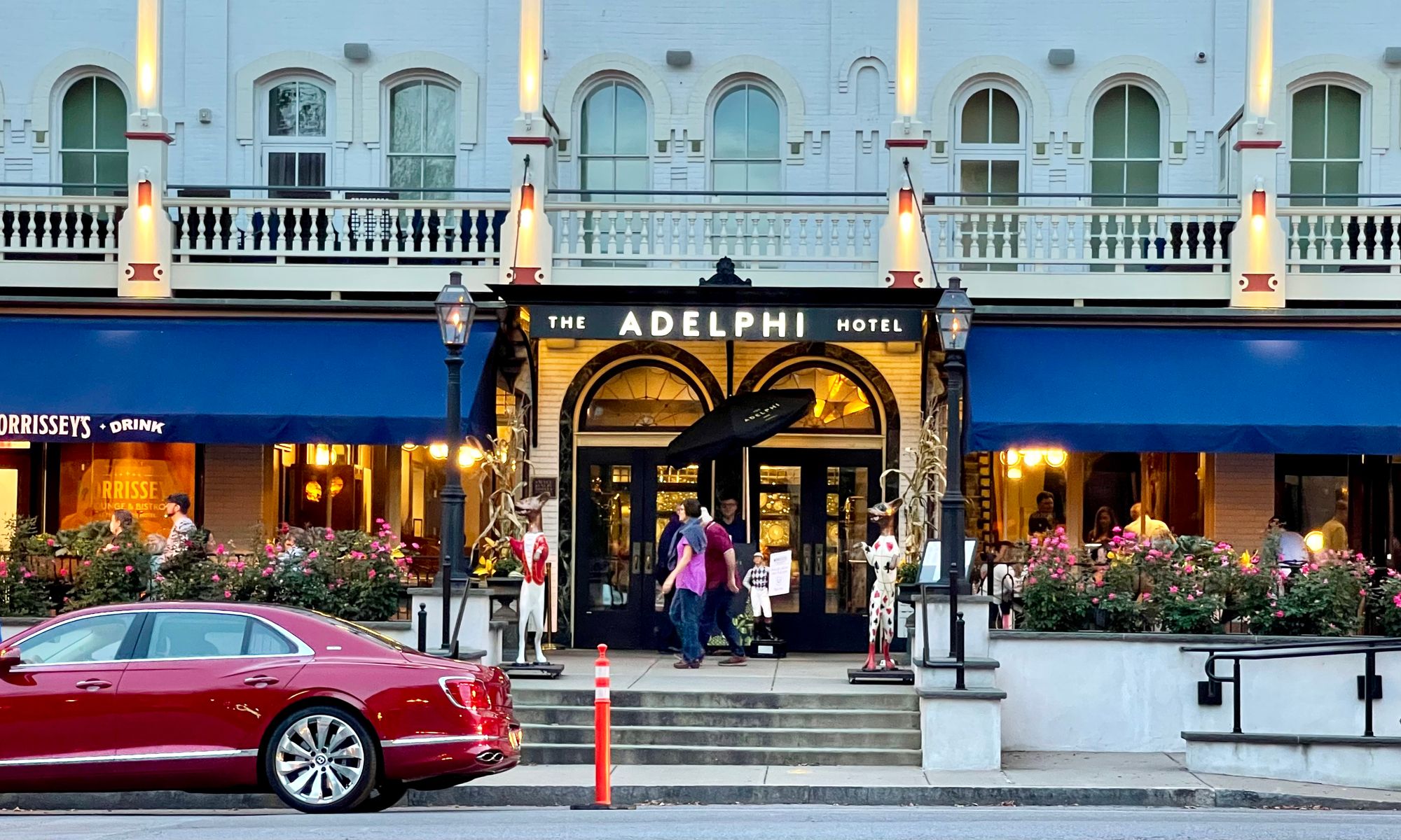
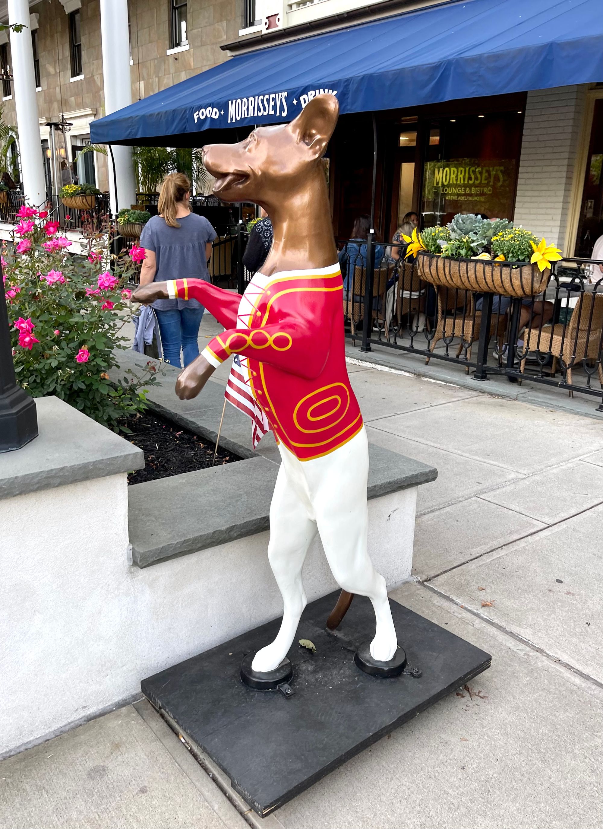
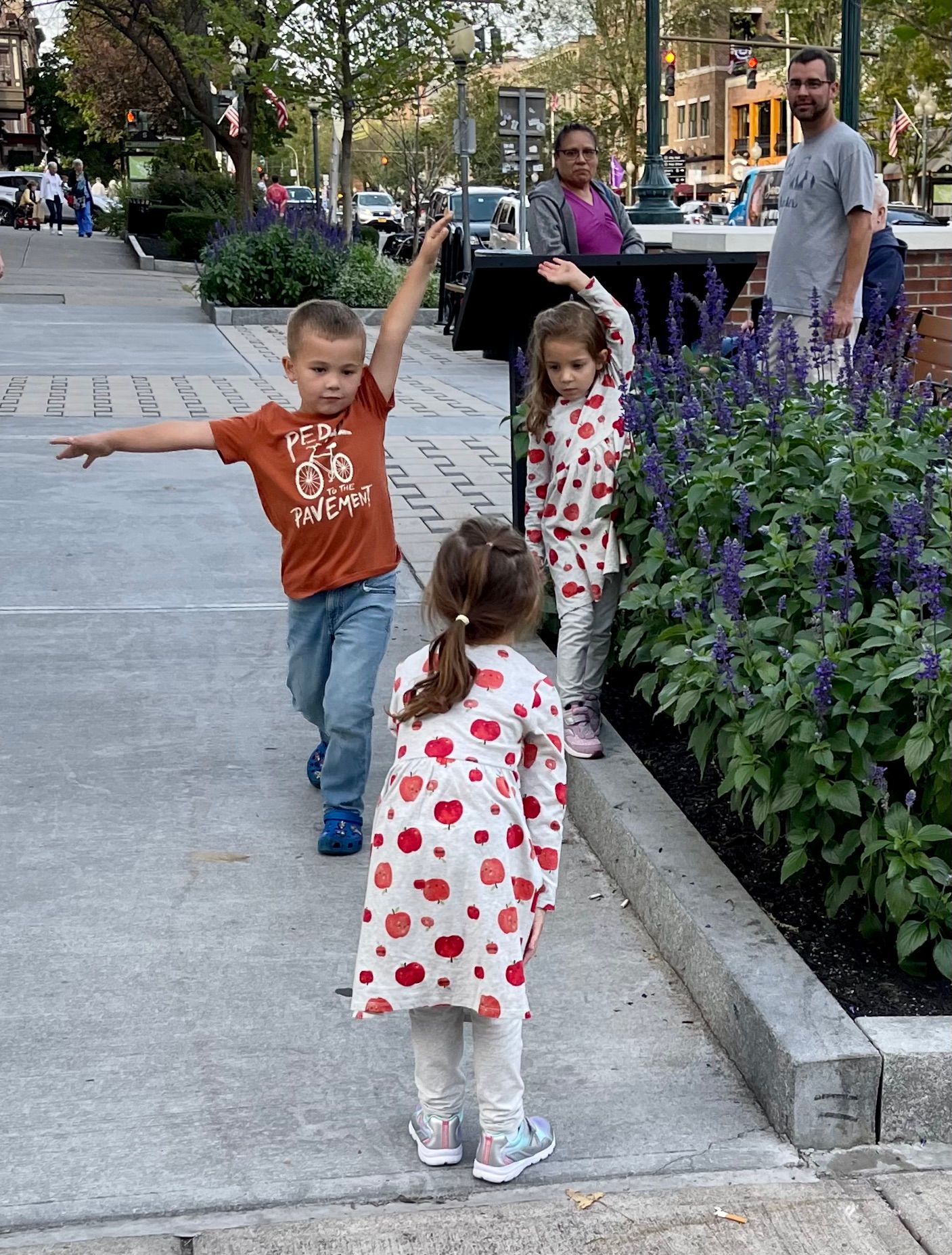
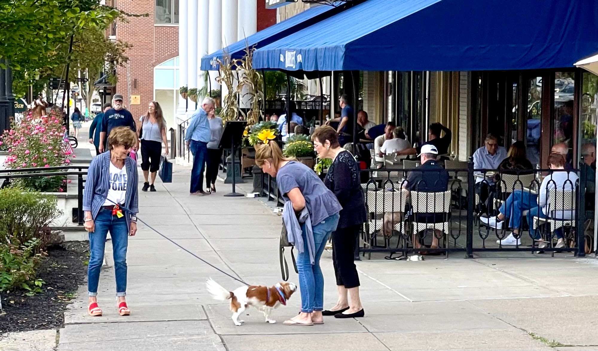
In Saratoga Springs, the Adelphi Hotel has created an active sidewalk plaza, which has turned it into a local destination. Bringing the dining out onto the sidewalk makes the entry area that much more inviting as a place to linger.
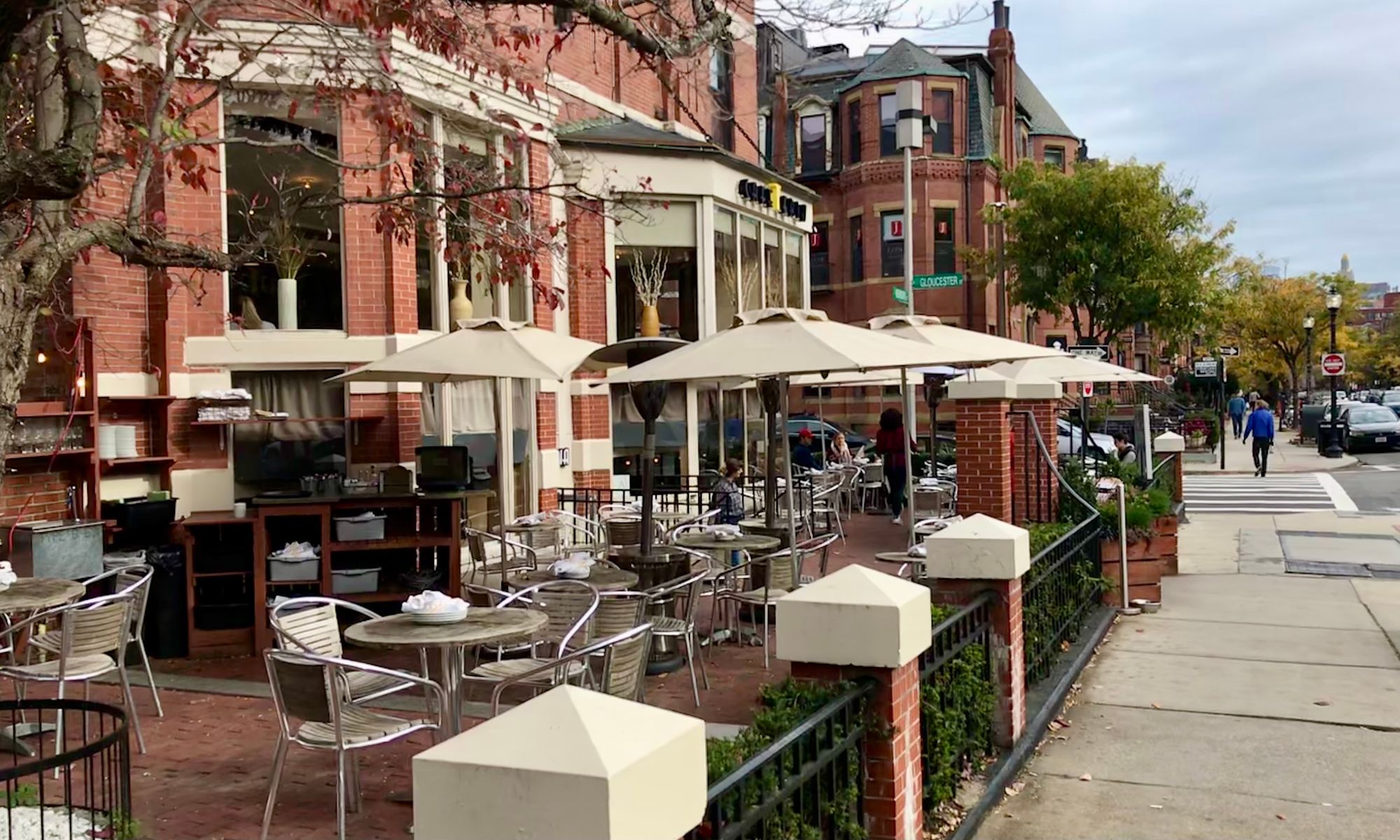
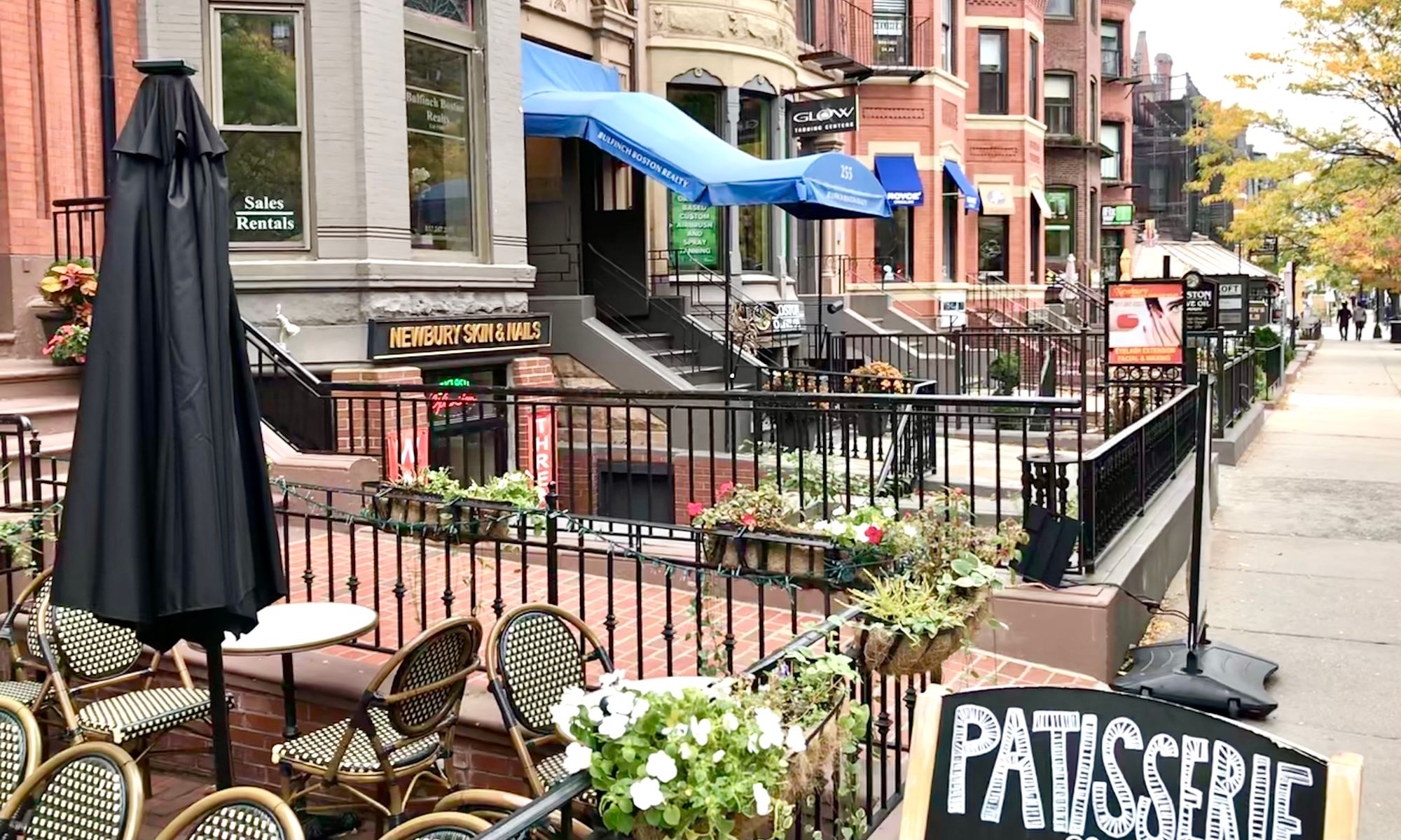
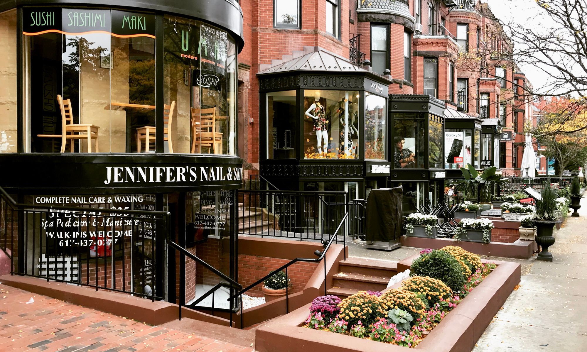
Boston - Newbury Street
This street in Boston is a wonderful example of how front porches can bring a community to life. In front of what look like traditional residences, there is a variety of stores, cafés, and restaurants for everyone to enjoy.
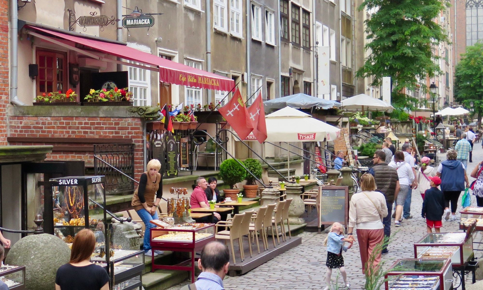
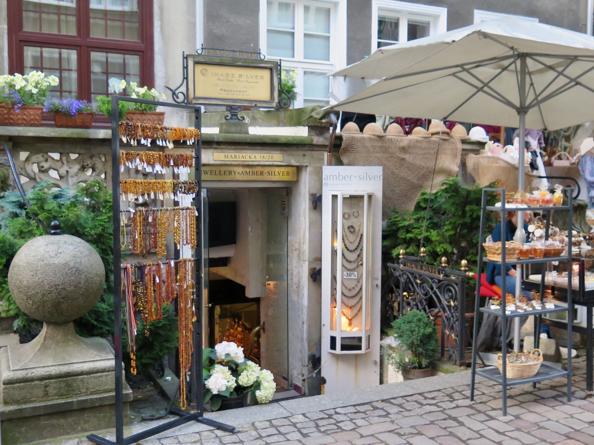
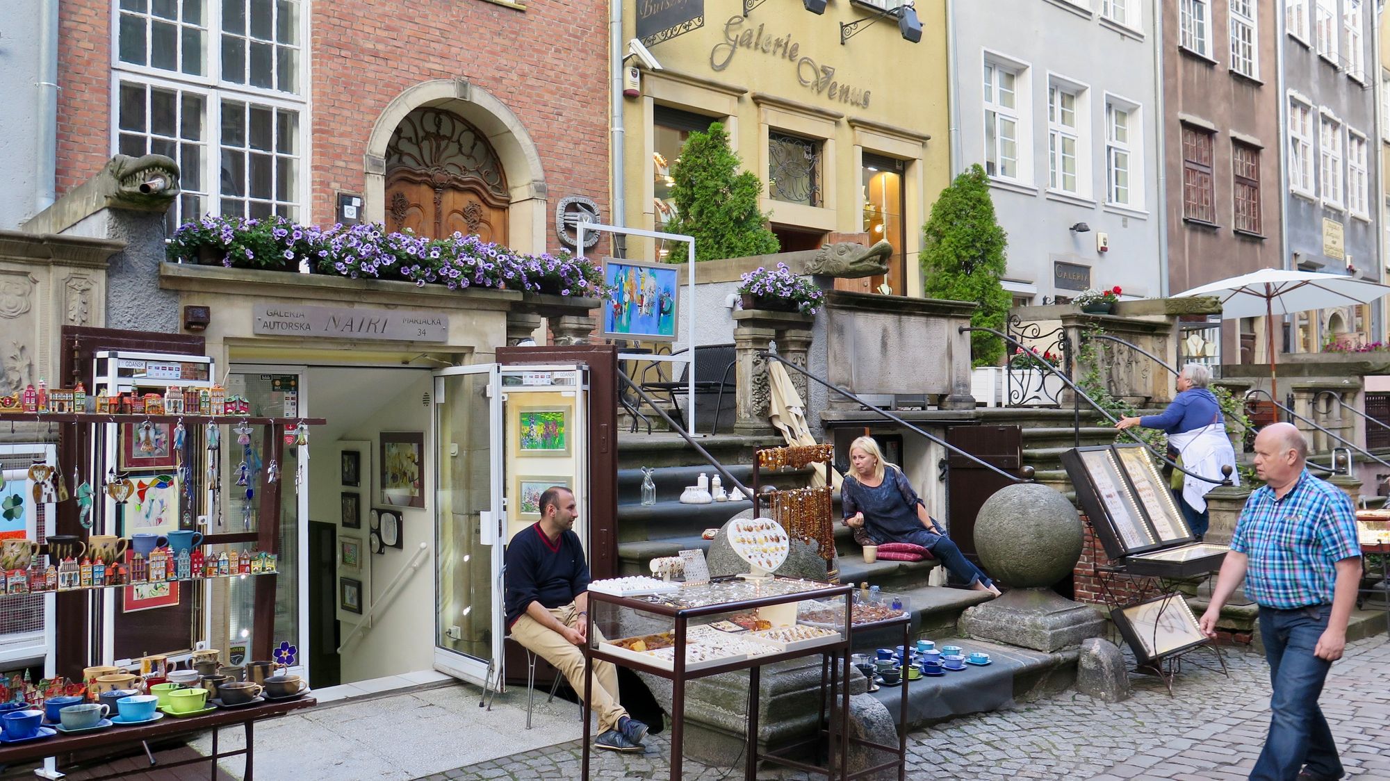
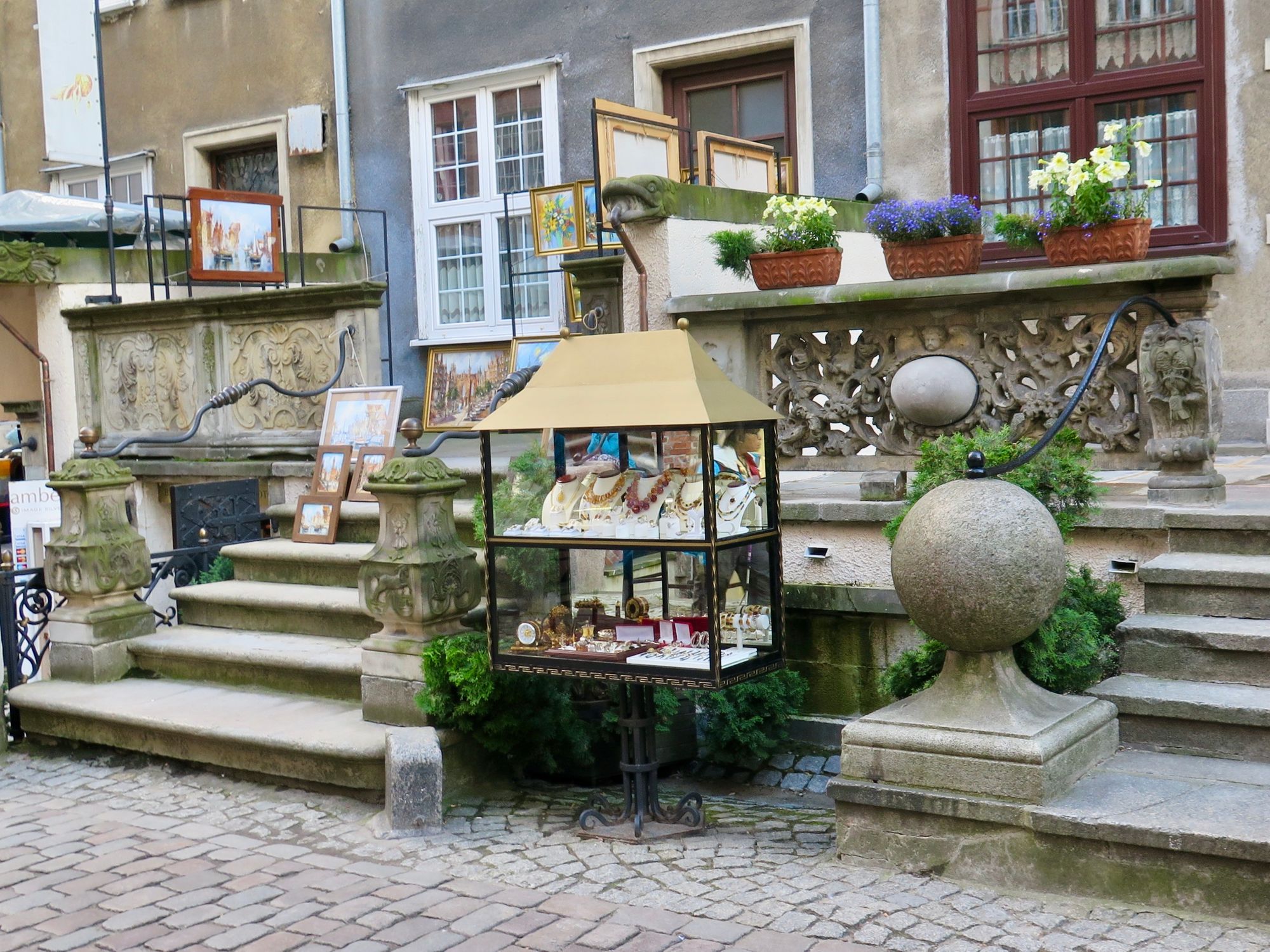
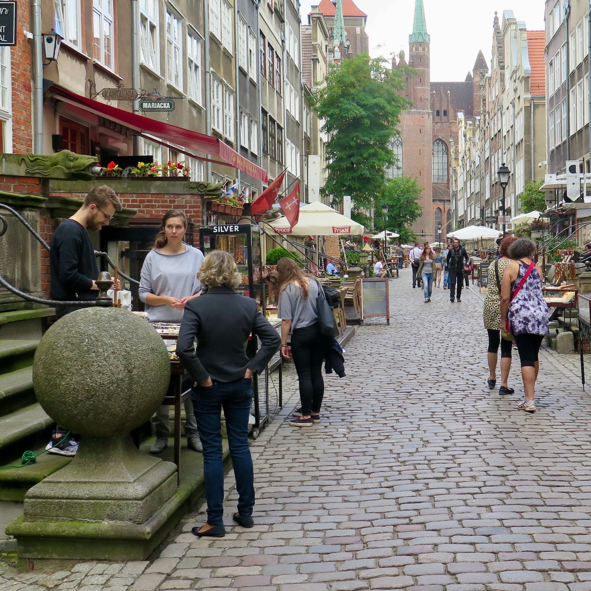
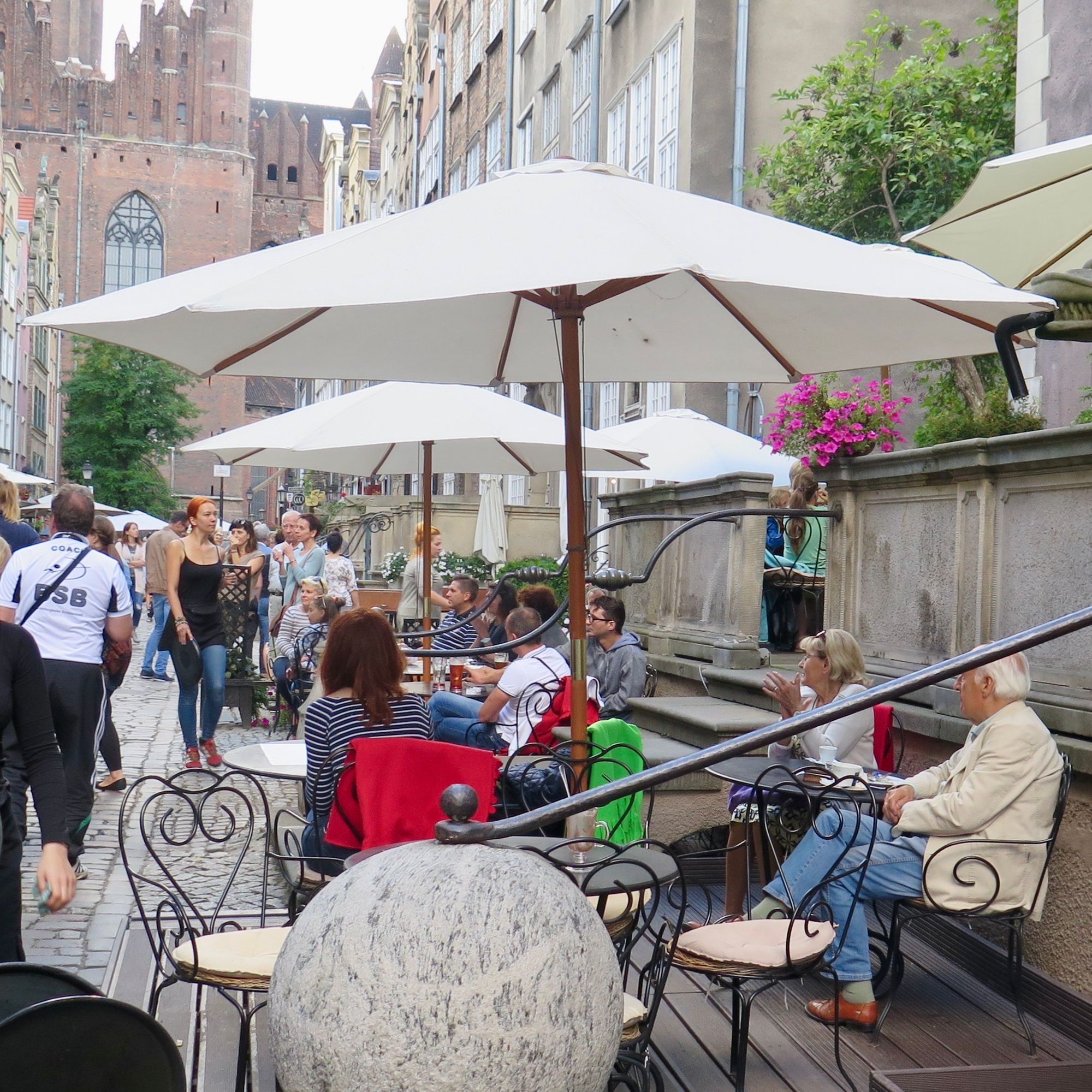
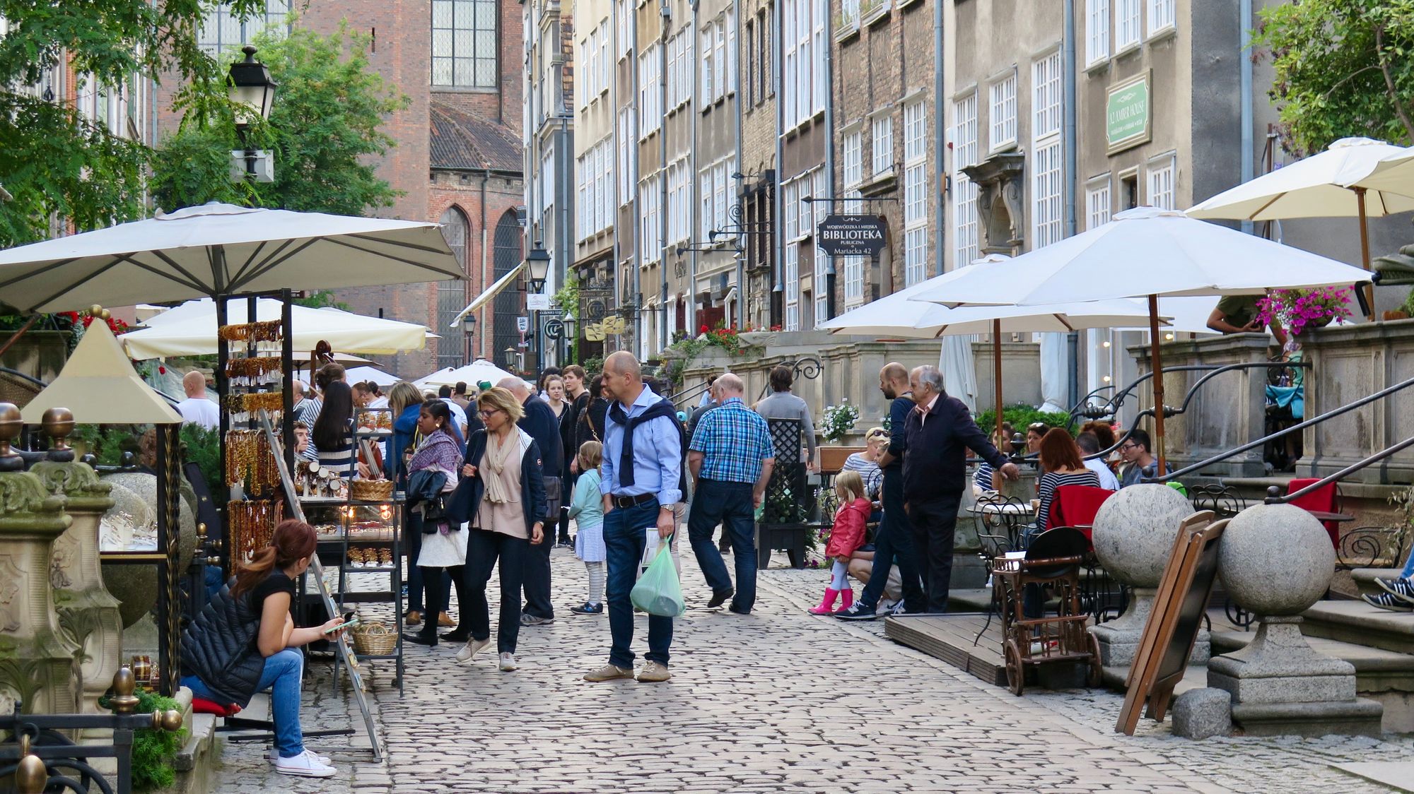
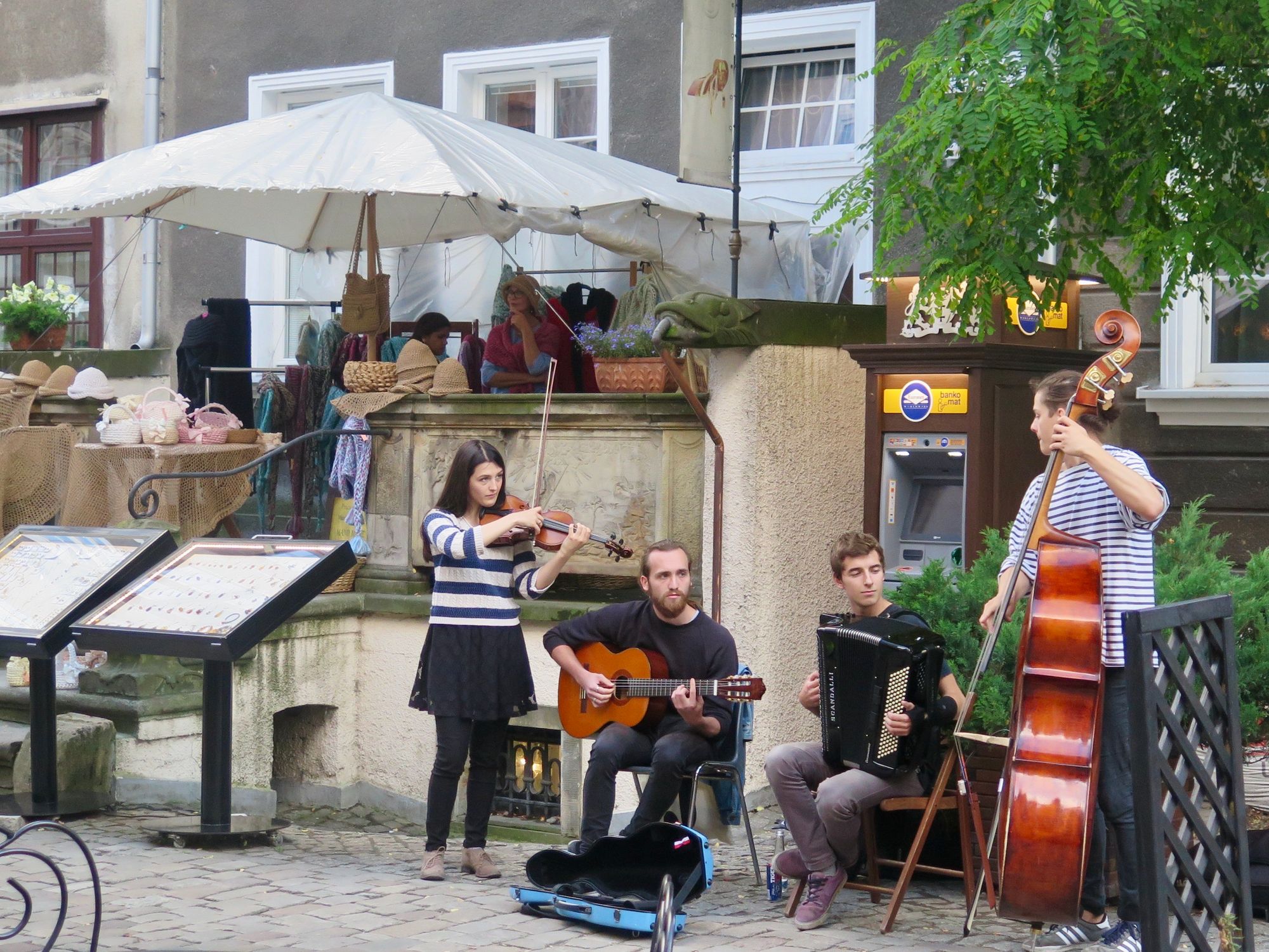
Poland - Gdansk's Highly Sociable Street
Mariacka Street is a uniquely engaging location – one of the best streets we have seen. The terraces encourage socialization at three different scales, starting at the basement steps, working their way up the street and onto the terraces themselves. Here, outdoor dining and shops thrive, along with frequent public performances.
Amsterdam and London
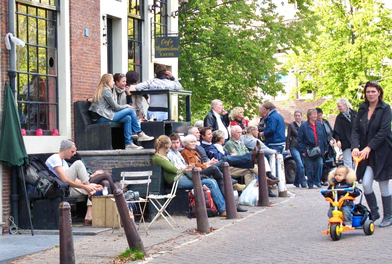
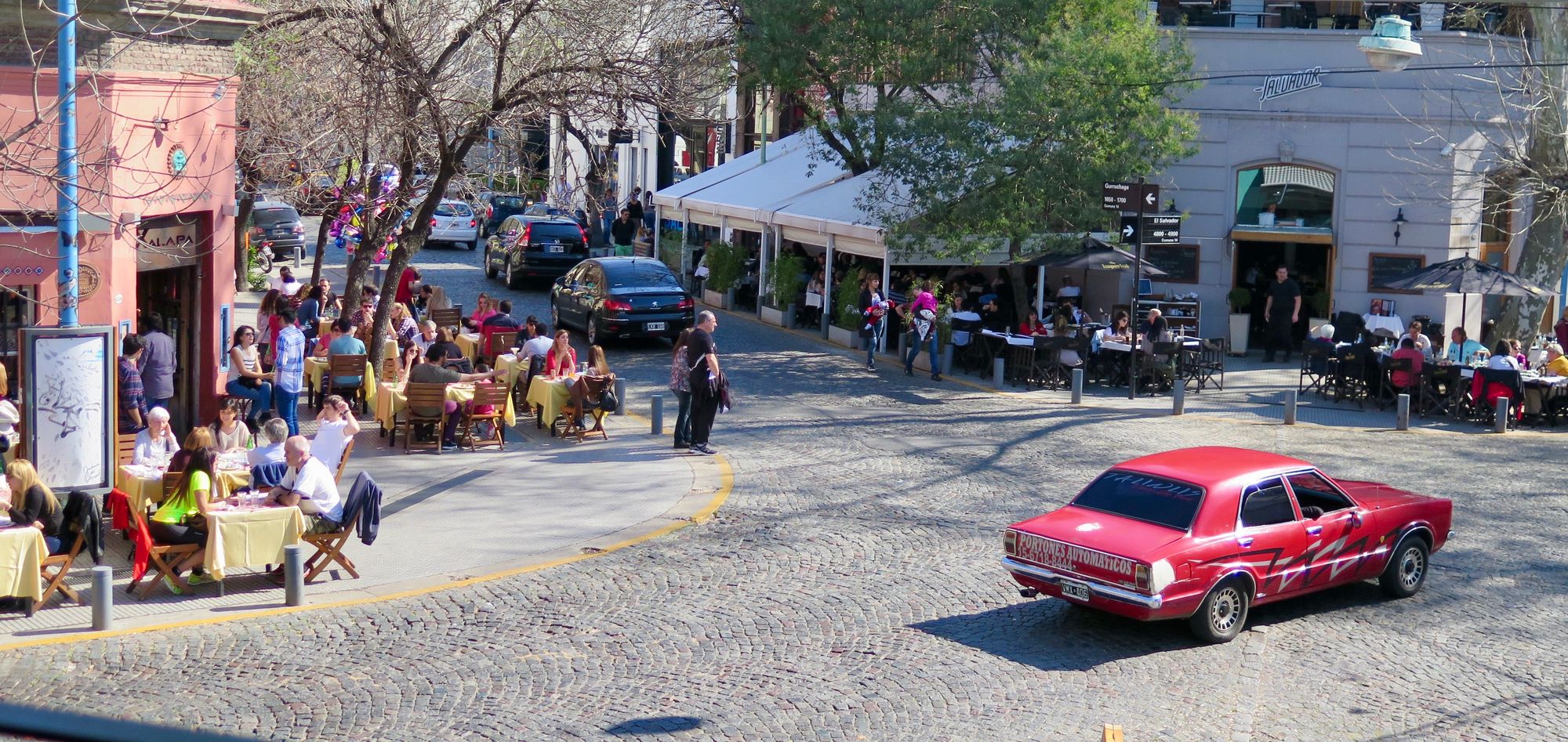
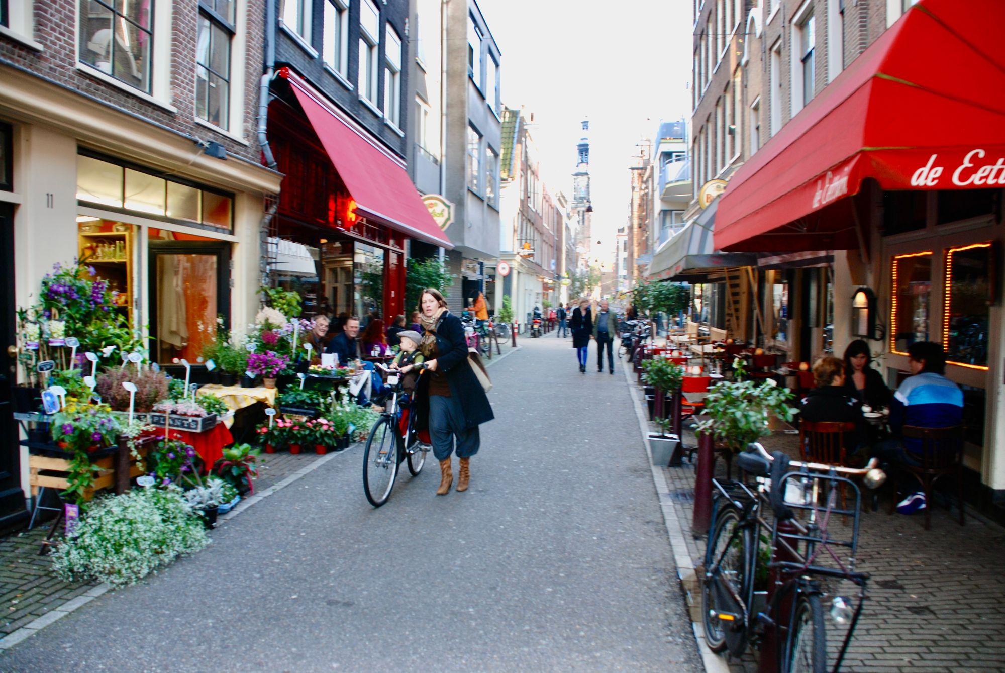
We see similarly lively sidewalk life pouring out of buildings inside-out style in Amsterdam and London.

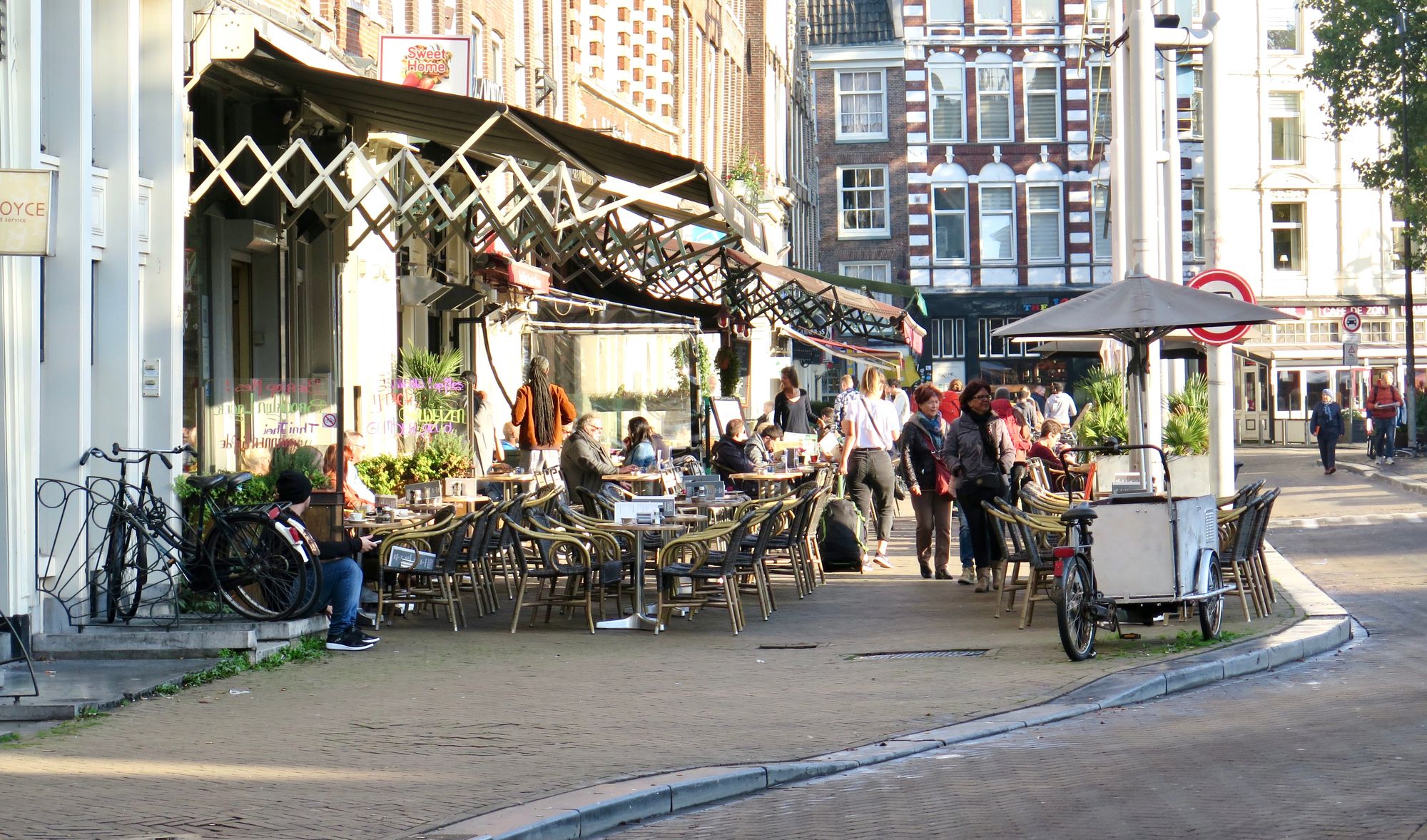
Amsterdam
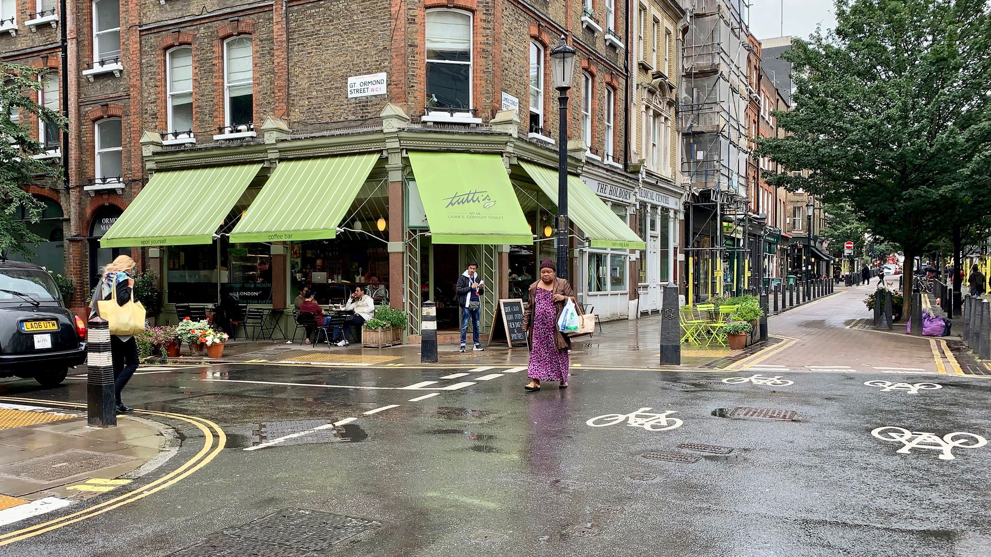
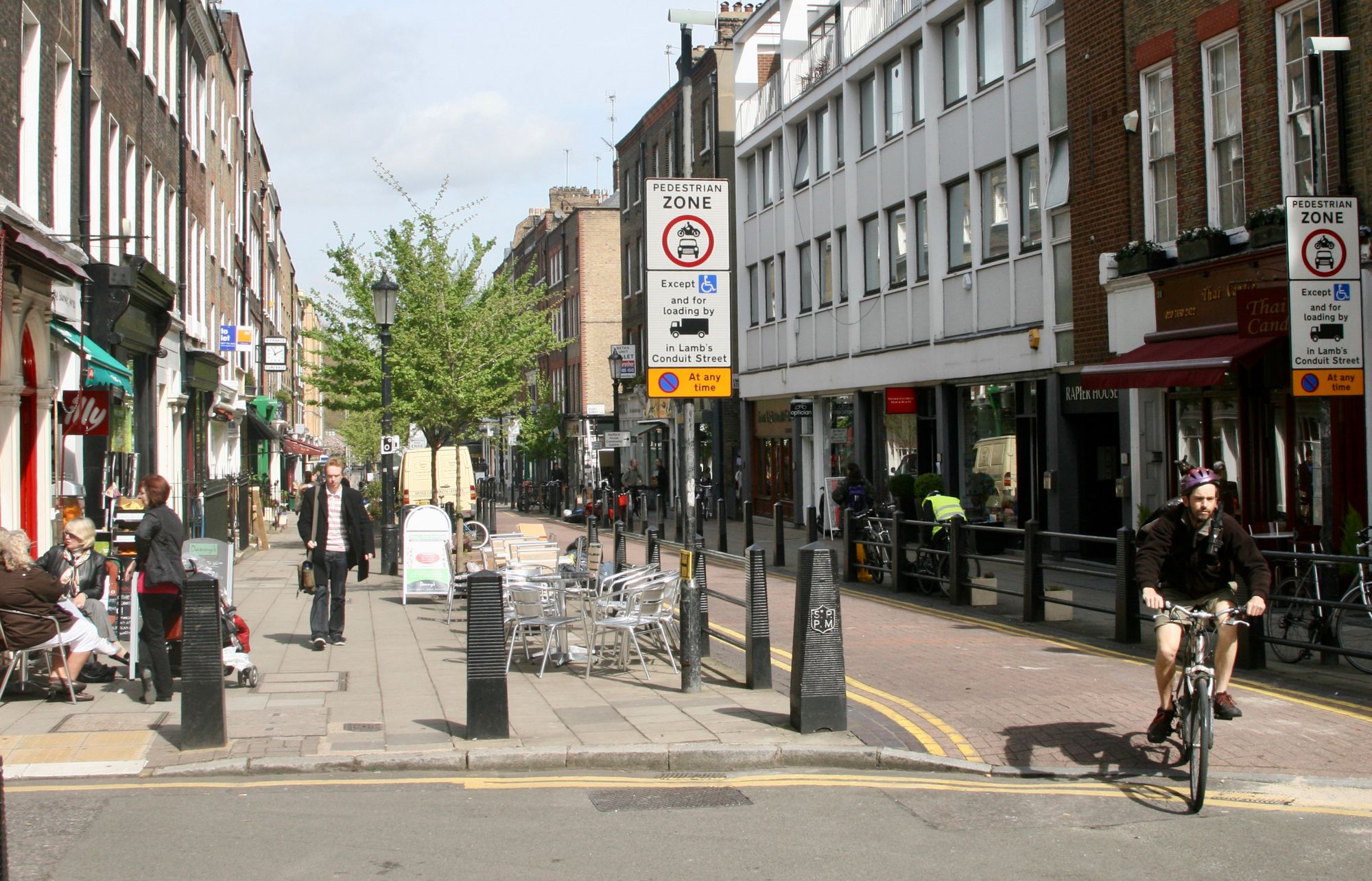
London
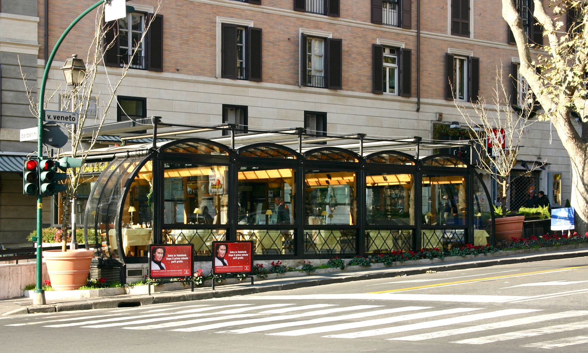
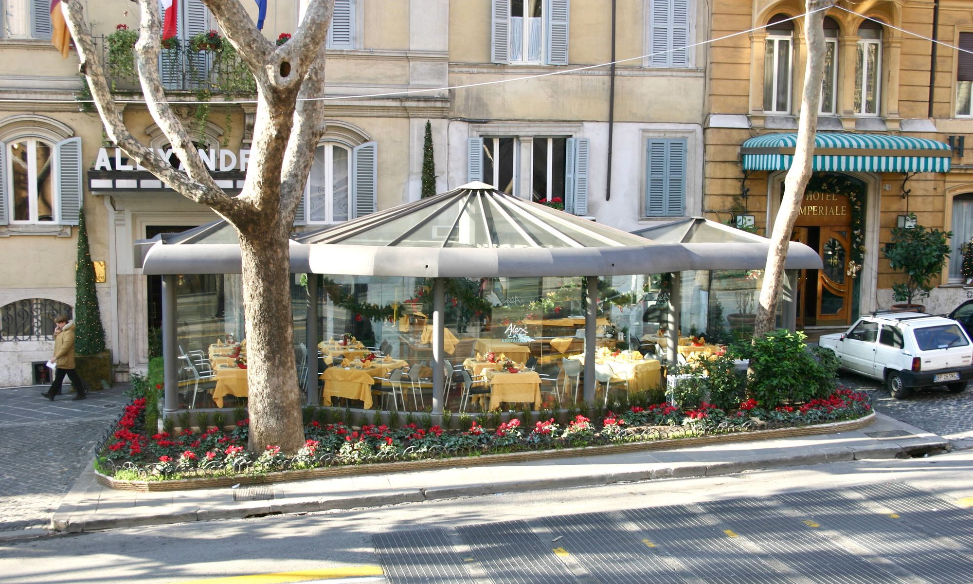
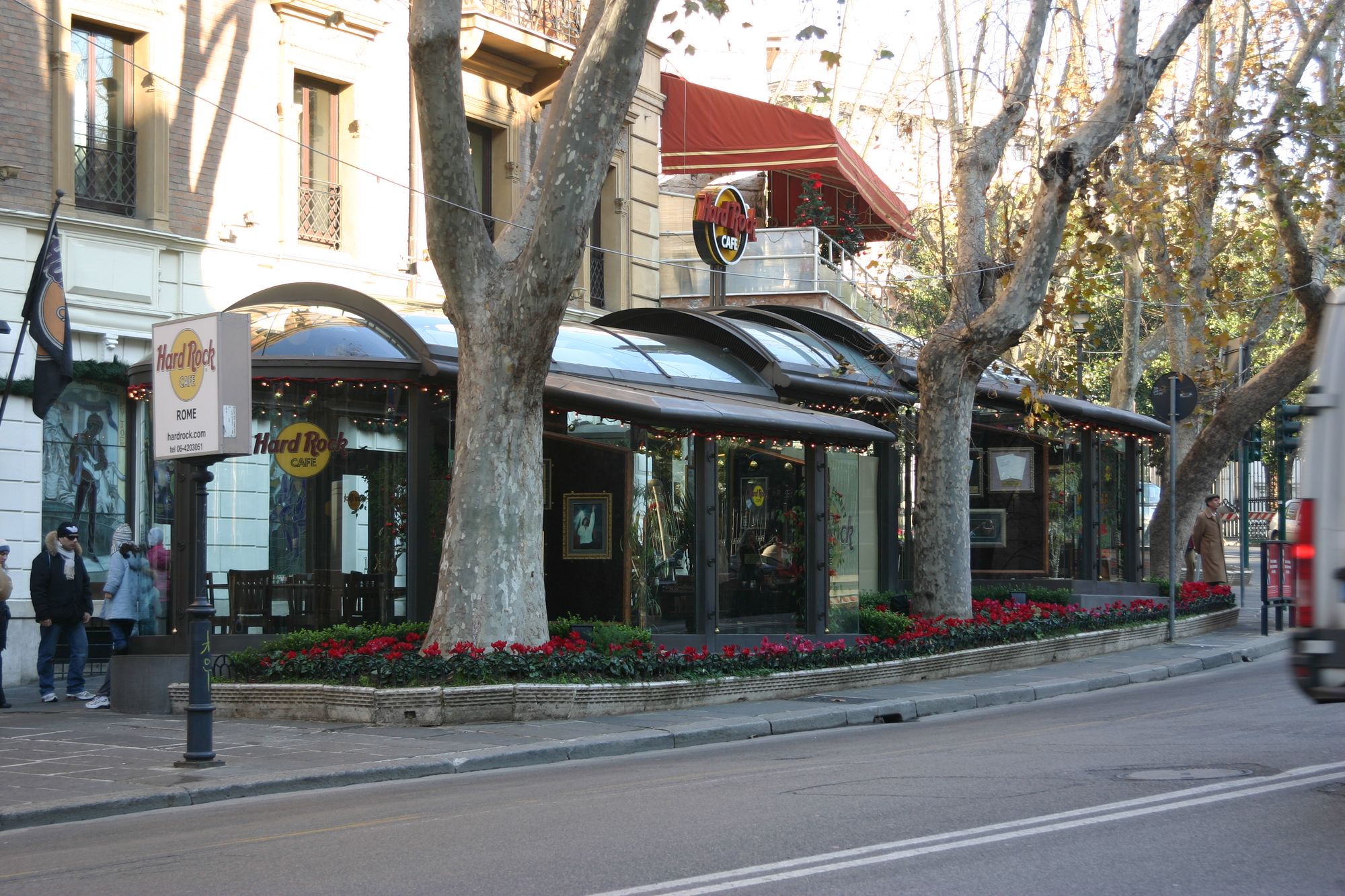
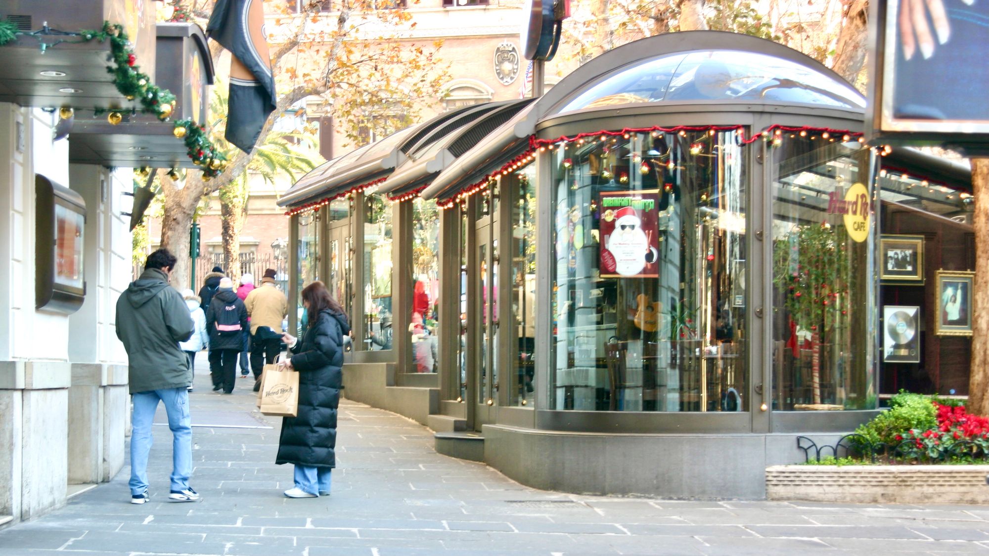
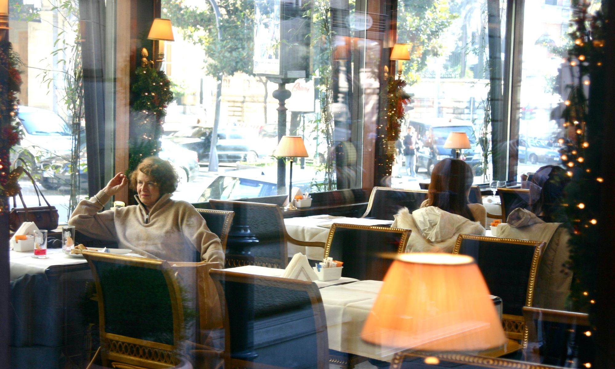
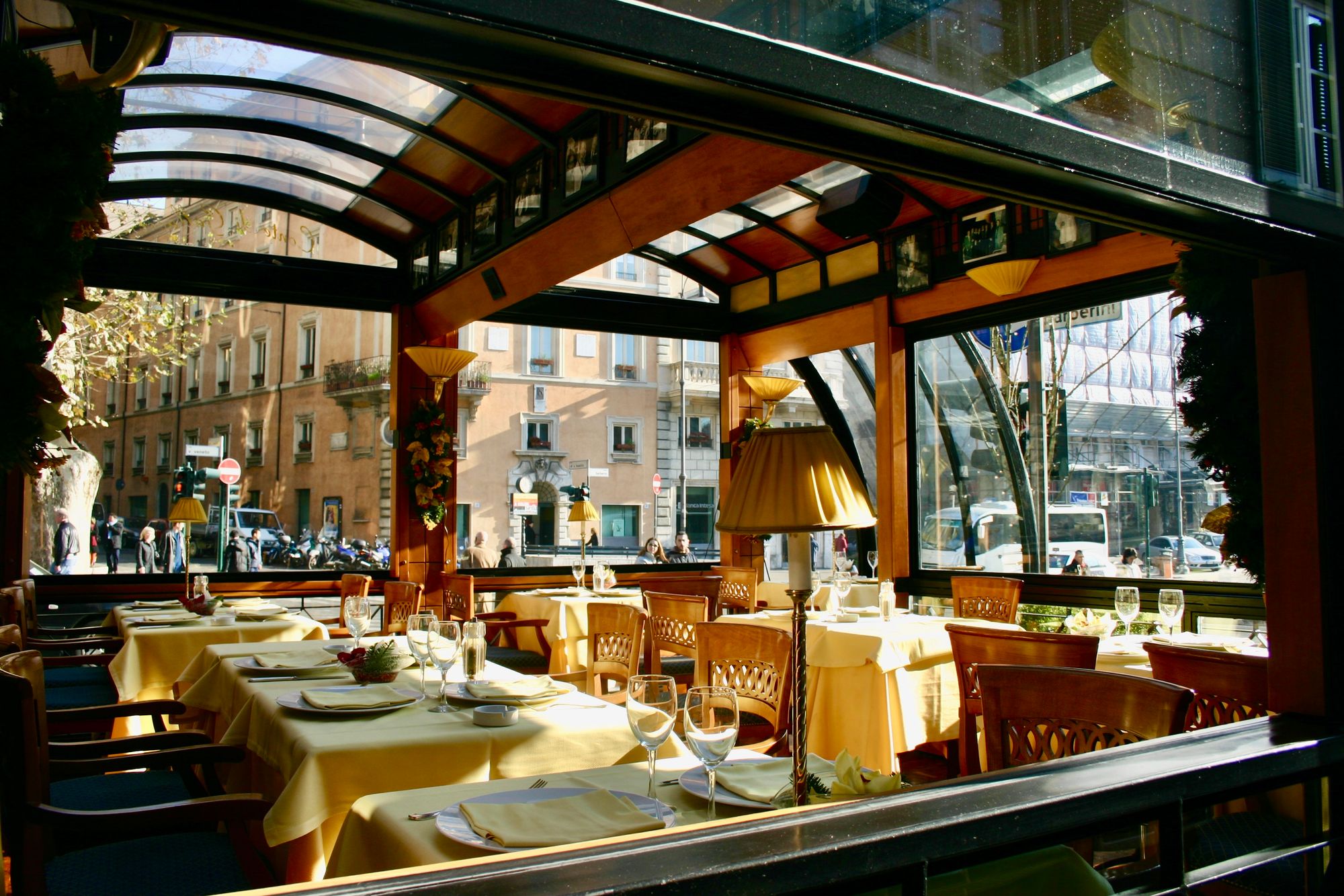
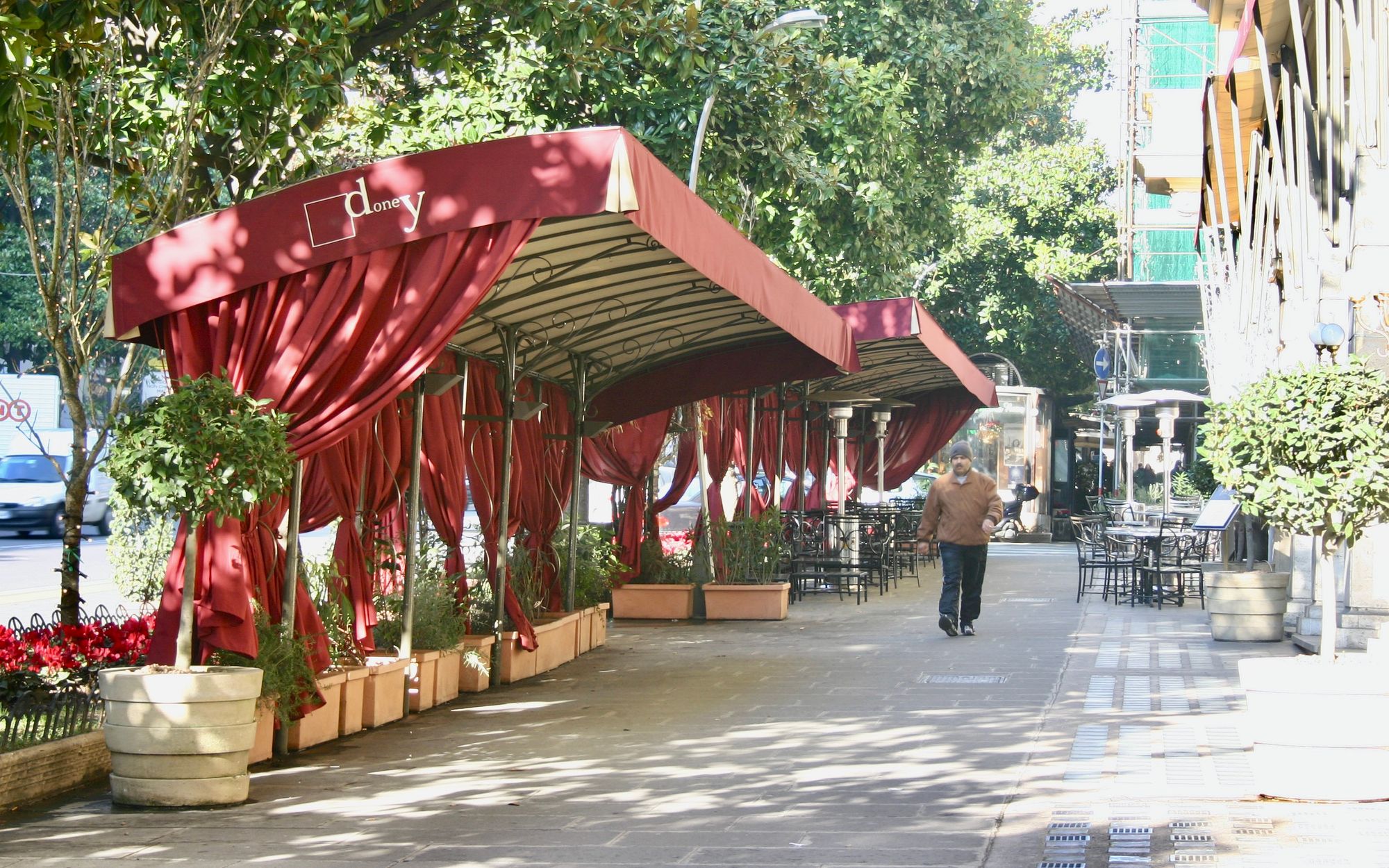
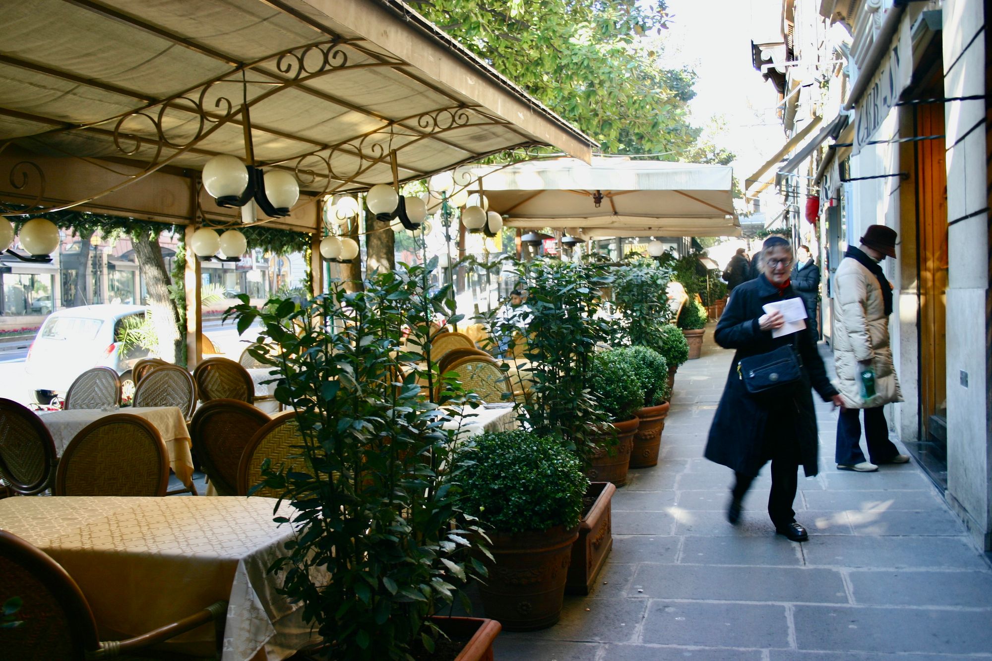
Rome – outdoor dining pavilions
These closed pavilions maintain the air of privacy people may want while dining, but still bring the inside out into the public eye because of their glass walls and notable sidewalk presence.
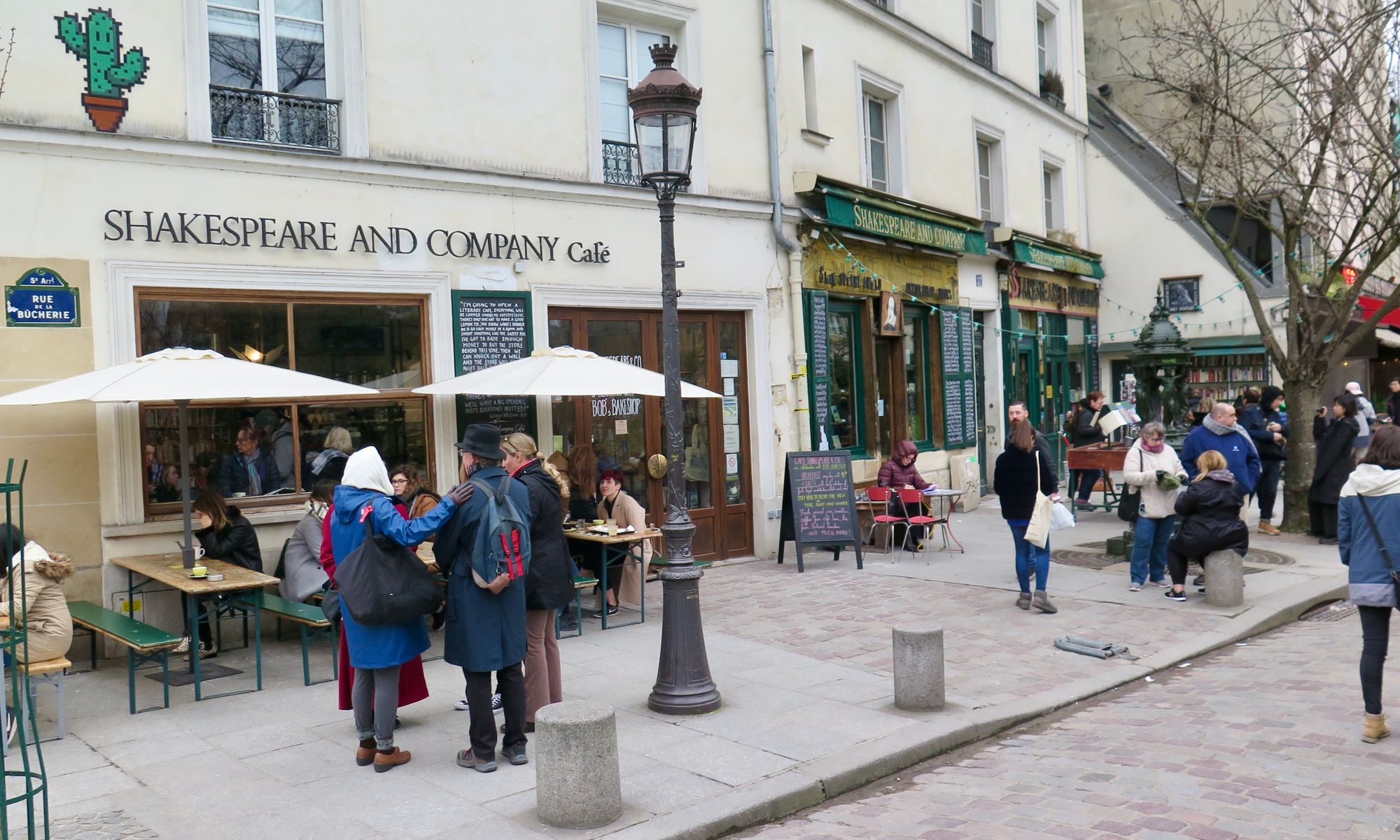
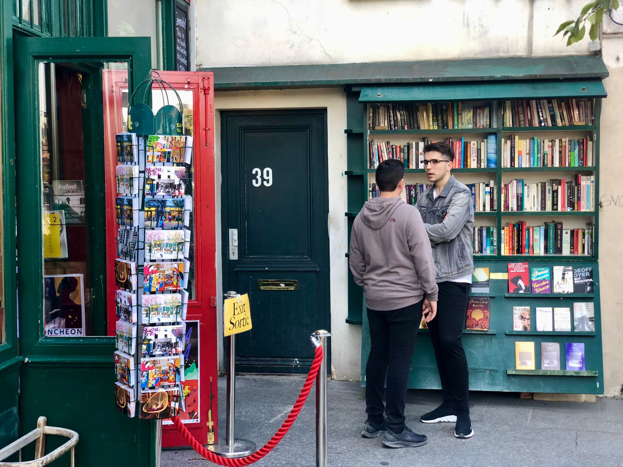
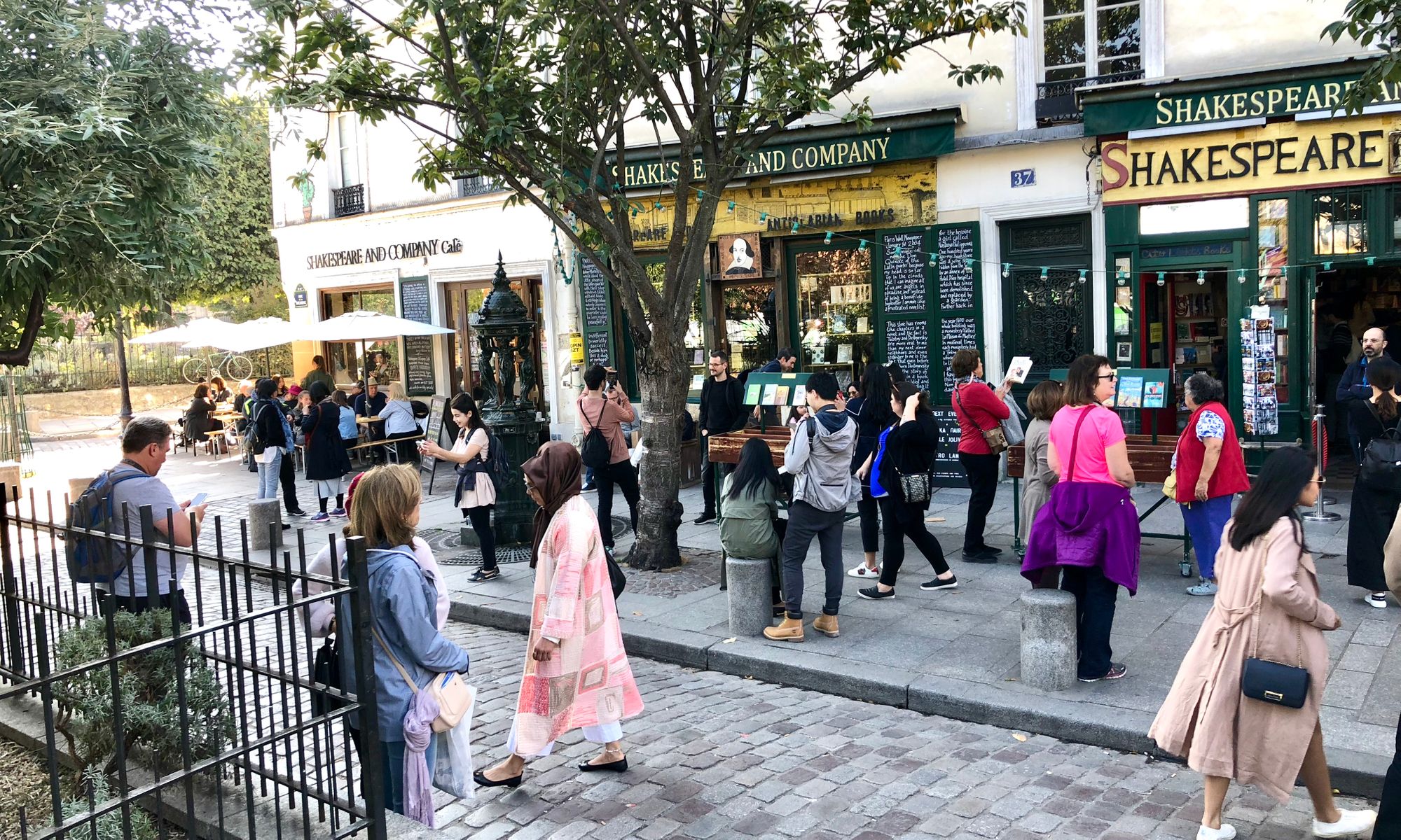
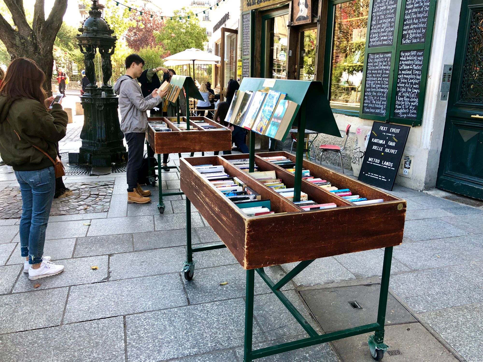
Paris's Shakespeare and Company: A bookshop that became an international neighborhood hub
This bookstore serving English-language literary lovers since 1951 includes a year-round outdoor café that functions in all seasons. The outside of the shop buzzes with people meeting, searching through the stands for the perfect book, or eating lunch, attracting more and more people to this social hub.
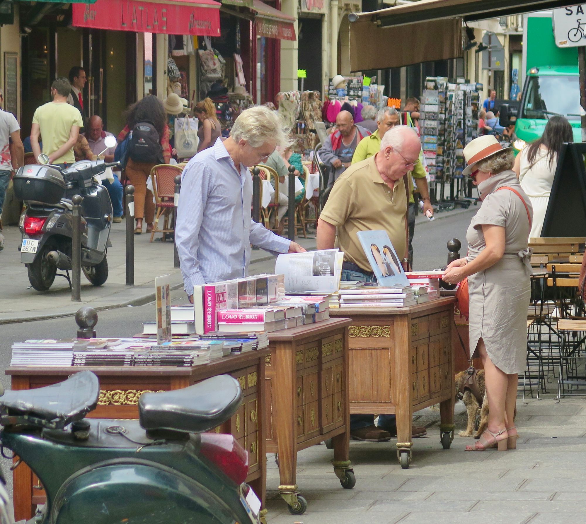
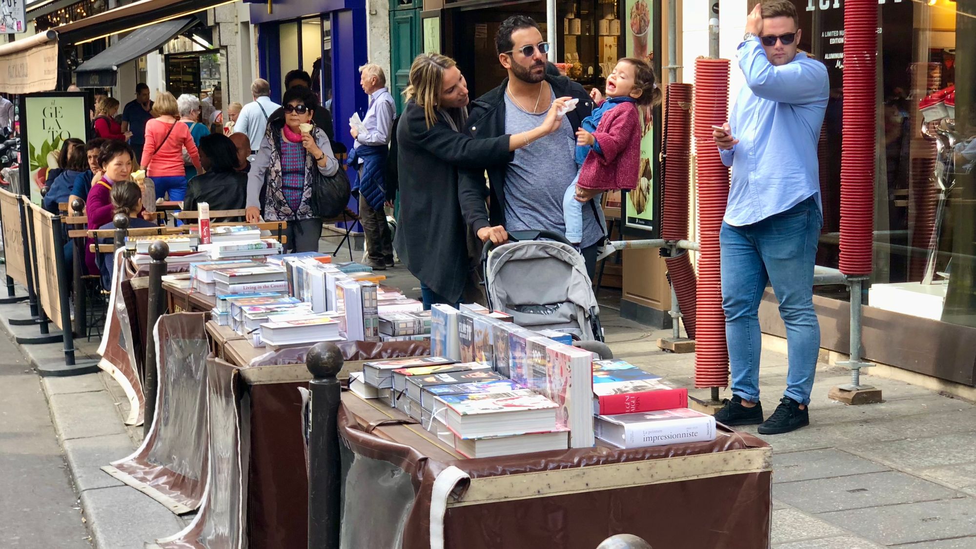
Book stalls on Rue de Buci
Putting books out onto the street is a great example of inside-out street activation in many places, throughout Paris and beyond.
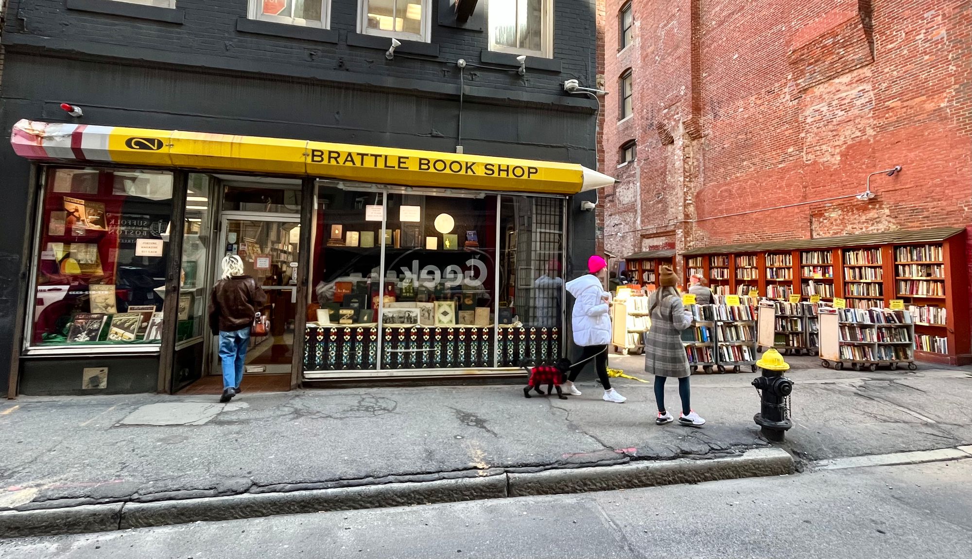
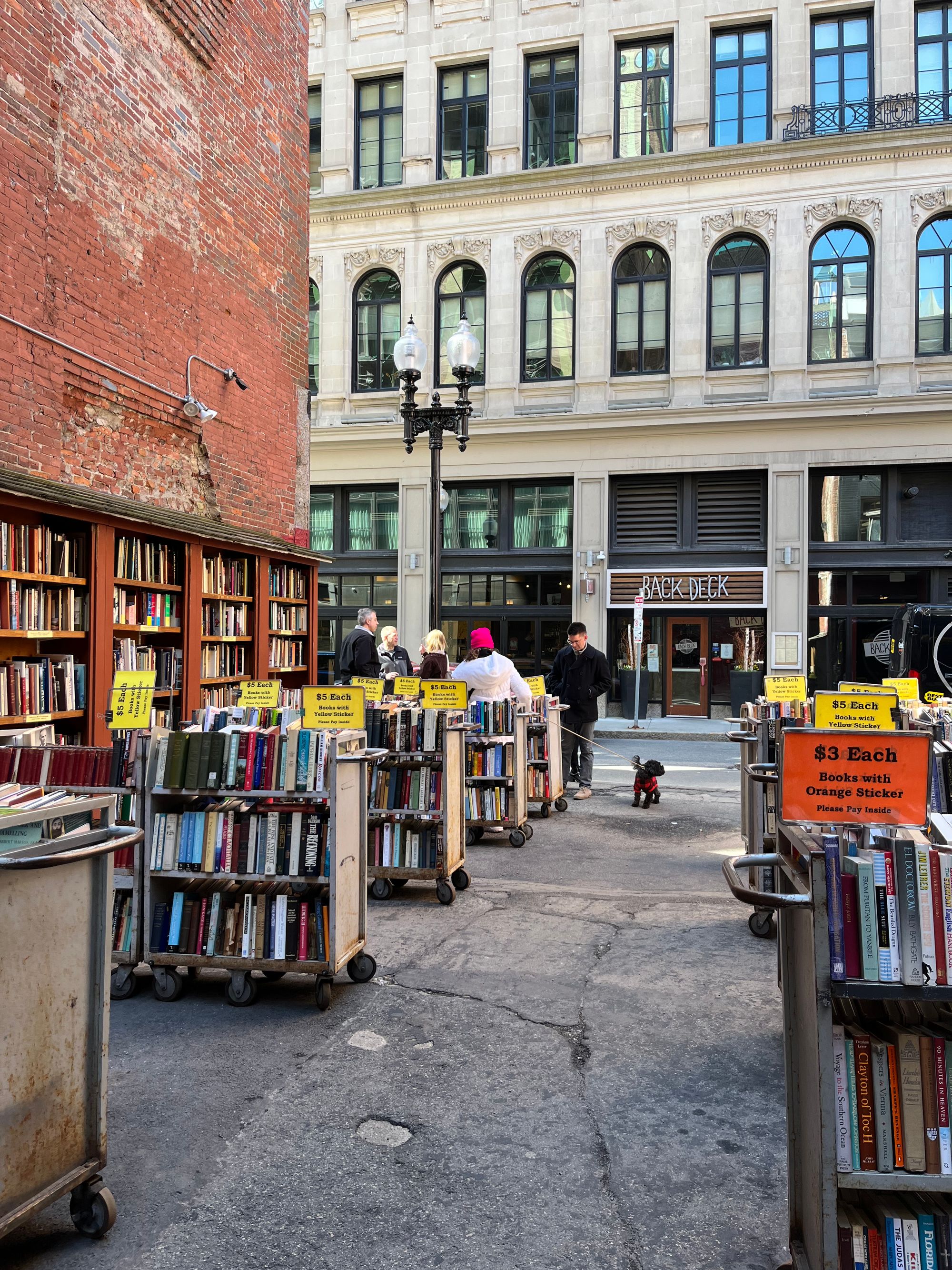
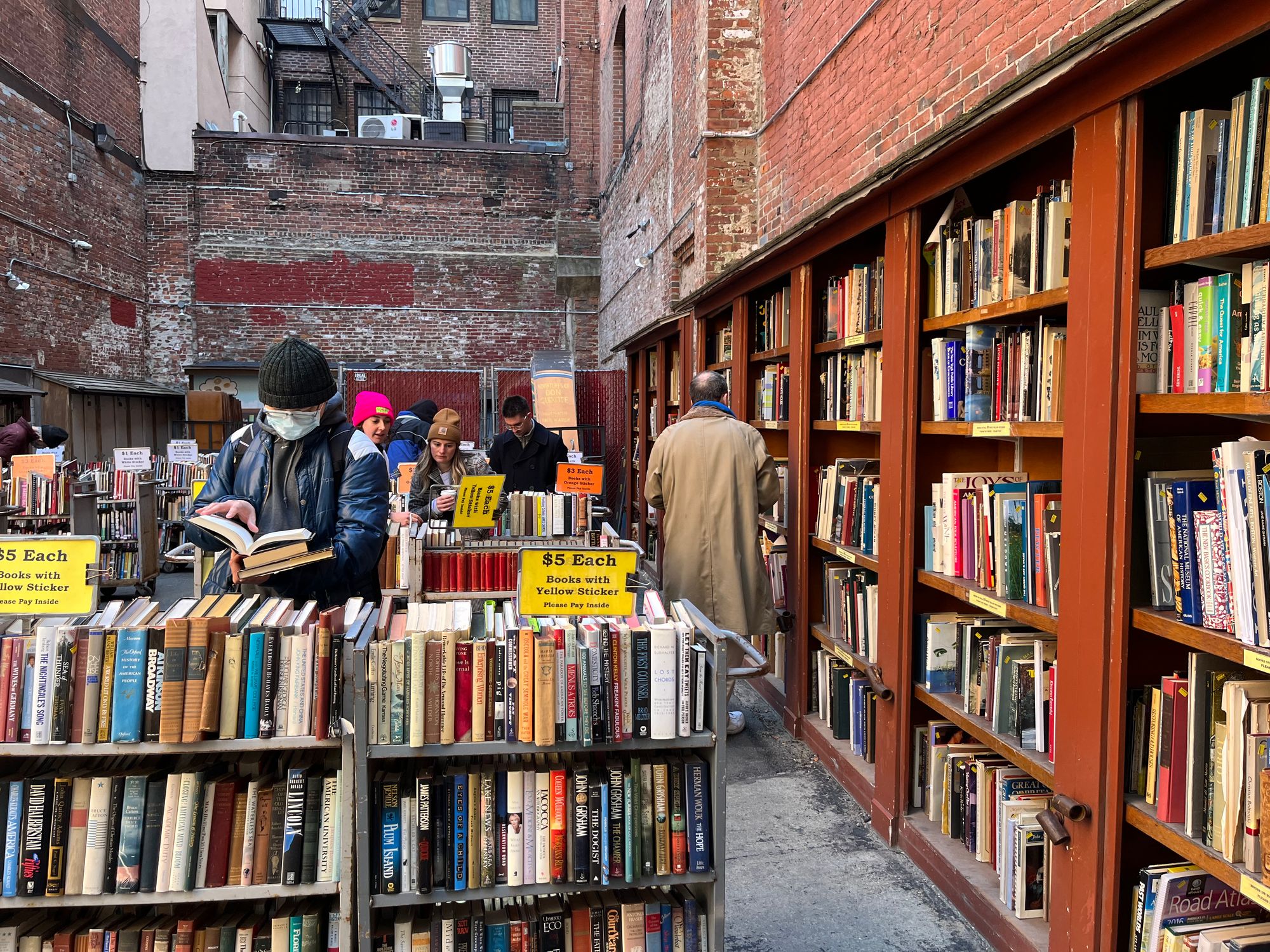
Brattle Book Shop, Boston
An example of an incredibly inviting storefront, Brattle Book Shop spills out into an adjacent alley with rows and rows of books to peruse.
Sidewalk displays bring the streets to life
A long-standing and enticing technique, shops have long displayed their wares front and center. The way that these goods are presented draws people in – enhancing both sales and sidewalk life.
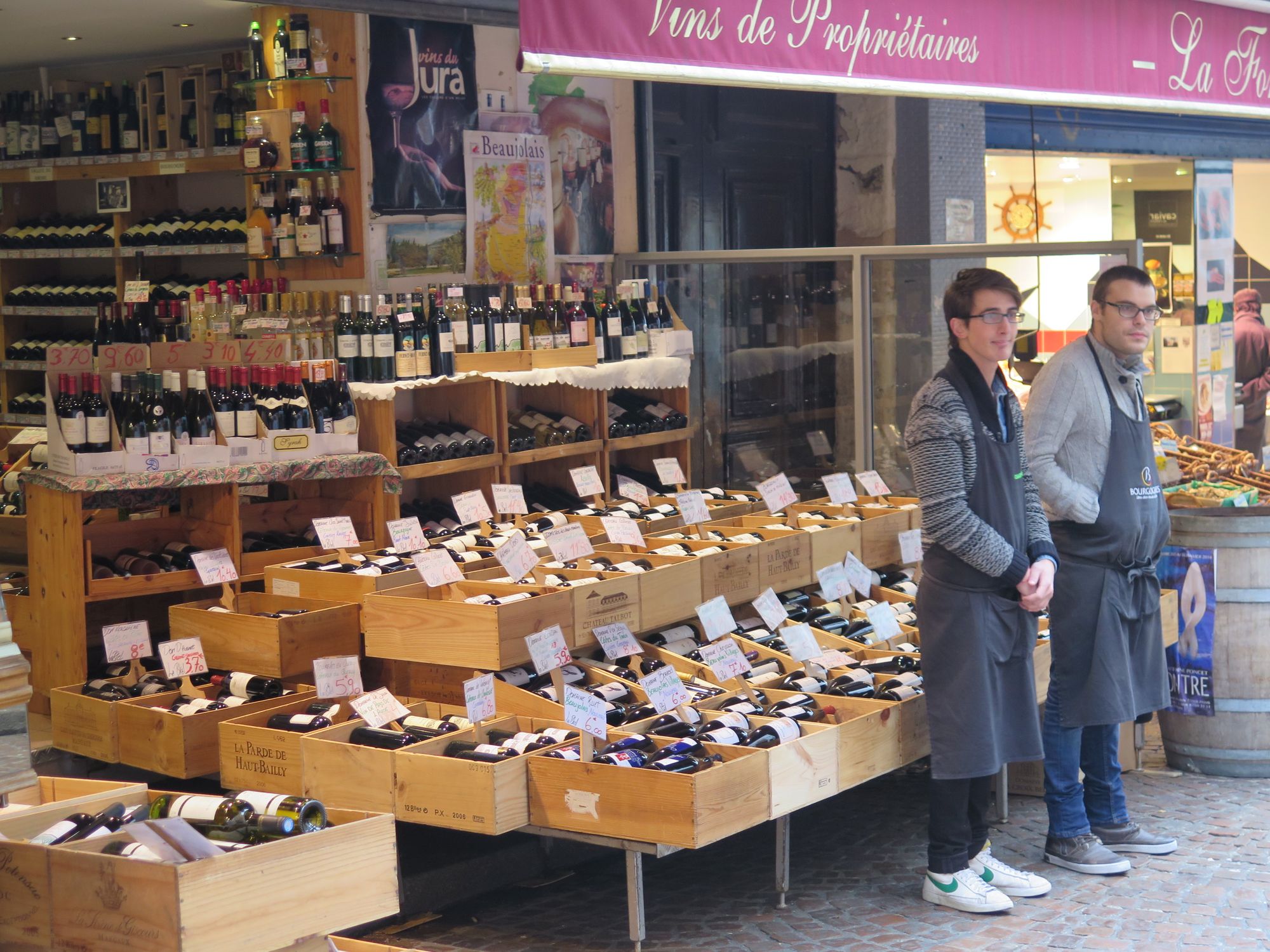
These mannequins bring the inside out
These outdoor displays of indoor goods create an ambiance that gives a stronger identity to stores than just window displays do. They make people want to stop, take a closer look at the outfits, and maybe even pop into the store to see more.
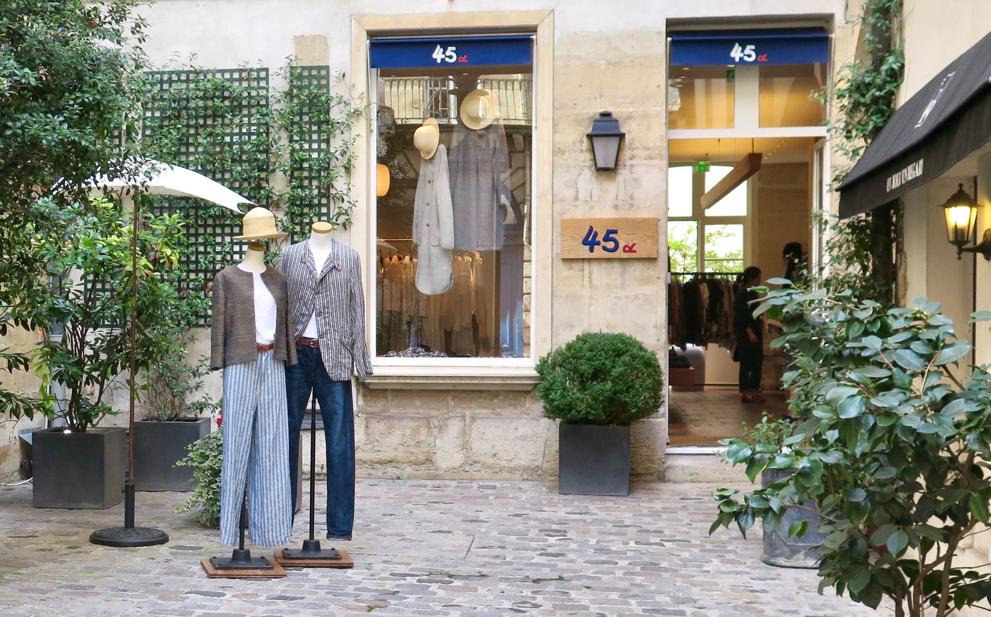
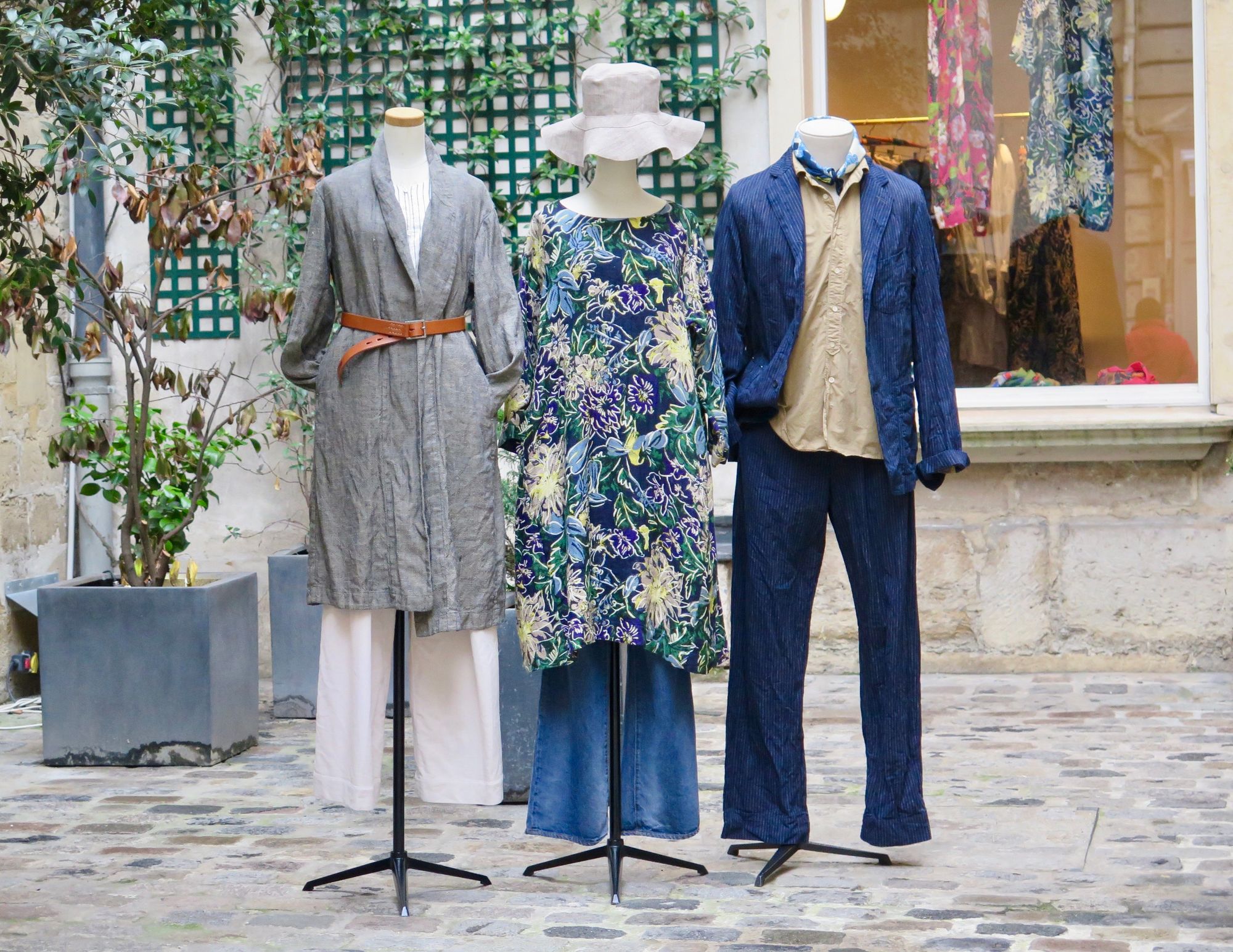
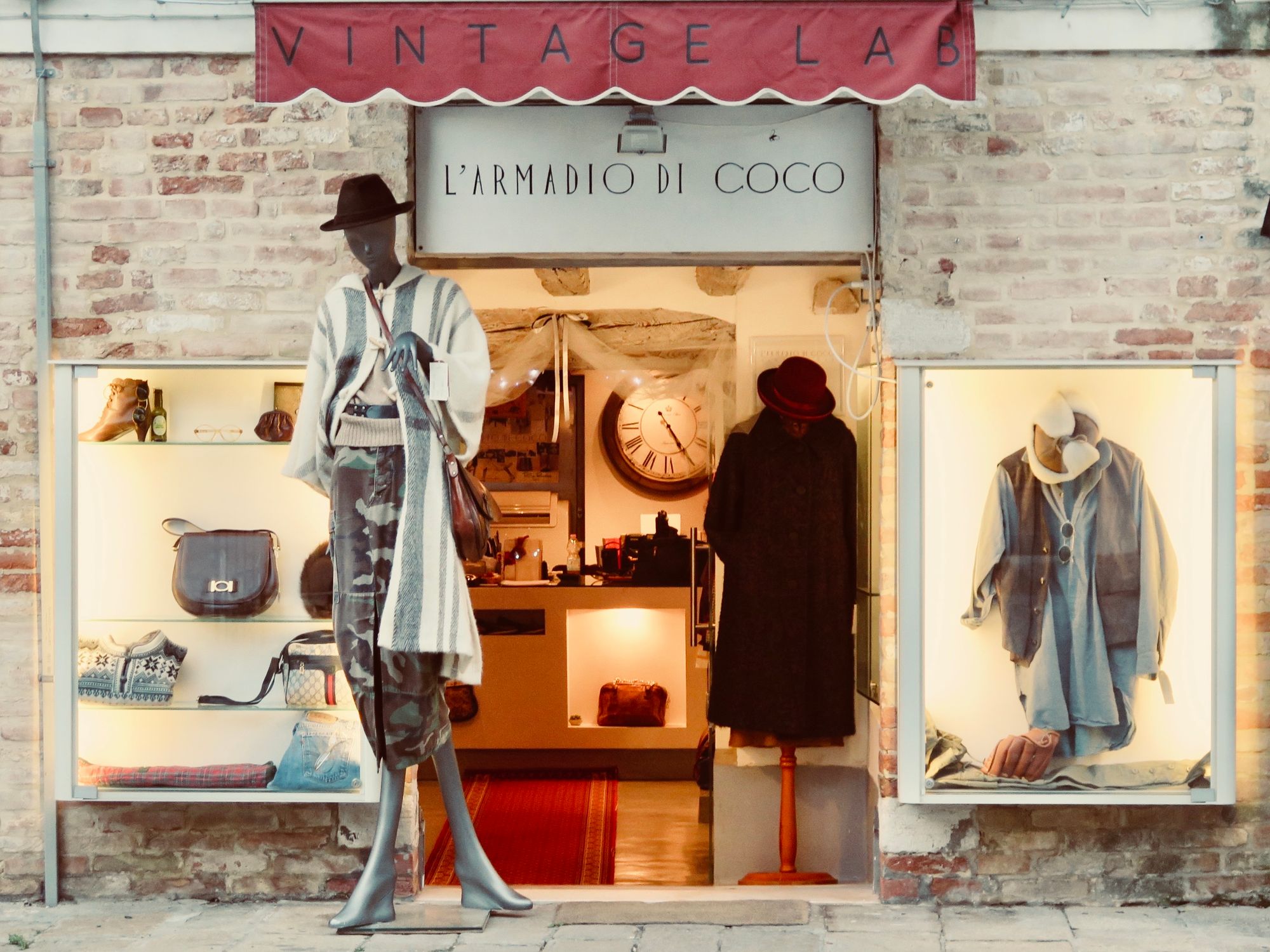
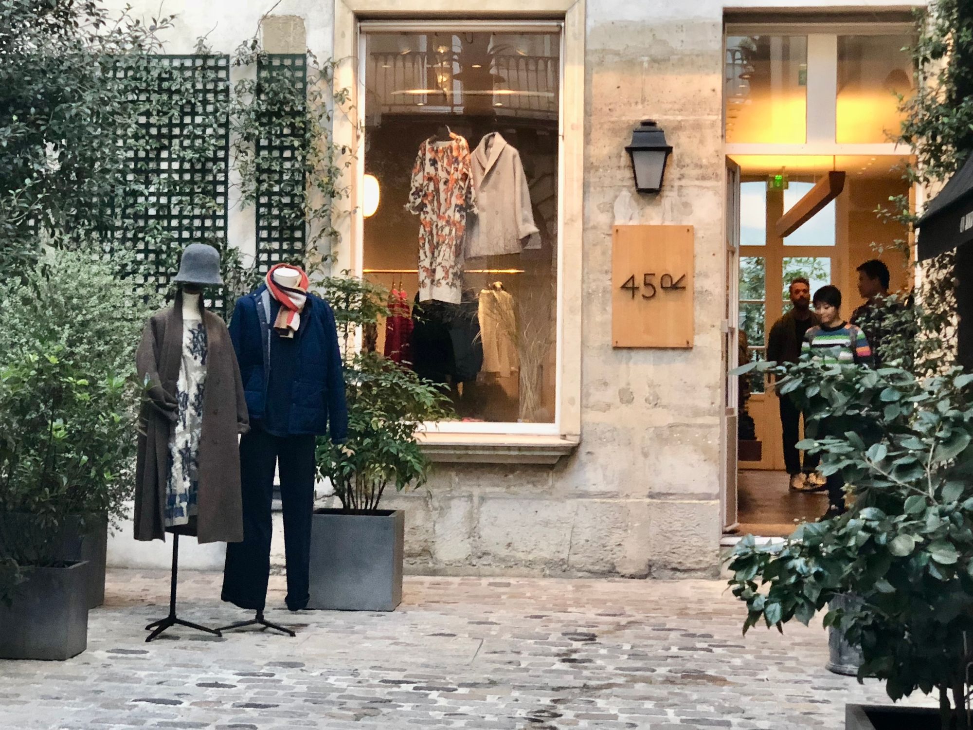
Street front displays play a surprisingly important role in the social life of cities
Street Markets
Paris
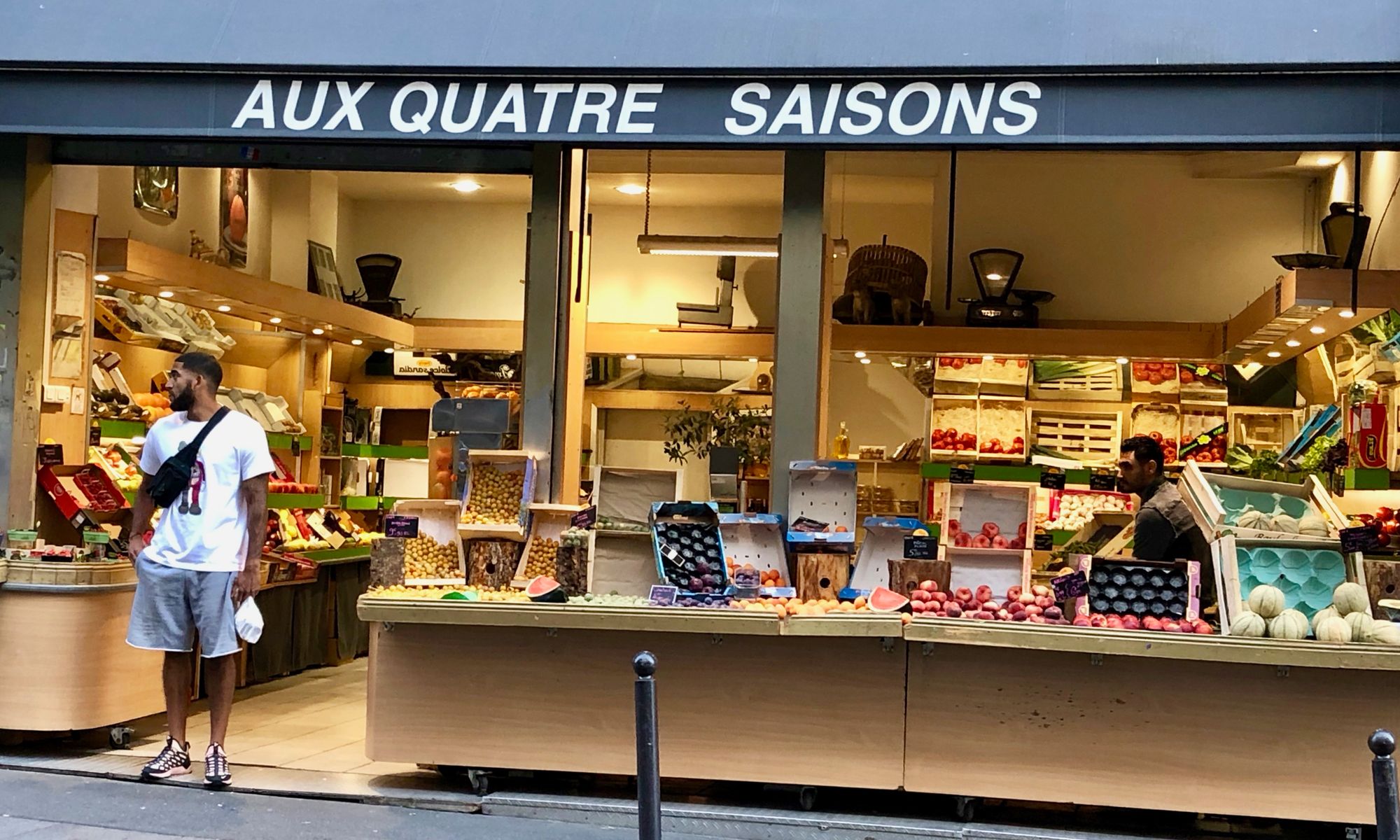
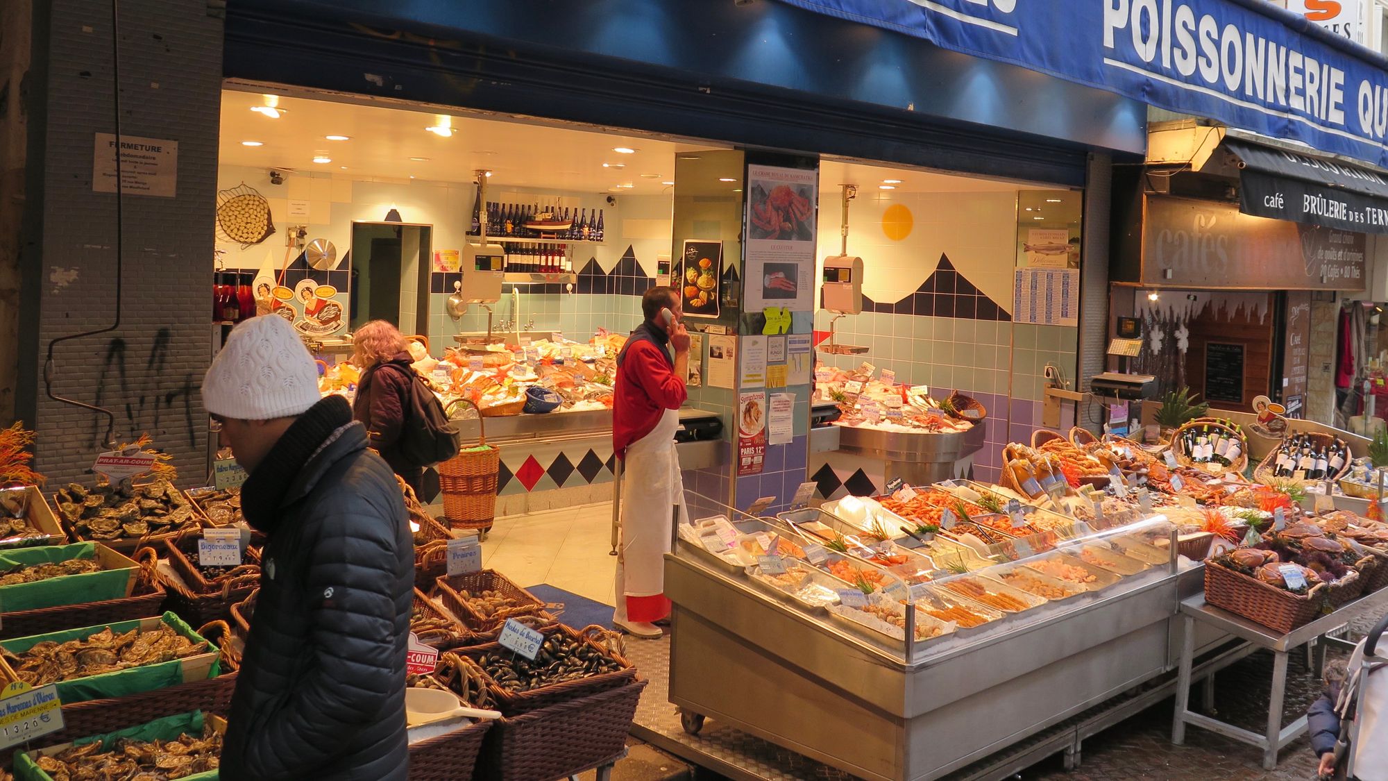
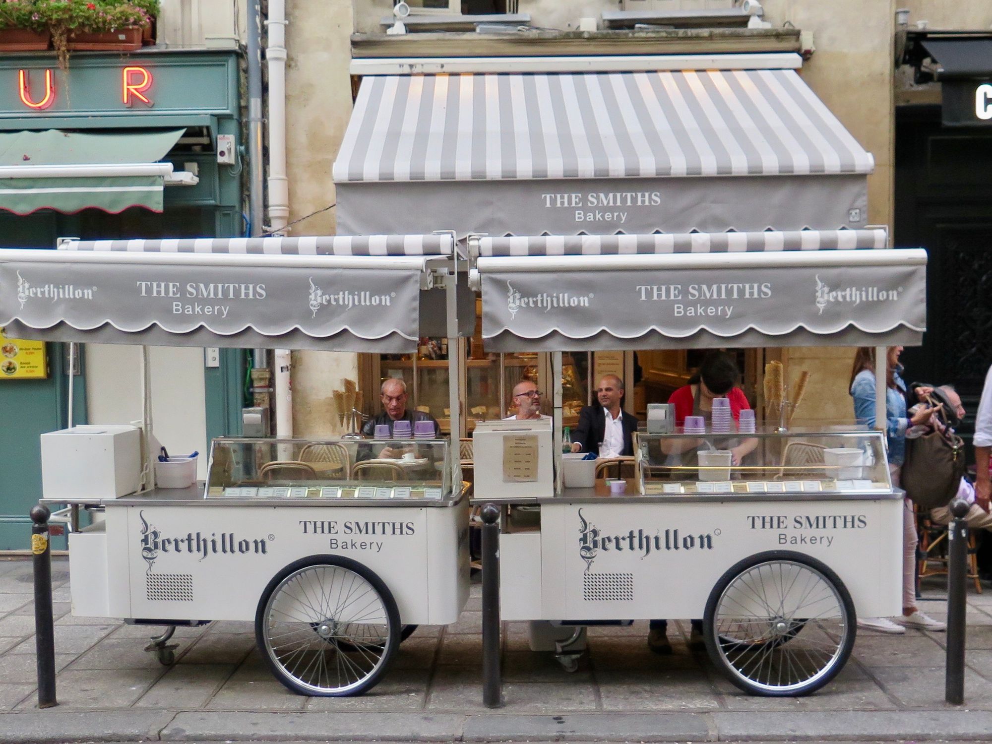
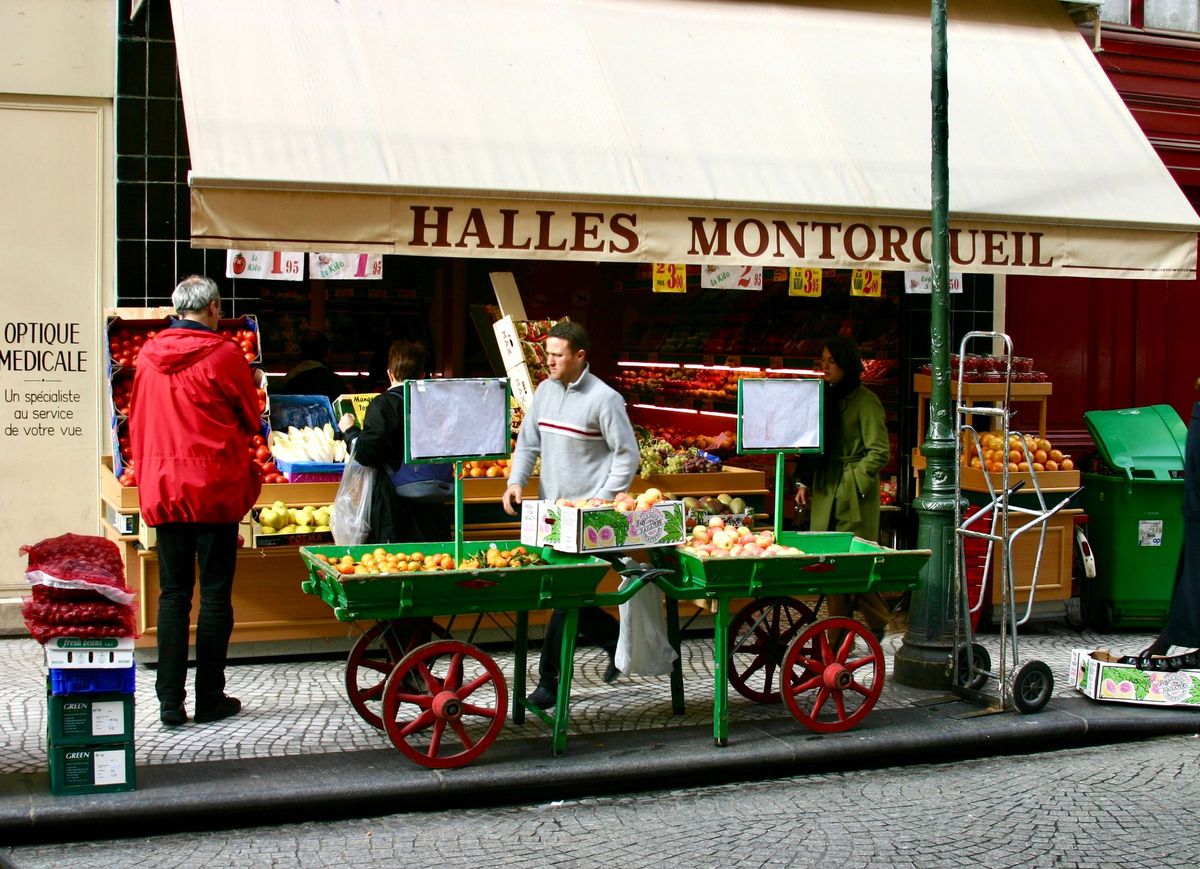
Paris does inside-out especially well on Neighborhood Market Streets. Here are some photos of Paris mastering the concept through outside seating, displays of produce and more.
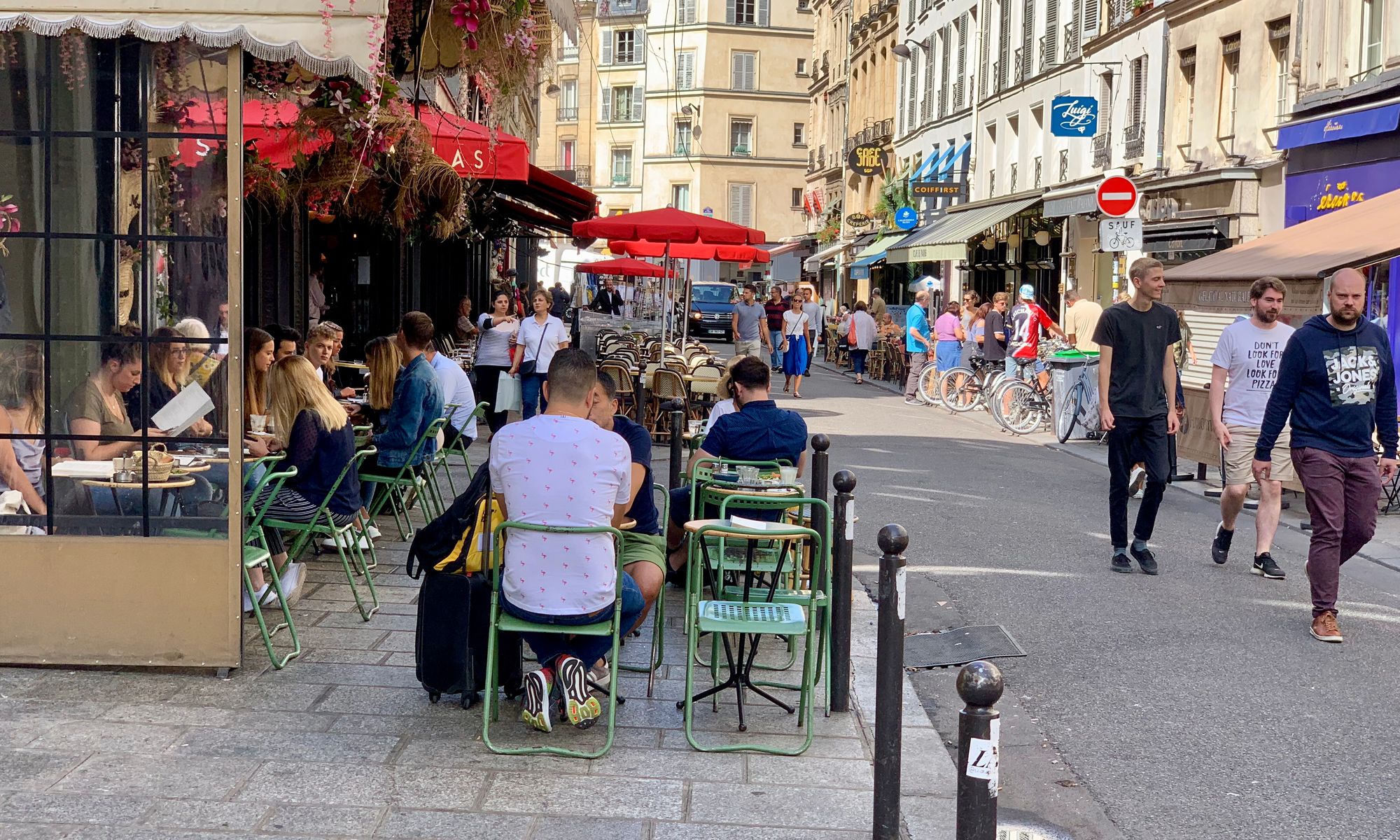
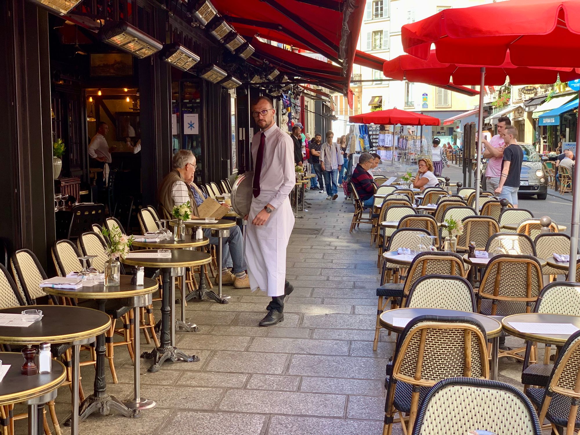
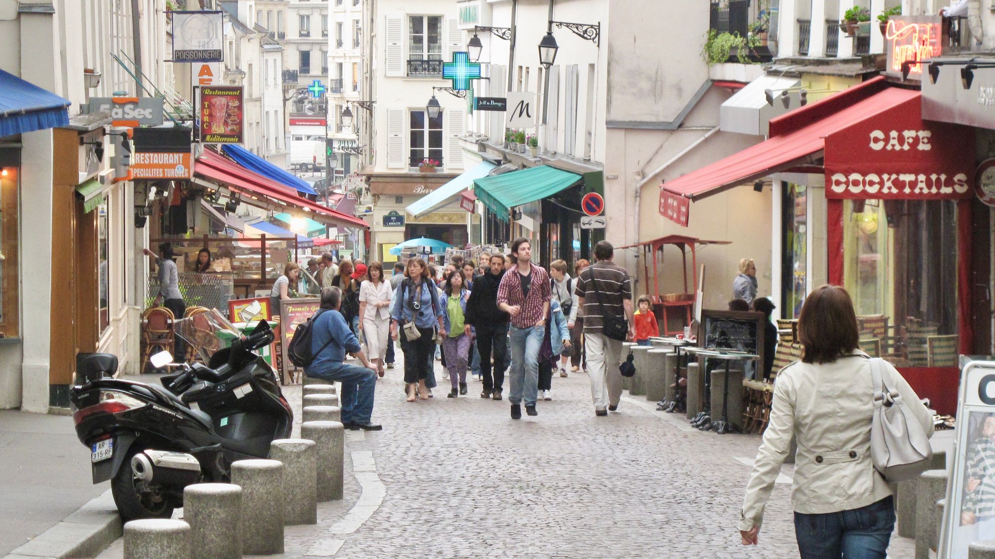
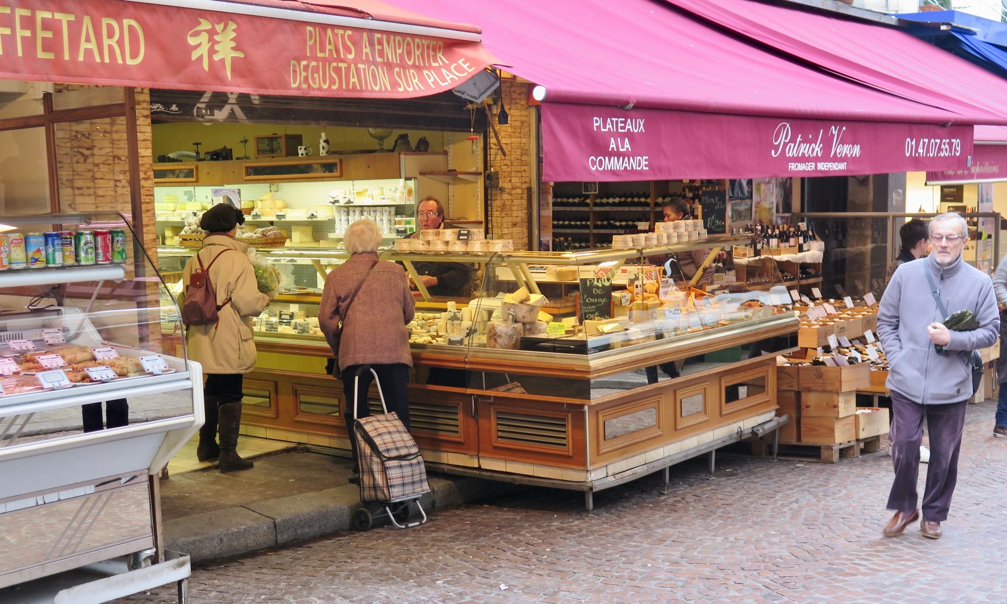
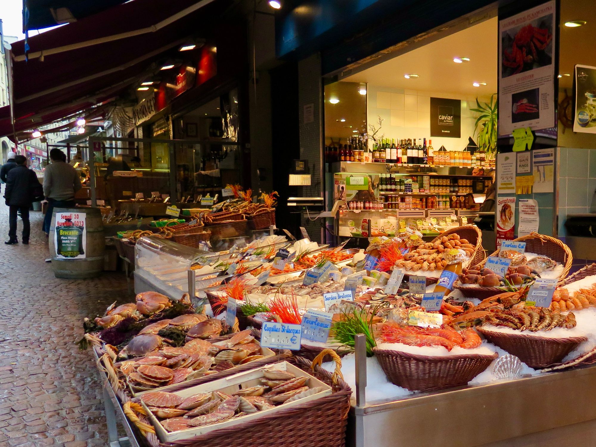
Paris - Rue Mouffetard
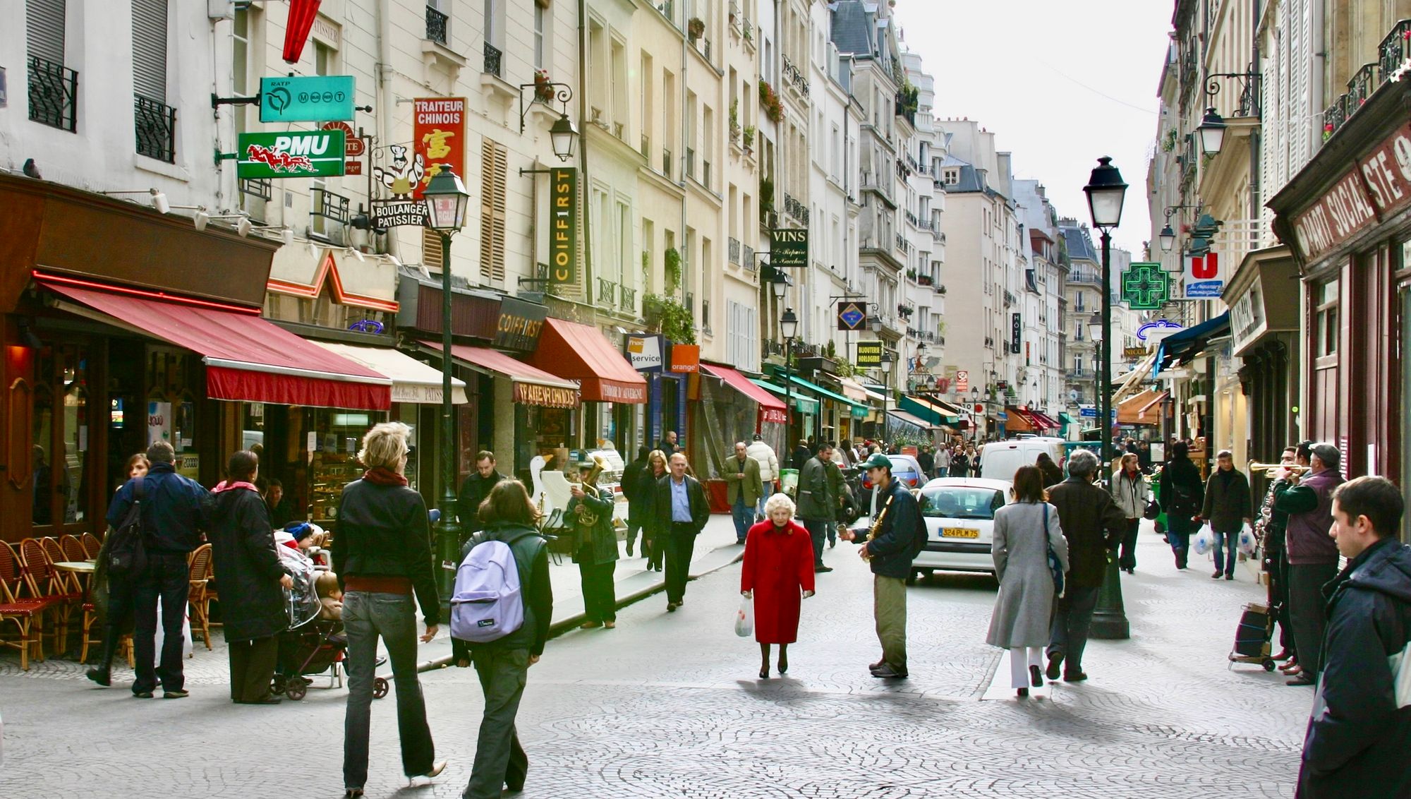
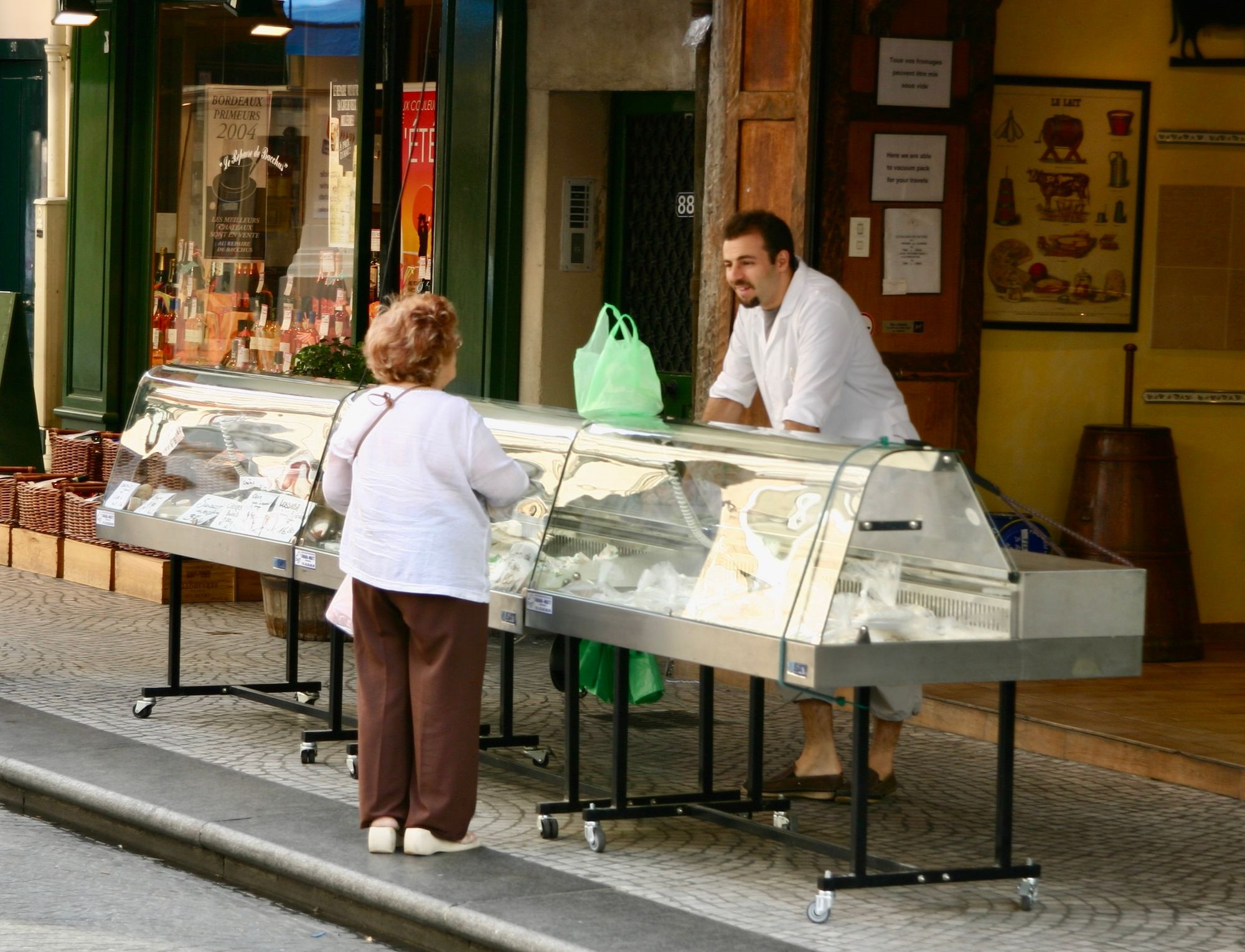
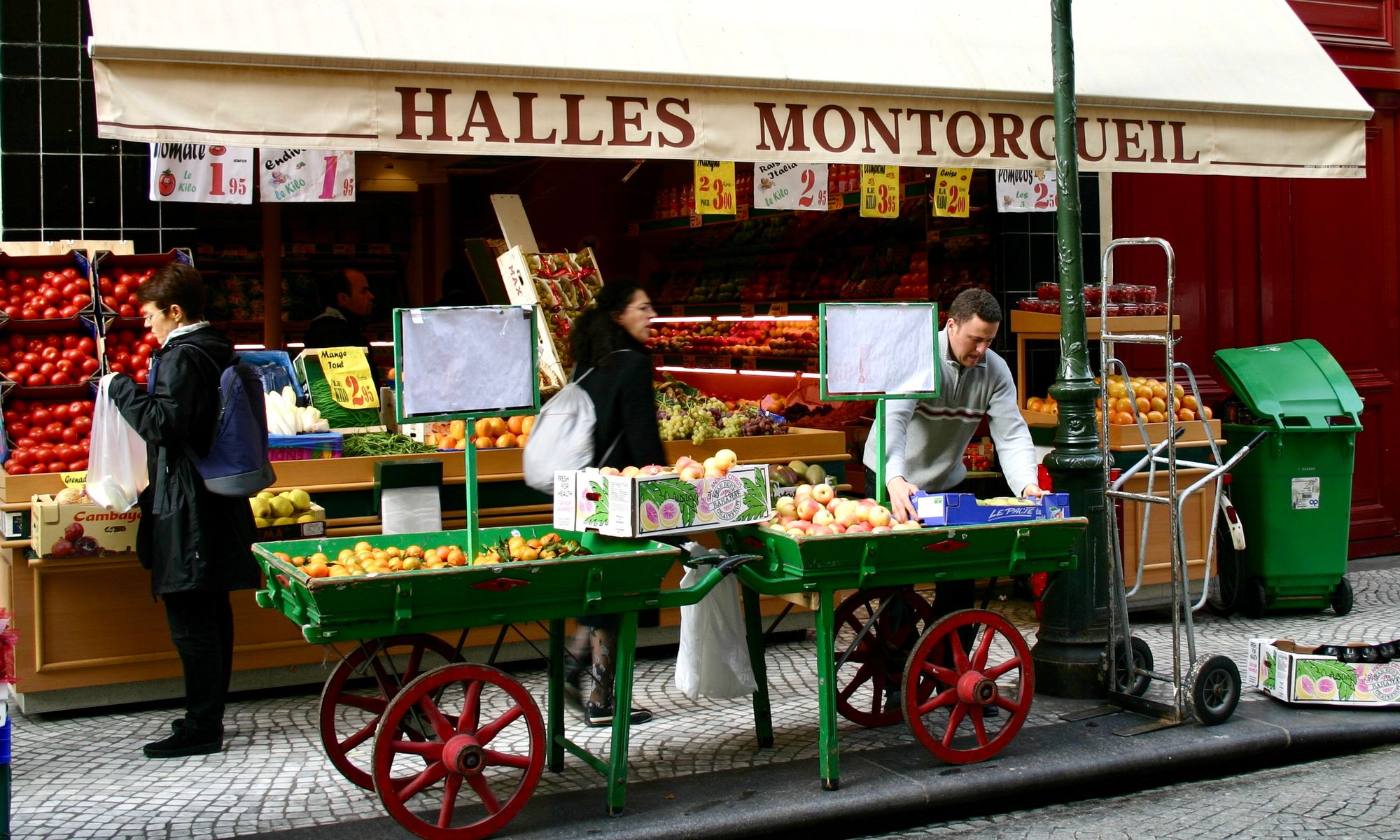
Rue Montorgueil
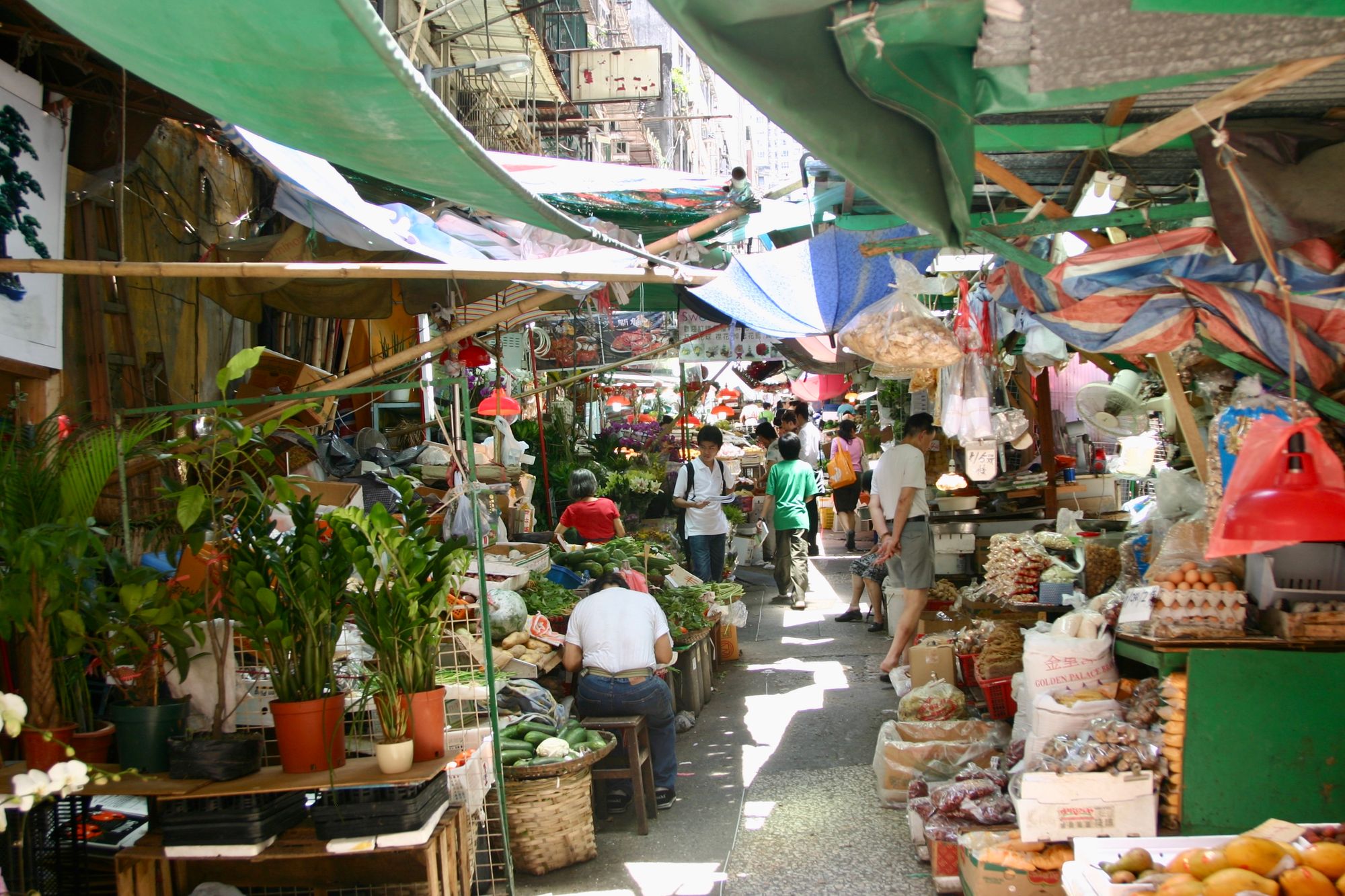
Hong Kong Street Markets
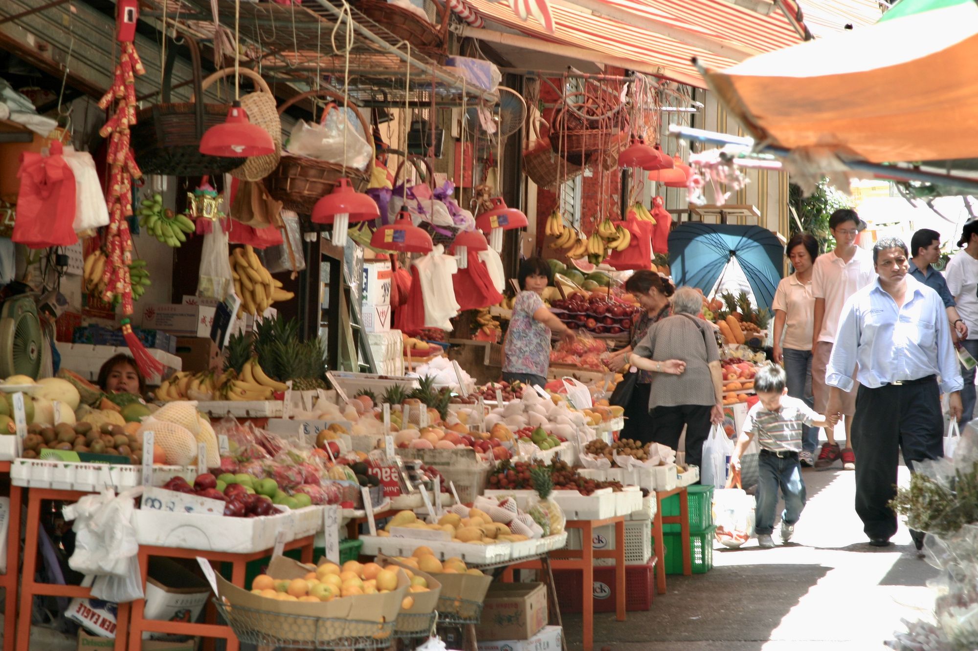
Street markets are a classic example of pulling goods outside. Their popularity powerfully demonstrates the success of doing so. Open air markets like the one below in Hong Kong are always bustling with social activity and sales.
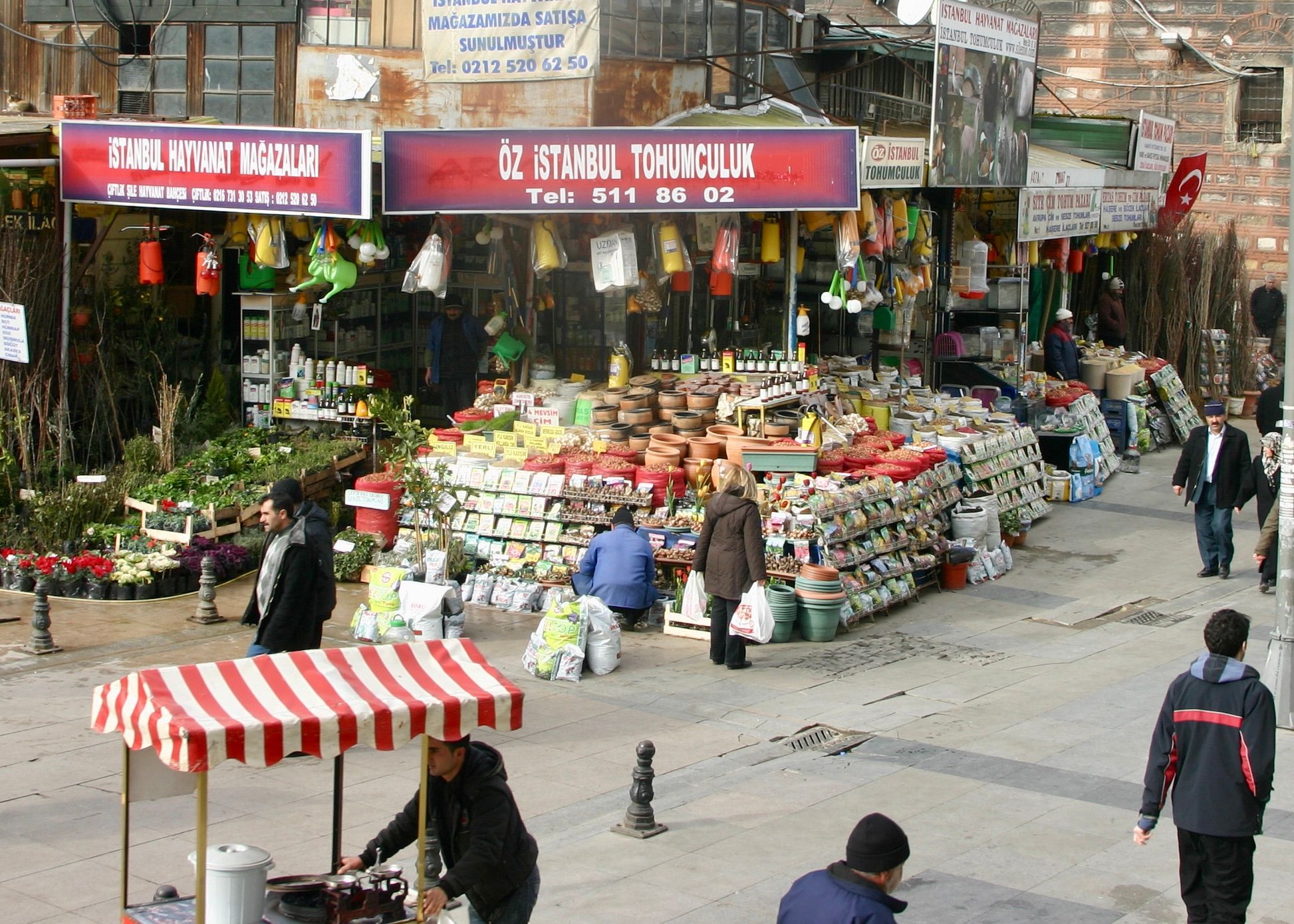
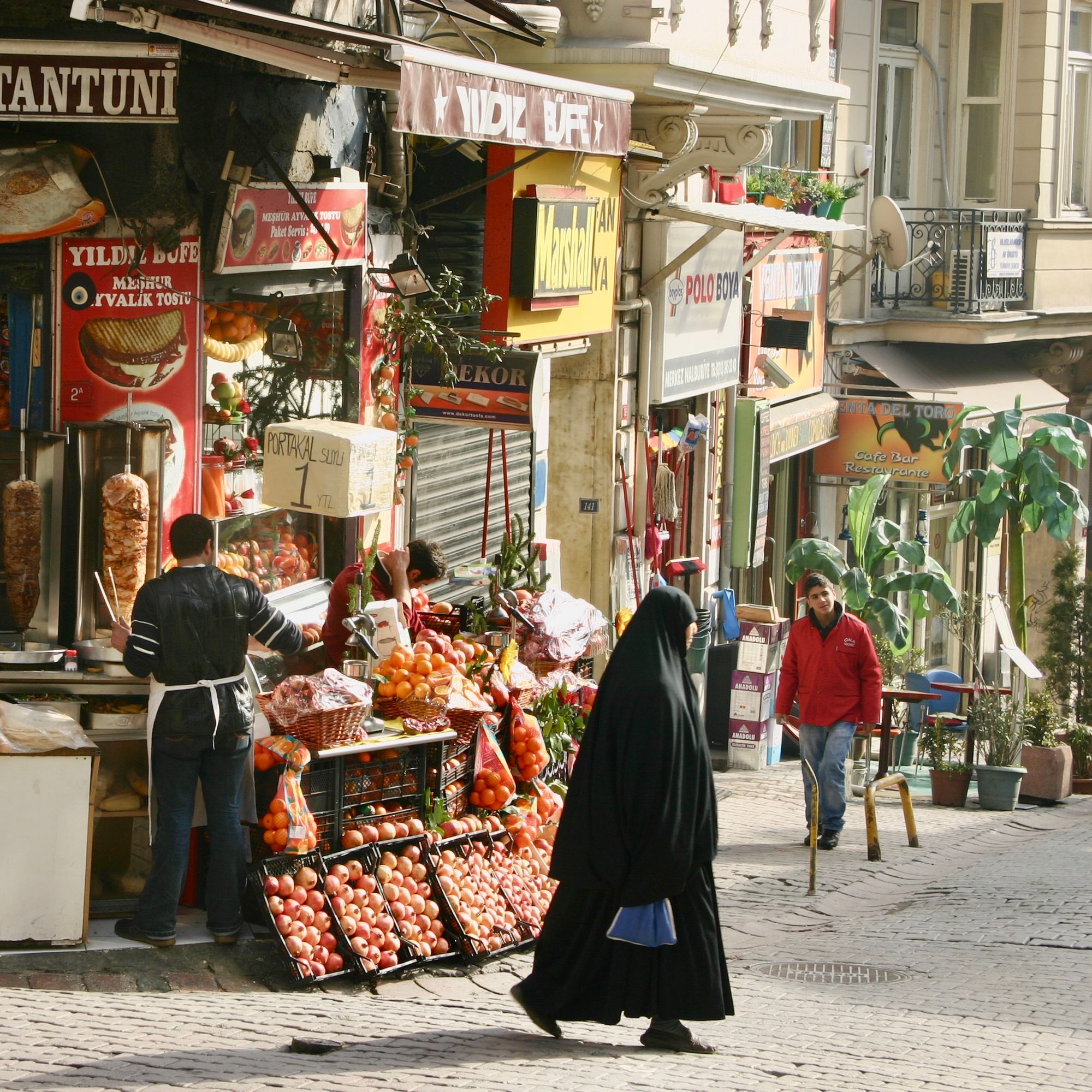
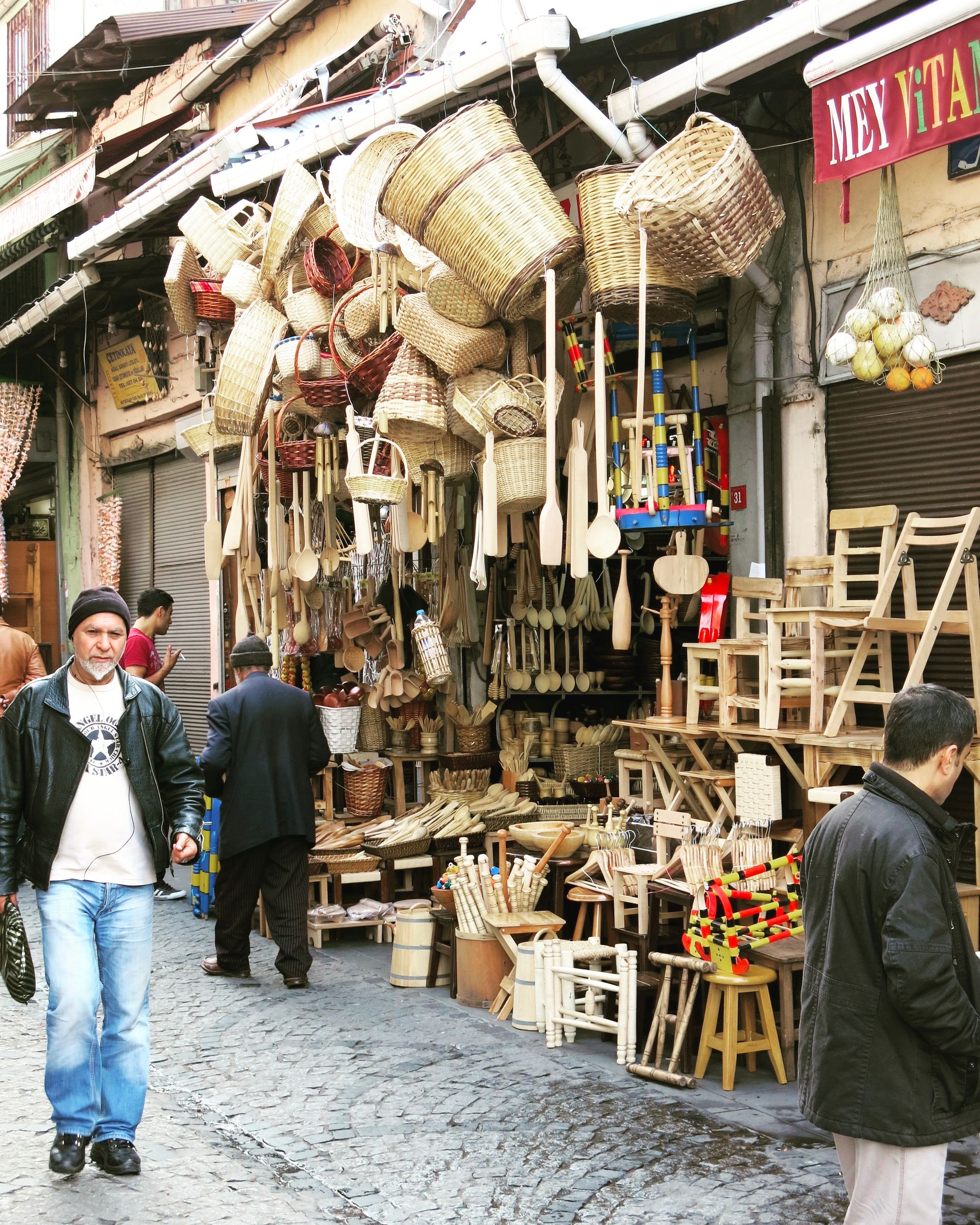
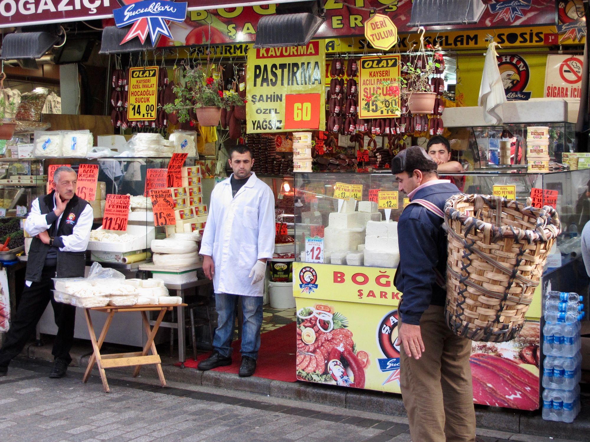
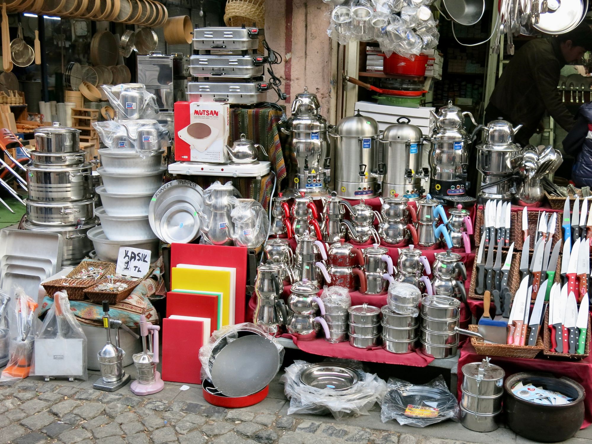
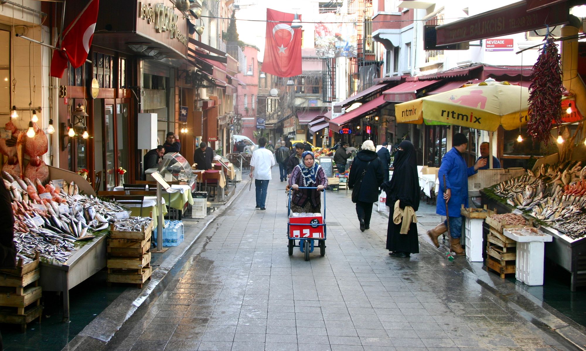
Istanbul Street Markets
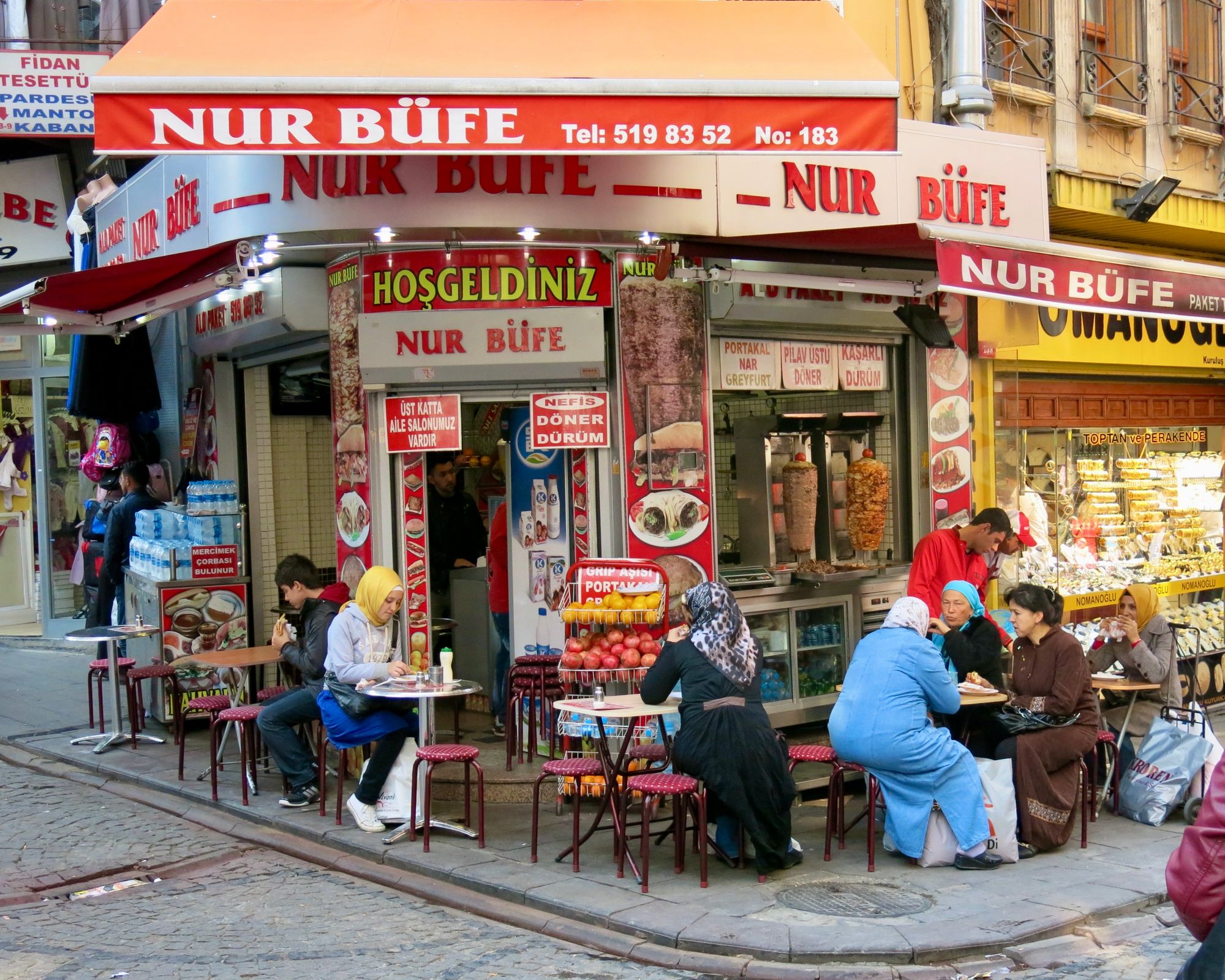
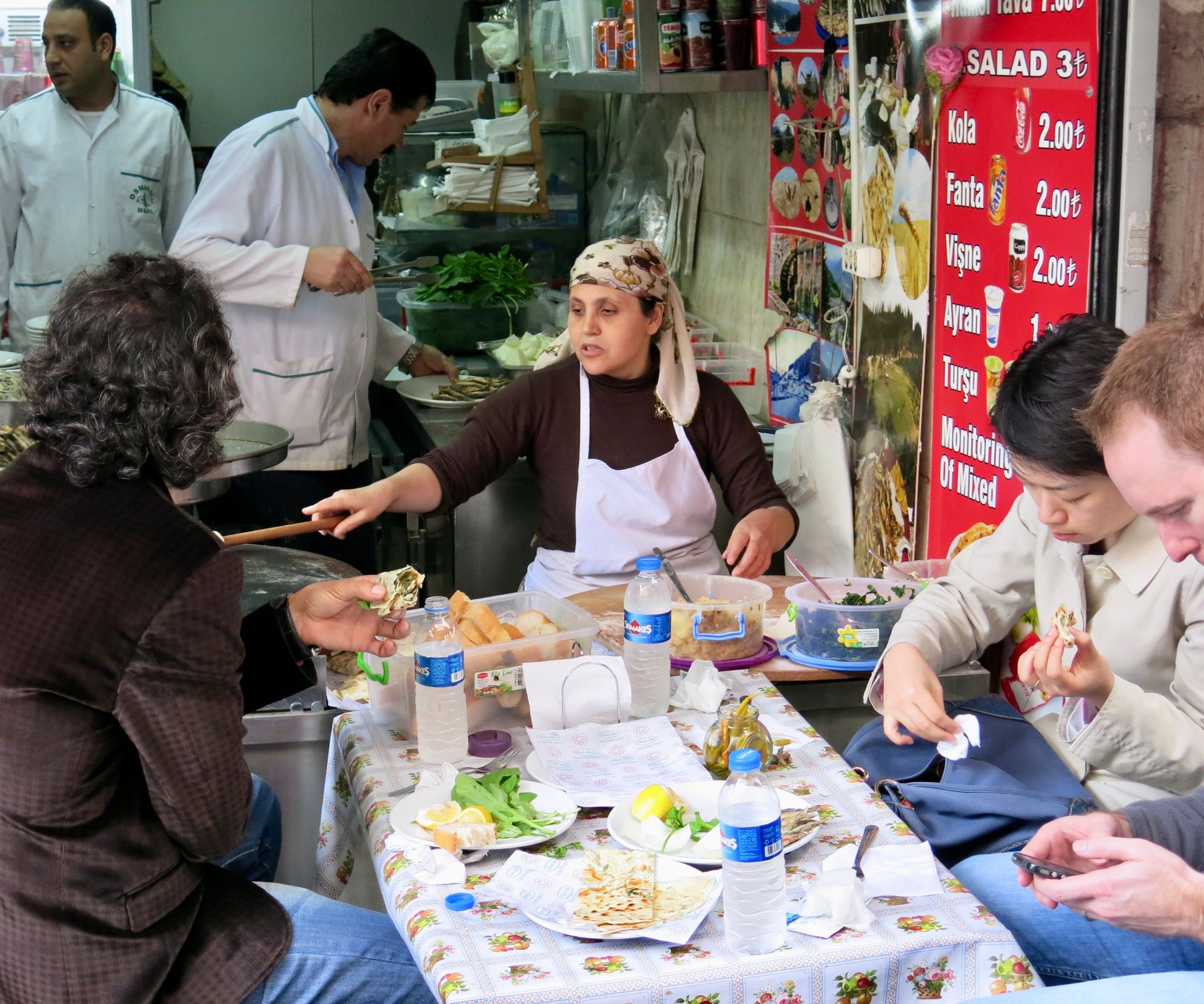
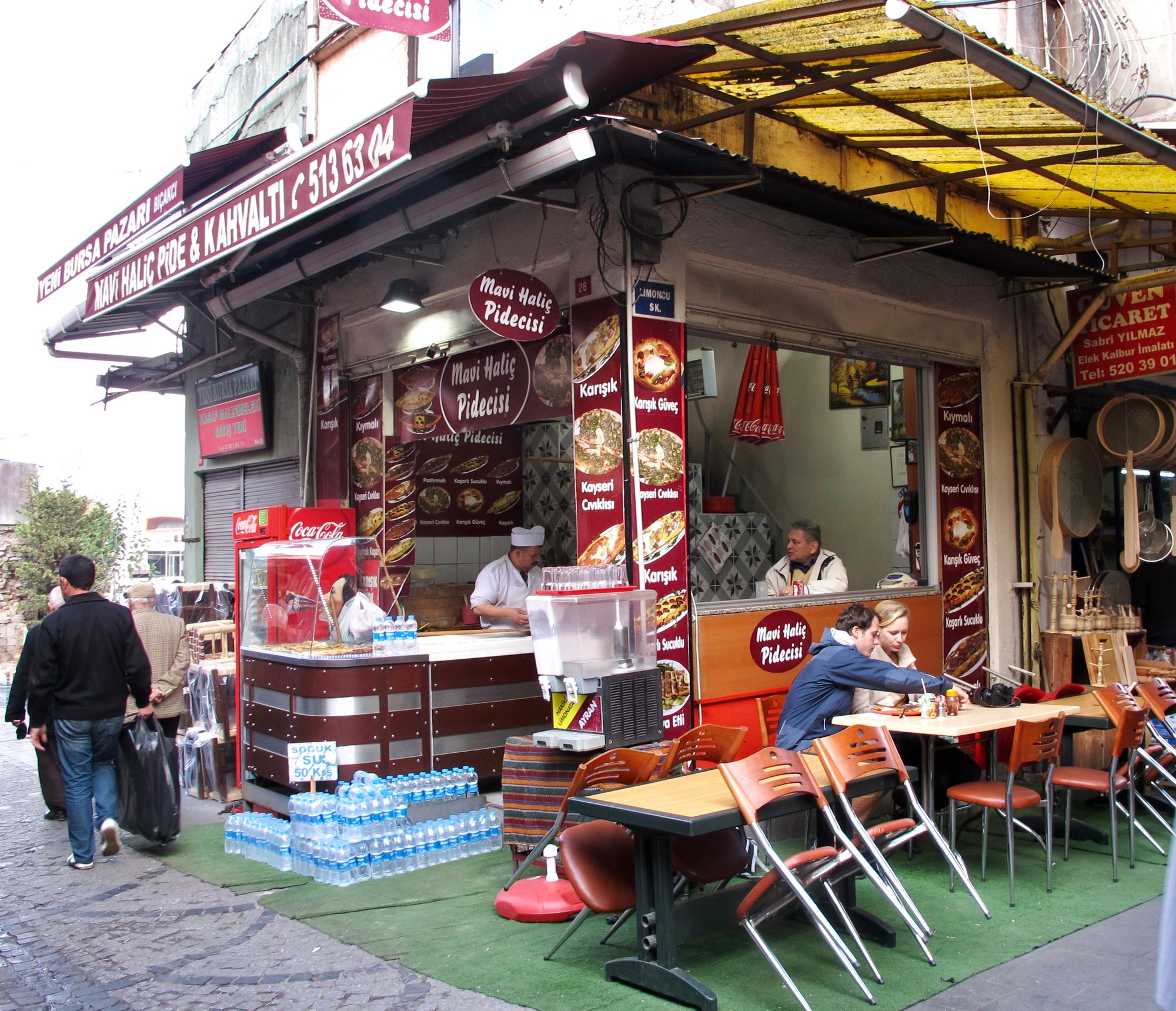
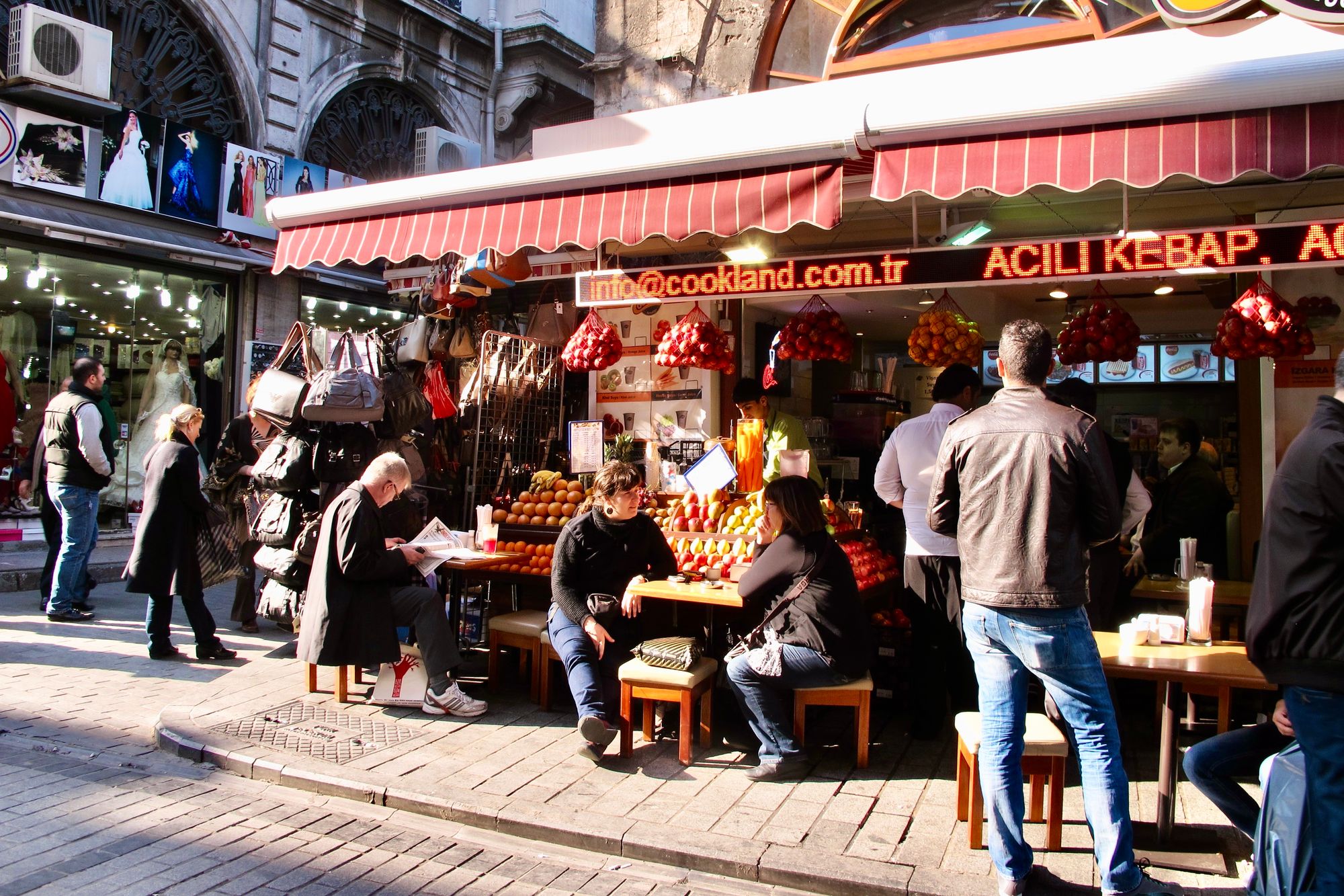
Street life thrives in the historic center of Istanbul. Middle Eastern bazaars are the epitome of exciting urban culture, with everything displayed outside on the street.
Where we went wrong
Sealed-off corporate office towers that have killed city centers around the world
"It takes real work to create a lousy place" observed our mentor, William H. Whyte. This is what we mean when we talk about over-designed places that focus too much on a particular aesthetic and not on how the place will interact with the people. This problem is very apparent in the downtowns of many big American cities.
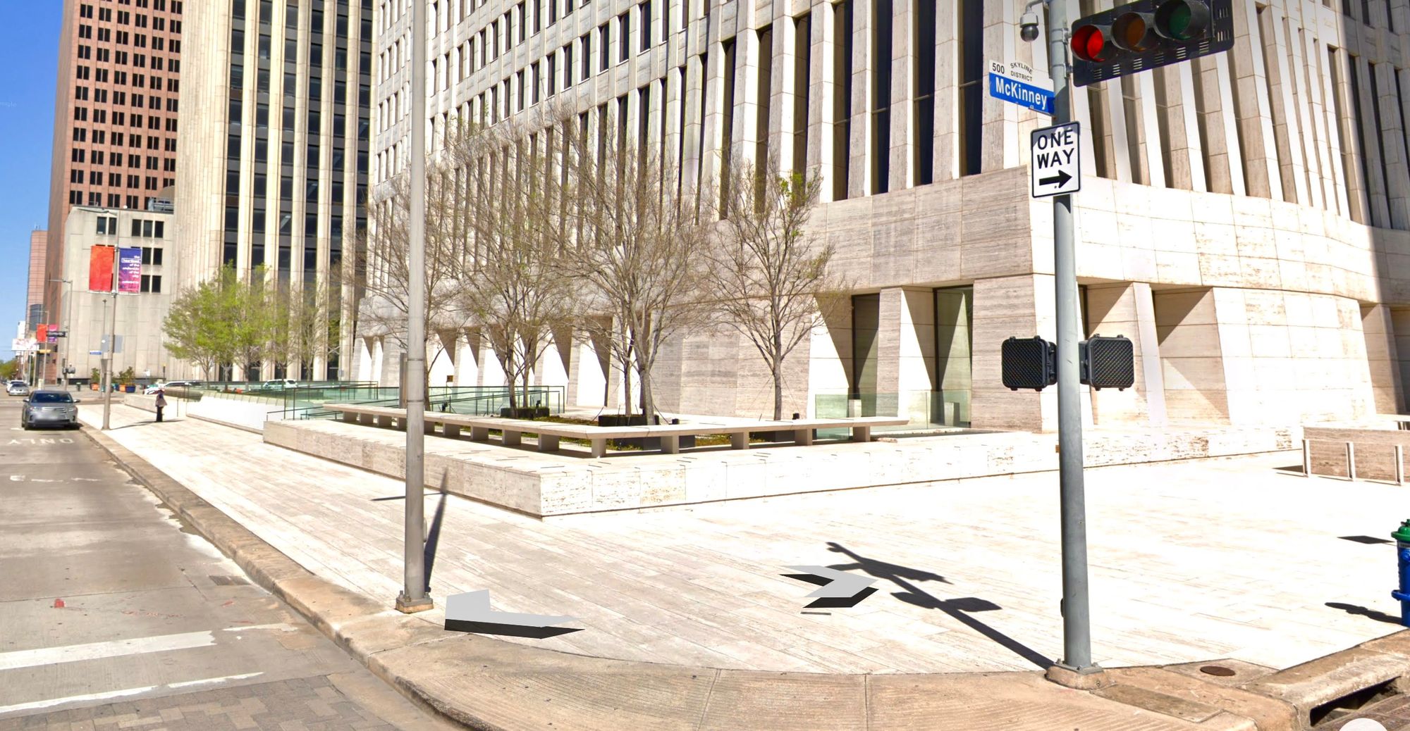
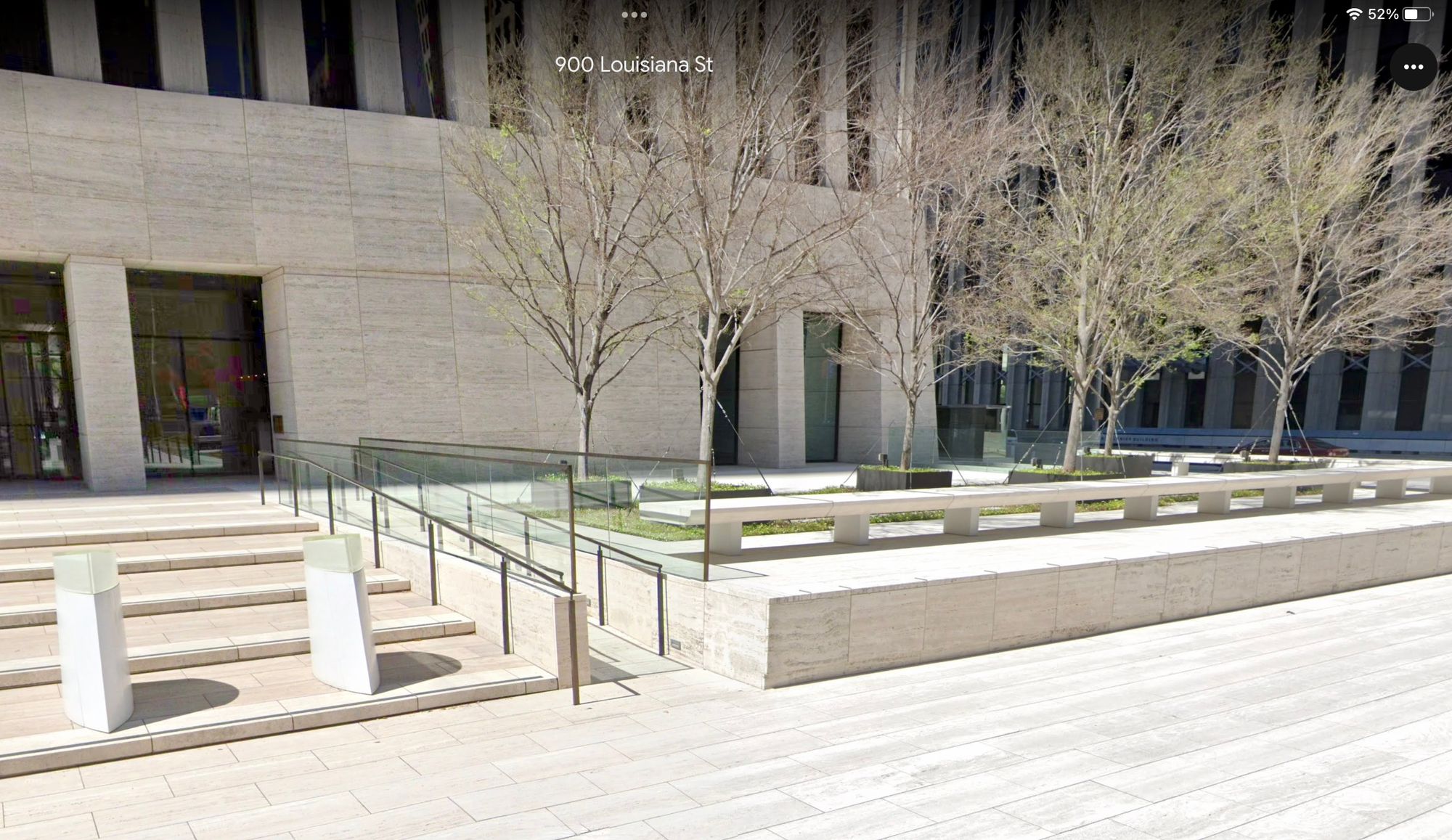
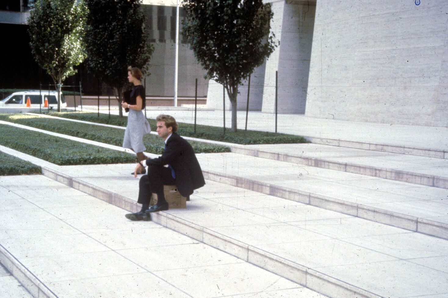
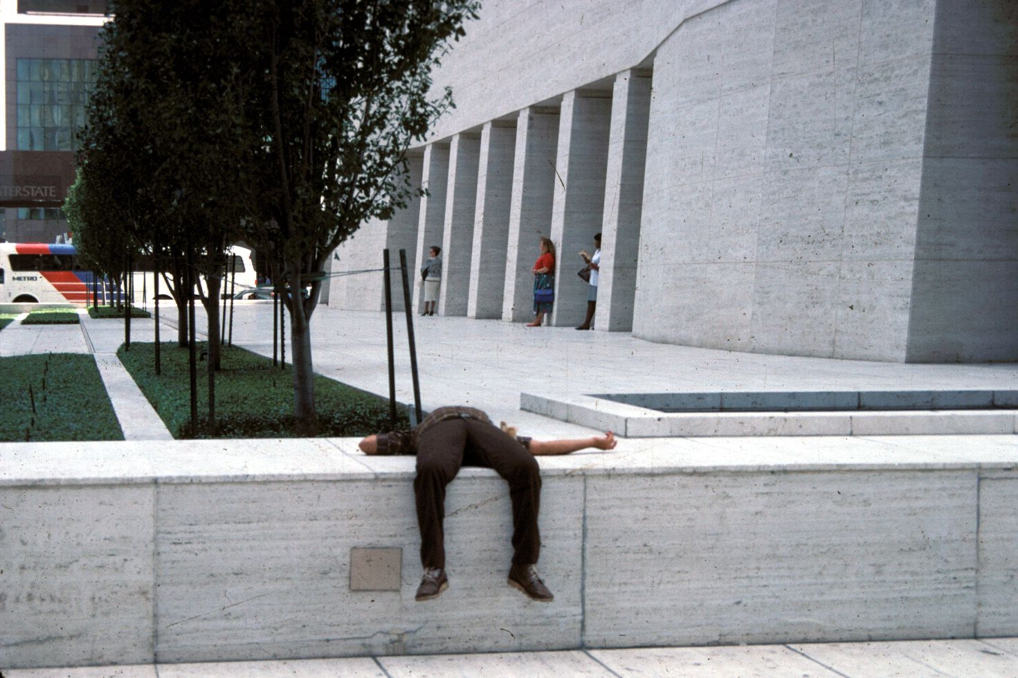
For example, in Houston, one of the worst building is the Shell Oil Building. There is no place to sit or any shade to help people escape the hot Texas sun. This plaza, designed by SOM architects, was clearly not meant to be used by people in any way. Everything about it commands us to "look but don't touch." There is no welcoming spot to sit down on and even the steps are uncomfortable to walk on. We think the designers and managers purposefully meant to keep the public away from this important corporate center in the heart of the city. It definitely looks and feels that way.
When we spoke with the architect for the building about some possible improvements, he actually put me down and asked in a derisive terms,"What do you want...quiches being sold on each corner?" In front of the building owner, Gerald Hines, I responded yes, or better yet a hot dog stand.
A place designed to make people uncomfortable
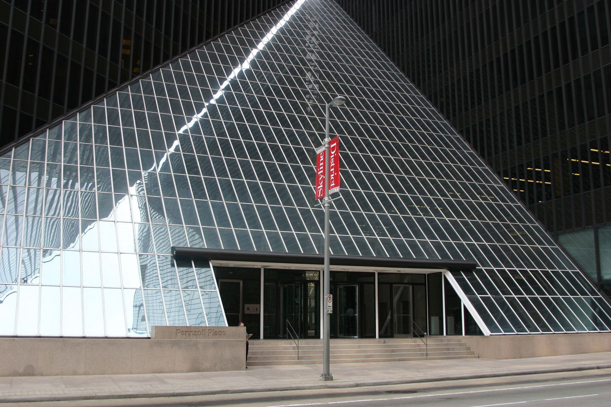
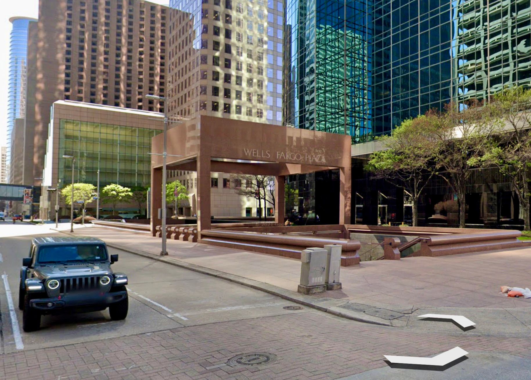
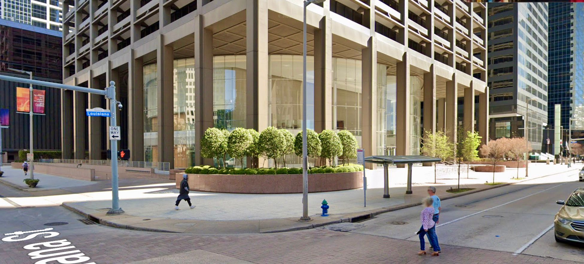
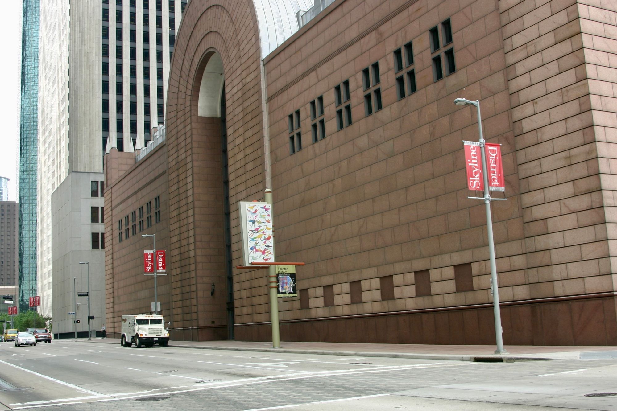
Each building below creates a street of fortress-type buildings, eliminating any sort of pleasure people might obtain from visiting the area, making them feel unwelcome and uncomfortable. All too many city cores around the world are full of this kind of lifeless/soulless building.
Takeaways
In summary, "softening" the boundary between the public and private realms by pulling the inside out carries benefits for everyone. It creates a more interesting street environment by decorating and furnishing the street with a variety of goods and experiences, it offers opportunities for people to slow down and interact with their neighbors, and it serves businesses well by pulling in customers off the street and into the store. With such a win-win arrangement, we should be doing this on streets everywhere.
- Blank walls and uninteresting storefront windows repel people, making them want to walk faster with their "heads down" so they can escape boring areas like this more quickly. That serves neither social life nor commercial activity.
- On the other hand, opening up the walls along the sidewalk and letting stores and eateries "spill onto" the streets draws people in by attracting their attention and activity.
- Putting the inside out leads to people interacting with each other as they stop to explore, leads to more success for businesses as outer displays grab the interest of potential customers, and leads to places being more appealing for visitors.
Related Articles
Further Reading
The Foundation and Future of the Placemaking Movement
"There are more and more of us fighting for a different vision of the world—a world that takes care of our most precious resources: the air we breathe, the water we drink and the places we share." - Anne Hidalgo, Mayor of Paris, France


