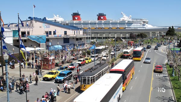
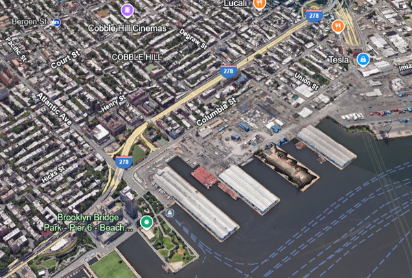
Congestion pricing offers an opportunity to reconnect Midtown Manhattan to our greatest public space
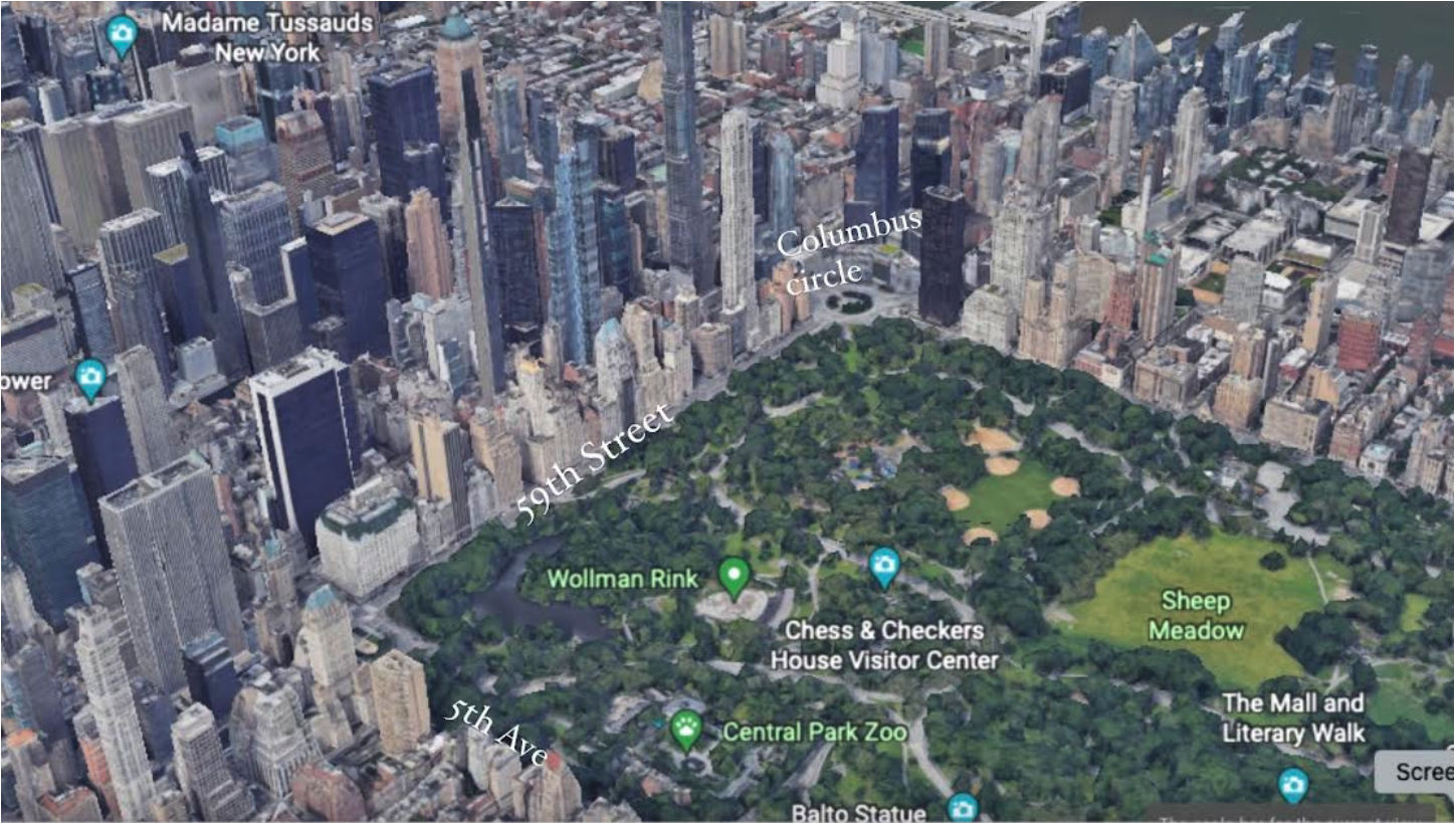
A too-wide 59th Street and the two "Killer Intersections" of Grand Army Plaza and Columbus Circle create a wall of fear and isolation between Midtown and Central Park.
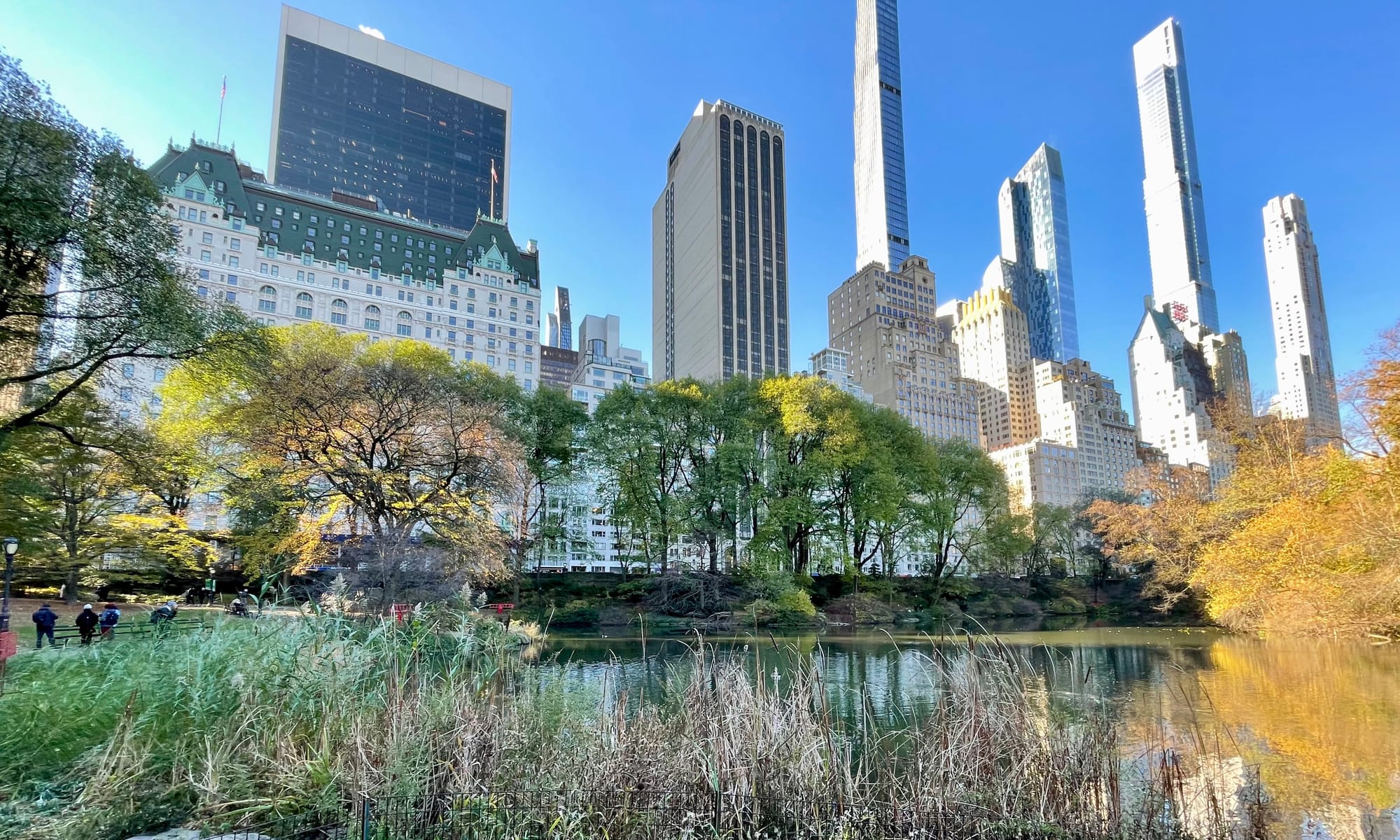
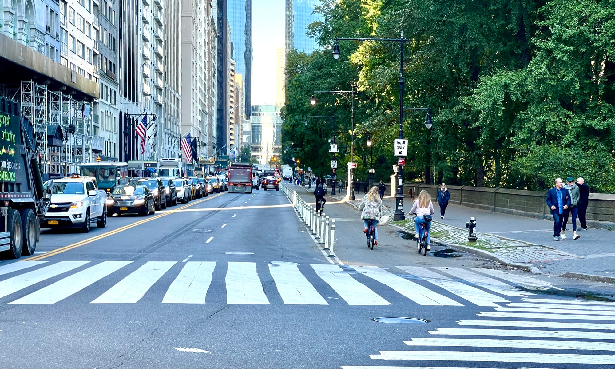
The most beautiful part of Central Park, adjacent to 59th street where one finds no character or beauty
We use the term "killer intersections" to describe intersections that are not only dangerous, but that kill social and commercial life in their vicinity because of how large and disruptive they are. We use the designation "killer" to draw attention to the devastation they have created. The sad thing is that there are many such intersections in the core of Midtown, as well as in downtown and historic Brooklyn. Most cities around the world are in a similar situation, with this type of intersection nearly always found in key places at the center of a downtown or neighborhoods, multiplying the damage they inflict.
Central Park is the most prominent destination in all of Manhattan. However, when you look at the intersections and the highway-sized streets that border it, the park feels isolated and disconnected. It feels like an island surrounded by a turbulent sea of vehicles and ugliness that doesn't belong in the heart of a city, let alone at the entrance of one of the most iconic destinations known the world over.
However, a new congestion pricing program is about to be implemented in New York City this June, and cars will be charged $15 or more for entering Midtown below 60th street, right around the entrance of Central Park. This is expected to result in 100,000 fewer vehicles entering the area every day. Because of this, we have a landmark opportunity to revitalize the heart of NYC and take this key area back from cars. This article proposes a plan for how to do so.
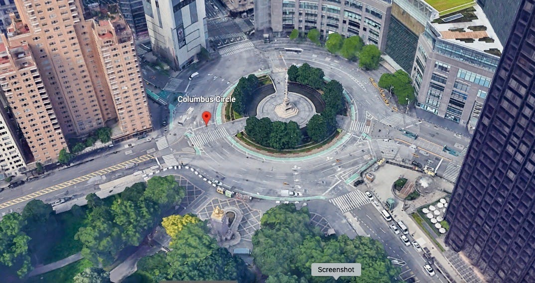
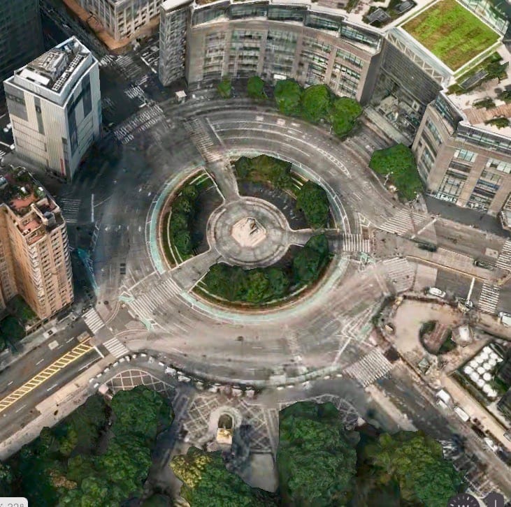
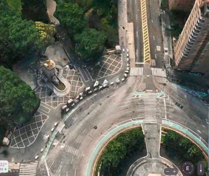
The intersection at Columbus Circle is one of the most hostile places in the city. Each road coming into the circle expands with extra turn lanes, creating situations at each corner that are hostile and uninviting because the experience of the car is a priority over that of the pedestrian or cyclist. When entering or leaving the circle, one is faced with sidewalks that are narrow and lanes that are often wider than 25 feet to reduce the friction which would be caused by slowing down vehicle speeds...Pedestrians in this area have to cross an absurd 7-10 lanes just to get from one side into the park. That all adds up to a dangerous intersection.

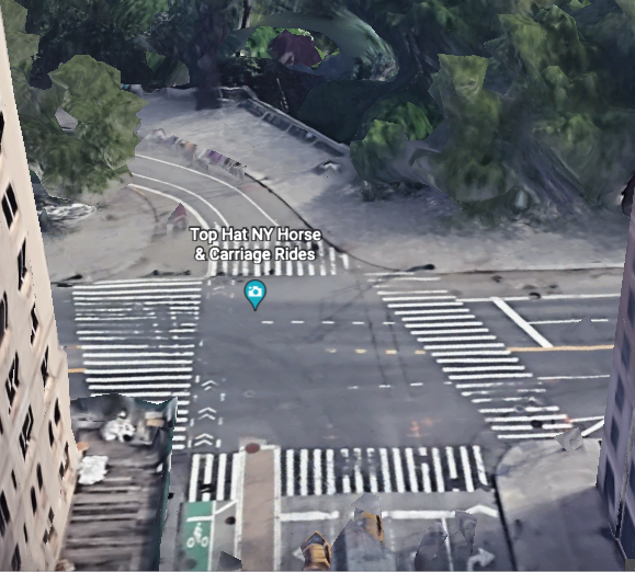
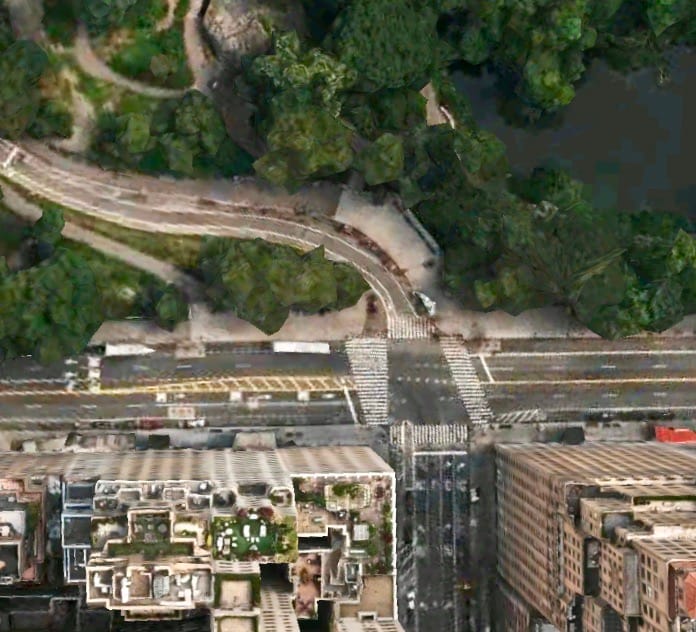
The emphasis on expanded intersection and narrow sidewalks extends al the way to Grand Army Plaza
The south end of the park that borders Midtown has very little appeal and presence. The corridors that lead up to Central Park are noisy and chaotic. Traffic dominates the entrances into the park and the gateways into upper Manhattan. Roads coming into and out of Grand Army Plaza and Columbus Circle are practically highways of at least 6 lanes, separating Midtown from Central Park and the upper neighborhoods. None of this creates an environment that celebrates the park or welcomes people into it.
Central Park Entrances and Streets – Connecting to Midtown
The area of Midtown Manhattan that connects to Central Park is one of those key places that exposes how deeply the transportation profession has negatively impacted the most important parts of our cities. It is a case study in how terrible intersections are front and center, wreaking havoc even in the places we consider most valuable and precious.
Instead of highlighting and celebrating the world-famous treasure of Central Park, using design choices to invite people in and facilitate visitation, the city has suffocated it with traffic. Accessing it has become a difficult and dangerous obstacle course. The good news is that this area also presents the greatest opportunity for seeding change in the city because improvements here would ripple outwards in powerful ways.
Historic images of 59th Street, Columbus Circle and Grand Army Plaza
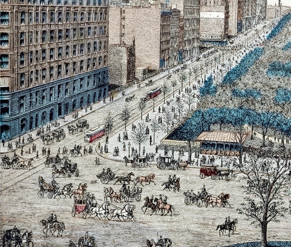
Before we can create a plan for the future, we need to look at the past, as what was once a reality can inspire what we want for our future. The borders of Central Park used to be vibrant public places where people would enjoy strolling and weaving in and out of the park easily from within the city.
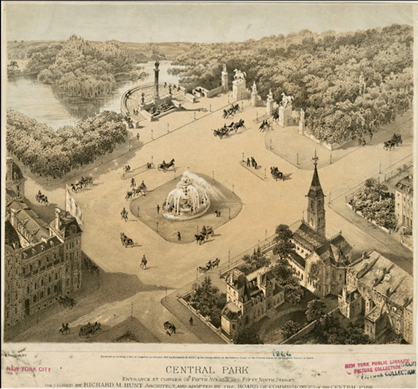
From the New York Public Library: https://digitalcollections.nypl.org/items/5e66b3e8-c6cb-d471-e040-e00a180654d7
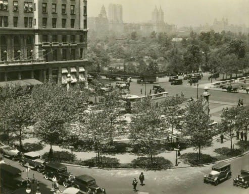
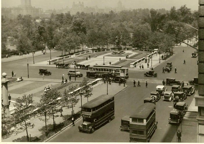
Source: https://digitalcollections.nyhistory.org/islandora/object/nyhs%3A25757 & https://digitalcollections.nyhistory.org/islandora/object/nyhs%3A25770
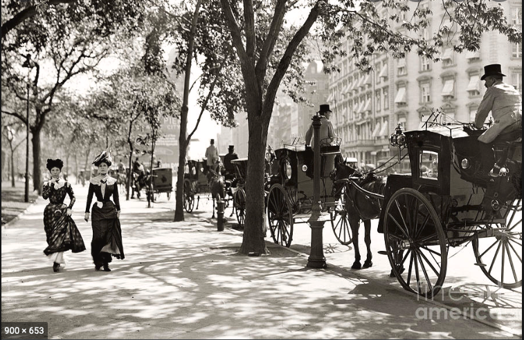
Nowadays, these borders are overwhelmed by walls of traffic and the flurry of unpleasant sounds and smells that cars carry, making them hostile places to linger in and blocking access into the park.
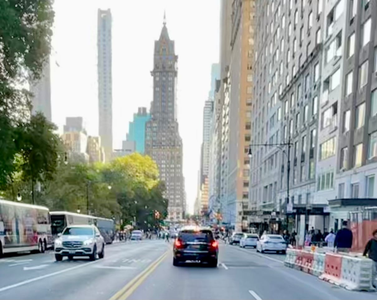
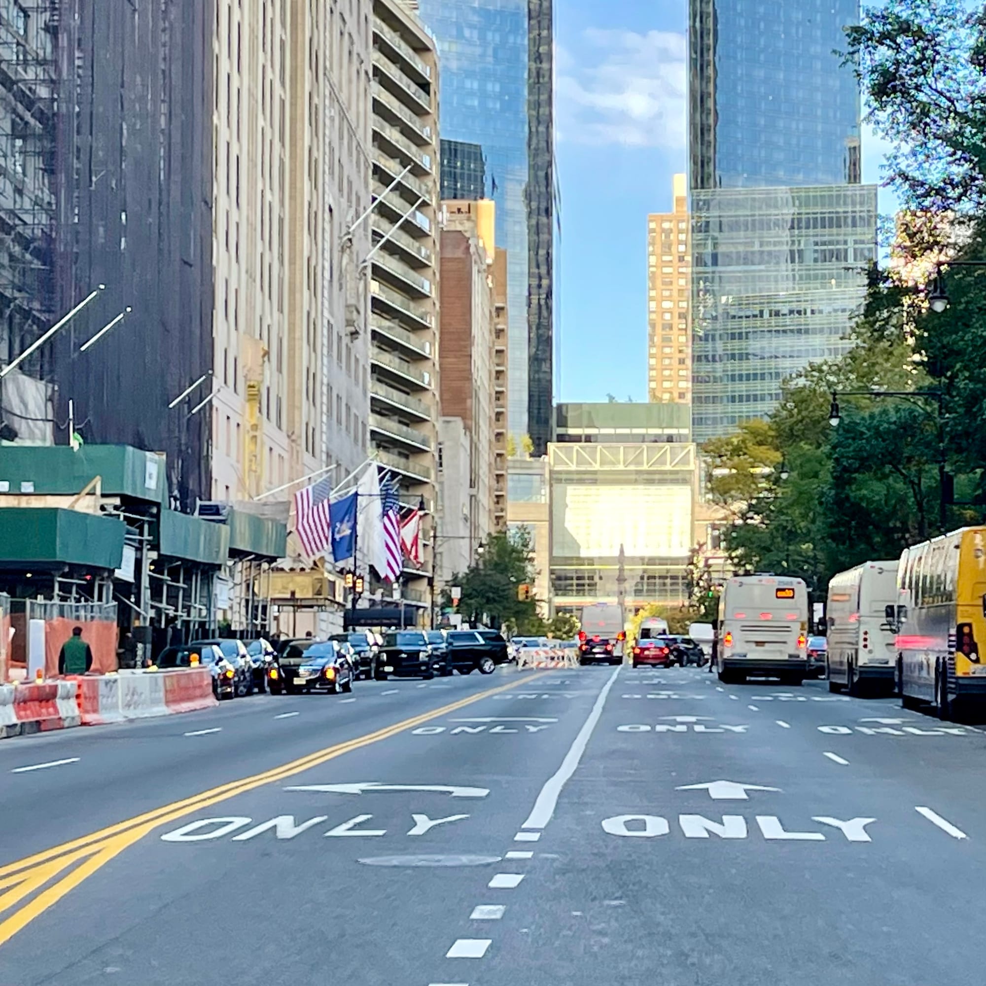
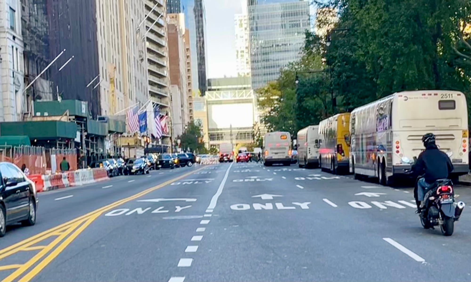
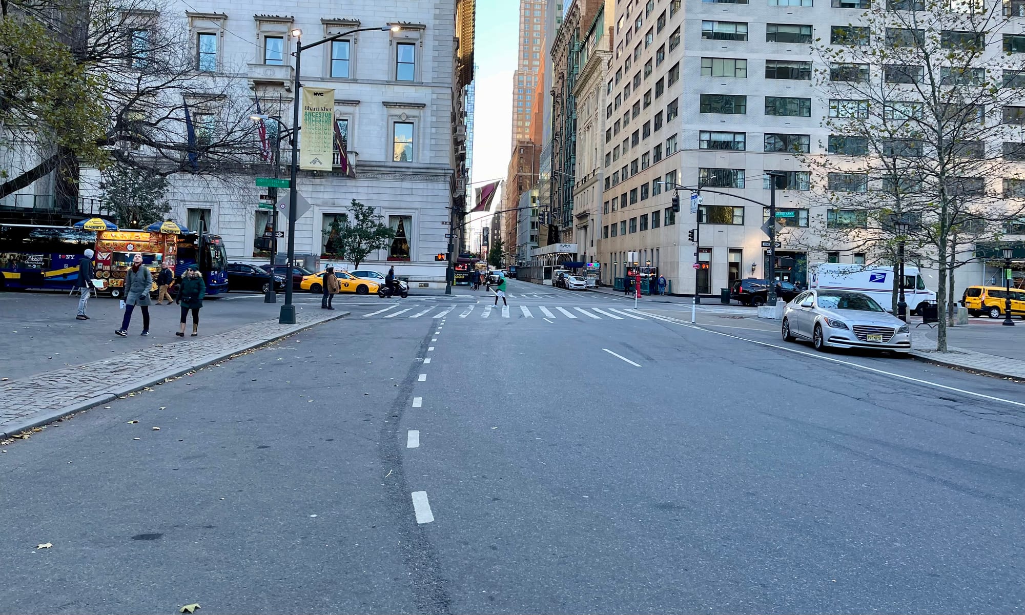
59th Street Today
Columbus Circle
One of the entrances into Central Park – Columbus Circle – is more like an intersection for three highways than a gateway into one of the most popular neighborhoods (Upper West Side) and biggest assets (Central Park) the city has. It is an isolated island in a turbulent ocean of traffic. As a result, it sends a strong message "No People Wanted Here."
Every road into and out is at minimum 6 lanes. The crosswalks do not lead you to any desired destination. They deliver you to the center of 59th Street and Broadway north, where one has to cross another wide, anxiety provoking, multi-lane road, making for a record seven lanes of traffic that need to be traversed just to enter Central Park. The central circle is merely a pass-though; it is in no way the destination that this key location deserves. Not only that, but it is a life threatening experience to navigate this area on foot and stressful to do so by car. It works for nobody.
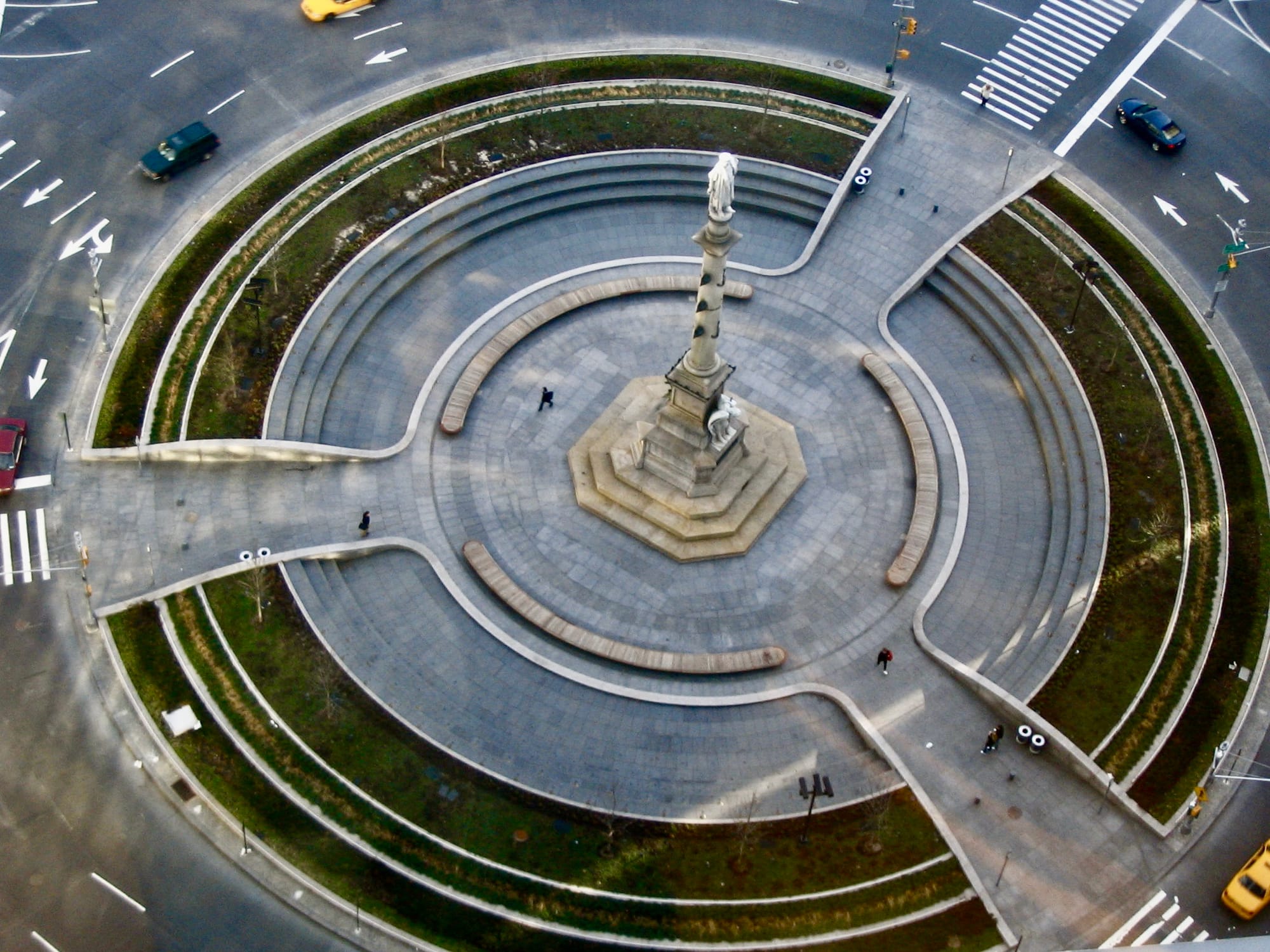
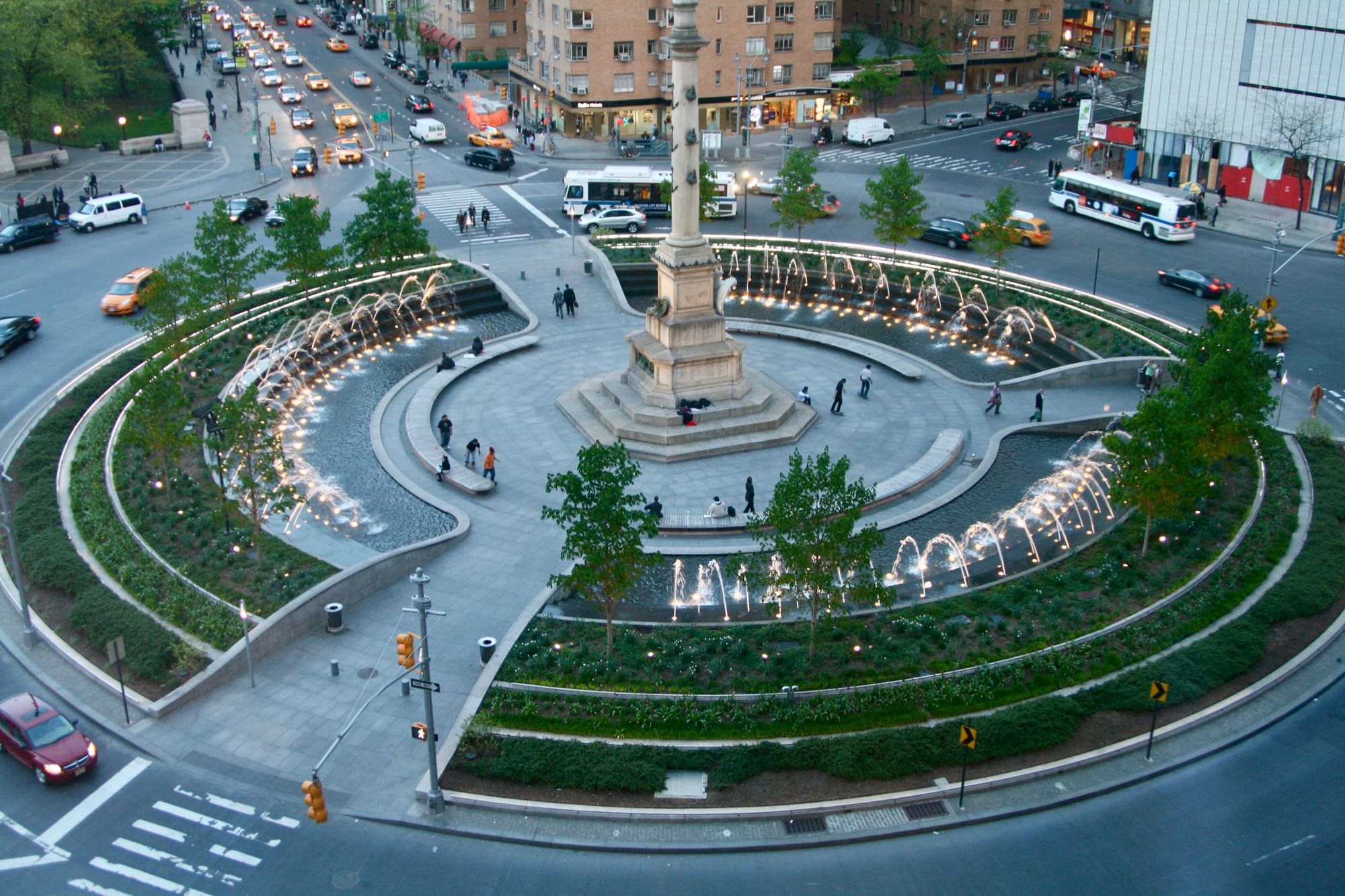
Images 2005 and 2008
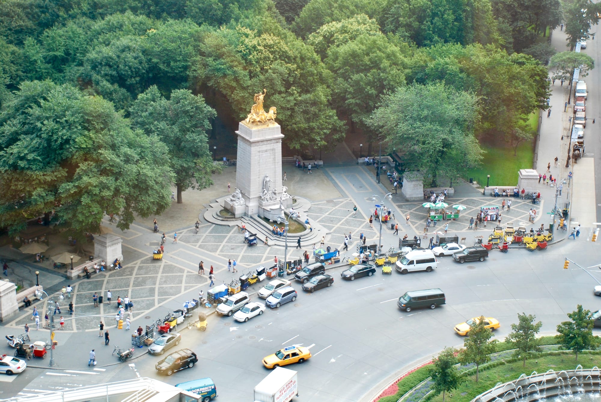
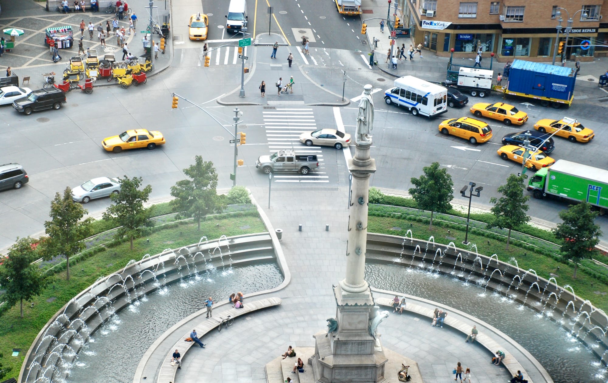
Columbus Circle could have the public spaces around it expanded through a narrowing of the lanes from 6 to 3 and expanding its sidewalks. A direct entrance into Central Park should be easily accessible and spotlighted. Below are some great examples that can inspire this transformation.
Benchmarks for Columbus Circle
Logan Circle in Philadelphia
Logan Circle in Philadelphia has a similar traffic circle. A vision we put together when we led Project for Public Spaces added crosswalks to the circle, leading into and out of most of the streets around it and thus making it a key connector between a number of desired destinations. Connectivity is important for any central destination of this sort.
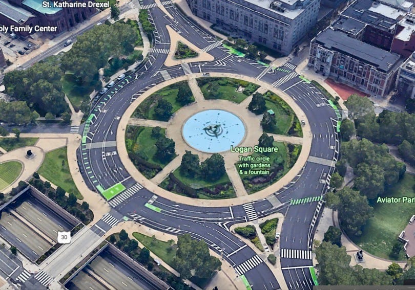
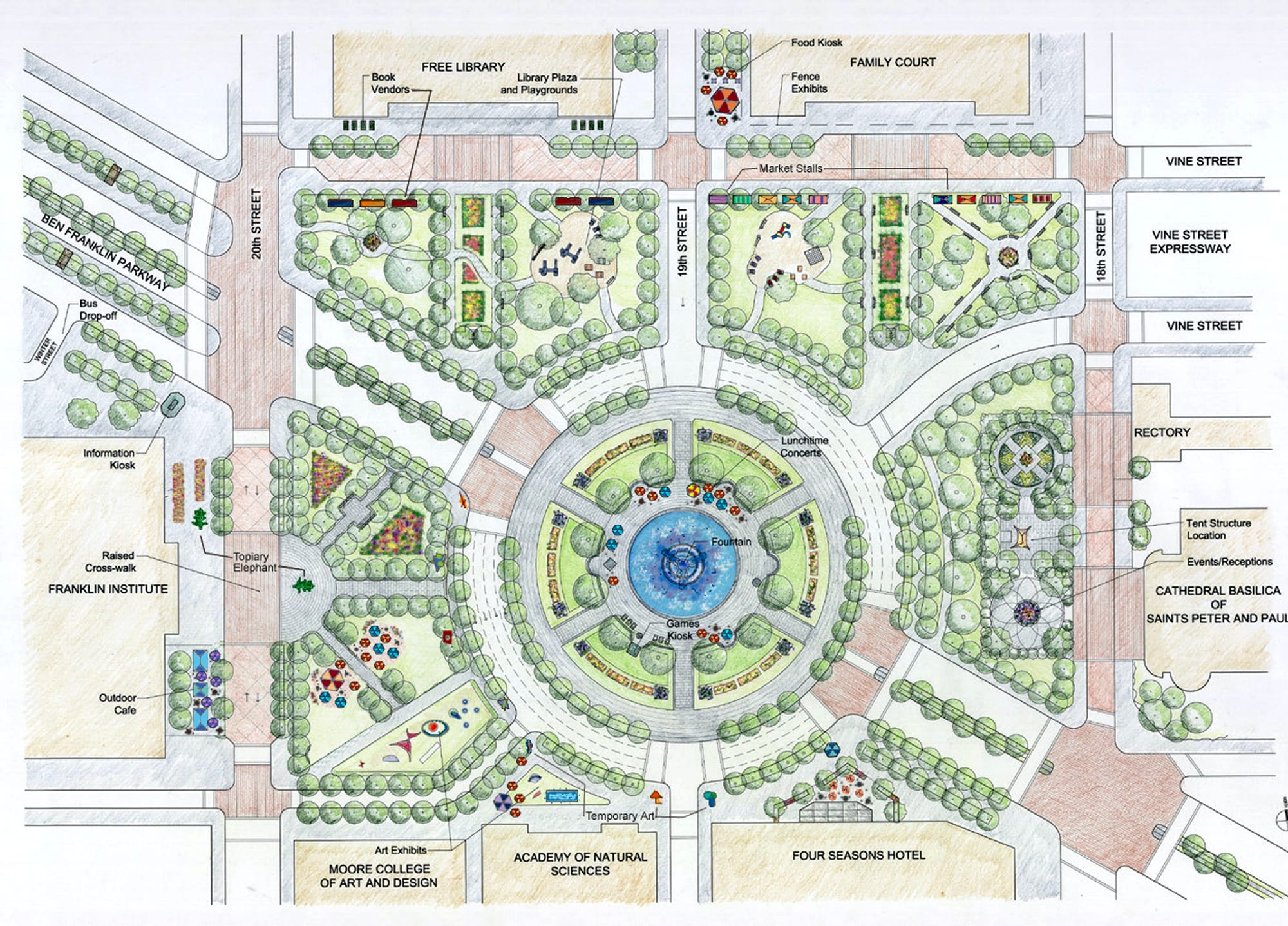
The existing Logan Circle in Philadelphia and our earlier proposal
Place de la Nation in Paris
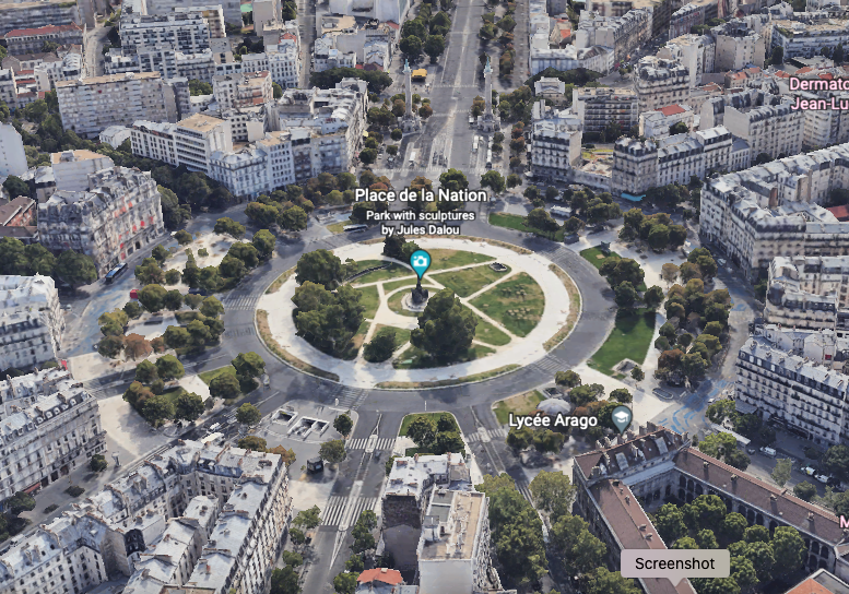
The Place de la Nation in Paris is not just a traffic circle, it's a public park. It has numerous trees, art, pavilions, benches, places to picnic, etc. In other words, it's a place where people want to end up, not just somewhere they need to pass through. This is what a central intersections like Columbus Circle needs to be.
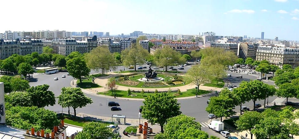
Place de la Nation has few lanes around it and sidewalks in places where pedestrians need and want them. Despite being a massive intersection, it still feels like a place designed for people.
Place d'Italie
Place d'Italie has less going on than Place de la Nation, but it is still a worthy example that can inspire Columbus Circle. It is sized like a small park and has a lovely fountain serving as its focal point and seating around it where people can rest and recharge.
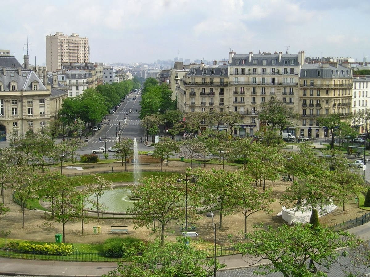
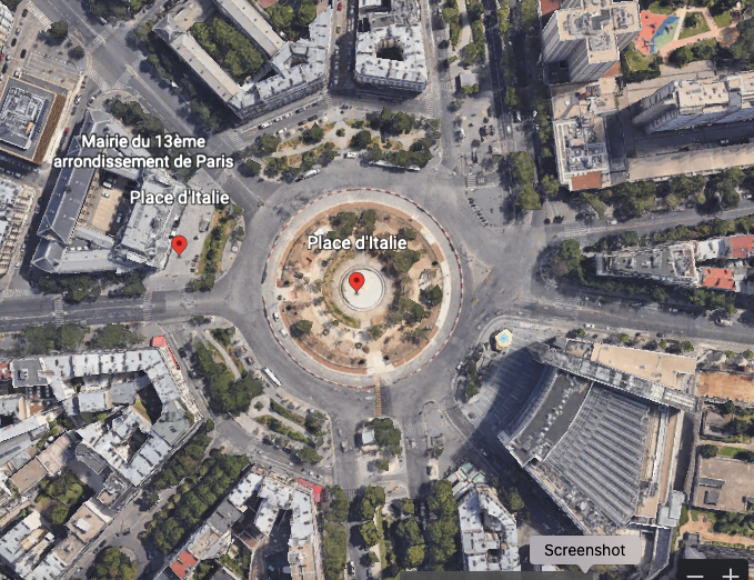
Place d' Italie has a lot going on in the middle, a ring road in parts and fewer lanes in the central circle
Grand Army Plaza
Historically, Central Park had an entrance into it that set up many opportunities to arrive in splendor.
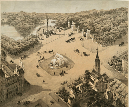

What we have today is just a mass of conflicting uses and knotted streets around it that block any sense of the magnificent asset lying past its walls. This does not do our great park justice.
For all intents and purposes, the area around Grand Army Plaza and Pulitzer Fountain is dead. There is a beautiful fountain and sculpture, yes, but people don't hang around. They stop to take a picture then quickly move along. This is no surprise considering there's no pleasure in being here. These small squares are choked by multiple lanes of traffic with all the car smells and sounds that multiple lanes create, and they offer nothing to the experience of being here apart from their two lonely focal points.
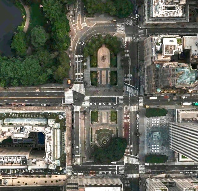

These historical focal points are visited by millions every year, but they are located in a sea of asphalt and traffic
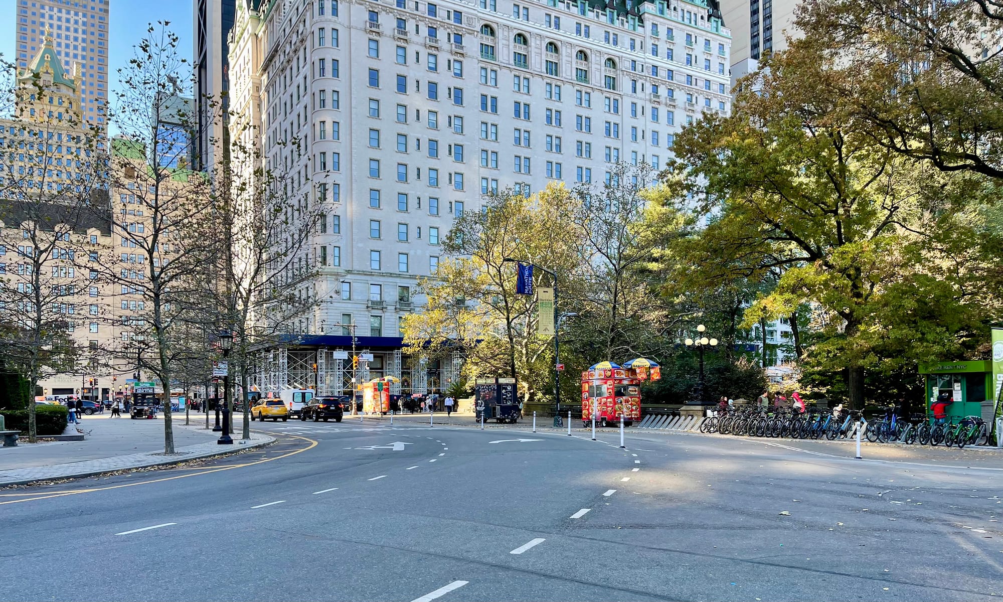
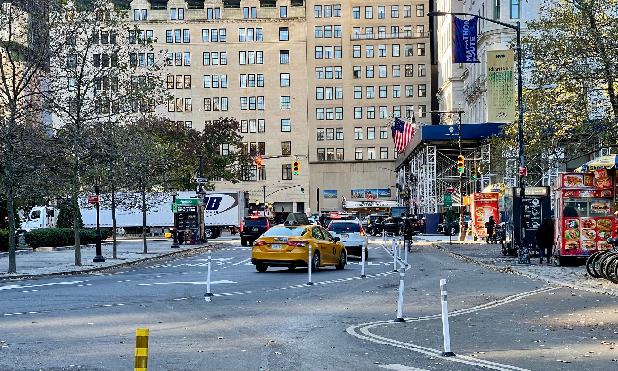
Grand Army Plaza is a terrible midway stop for anyone going to the Upper East Side or into Central Park. No matter what direction you arrive from, the number of lanes in this area is excessive, helping vehicles move through easily at the expense of the pedestrian and cyclist experience.
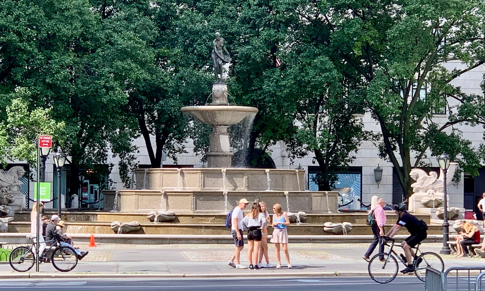
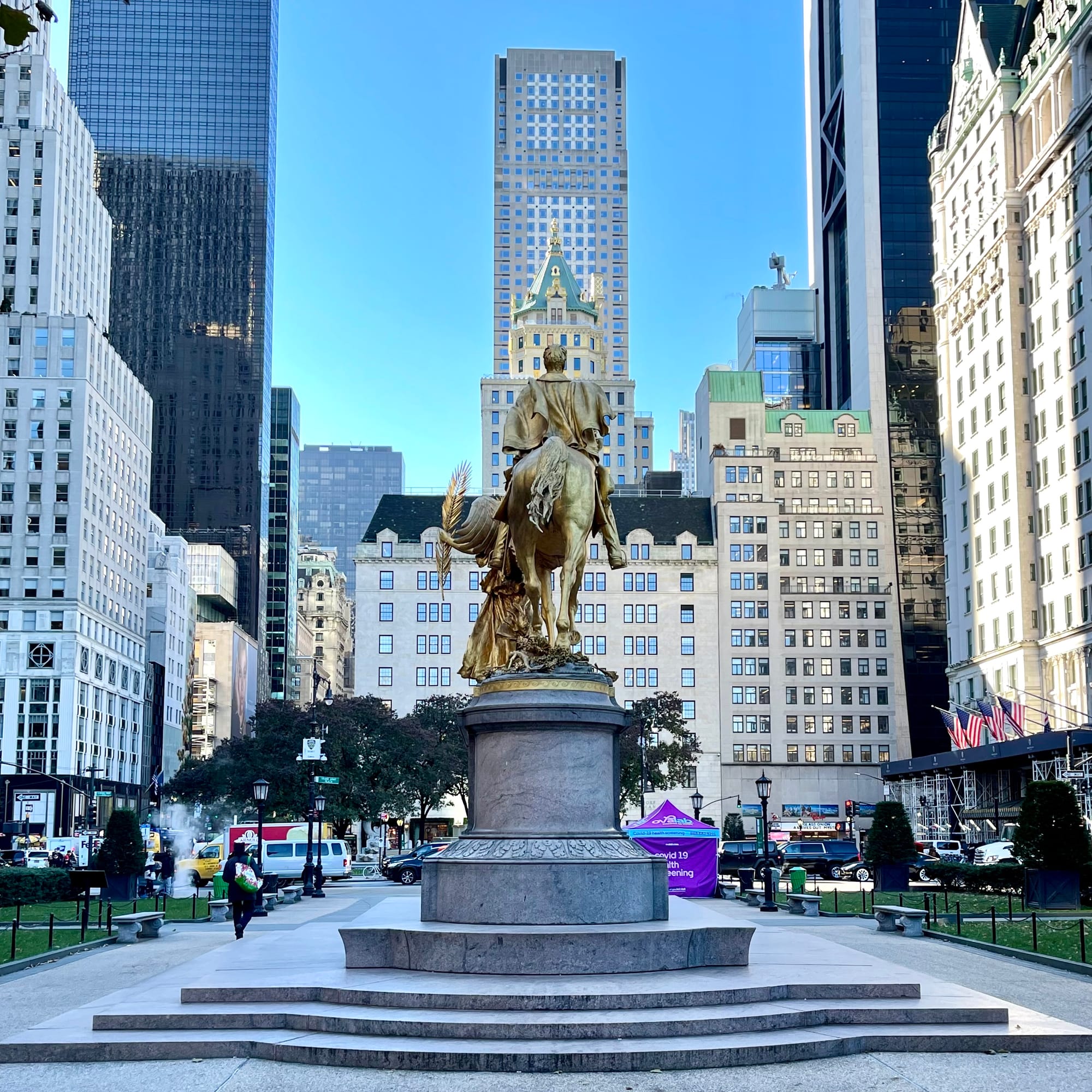
The outside ring of the park is made up of too narrow sidewalks and the entrances into the park offer no sense of arrival. Getting into the park feels like an obstacle course.
Bike racks at the entrances to both the Plaza Hotel and Central Park should not be there. Bikes are a great transportation option, but their storage should not create a barrier to important entrances and passageways.
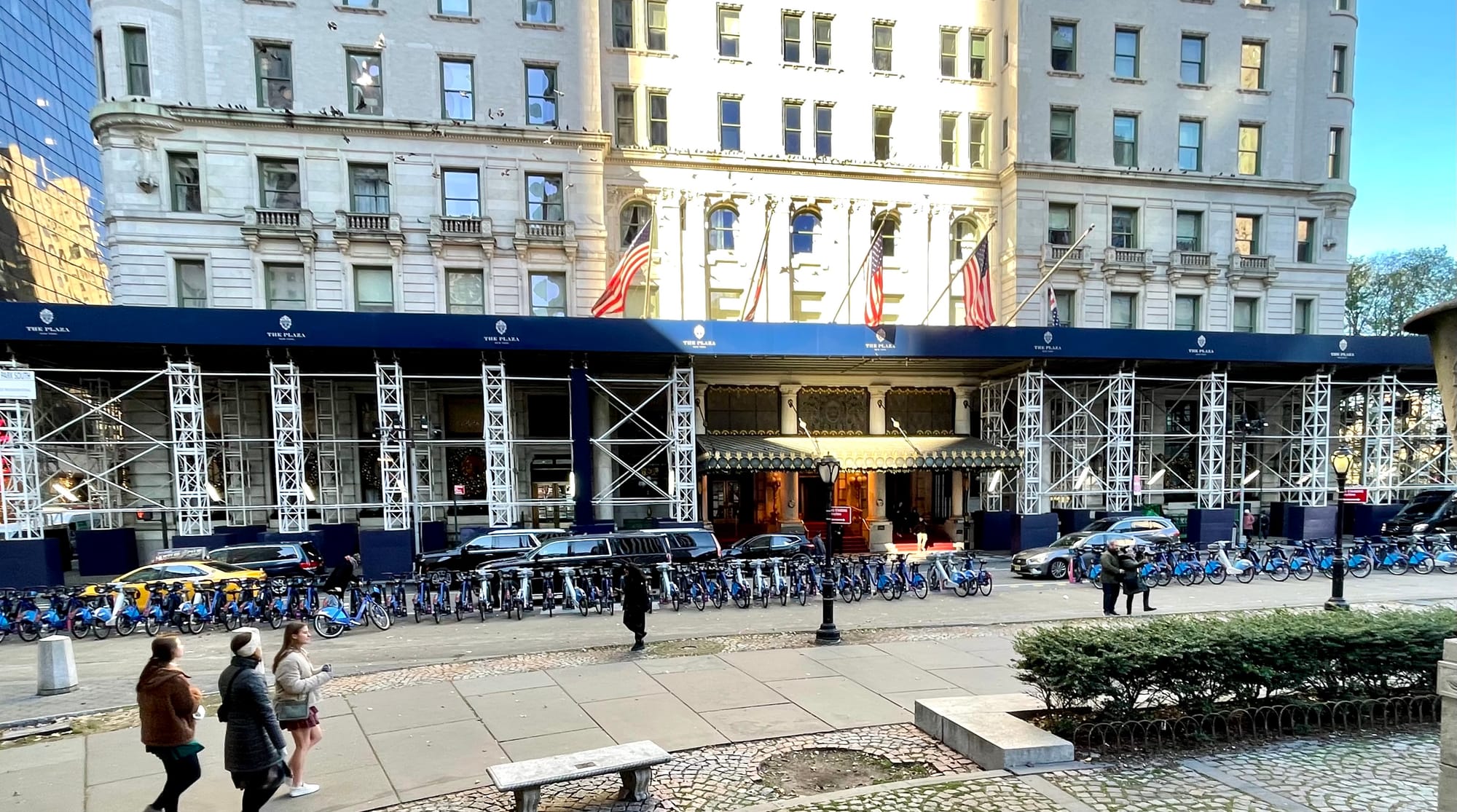
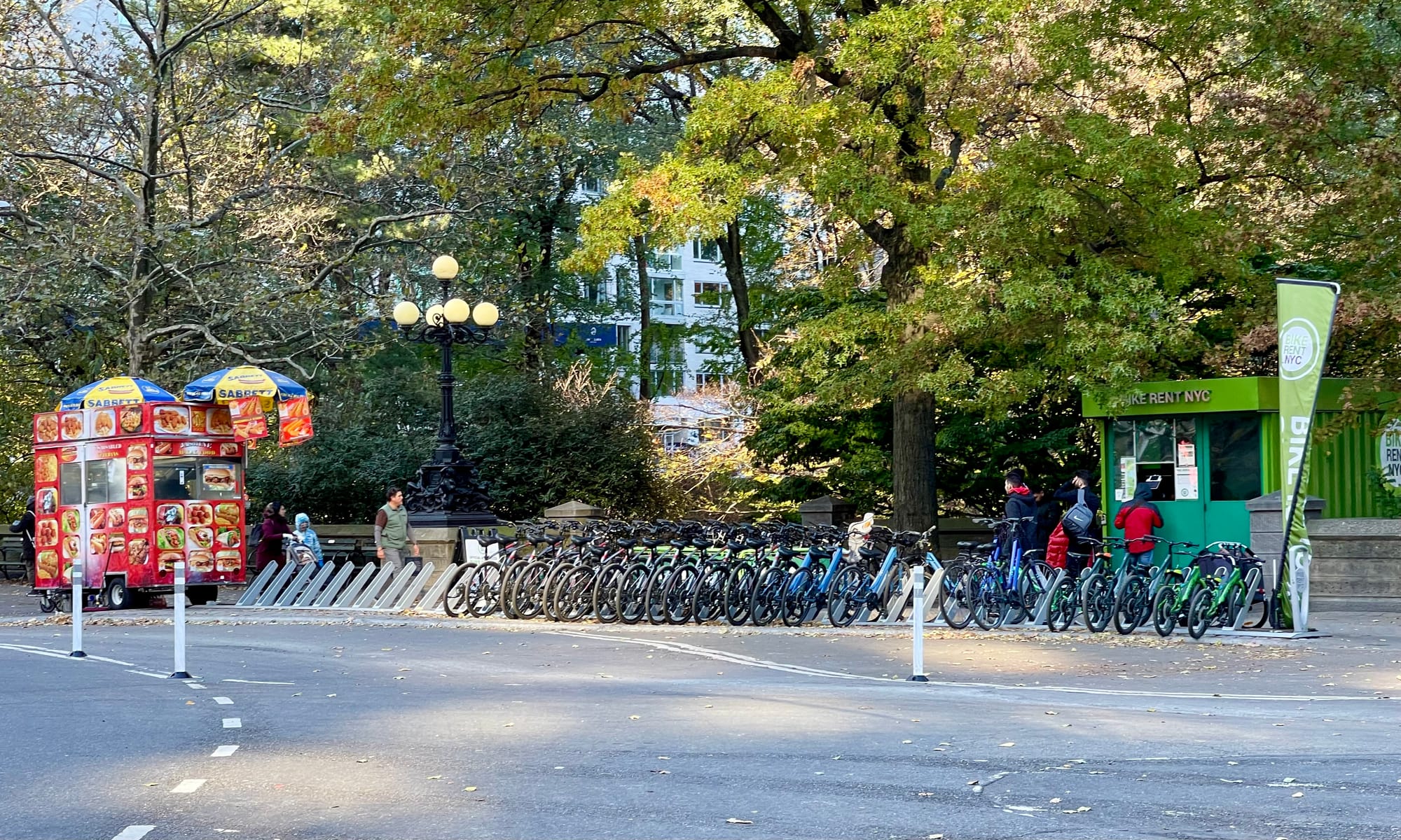
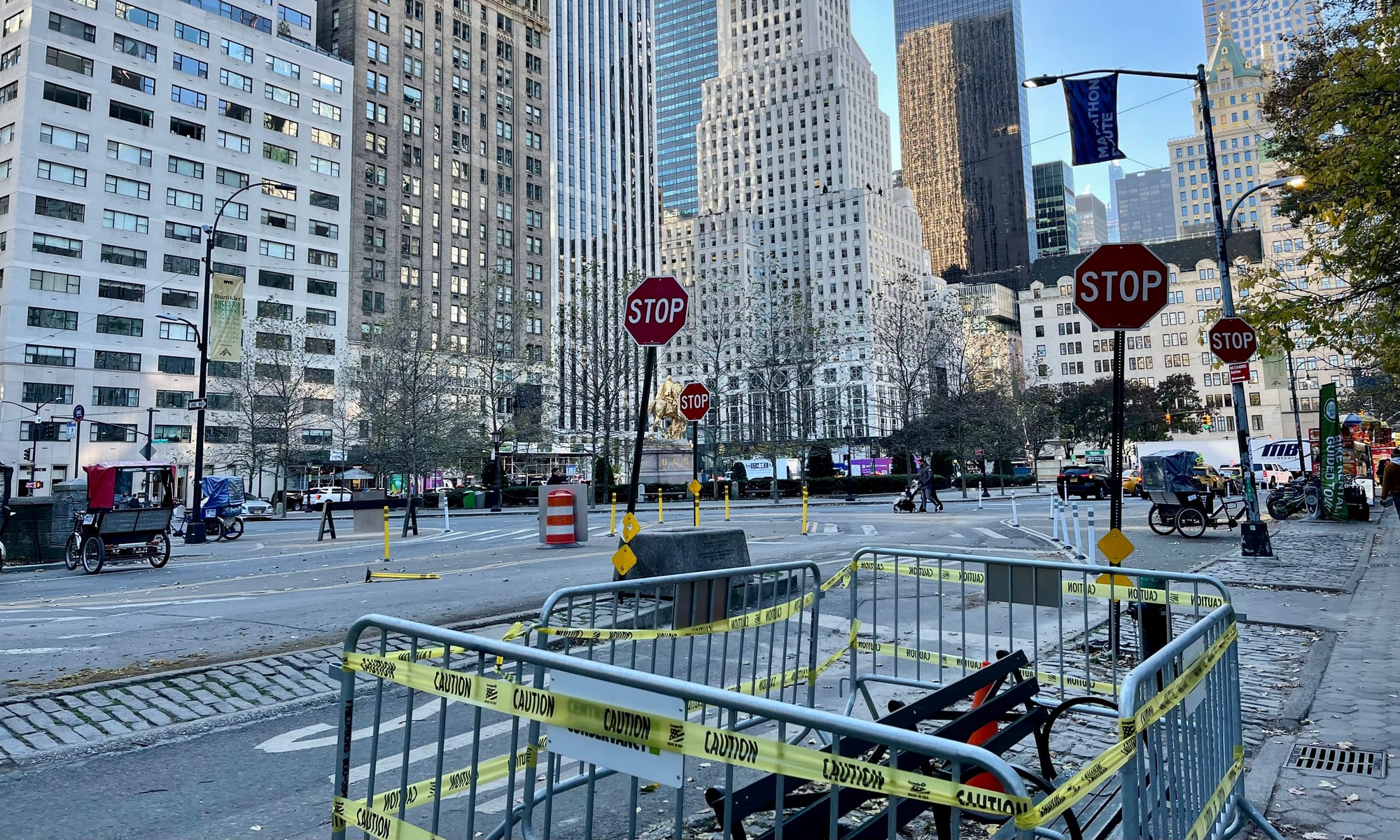
No matter where you are in this area, it has no sense of place. It is a story of chaos and disfunction. This is a disgrace to anyone who loves New York City because of how profoundly it takes away from its biggest gem rather than celebrating it. The idea of dwelling here and enjoying oneself simply does not make sense.
That goes for the entire area, including the unusable plaza where the Apple Store is located and all the streets coming into and going through. Vehicles have been given priority here for as long as we can remember. It is not a place designed with people in mind and that is very clear to see.
Benchmarks – Great Entranceways
Instead of chaotic, overly wide intersections at its entrances that create stress and frustration, what Central Park needs are dignified gateways that signal to those approaching that they've reached an amazing destination worth exploring. You don't wrap a diamond in a paper bag and you don't wrap a famous landmark in six lane streets and killer intersections...
Copenhagen, Barcelona, and Paris have amazing gateways into their most famous landmarks that Central Park can look to for inspiration.
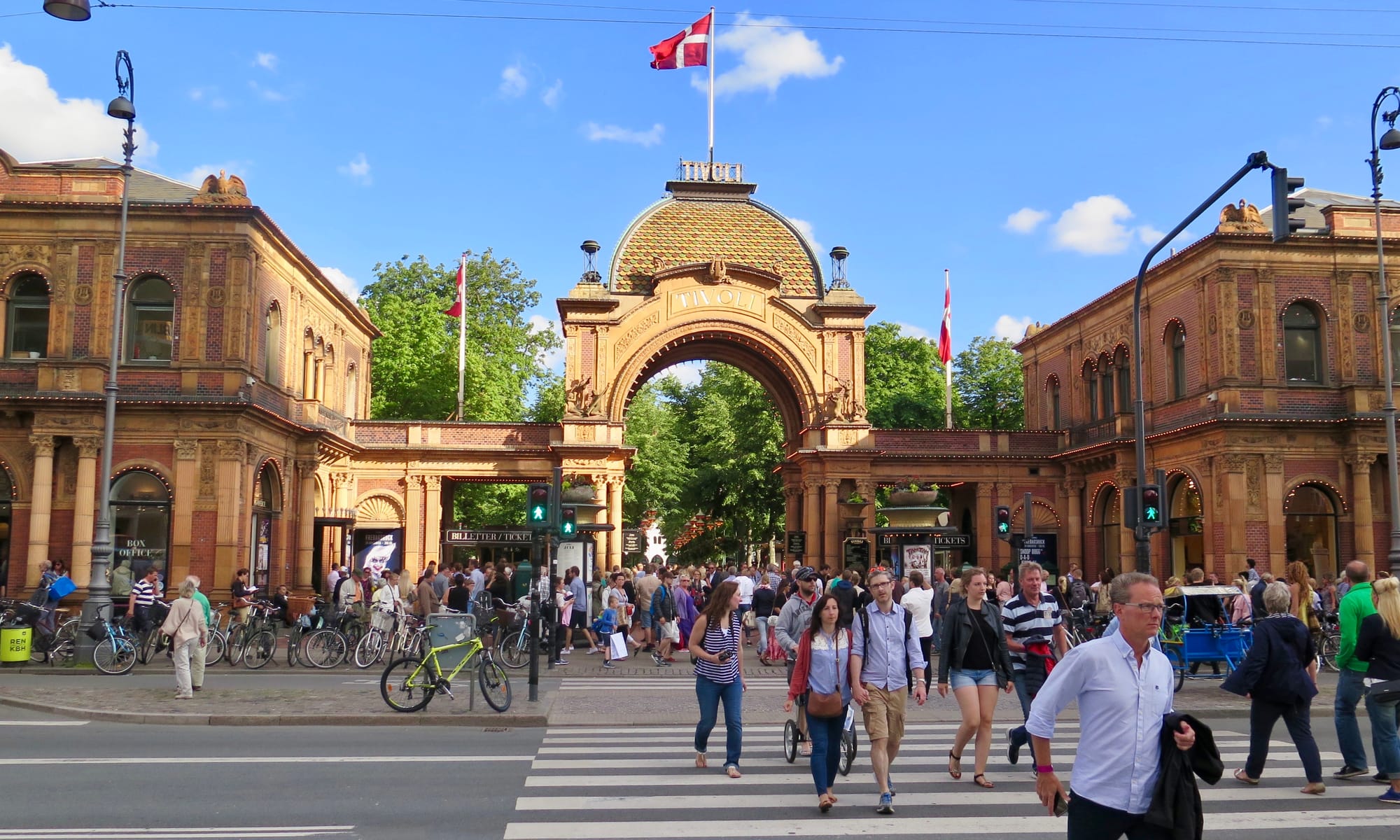
Tivoli Gardens
Copenhagen's Tivoli Gardens has a very prominent entrance, built around the same time as Central Park. It communicates that the place beyond it is something magnificent and creates a sense of excitement. This is the kind of gateway that a destination like Central Park deserves as well.
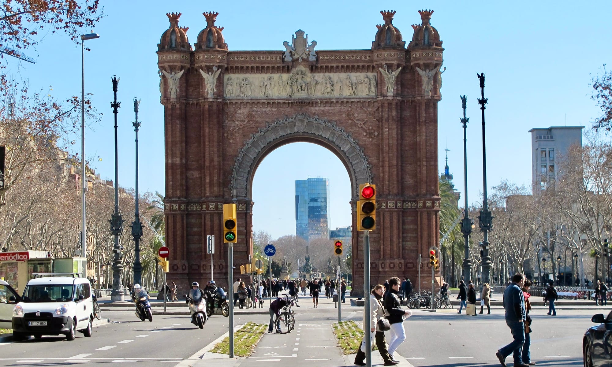
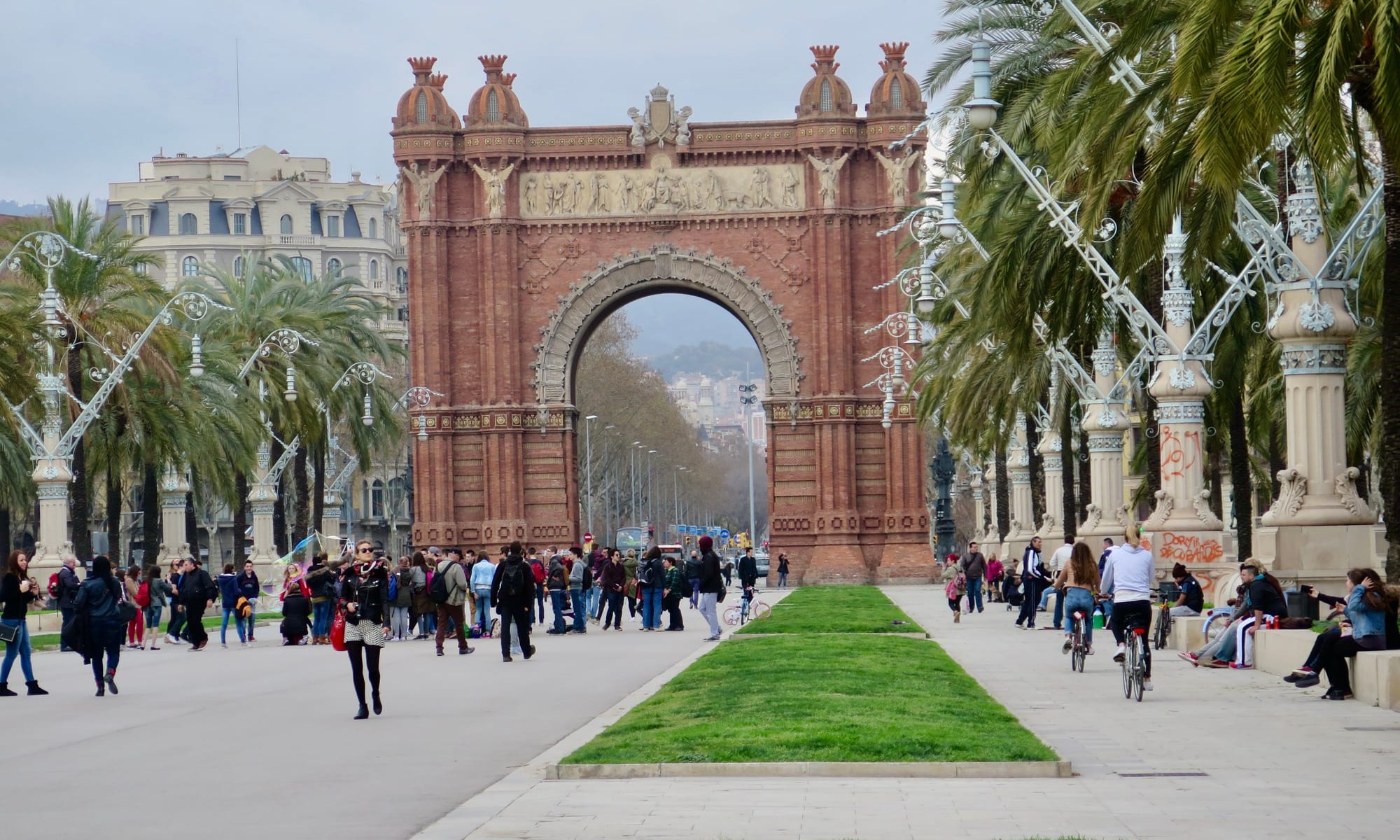
Barcelona's Arc de Triomf
The Arc de Triomf in Barcelona leads into the center's main park – Ciutadella Park. It is the focal point for the whole area and elevates the park's presence, creating a sense of grandeur.
Paris Champ-Élysées
Paris has a famous Arc de Triomphe as well, and while it doesn't lead into a park like the one in Barcelona, it does open up on to Champs-Élysées which is one of the most important public spaces in the city.
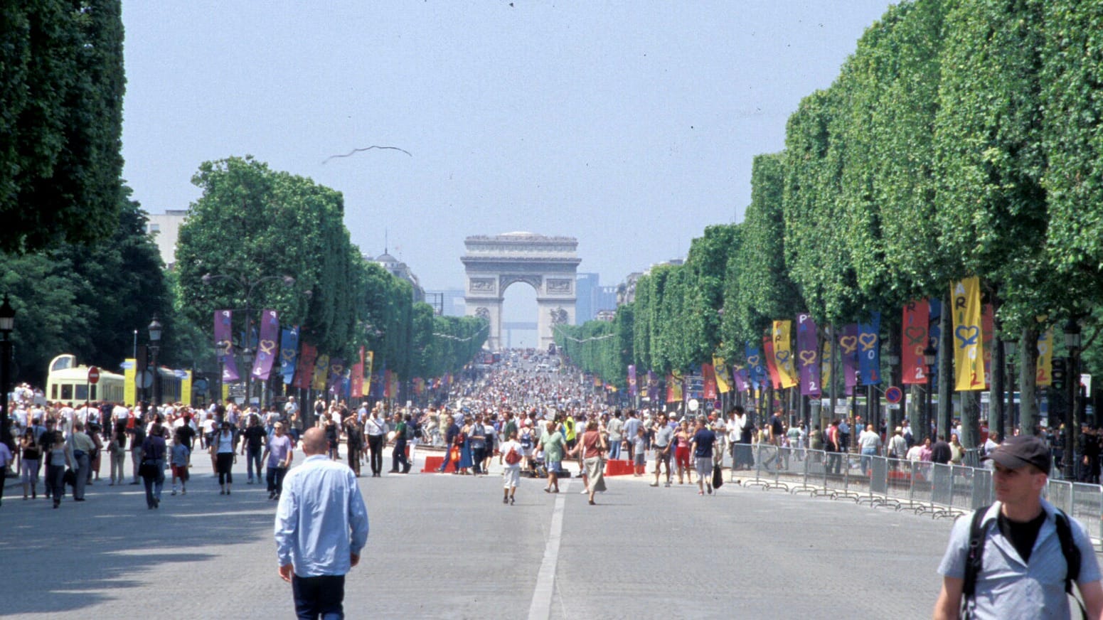
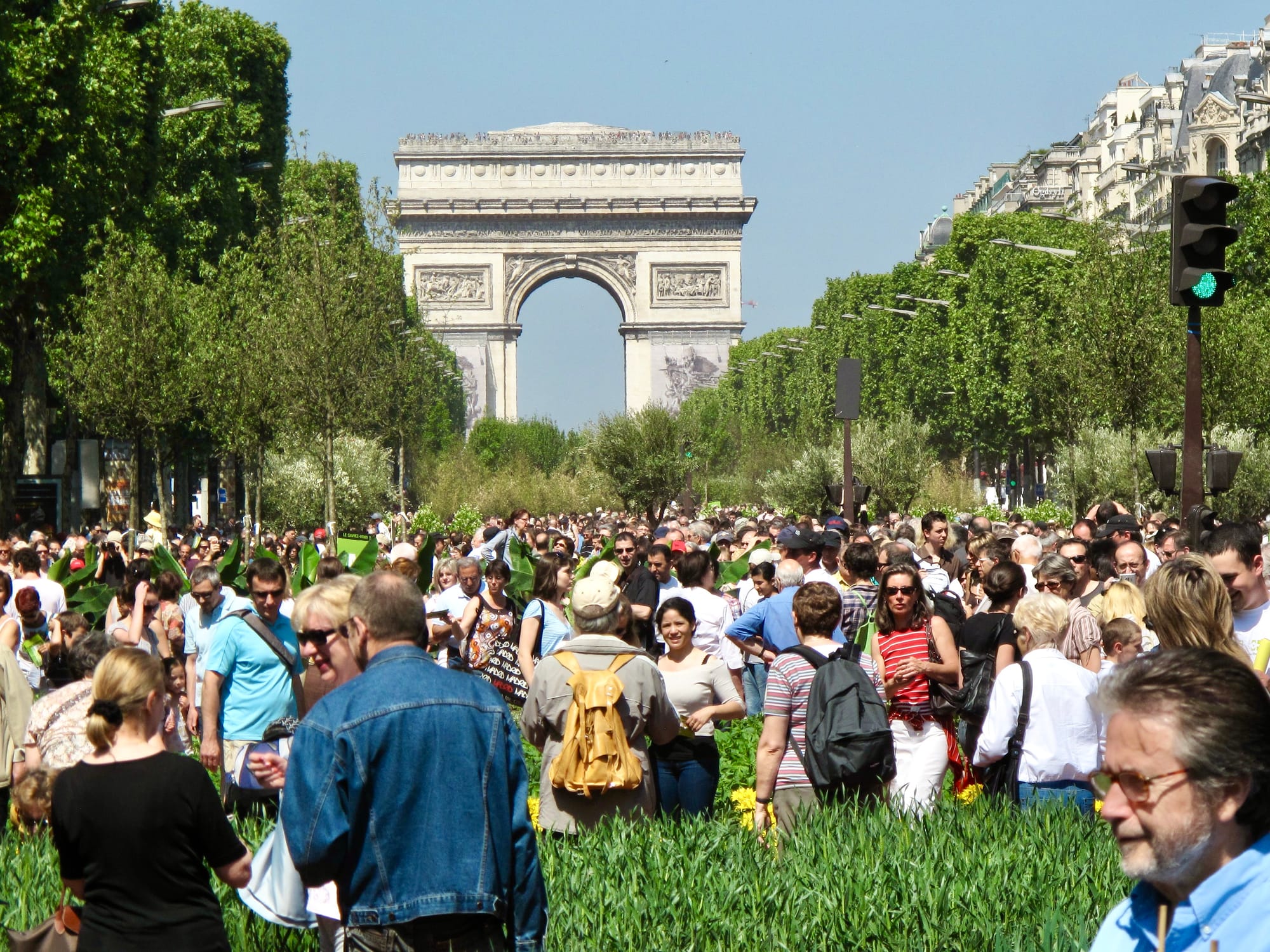
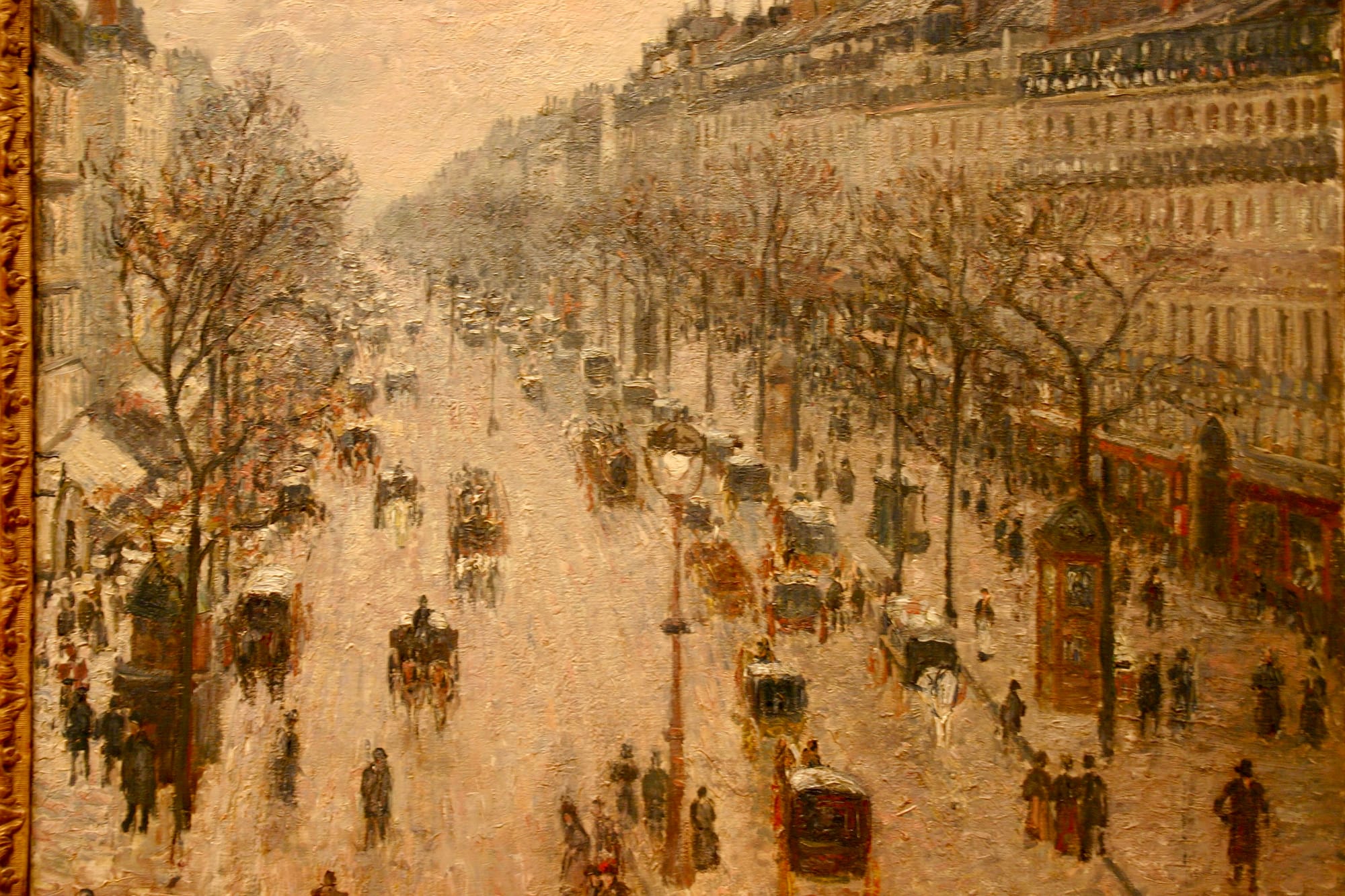
These are the kinds of glorious gateways that the most famous landmarks of a city should have to highlight them. Where is Central Park's?
59th Street
This important street bordering the south of Central Park and connecting it to Midtown, bookended by Columbus Circle and Grand Army Plaza, needs to be much more than it is today. It needs to be a grand boulevard.
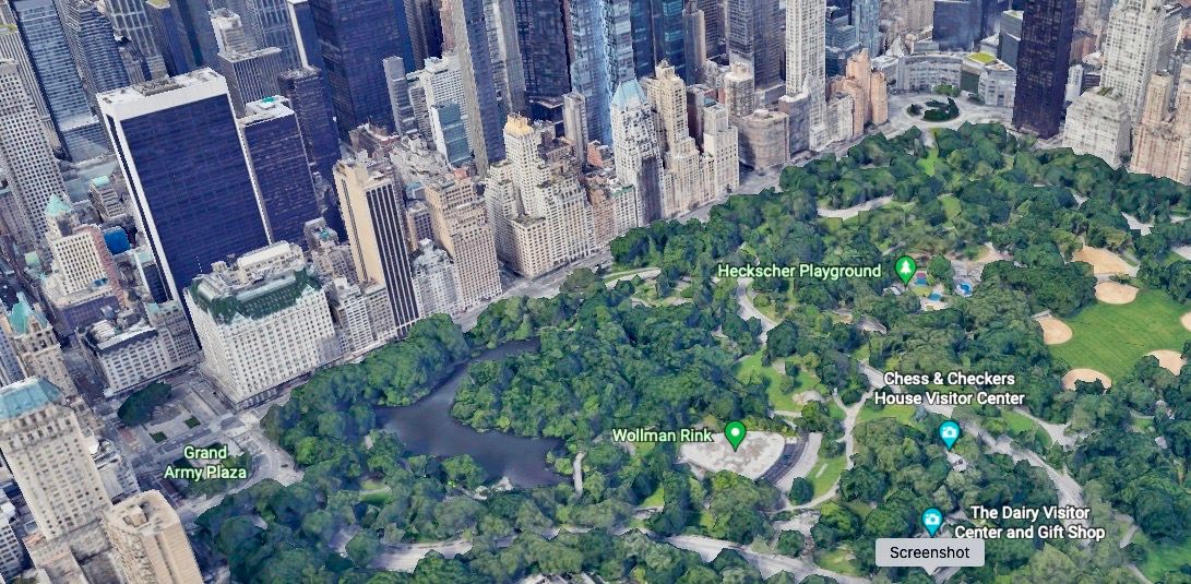
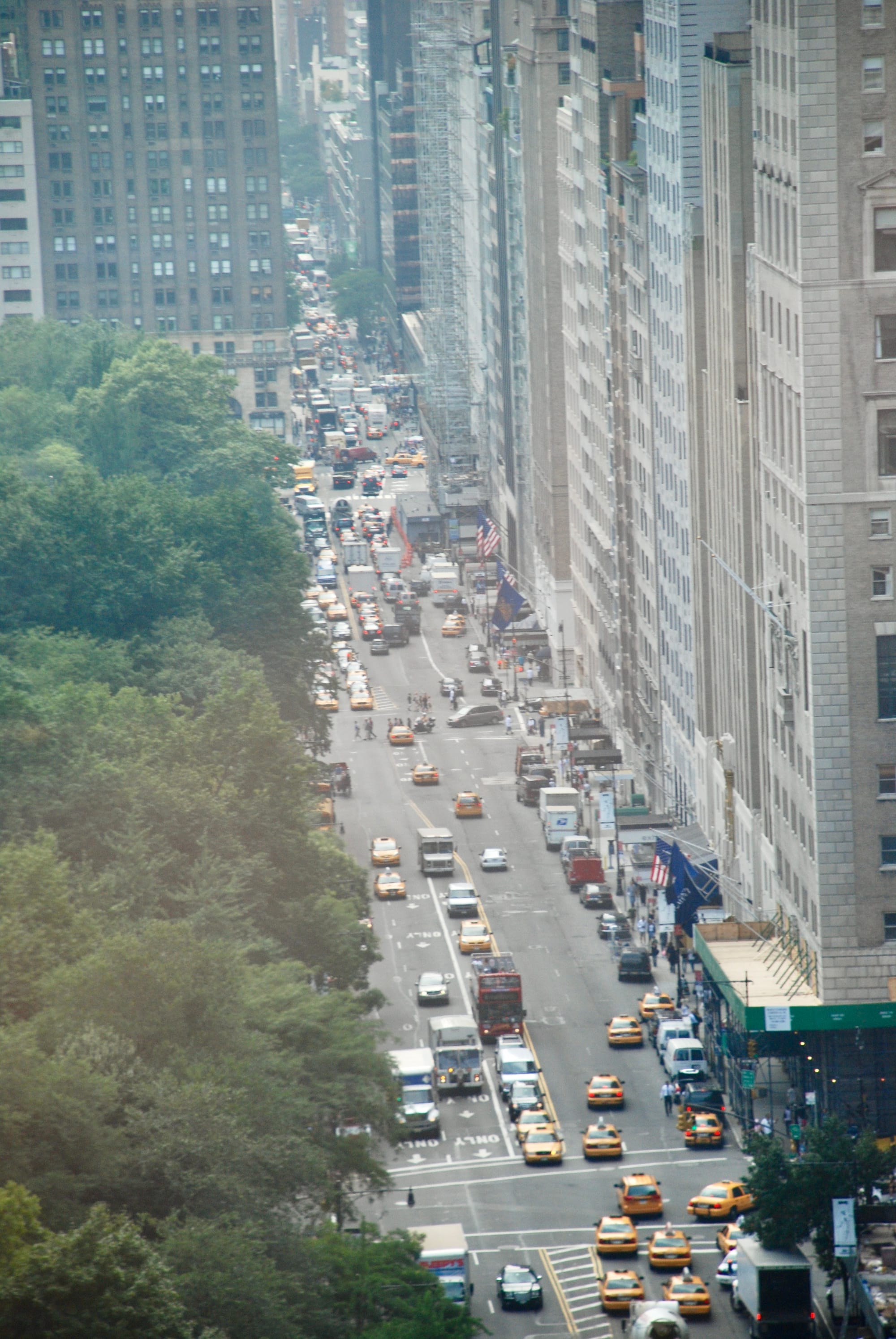
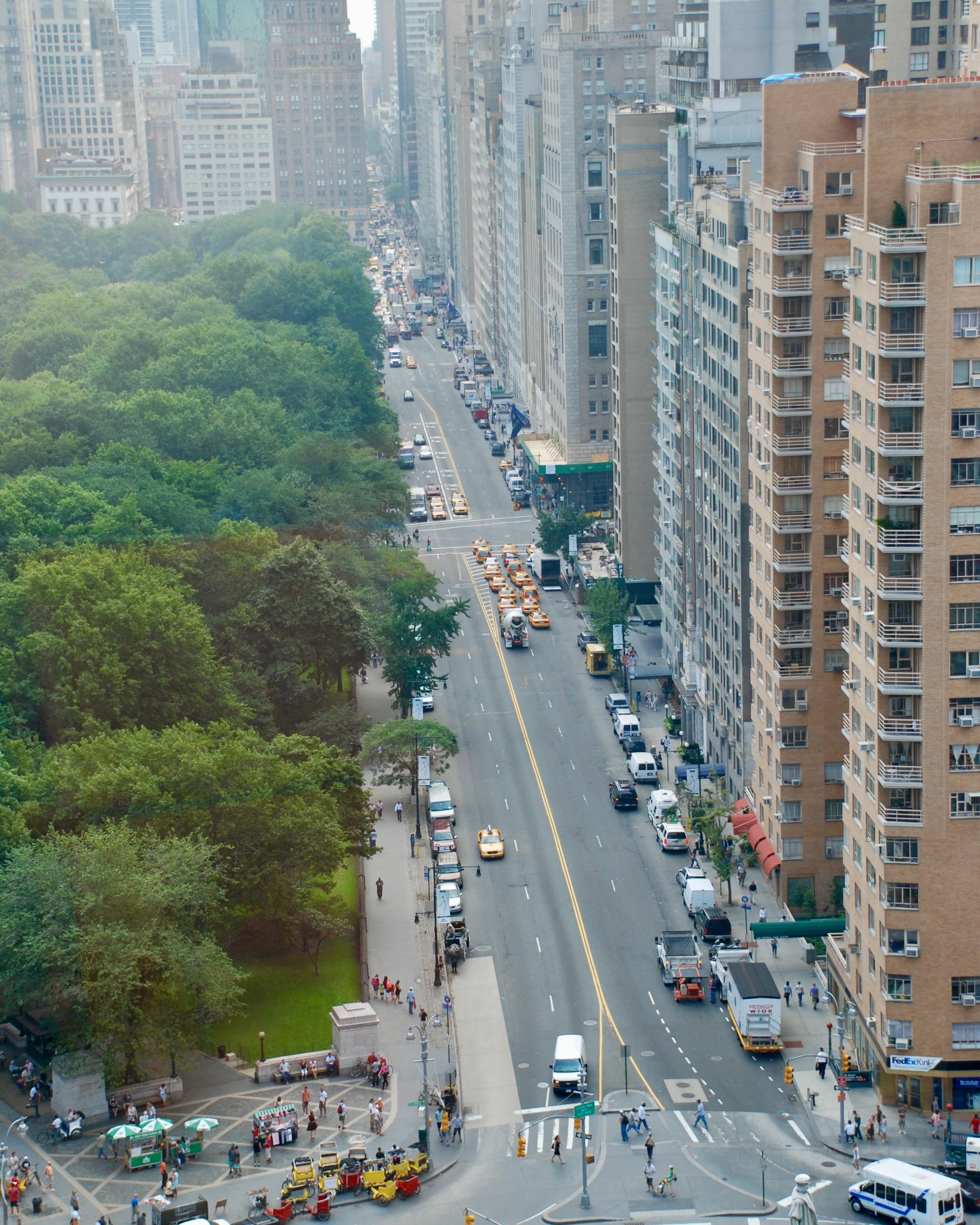
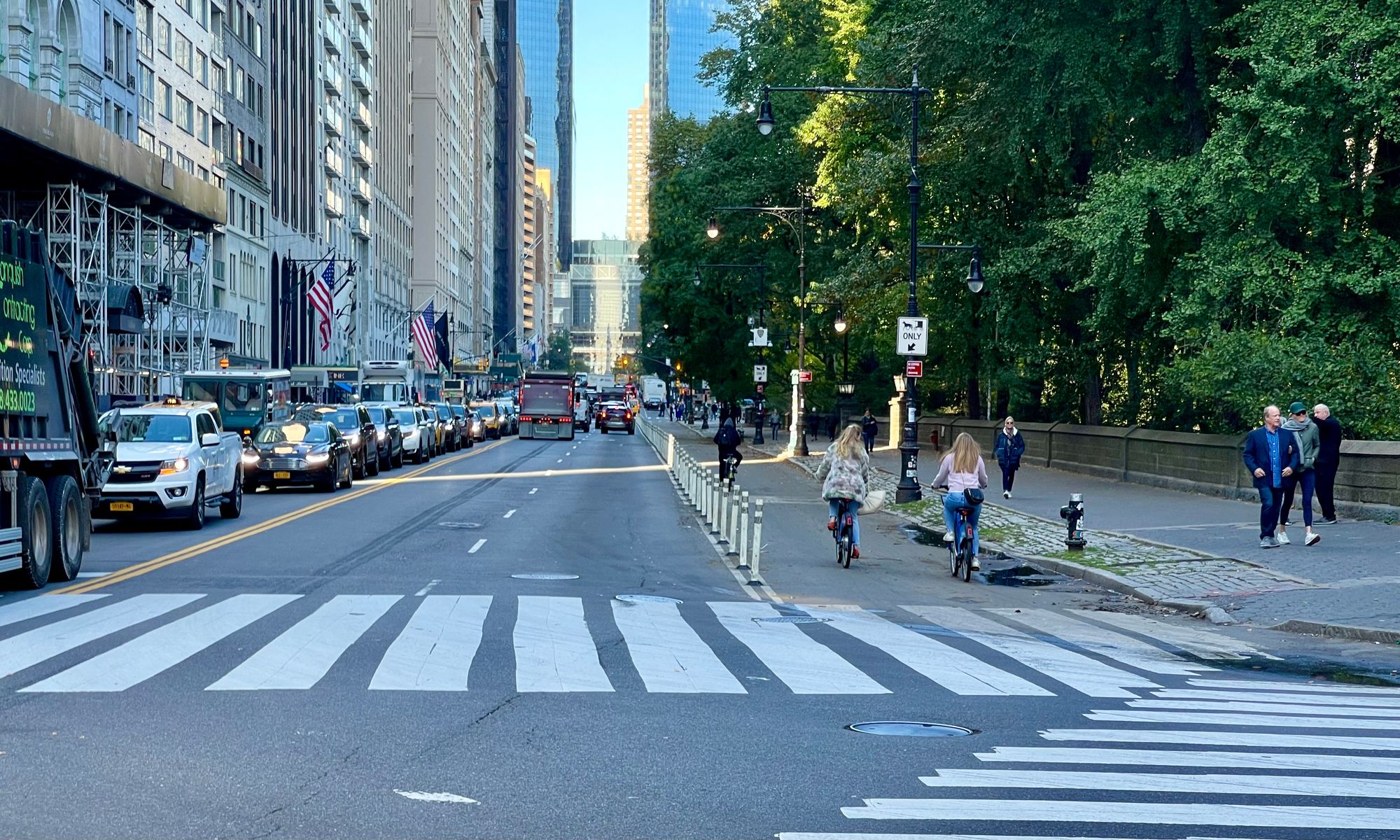
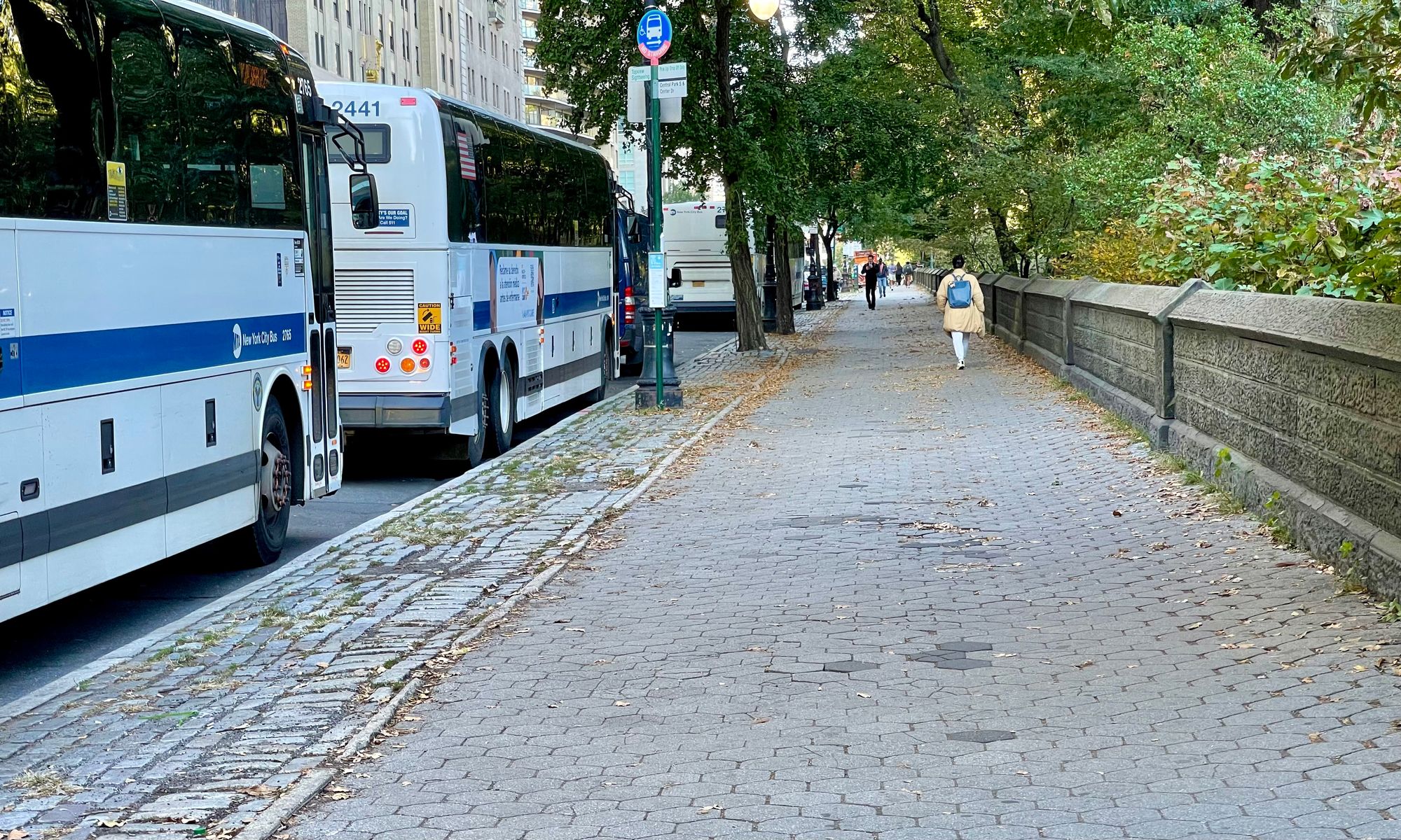
There is nothing pleasant about 59th Street currently. The sidewalks of 59th street are far too narrow, vehicles are flying through, and its six lanes of traffic make the street an undesirable destination. Once you get there, there is little ahead to draw one into the park or along the street.
It was not always like this. Below is a historic image of 59th Street in 1886. Notice the width of the sidewalk/promenade on 59th Street and the narrow street with calm activity along it.

59th Street should not be a thoroughfare for traffic
Like Avenue of the Americas, there's an opportunity to redistribute the street and sidewalk space to create a grand promenade as above. The south side of the street could be a wide, often double-loaded (things to do and see on either side of the walkway) pedestrian environment for strolling, shopping, and eating in cafés.
The intersections and entrances into Central Park on 59th Street need to be defined by much stronger identities with amenities, design that creates a sense of arrival, and narrowed car areas, filling out the spaces with other uses apart from driving. This would have a dramatic impact on the area, extending down to the major avenues (5th, 6th, 7th, and Broadway from Lincoln Center to at least Times Square), crosstown streets, and 58th and 59th.
North Side of 59th Street
On the top side of 59th street, the grand destination of Central Park does not greet visitors with any sense of arrival. What's more, the park along the entire length of 59th Street between Columbus Circle and Grand Army Plaza is bordered by an impenetrable 4 feet high wall, with the lower limbs of trees blocking views into the park.
South Side of 59th Street
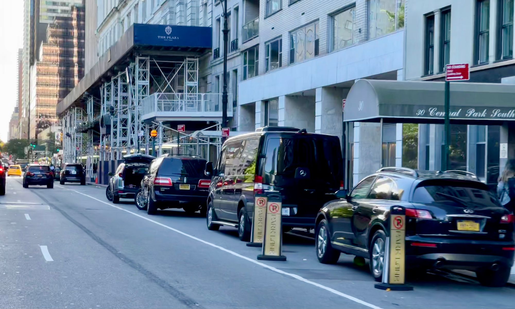
On the south side of 59th street, there are famous hotels and prominent residential buildings, but the sidewalks are so narrow that these buildings have no place to show off what they're all about or take up the space their prominence deserves. This area does not feel grand or luxurious in any way, despite the fact that the renowned hotels in this location should be some of the most illustrious places in the city.
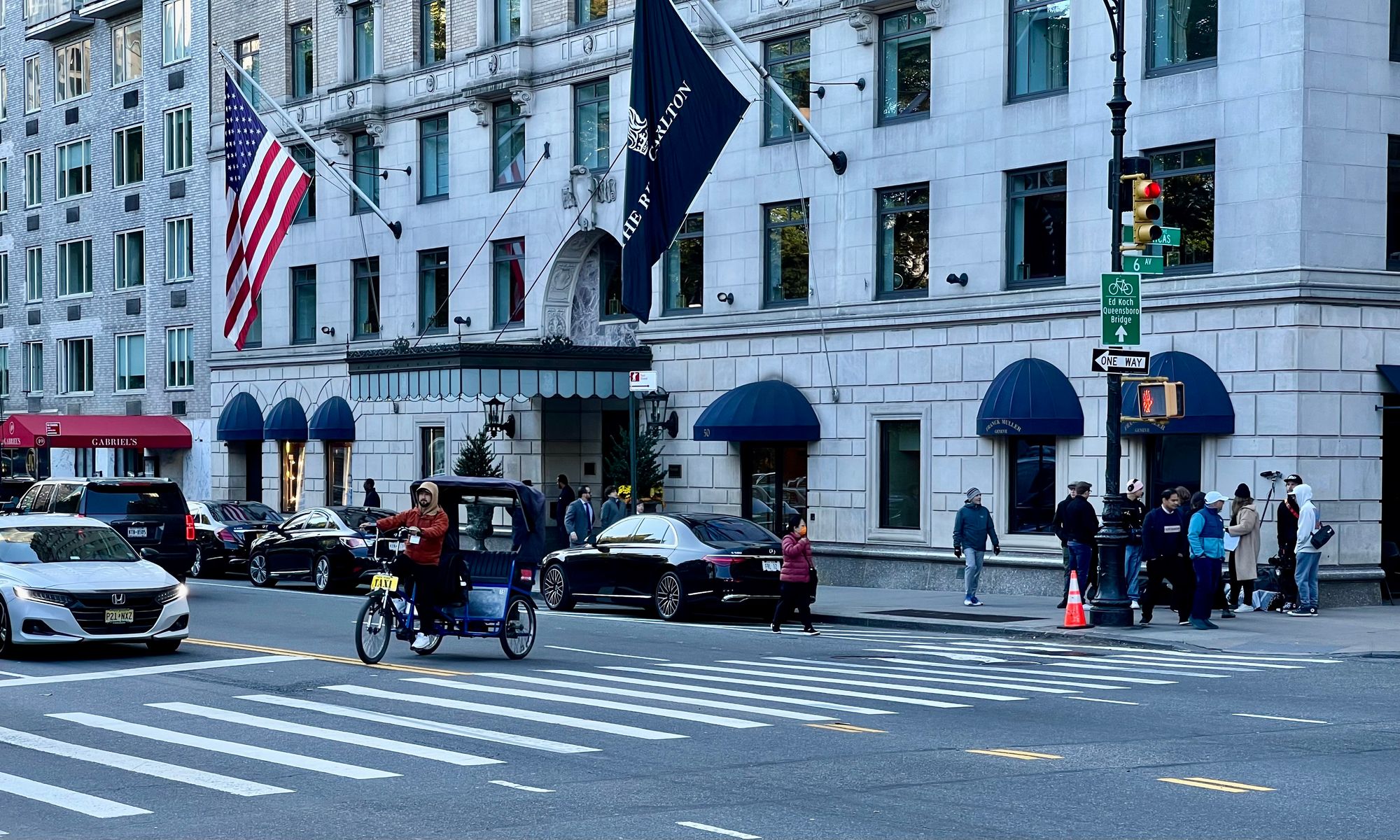
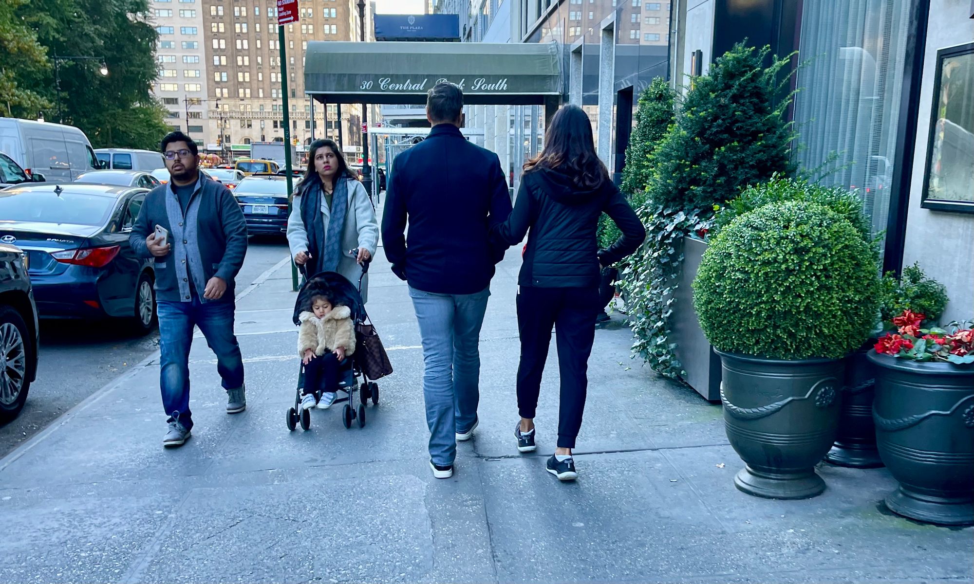
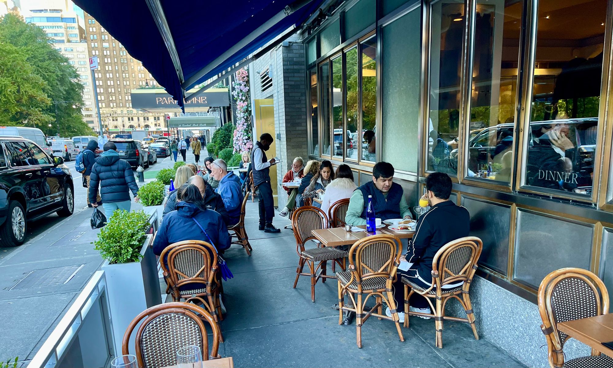
Doubling the size of of sidewalks of 59th Street could be transformative
Benchmarks for 59th Street
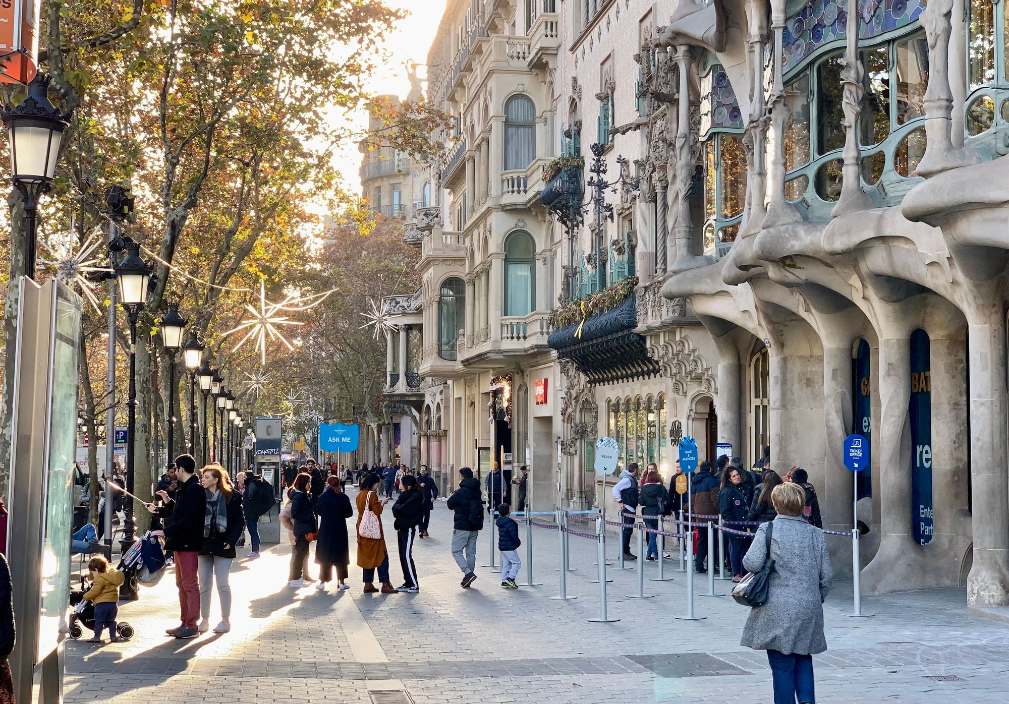
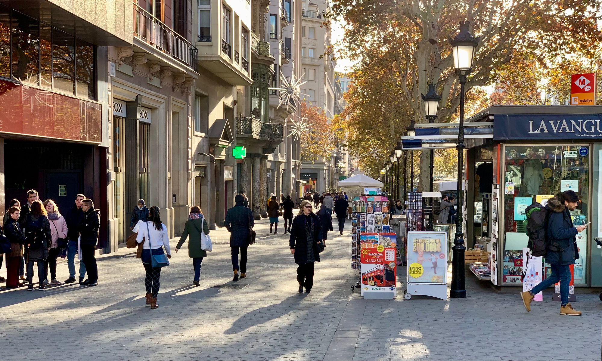
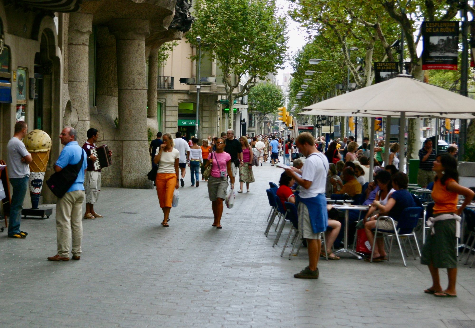
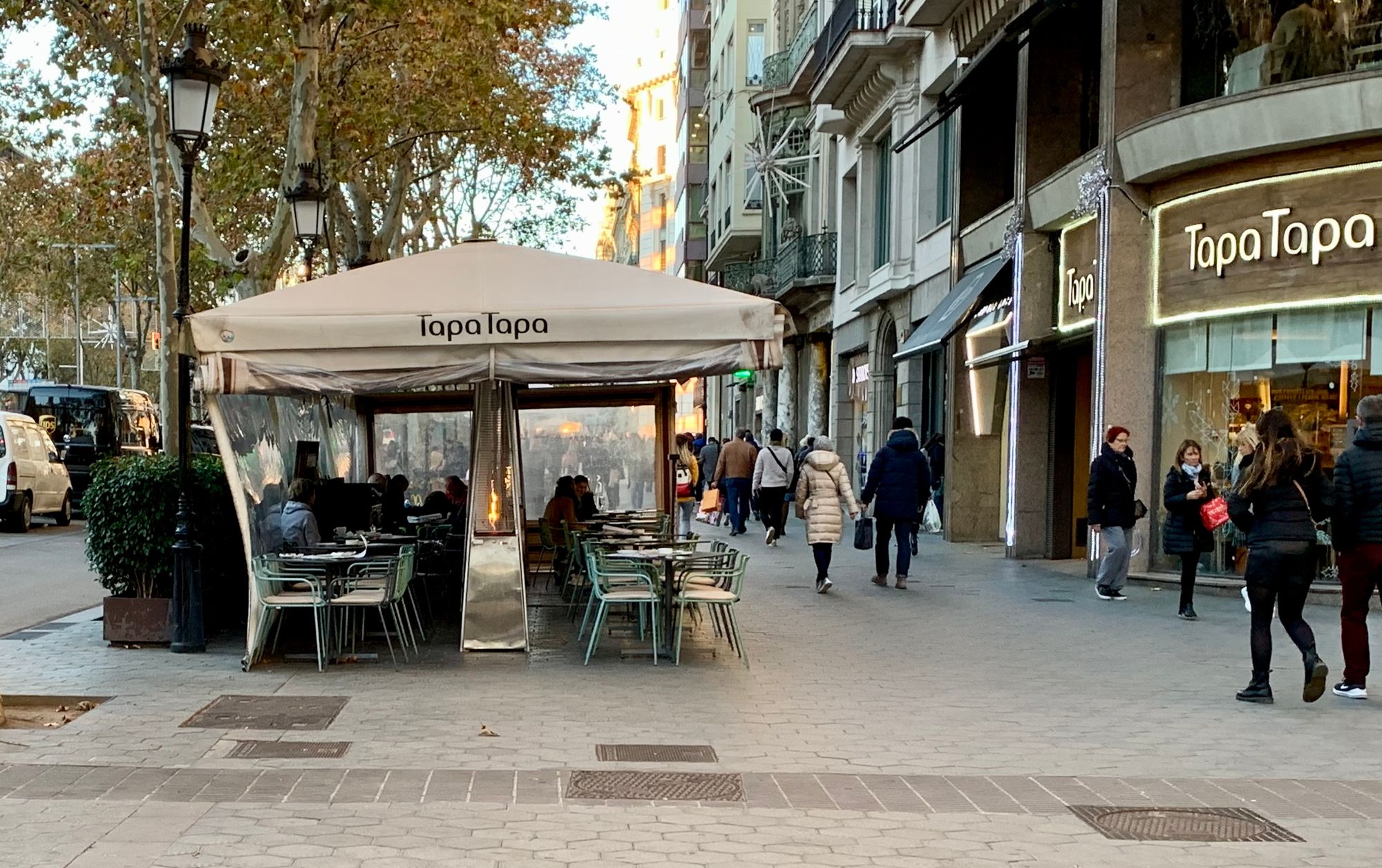
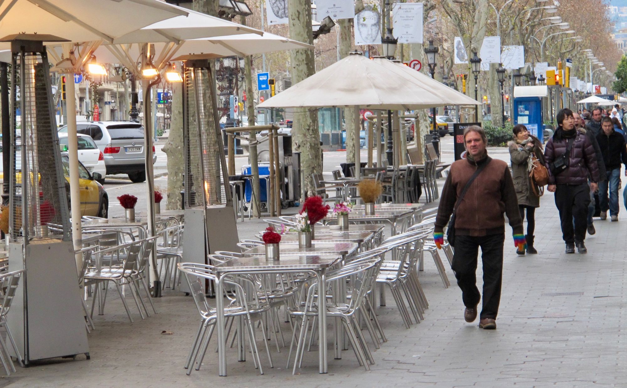
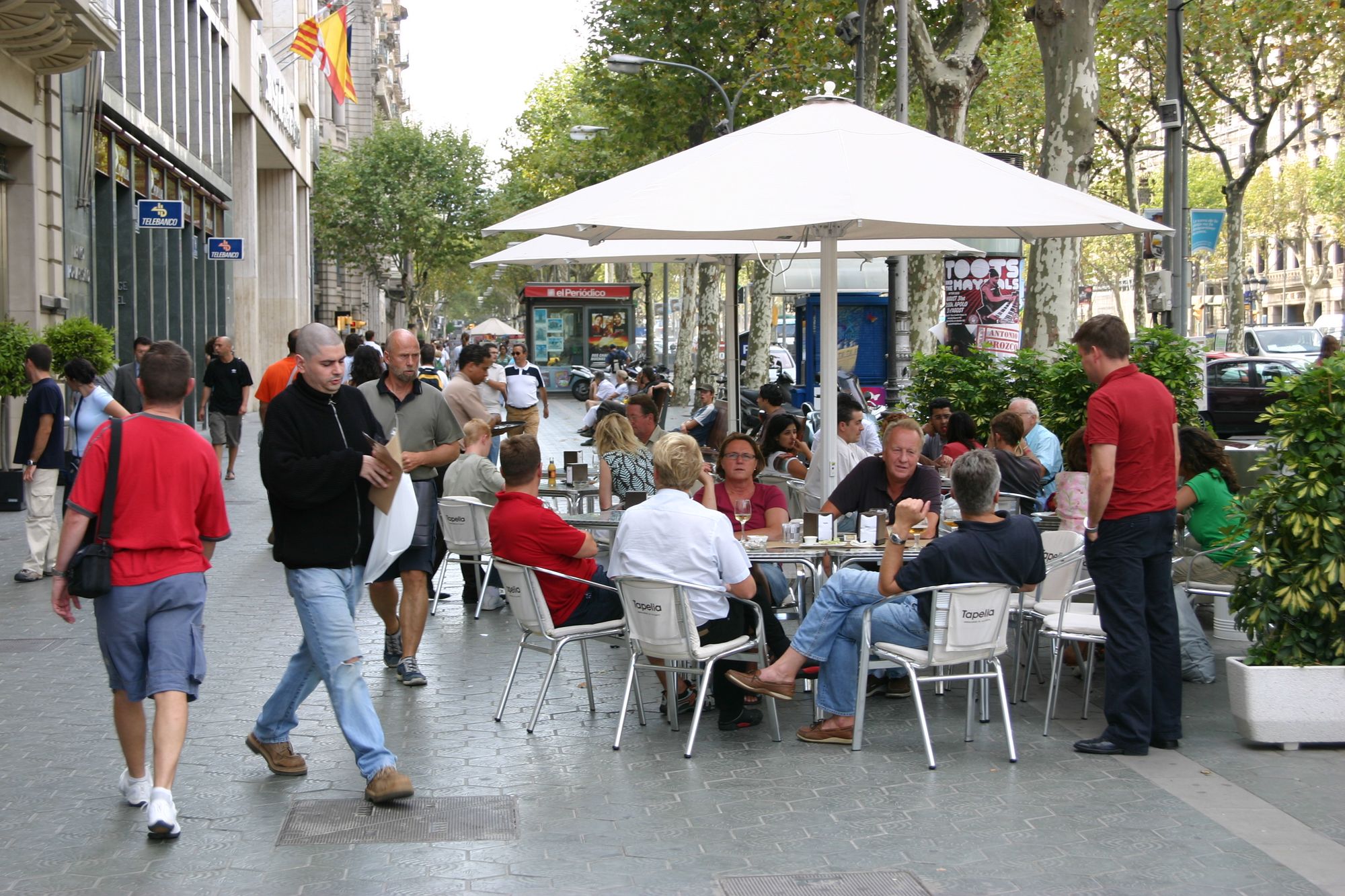
Extended sidewalks and intersections in Barcelona
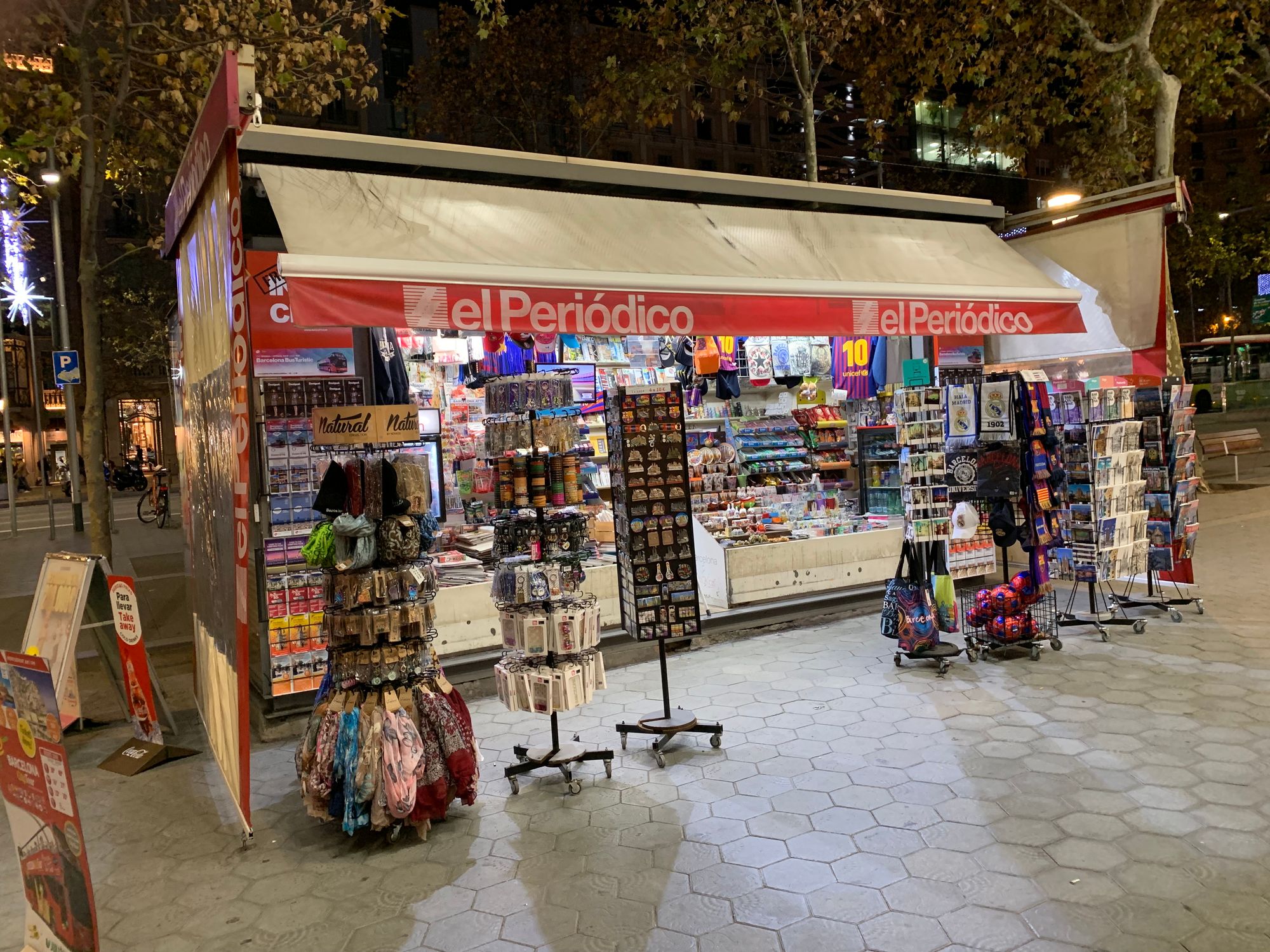
Barcelona's central shopping street, Passeig de Gracia, has very wide sidewalks (roughly 30 feet) hosting a variety of activities. Because of this, they are full of life and support plenty of foot traffic from morning to night time, every day of the week.
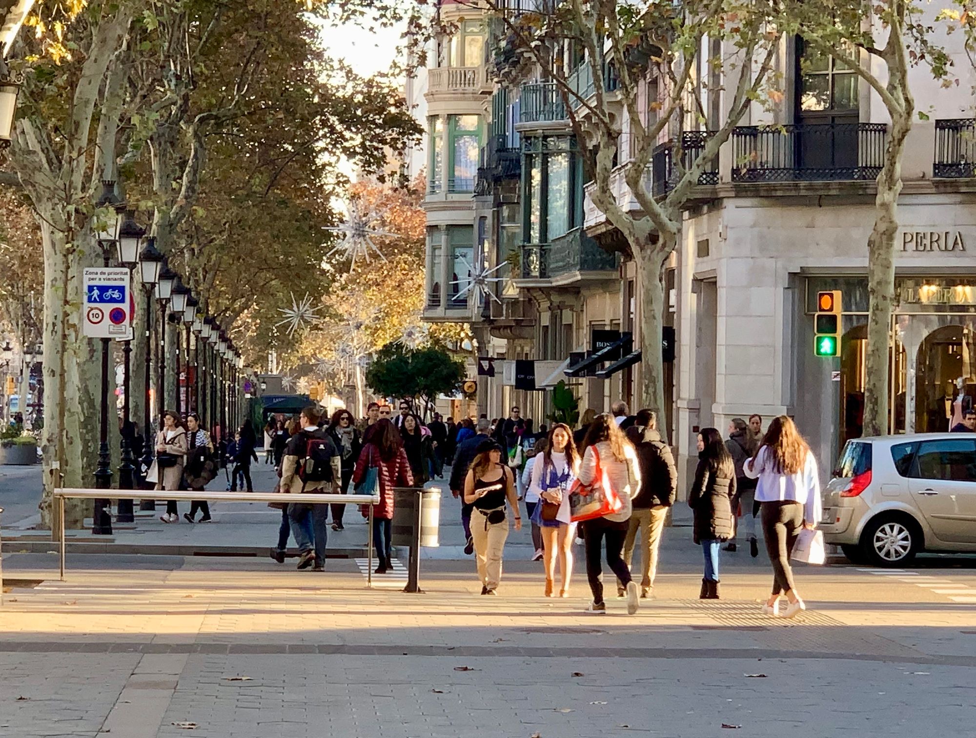
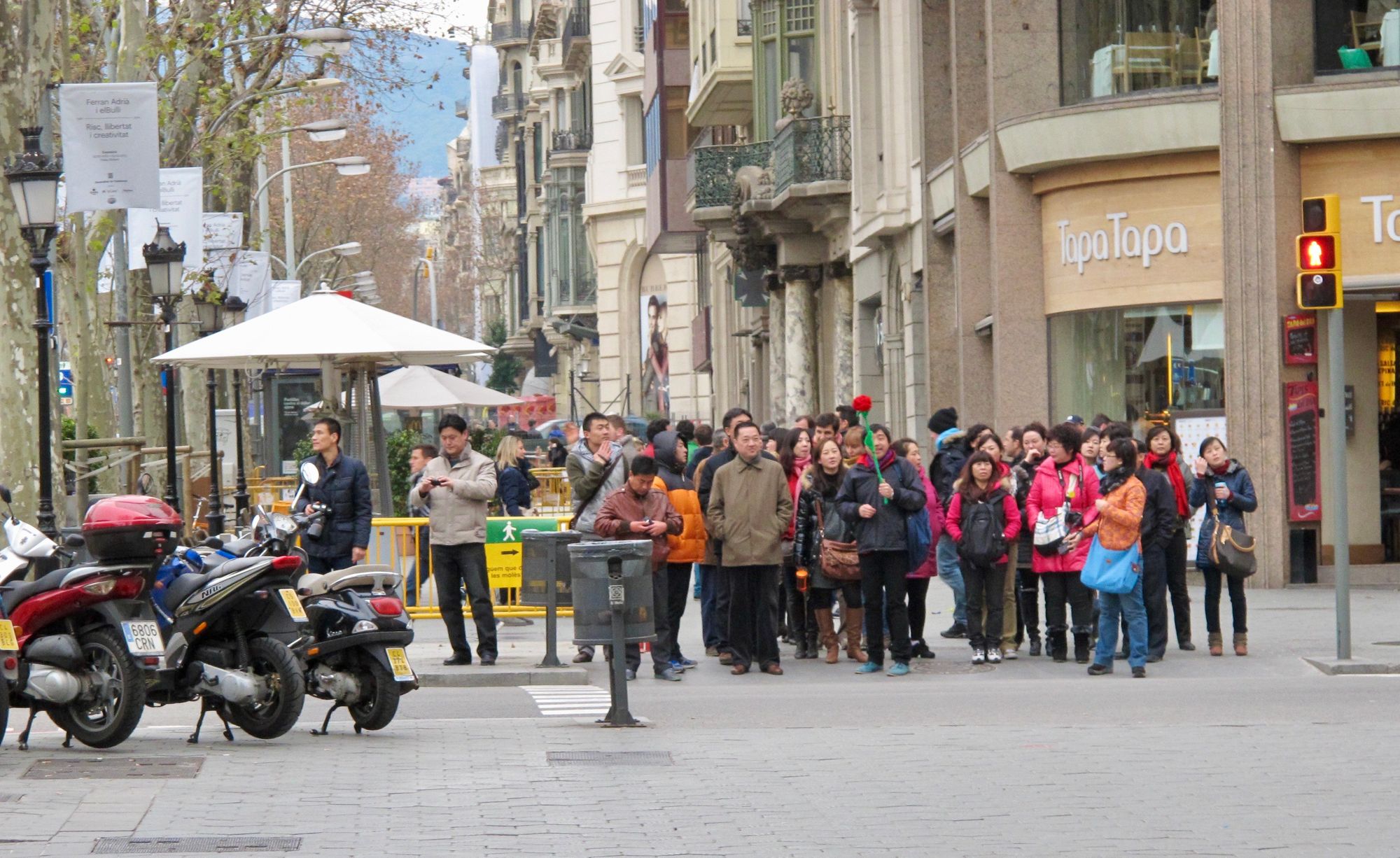
Sidewalks are mostly "double loaded" here, meaning you can find seating, cafés and kiosks on both sides of the walkway. This adds a lot of vibrancy to the street.
Paris - Luxembourg Gardens
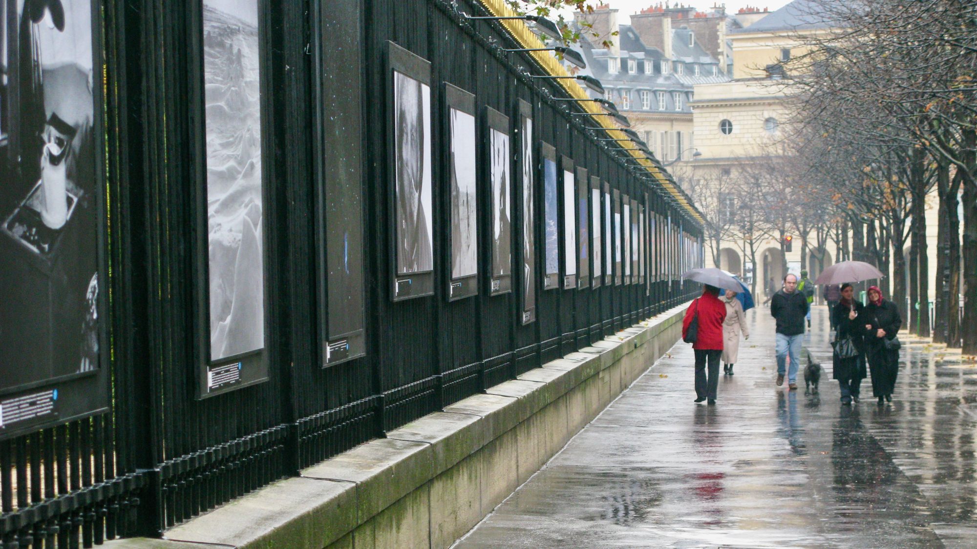
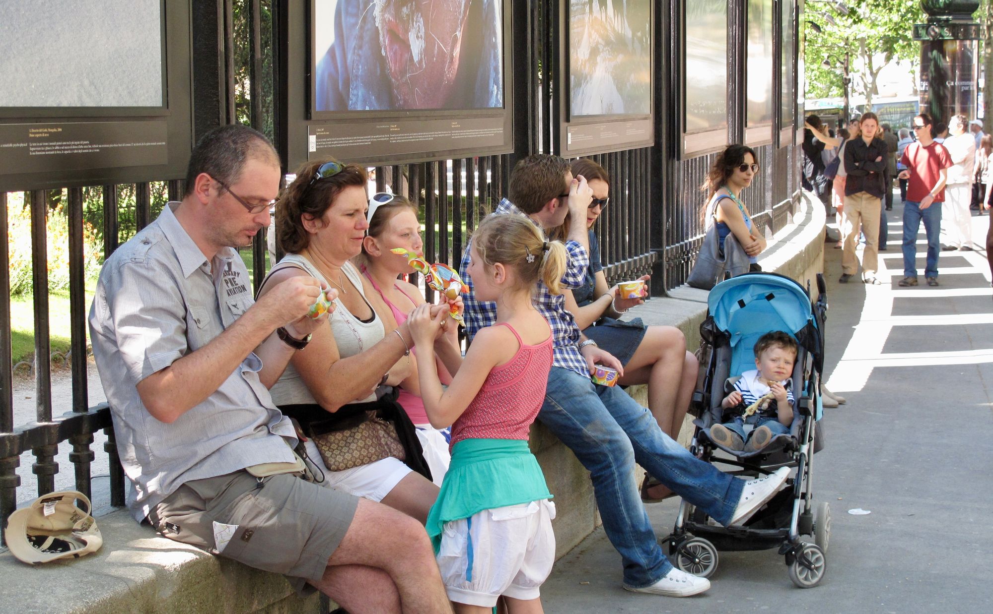
The street along Luxembourg Gardens is a great example that 59th street can follow. Instead of a wall, there is a fence you can see through, and that fence is often decorated with art to create a kind of outdoor museum that draws people in and invites them to continue on into the park.
Paris - Pont Neuf Bridge
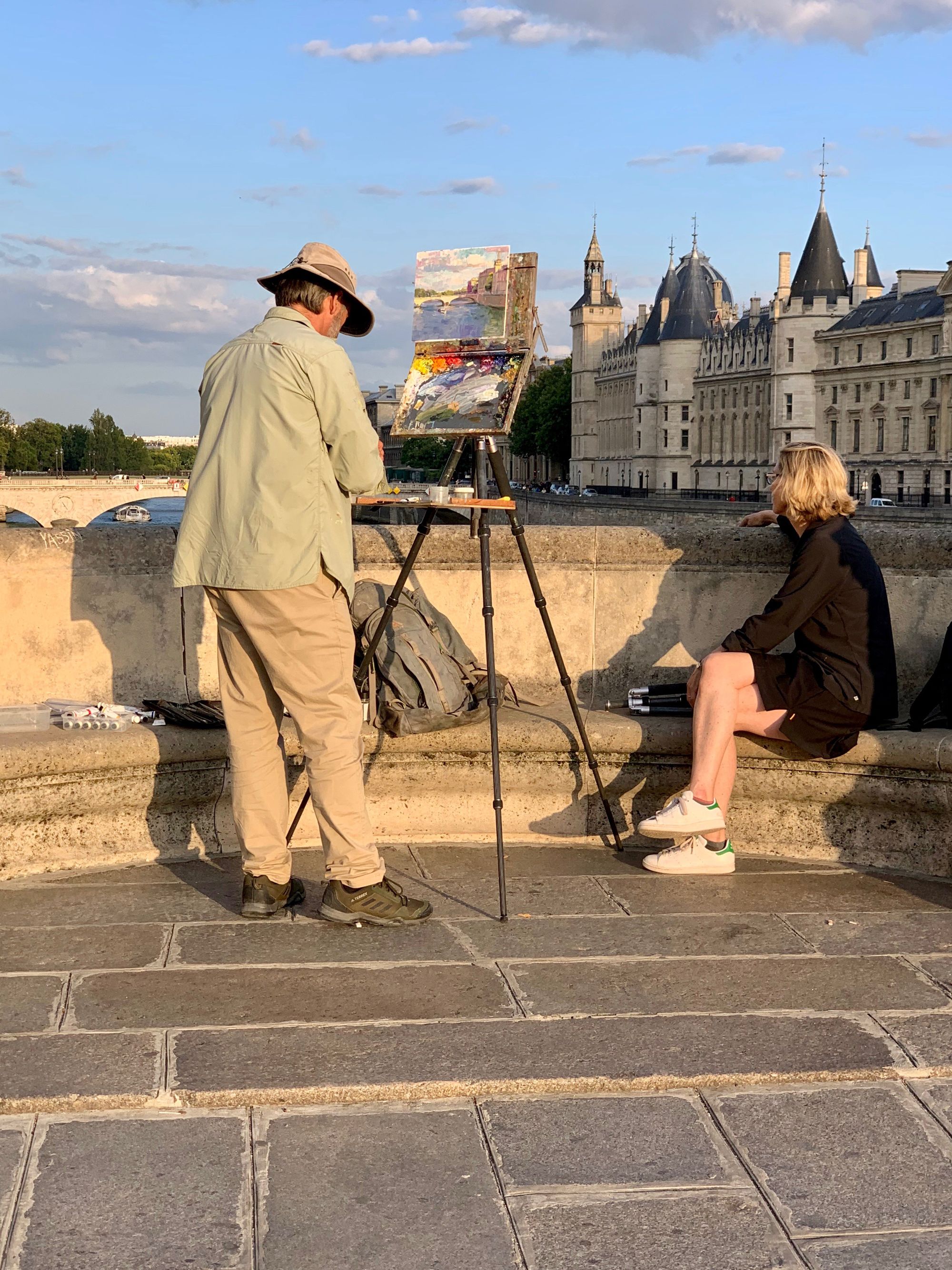
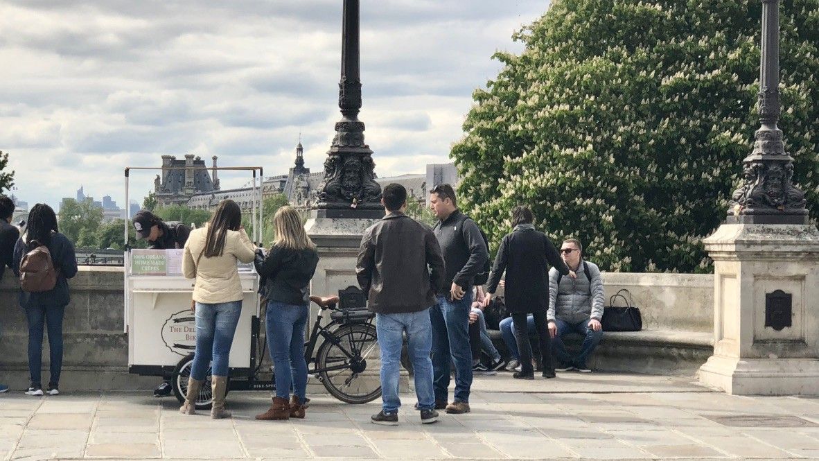
While it might not seem like the most obvious example to follow, the Pont Neuf Bridge across the Seine in Paris is also worth taking a look at for inspiration. Paris' history as the world’s favorite city began with a bridge which opened in 1607 and became visitors’ and residents’ favorite hang-out. It had markets, seating, and promenading along its length as well as a number of charming alcoves that jut out, providing places for people to sit, street entertainers to perform, and artists to create.
If the wall around Central Park is kept, these kinds of alcoves can be built into it to "soften" the border between what's inside and what's outside the park. By hosting interesting activities like musical or artistic performances, they can also attract more visitors.
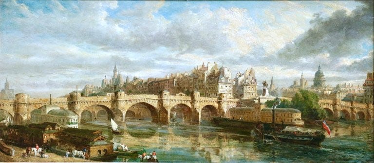
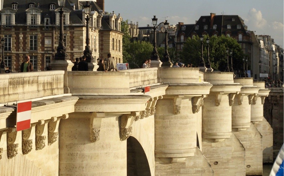
Google Earth image and The 1734 Bretez-Turgot map showing the first bridge to cross the Seine in a single span
Central Park Proper
Central Park is so large and connects directly to so many communities, from Harlem above 125th street, to both the east and west side neighborhoods bordering the park. It has a variety of thriving destinations within with numerous offerings that serve the whole city. It is therefore known around the world as the heart of NYC.
However, because of the walls and trees surrounding it, Central Park is barely visible from the outside and thus does not attract the attention it deserves. If there were no walls, people would be drawn into it by these beautiful views.
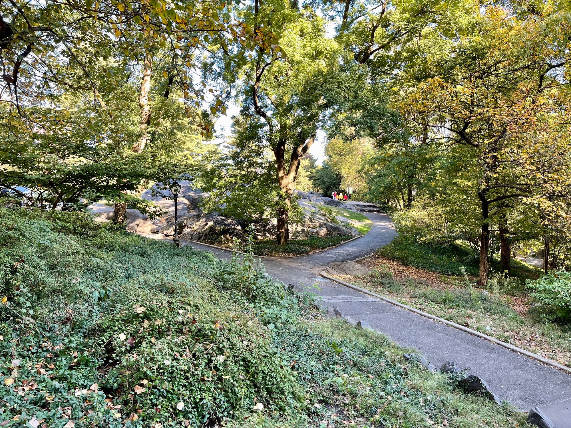
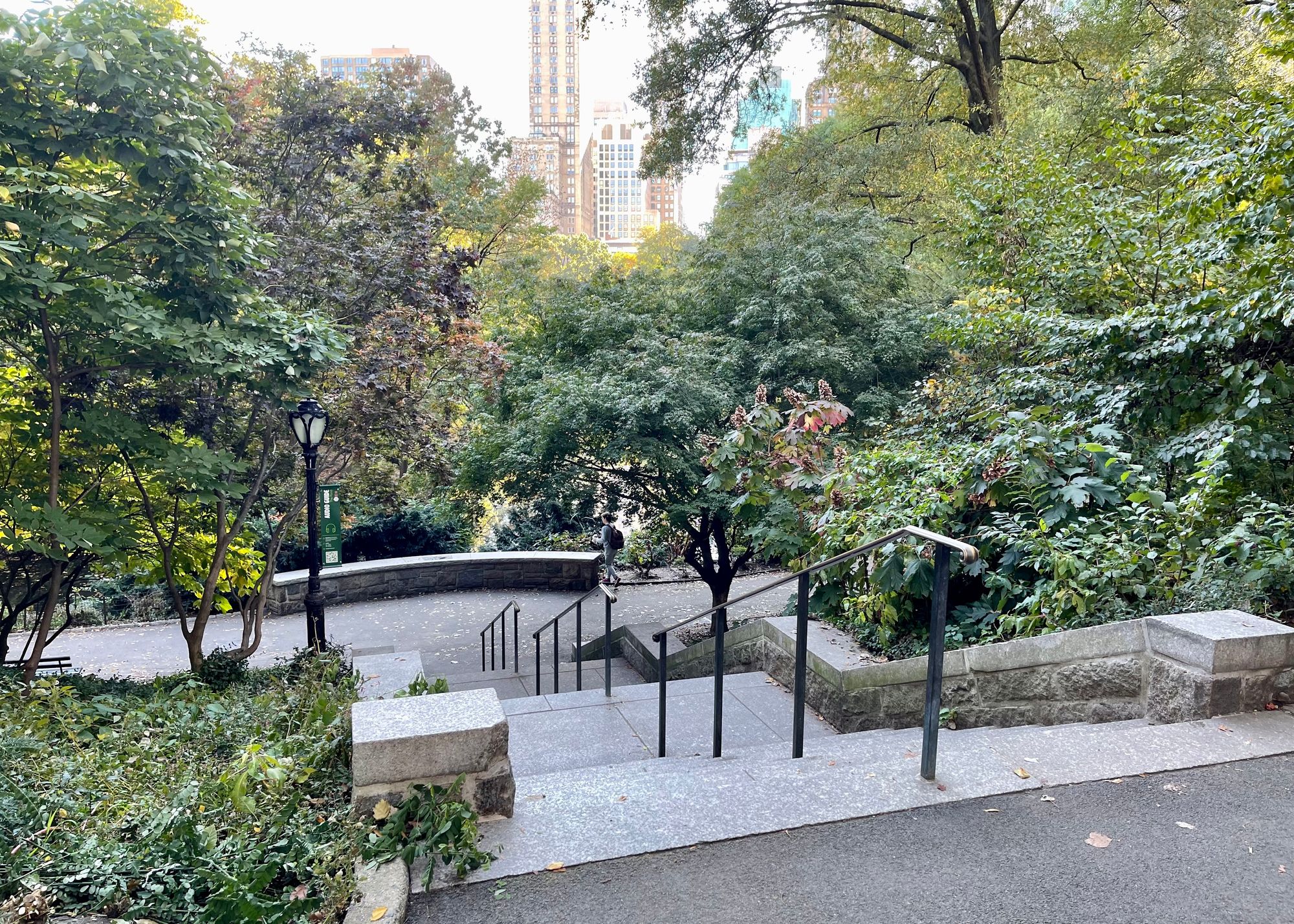
The park has some of the best views in the city that should be shared with its residents and visitors. Blocking this treasure with walls is like hiding it and creating a sense that it's somehow separate from the rest of the city, even though it is right in its center.
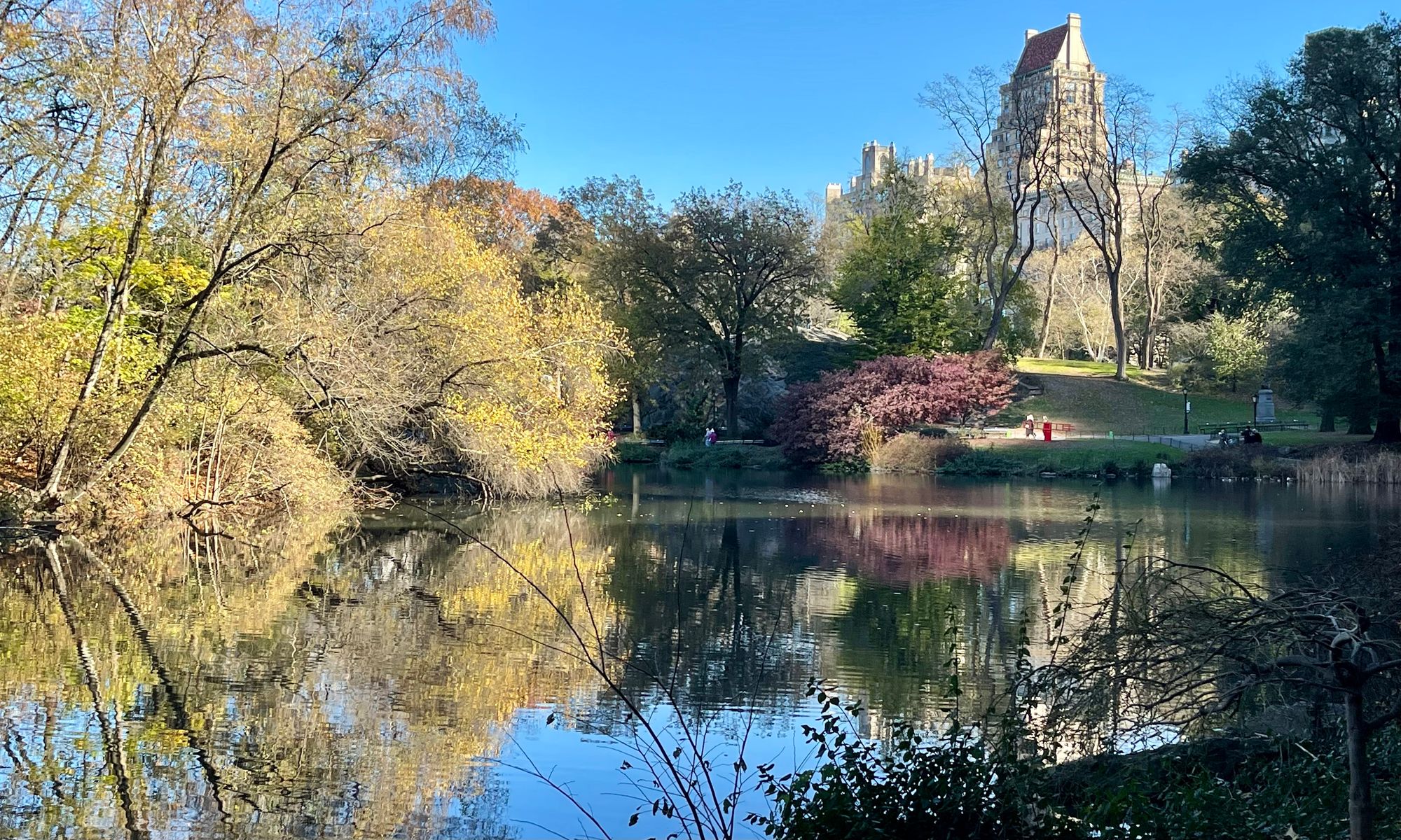
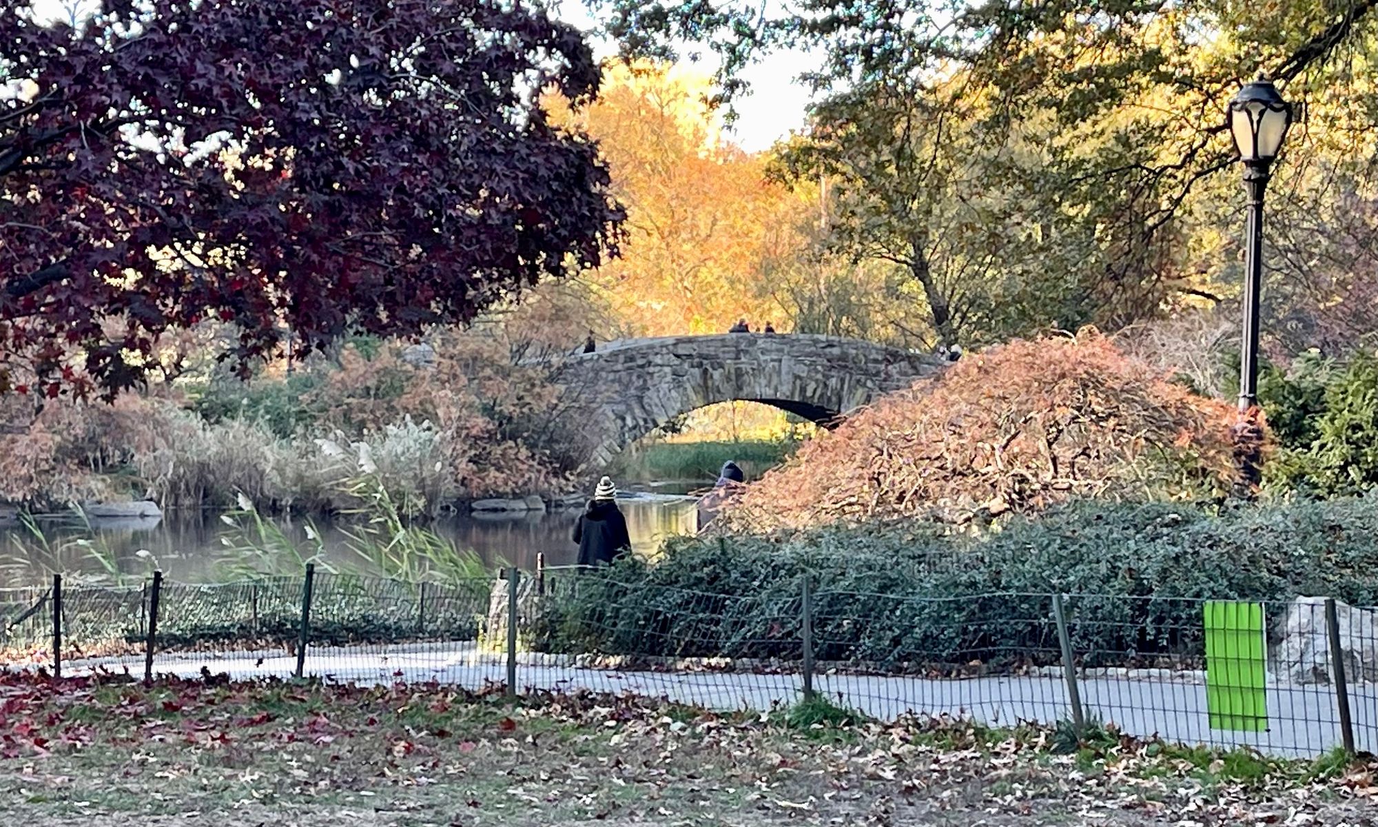
Inside the Park
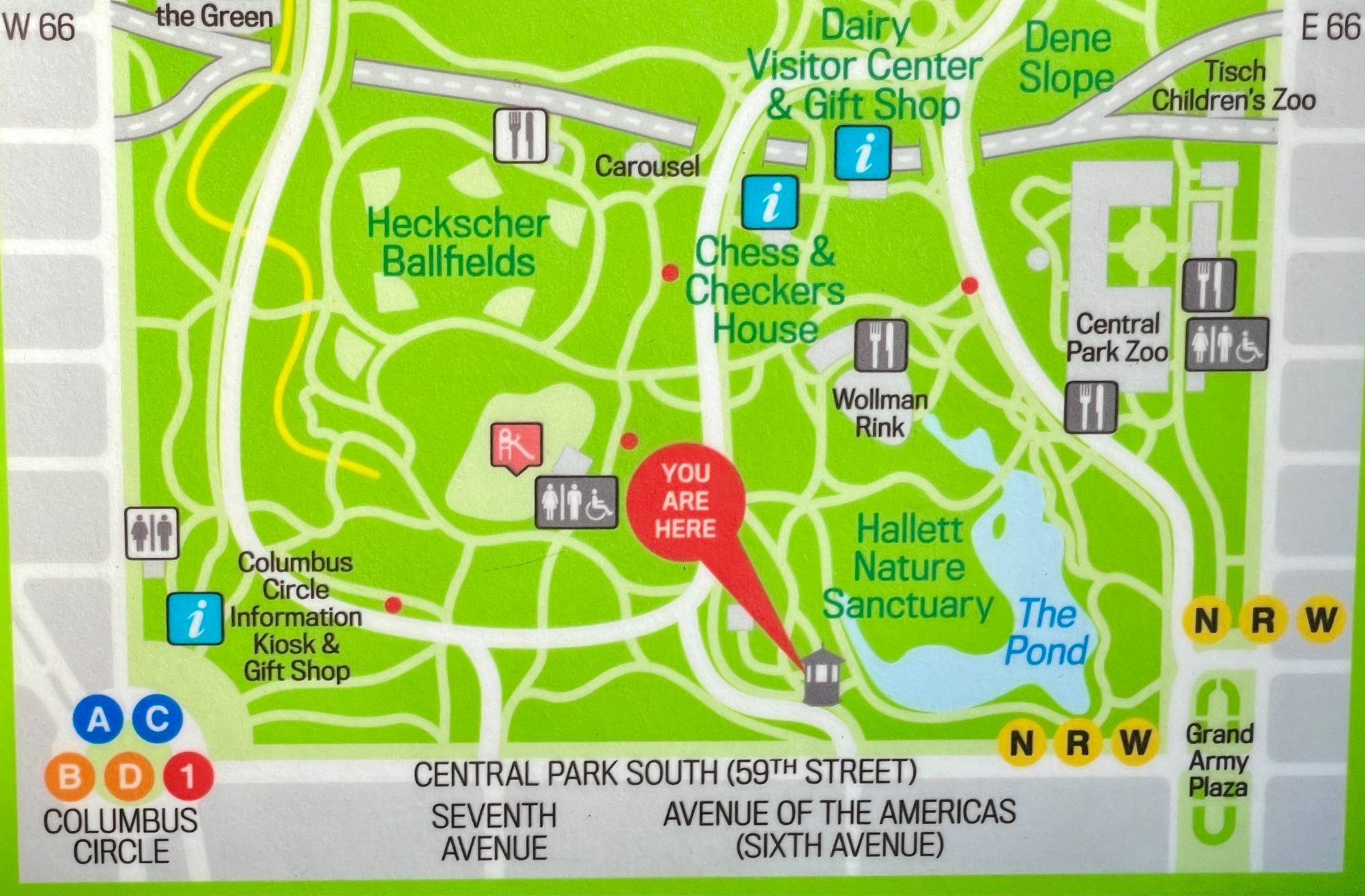
What's more, the lower part of the park where it touches Midtown has too little going on. There is a beautiful pond and paths through the trees, but not much else. As the part of the park that is closest to the heart of the city, it should embody at least some of its energy. It can be activated by a variety of offerings like cafés, music performers, playgrounds, etc.
Benchmarks for Central Park
Bryant Park in New York and Campus Martius in Detroit offer great examples for how to do a large, central public space right.
Bryant Park, New York City, USA
In the 1970s, Bryant Park was a bare field where there was nothing to do and its entrances were blocked from the street, creating hidden areas that invited shady activity.
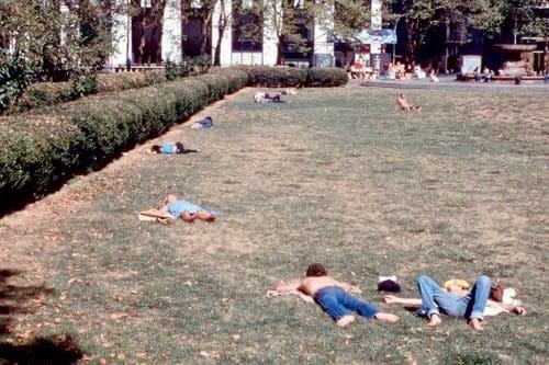
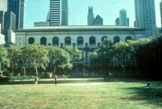
1980
One of our main goals at Project for Public Spaces was to turn Bryant Park around from a place that had serious safety issues to a thriving public place that was welcoming for everyone. Our Placemaking Vision involved reprogramming the space by making it a multi-layered destination with a variety of offerings.

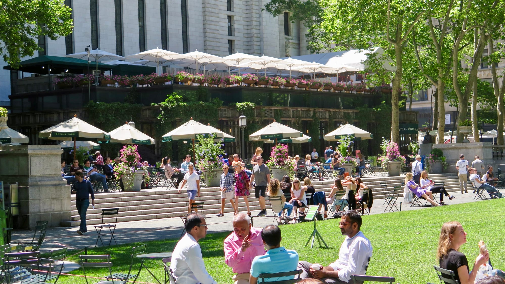
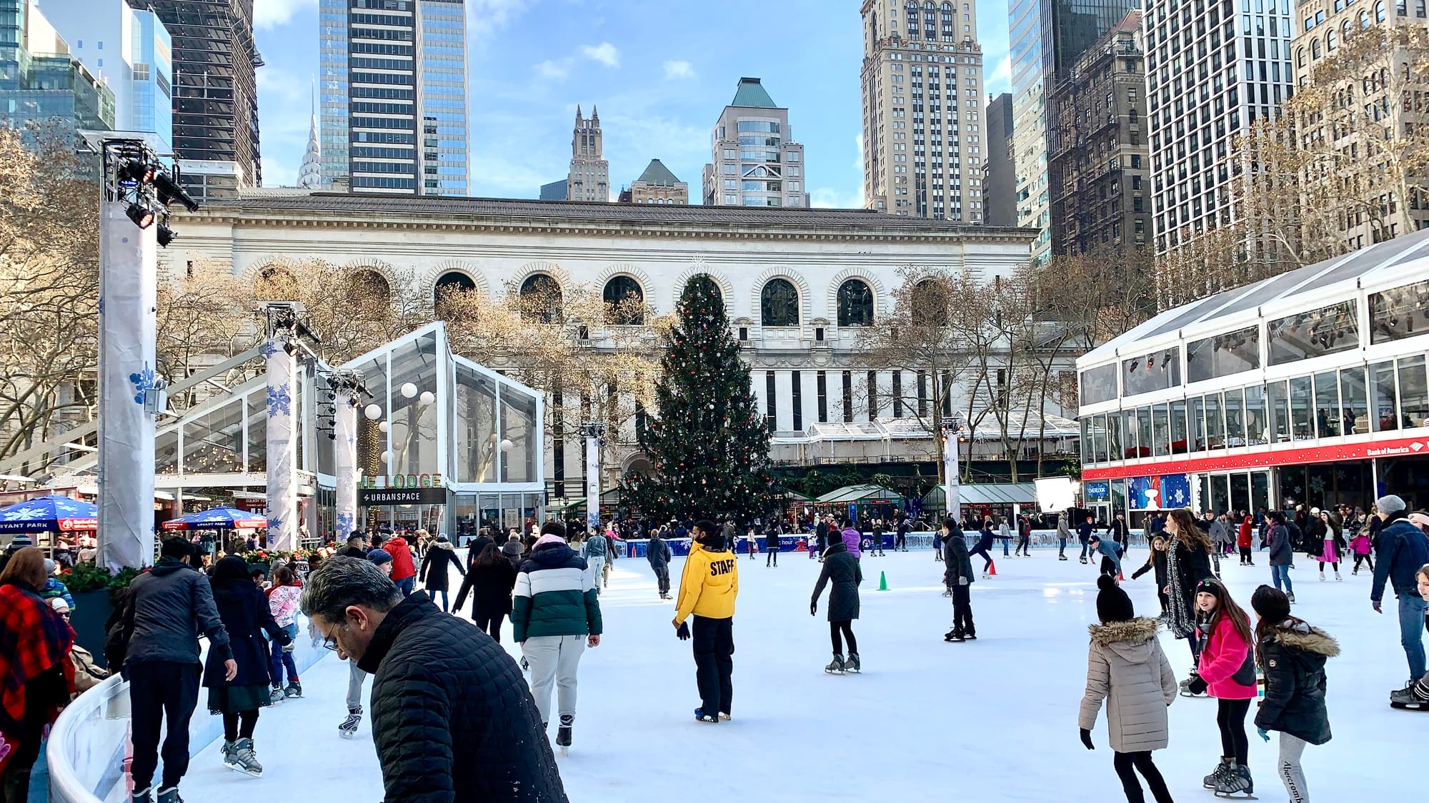
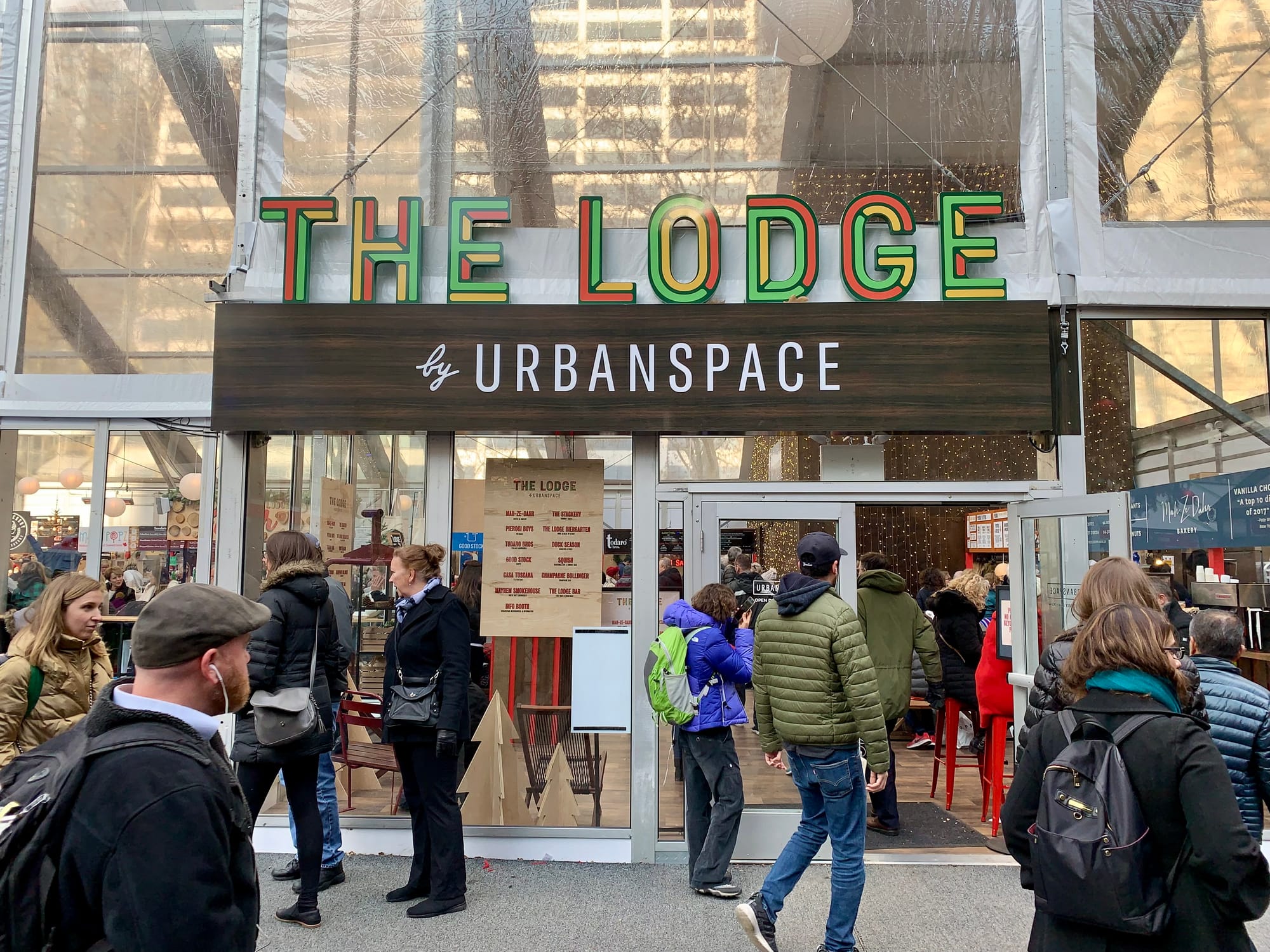
Bryant Park has historic significance, therefore big changes weren't permitted, but many of the small changes we proposed were accepted. Now, all kinds of people are drawn to the park from morning to evening, every day of the week, in large part thanks to its food vendors, movable chairs, and a wide lawn that hosts a variety of activities and events. Today, Bryant Park is in a world of its own in terms of how it embodies what the public park/square of the future should look like.
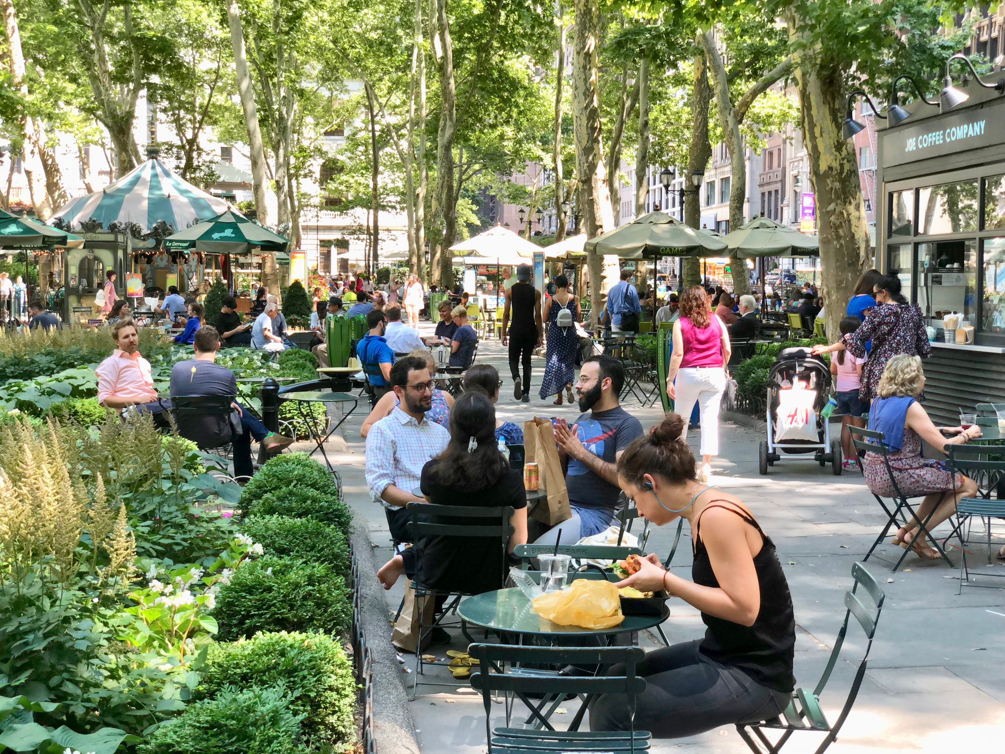
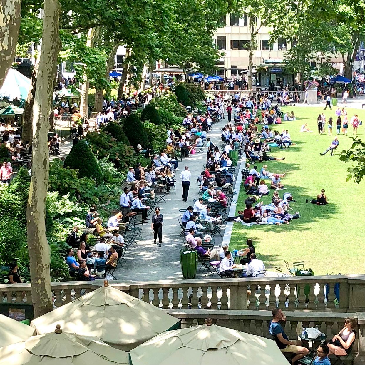
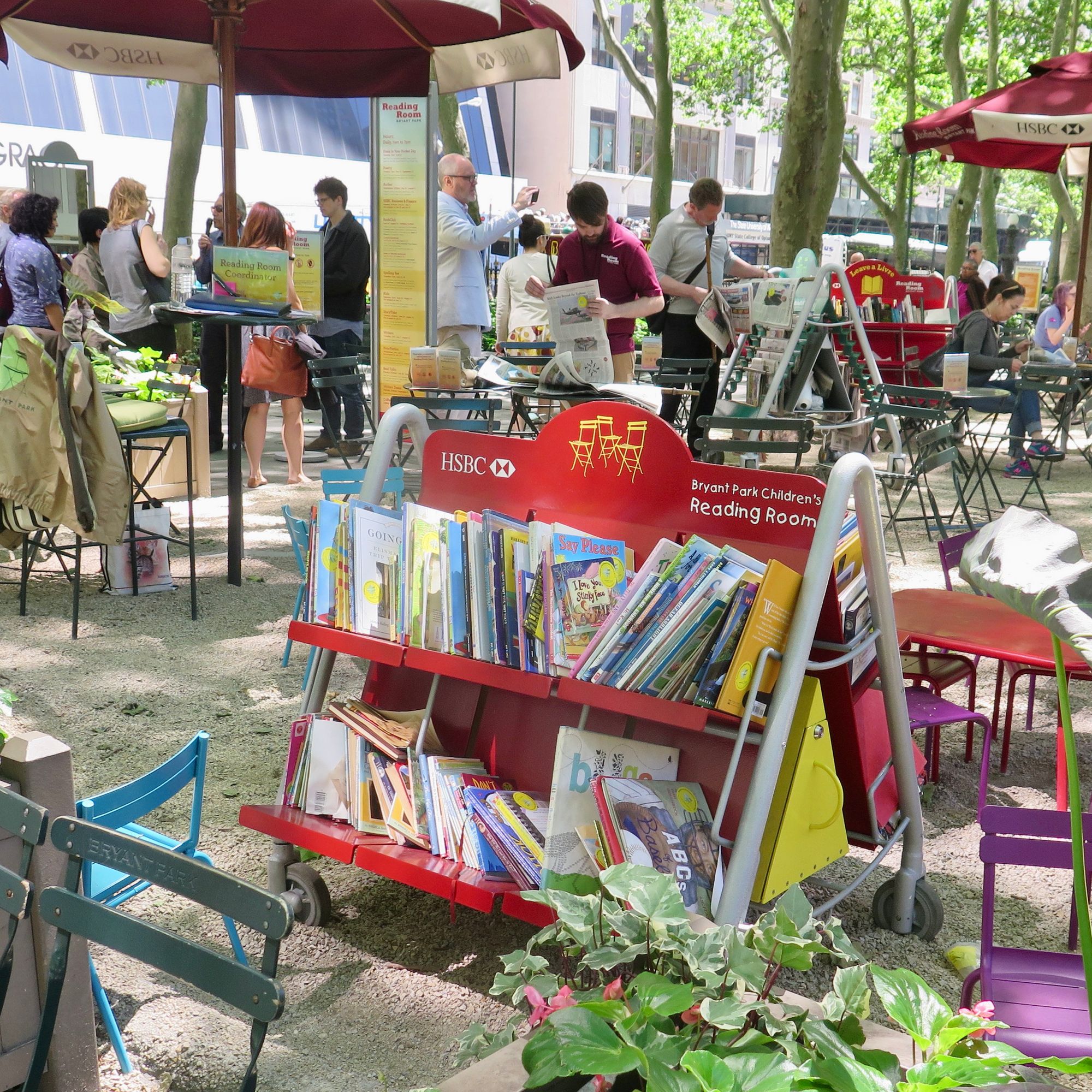
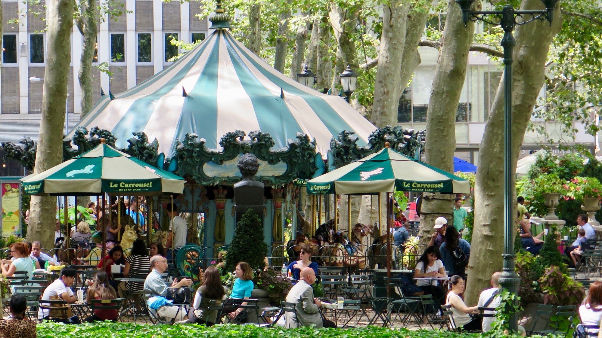
You can often come across piano performances, board games and art supply carts, ping pong tournaments, a carousel, tai chi, outdoor libraries, and the Fever Tree Porch, which is equipped with swings and lounge furniture, a full bar and restaurant, and fire pits.
This is the kind of activation that Central Park needs as well. Currently, there is too little going on, especially in the areas that interact with the street and the park's surroundings. These areas need to be activated to draw people in.
Creating Great Places with the Power of 10
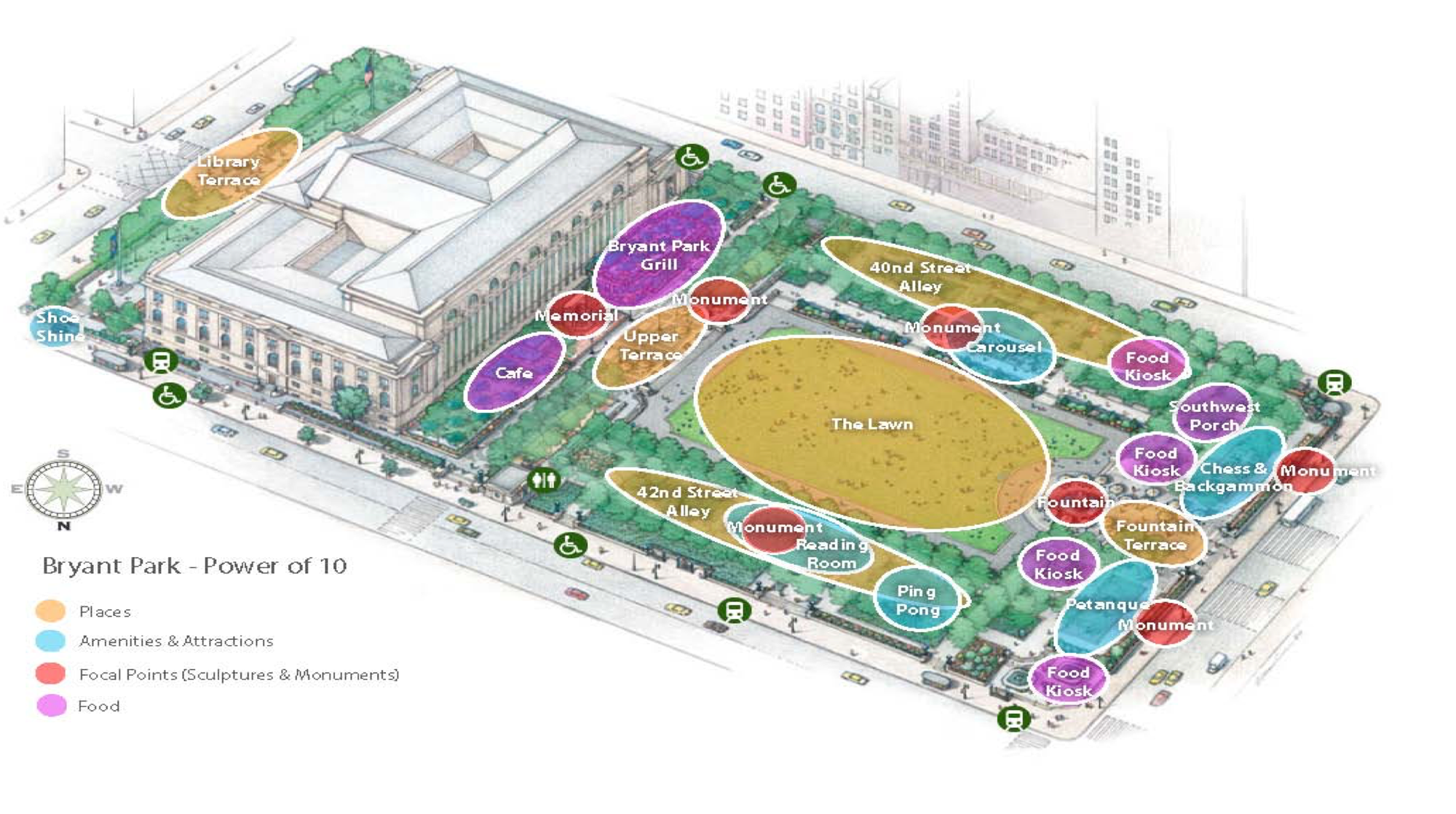
Bryant Park's revitalization was program/management driven. You can break Bryant Park down into distinct destinations, where each "place" is its own active space within the larger area. The Power of 10 approach describes how at different scales one can create a strategy for activation by trying to create 10 things to do within 10 places within 10 larger areas. For example, rather than just thinking of adding a café to a public place, ask yourself what are the 10 things one can do at that café?
Bryant Park is so vibrant that it has 20 distinct places. Multiplying that by 10 things to do within each means there are 200 activities happening there at any one time. Compare this vibrancy to Central Park, especially the part closest to the center. Central Park has a long way to go to.

Detroit's Campus Martius
Detroit offers another great story about the transformation of a central public square. In the early 1900s, Detroit had the most vibrant downtown in North America with Campus Martius at the center – a crucial crossroads and the heart of the city. However, by 1999, Campus Martius had been completely taken over by car traffic, leaving only the Soldiers and Sailors Monument in the center as a reminder of Detroit's former glory.
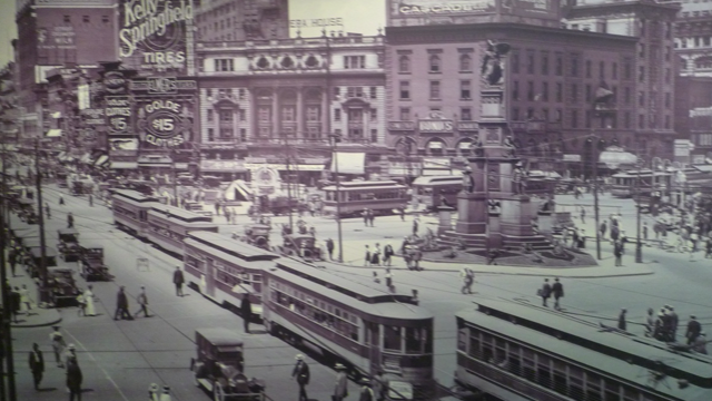
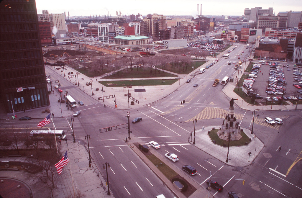
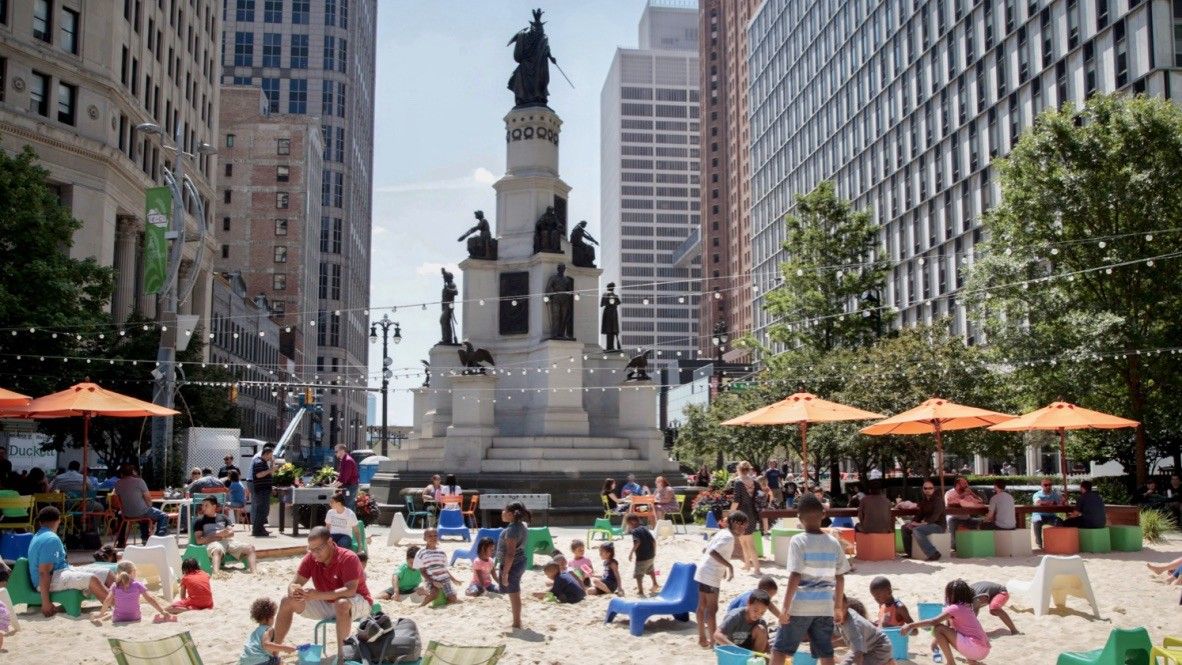
Starting in 2002, Detroit helped bring its downtown back to life by turning Campus Martius into a vibrant square serving its community. Local leaders did so by making use of easily achievable "LQC" (Lighter, Cheaper, Quicker) activations.
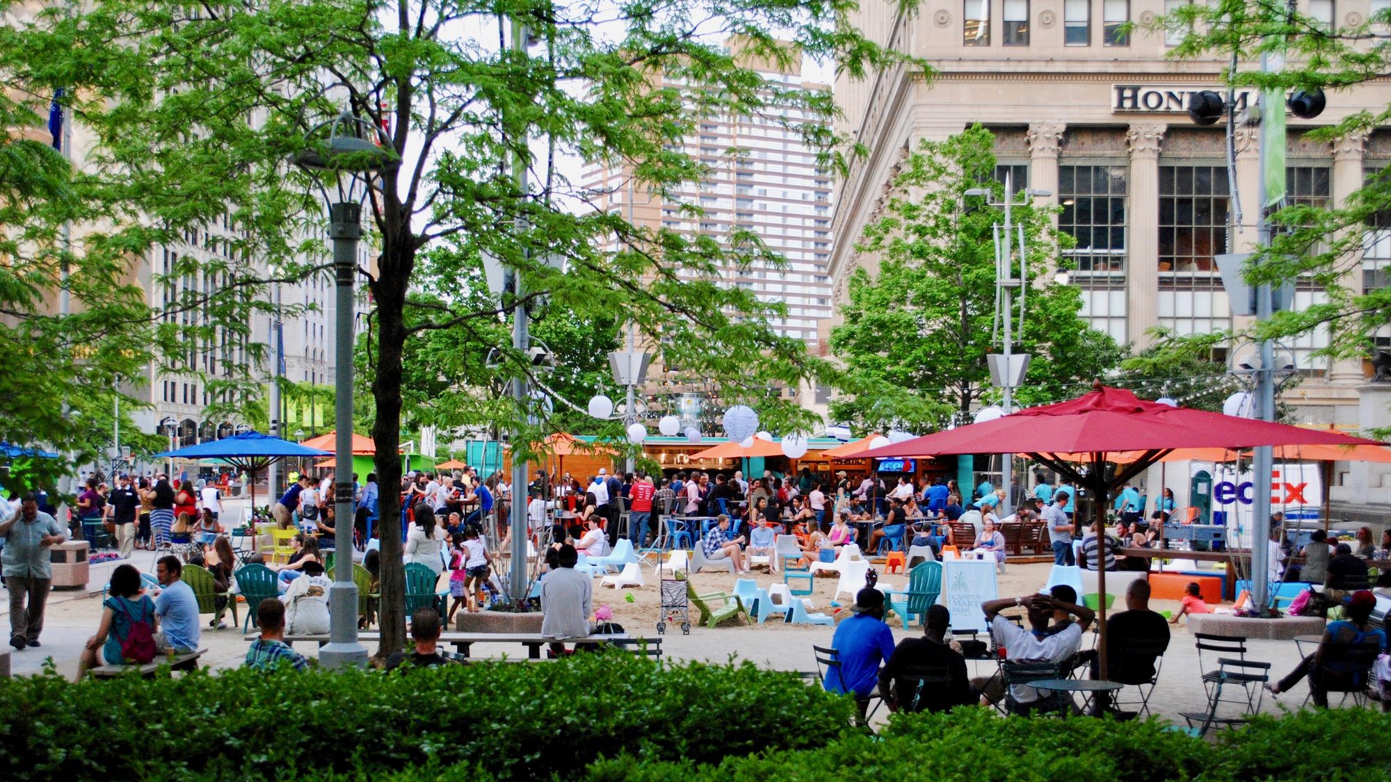
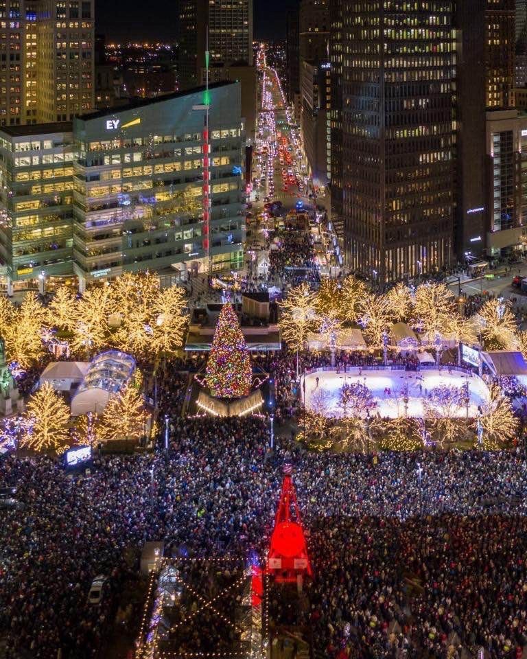
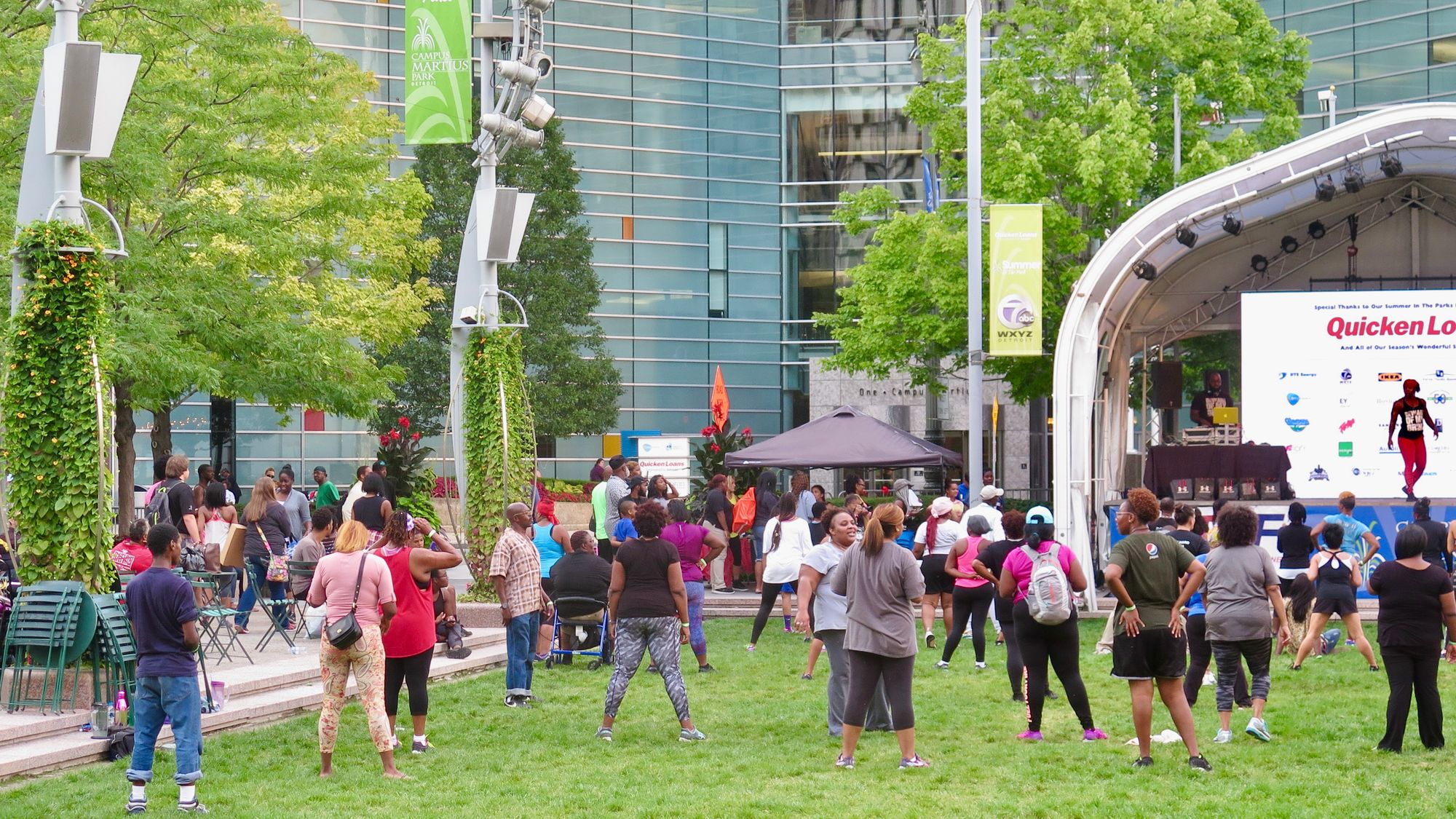
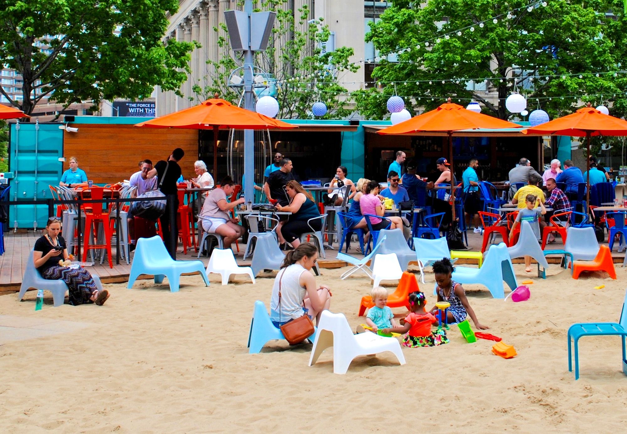
A place for all seasons: Campus Martius is now a favorite location for events, meeting up, and just hanging out.
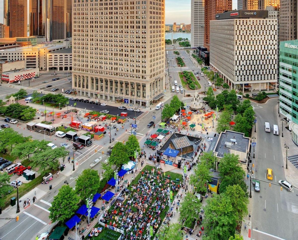
Since then, through the use of placemaking, Detroit's downtown area has been entirely transformed. The key was that local leaders kept the momentum going after they saw Campus Martius change, working to create an ever-improving city center. In this way, a large central public square or park can revitalize a city. This is what needs to happen with Central Park as it relates to Midtown.
Connections To NYC's Main North/South Streets
Walking up from the five north/south streets (Fifth Avenue, Avenue of the Americas, Seventh Avenue, Broadway, and Eighth Avenue) gives no sense that there is a spectacular asset for all to enjoy ahead because there is nothing to create a sense of arrival or highlight it. You wouldn't know that there was any destination of interest in this area unless you saw it on a map because what is mostly present in the areas leading up to Central Park are wide, highway-like streets full of traffic, overwhelming intersections, and isolated public spaces – places that indicate a place to avoid, not a place to approach. A city's assets should be celebrated, not hidden or obstructed, and this is something the city is far from getting right in regards to Central Park.
59th and 5th Avenue
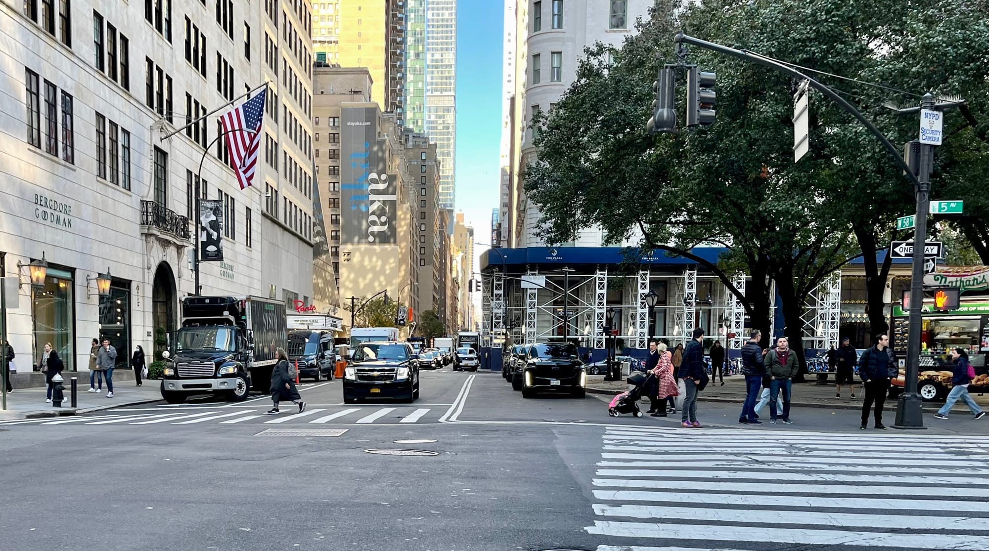
59th Street on the east corner of Central Park intersects with Fifth Avenue. This street is four lanes wide, but it widens to five lanes south of 59th Street – not the kind of gateway you would expect for the most prominent, high-end shopping street in the country, especially with the sidewalks in many areas along it being as narrow as they are.
The intersection of 59th and 5th could be narrowed to two lanes, the sidewalks can be expanded, and there can be a series of well-designed kiosks bordering the Pulitzer Fountain Plaza to create the sense of a gateway into this important shopping area.
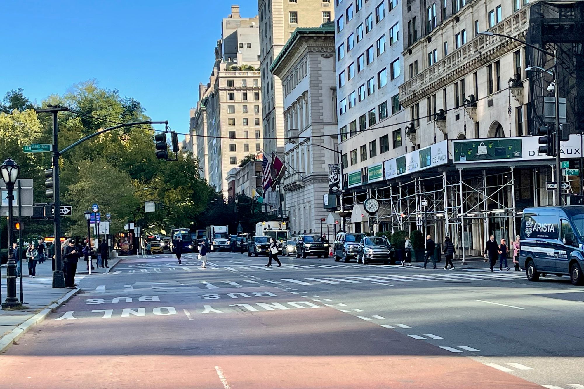
58th Street Looking West from Fifth Avenue
Apple Store Plaza
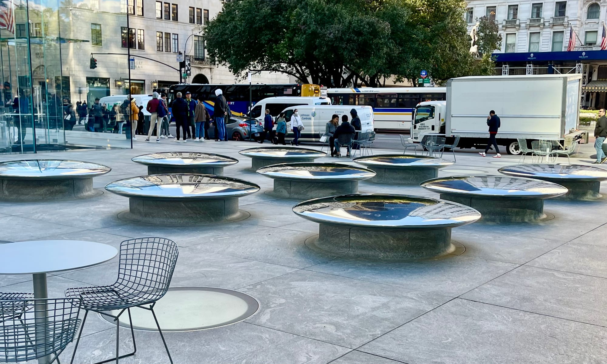
We thought we would never see another "stupid" plaza like the ones Avenue of the Americas built in the late 60's yet here we are. What is someone supposed to do on these low, rounded mushrooms that are unsuitable for play and uncomfortable for sitting on? Why are the water features cordoned off puddles? Who is this plaza meant to be used by?
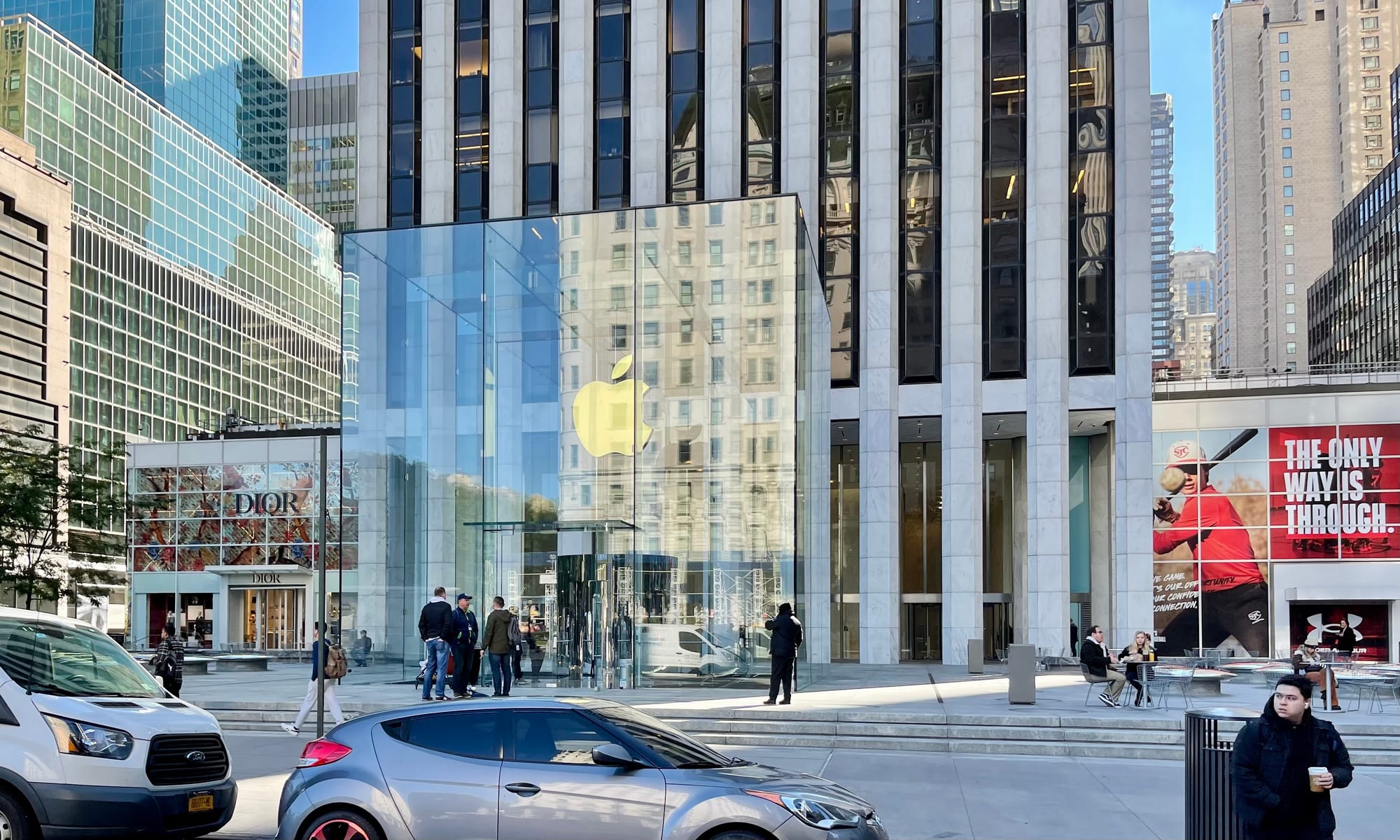
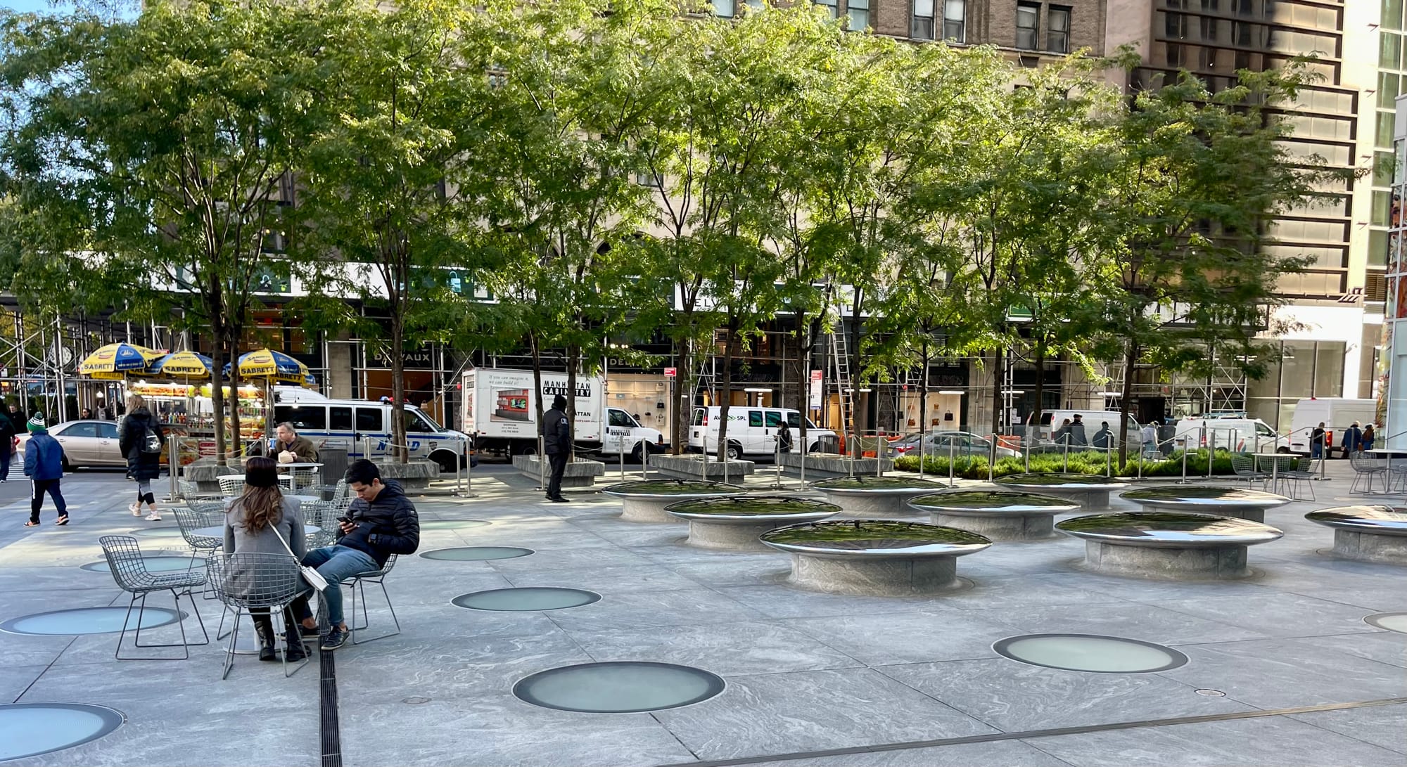
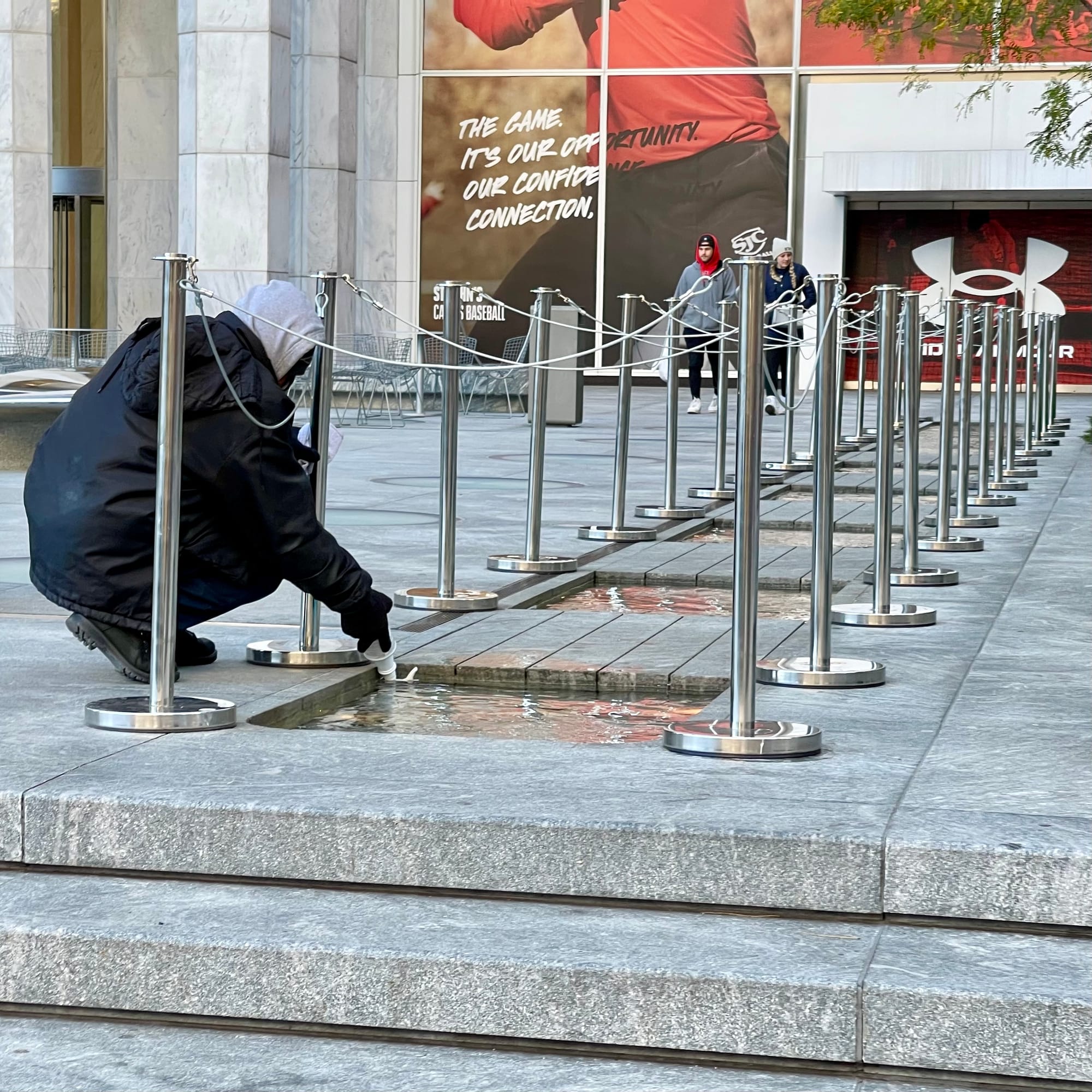
Entrance into Central Park from Avenue of the Americas
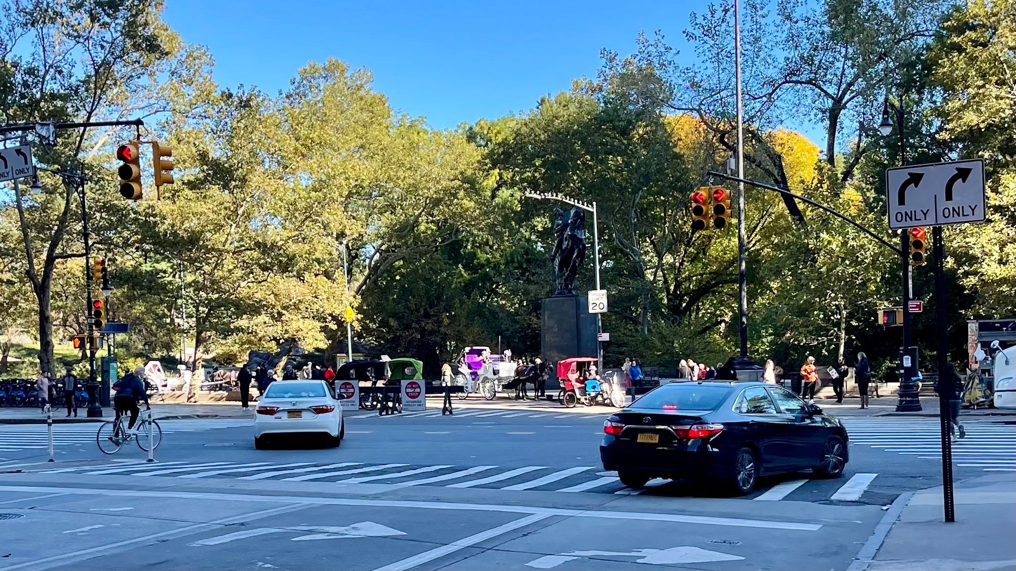
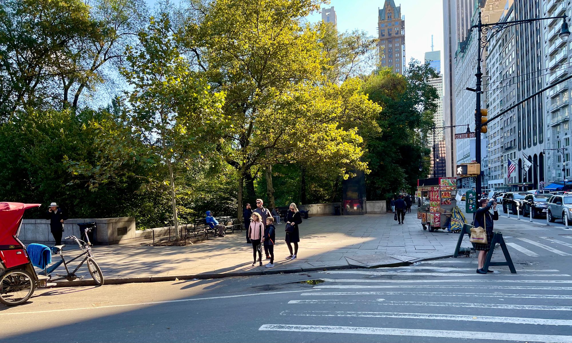
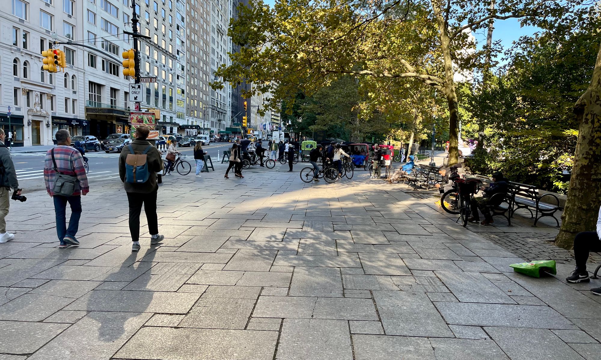
Because of the lack of gateways, signage, or views, the entrance into Central Park where the Avenue of the Americas dead ends into it feels like one is going into this destination through a back door... Nothing indicates to people arriving here that this is one of the most beautiful and famous parks in the world.
Creating a Better Connection Between Midtown and Central Park
Back to the Future
59th Street needs to become both the "porch" and the "front yard" of Midtown, facing and embracing Central Park. It should offer a beautiful complexity that dramatically reduces the hostility that the current vehicle dominance creates.
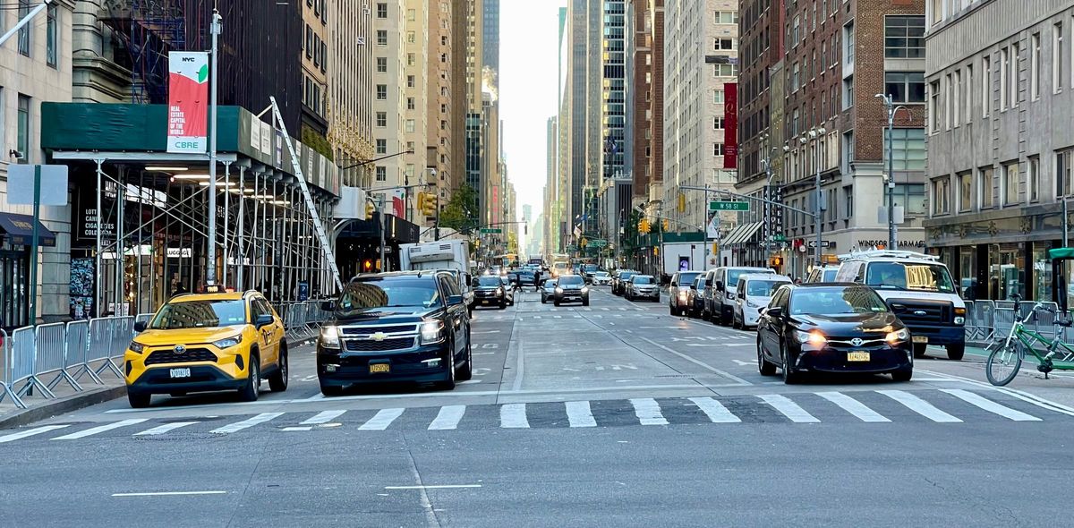
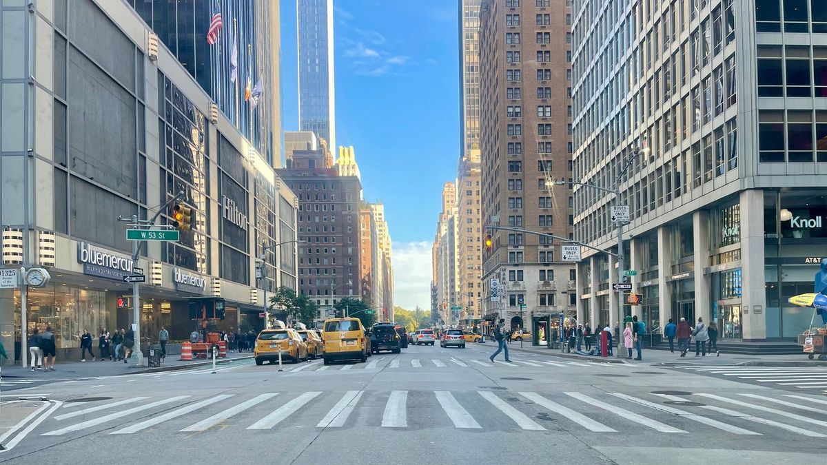
These changes would be catalytic for the area by revitalizing Midtown's heart and thus bringing the whole downtown back to life. We have written about how that can happen in depth in the articles below:
Who We Are
We are the founders of the global Placemaking movement. We have been leading efforts to transform car-centric streets and intersections around the world since the inception of Project for Public Spaces in 1975.
What brought the NY intersection issue to light for us initially was the transformation of Times Square which we played an important role in. Fixing Times Square had such an impact on the city that it inspired us to pay more attention to other large intersections that could be transformed. When we led PPS, Ethan Kent partnered with Transportation Alternatives in a program called "Streets Renaissance" with Mark Gorton. Recently, the NYCDOT has begun a program to improve the safety of over a thousand intersections. The ones in this article represent some of the more important and difficult ones.
A lot of this underperformance has to do with the prioritization of cars over people in the city design, something that plagues cities around America and the world. Our streets have been taken over by traffic, but if we and our cities are to prosper, that needs to change, especially in central areas.
This type of car invasion is a global phenomenon. Spaces for people have been sacrificed to places for cars all around the world. Recently, rumblings of change have started to ripple through communities. Now, we go hardly a day without someone somewhere in the world showcasing streets and intersections that are being recovered from the Transportation Mafia. We are making headway, but there is still a lot of work to do.
